Learn about the limits of your user’s short-term memory by understanding how the serial position effect works and how you can manipulate it in the context of user experience design. Many of the most successful designs out there, produced by highly successful companies like Apple, Electronic Arts, and Nike, reflect an understanding of the serial position effect and how it influences their designs. This article will teach you the theories that support the serial position effect, and ways you can manipulate it in your design work so you can further improve user experience.
The Serial Position Effect
The serial position effect, a term coined by Hermann Ebbinghaus, a German psychologist and pioneer of memory research, describes how the position of an item in a sequence affects recall accuracy. There are two main concepts involved in the serial position effect:
The Primacy Effect: Items that are presented at the beginning of a list are recalled with greater accuracy than items in the middle of a list.
The Recency Effect: Items that appear at the end of a list are also more likely to elicit better recall than items presented in the middle of a list.
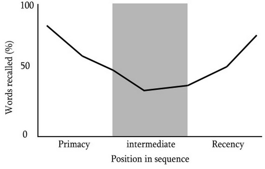
Author/Copyright holder: WikiPremed. Copyright terms and licence: CC BY-SA 3.0
This graph illustrates the tendency of a user to better recall items from the beginning as well as the end of a list or sequence. The middle items are the most difficult to remember.
The Primacy Effect
The theory for the primacy effect is that the greater accuracy of recall is due to the relatively small amount of processing effort expended in rehearsing the item by itself. This is in contrast to proceeding items (in the middle of a sequence) which must be rehearsed with all the other preceding information (in the beginning of a sequence); causing significant cognitive burden and affecting recall.
This theory is supported by experimental findings from ‘A two-process account of long-term serial position effects’ by Glenberg et al. (1980), where the primacy effect no longer appears when participants get a rapid presentation of list items; whilst presenting items slowly improves recall. As expected, they found that the more time between being exposed to each item, the greater chance there is for the participant to rehearse previous items in order to store them into their memory.
The Recency Effect
The theory for the recency effect is that recall is better for items appearing towards the end of a sequence due to their preservation in our working memory, the part of our short-term memory that processes conscious and immediate perceptual information. Our working memory holds transitory information and acts as a buffer for new information while it assimilates into other memory systems.
Cognitive scientists Murray Glanzer and Anita Cunitz (1966) conducted an item recall test to assess whether recency and primacy are enduring effects if there exists a distracter task between the information study phase and test phase.
Results showed the primacy effect was present even after the 30-second interference task, but the recency effect was no longer present. Therefore, when distracter tasks are employed during recall tests, the recency effect disappears, supporting the theory that improved recall is due to recent items being sustained in a temporary memory system, such as working memory. Glanzer and Cunitz concluded that the capacity of human short term memory is likely to be three to four chunks of information at one time.
Consequences of the Serial Position Effect in User Interface Design
The effect of recency and primacy have implications for the design of user interfaces. Presenting long lists of information places significant strain on limited attentional resources and restricted memory systems, especially short-term memory, where only three or four items or chunks of information can be maintained at one time. Our ability to recall previously presented items is also severely impacted by events between initial processing and later recall.
Four Ways to Effectively Manage the Serial Position Effect in Your Designs
Knowing that the positioning of an item can affect user experience by causing information in the middle of a sequence to be harder to recall, it can be helpful to minimize the effect it has on your users. By understanding how to manipulate the order of information and minimize the serial position effect, you can reduce strain on your user’s memory load and limit the distraction that exists between presentation and recall of information.
Here are 4 ways you can design better user experiences by understanding how the serial position effect affects your users:
1. Maintain Task-relevant Information within the User Interface
Maintain task-relevant information within the user interface to minimize the tax on your user’s cognitive resources. Provide tools to guide your user toward their goals, helping them be more efficient and more accurate in their tasks.
Creative tools like Keynote by Apple Inc., Photoshop by Adobe, and Microsoft Word by Microsoft provide users with page number information, rulers, and grids to help the user create better work and be faster at it.
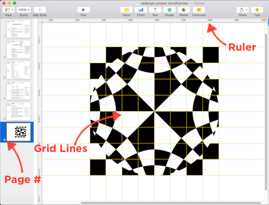
Keynote, a presentation software application developed by the multi-national technology company, Apple Inc., maintains task-relevant information for users so that they can more easily create presentation slides by providing things like page number and status, grid lines, and rulers.
2. Include Cues in the User Interface
Include cues in the user interface whenever possible as they can initiate recognition, the identification of something previously encountered, and recall, the action of remembering something previously learned or experienced. Provide various perceptual cues like sounds created by cause-and-effect (e.g., a “bling” sound goes off when a video game character collects gold coins), or provide a map or speedometer on the interface of a racing game.
 Author/Copyright holder: Need for Speed Most Wanted 2005. Copyright terms and licence: Fair Use.
Need for Speed, a racing video game developed by American gaming company, Electronic Arts, Inc., includes cues in the user interface to let the user know where they’re at at all times by providing a map on the bottom left and a speedometer on the bottom right.
3. Limit the Amount of Recall Required
Limit the amount of recall required across parts of the dialogue by retaining relevant information at all points of a task, when necessary, or offer simple means of retrieving this information. Human attention is limited and we are only capable of maintaining up to around five items in our short-term memory. Due to the limitations of short-term memory, designers should ensure users are only faced with less than five items at any one time within the dialogue. Many online retailers know that it’s important to keep the user informed as they move through the user flow of product purchasing.
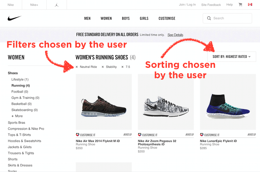 Author/Copyright holder: Nike, Inc. Copyright terms and licence: Fair Use.
The website by Nike Inc., the multinational corporation providing apparel and equipment, shows what filters the user has chosen at every step in their shopping experience, as well as what the products are sorted by.
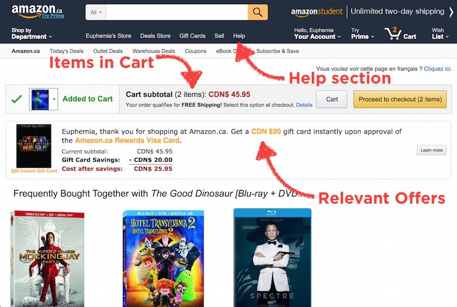 Author/Copyright holder: Amazon.com Copyright terms and licence: Fair Use.
The website by Amazon Inc., the American e-commerce and cloud computing company, shows the user how many items are in the cart at every step in their shopping experience, where to go for help-related information, as well as relevant offers prior to purchase.
4. Emphasize Key Information in the Beginning and End
Emphasize key information in the beginning and the end, while placing the least important items in the middle of your sequence. The primacy and recency effect explains that people remember information more accurately when it is consumed early on and at the end of a sequence.
Many landing pages are designed to support this concept. In the example below, we will examine the serial position effect by dividing Apple iPad Air 2’s landing page into three sections based on its apparent content: Beginning, middle, and end. You can also see this reflected in speech writing and textbook writing as well, where the important information is emphasized in the beginning and re-iterated at the end.
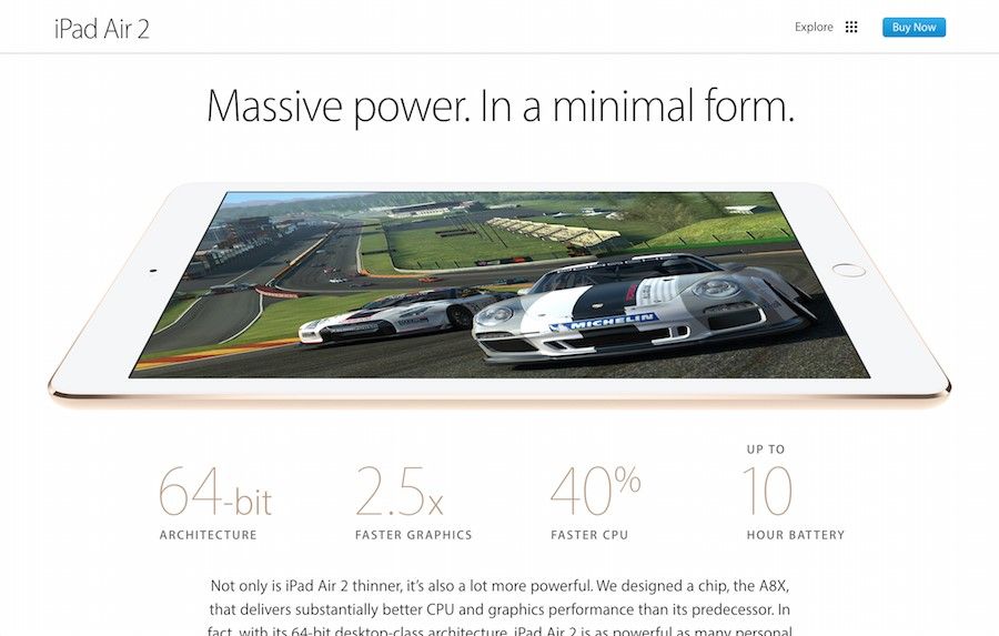
 Author/Copyright holder: Apple Inc. Copyright terms and licence: Fair Use.
The first section of the landing page that sells the iPad Air 2, a product by Apple Inc., communicates the key reason why you should buy their product at the beginning of the page sequence.
 Author/Copyright holder: Apple Inc. Copyright terms and licence: Fair Use.
In the middle of the landing page sequence of the iPad Air 2, there are chunks of relatively less important information compared to the beginning and the end of the page. This reflects the designer’s understanding of the serial position effect on their users.
 Author/Copyright holder: Apple Inc. Copyright terms and licence: Fair Use.
The final section of iPad Air 2’s landing page, provides the call-to-action activities a user would expect to find at the end of any sales pitch. Need special financing? Need fast delivery? Get help buying and click to learn more.
The Take Away
Design should reduce the strain on users by understanding the limits of their short term memory, such as the limitations highlighted in the serial position effect. Knowing the serial position effect, we should aim to empower the user by maintaining task-relevant information on the screen when necessary, including cues in the user interface, limiting the amount of recall required across parts of the dialogue, and emphasize key information in the beginning and end of a sequence whenever possible. By understanding your user’s cognitive processes and incorporating this knowledge into your designs, you will be better equipped to create more powerful and intuitive user experiences.
References & Where To Learn More:
To view more information on the primacy effect, please see here.
To view more information on the recency effect, read this interesting paper: “Two storage mechanisms in free recall”