Lists offer an approach for presenting a large set of items or options to users in a way that allows them to fulfill their tasks efficiently. The list design pattern supports users by guiding them through categories to their desired content. Different types of lists are helpful for different cases: scrolling lists, archive lists, and list inlays.
Lists in UX/UI Design
Your constantly-updated definition of Lists in UX/UI Design and collection of videos and articles.
Be a conversation starter: Share this page and inspire others!
Get 1 Powerful Email Each Week
Join 313,907 subscribers.
What are Lists in UX/UI Design?
Learn More About Lists in UX/UI Design
Make learning as easy as watching Netflix: Learn more about Lists by taking the online IxDF Course UI Design Patterns for Successful Software.
Why? Because design skills make you valuable. In any job. Any industry.
Earn Industry-Recognized Certificates
Industry giants trust our courses to train their teams, and prestigious universities integrate our content into their curricula. Add your certificates to your LinkedIn profile, résumé, and job applications.


All Free IxDF Articles on Lists in UX/UI Design


Search for Items with Scrolling Lists, Archive Lists or List Inlays
Even if you’re not the to-do list maniac like some of us, lists are a great way to deliver content to your users. A list allows them to navigate quickly to the section of content that is most relevant to them, while maintaining an overview of the entire body of information that is accessible. It als
- Social shares
- 683
- Published
Read Article
Search for Items with Scrolling Lists, Archive Lists or List Inlays

Even if you’re not the to-do list maniac like some of us, lists are a great way to deliver content to your users. A list allows them to navigate quickly to the section of content that is most relevant to them, while maintaining an overview of the entire body of information that is accessible. It also helps them understand the logic of the content you’re delivering, namely by showing the different categories and their relations. Learn more about the different types of lists that you can use to create great designs, and let us help you understand when and how to implement each type for the best results.
The Design Problem
If you have a large set of items or options, you need to present them to users in a way that allows them to fulfill their tasks. These tasks can involve viewing the content of different items quickly or searching for and selecting a particular item. Users will be best served with design patterns that prevent them from having to skip to different windows or pages when viewing content. Also, we should support users in searching for and selecting an item by guiding them through broader categories to their destination. This is especially true when we present items chronologically. Either way, you must ensure that users can fulfill their tasks with minimal effort and maximum overview, even when the set of items or options involved is so large that it threatens to take over the entire user interface.
The Design Solution
The solution is the use of lists. But there are different types of lists that are helpful for different cases.
A list inlay allows the user to view the contents of all items in a list, from one screen, by simply clicking on the item. Typically, the list shows clear labels or brief descriptions of the contents; then, upon the user’s clicking on an individual item, more in-depth details are shown beneath the corresponding label. The user is then provided with the utility to close the item by clicking on the general region of space occupied by the item contents, the brief list description/label or some designated button/icon, such as a plus/minus symbol.

Author/Copyright holder: Mango. Copyright terms and license: Fair Use.
An example of a list inlay design pattern: the smartphone application of the Mango online shop reveals the list items belonging to a single category (in this instance, the category of accessories consists of shoes, handbags, jewelry, etc.) when the image or label is clicked.
Archive lists consolidate data sets into broad categories, listed by the day, week, month or year in which the information items were uploaded or edited. As you can see from the example archive list below, for each action on a certain date, the type of action is added to allow the users to narrow their search according to the day and the group to which their target item would belong.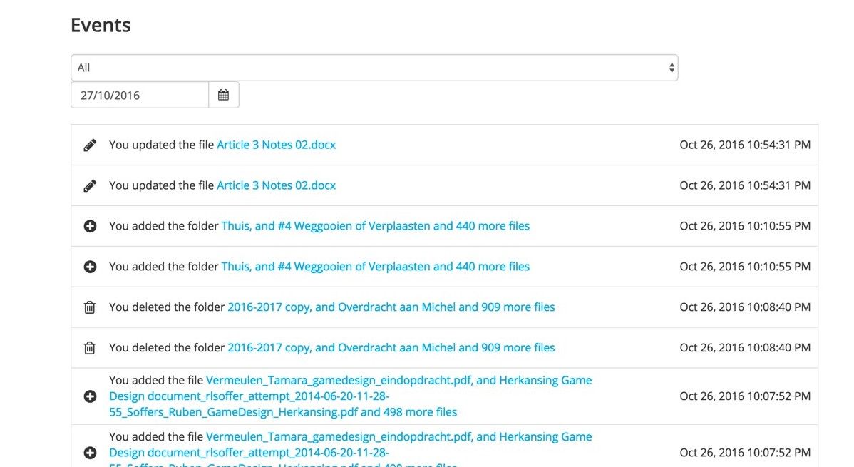
Author/Copyright holder: Sync. Copyright terms and license: Fair Use.
This example from the Sync cloud storage web panel shows an archive list. For each action on a certain date, the type of action is added to allow the users to narrow their search according to the day and the group to which their target item would belong.
A scrolling list makes all options available on the page, window or panel, with items further down the list accessed by scrolling. Scrolling lists are often used in user interface designs where there are a number of options that open in a separate section of the dialog box, window, page, or in another panel. Typically, scrolling lists consist of a column of options, arranged in alphabetical order, or some other meaningful sequence. The user can move back and forth (up and down) through these options by clicking the arrows, pressing the directional keys on the computer keyboard, swiping a touchscreen or scrolling a mouse.

Author/Copyright holder: Adobe. Copyright terms and license: Fair Use.
On start-up of the Photoshop application, a scrolling list design pattern is used to show users recently opened files. This helps them to select a document they are likely to want to continue working on. Without using a scrolling list, either too few options could be given or the essential learning tips at the bottom of the page would disappear from view, making them less likely to be accessed.
Why Choose a List Design Pattern?
“Design is thinking made visible.”
—Saul Bass, American graphic designer and Academy Award-winning filmmaker
You want to provide users with many options, files, emails or some other group of items.
A list inlay is especially useful when items would consume vast amounts of screen space if their full contents were displayed all at once. With a list inlay, the user can usually see a large proportion of other list items even when the contents of one are displayed, affording freedom of movement from one option to another.
Users are constrained by the limitations of human cognition; presenting them with large numbers of items all in one go increases the length of time it will take them to identify their desired items. Archive lists help guide the user to target information with the use of labeled categories which keep the number of options on the screen at any one time to an acceptable or manageable level. Clicking on these categories then takes the user to a further display, in which the contents of the selected category are either shown in narrower lists or all at once. Channeling the users in this way saves them from having to scan large numbers of items to identify their desired information.
Scrolling lists allow displaying a lot of options without taking up a large region of the user interface. Moreover, they enable the user to view the contents of a large number of items without having to move between different sections of the user interface.

Author/Copyright holder: Apple. Copyright terms and license: Fair Use.
The photos folder shown here uses an archive list design pattern, to help users navigate within the vast amount of content. By zooming out to a year-level, you can quickly select the approximate timeframe, and then zoom in again for more details.
Best Practice: How to Implement Lists
Before doing anything else, you must gather all of the options, arrange them into broader categories if necessary (e.g., for archive lists these would be days, weeks, months or years), and assign logical labels to these options.
Place the options in a logical order. For example, the list may be ordered according to the date files were last modified—as is the case with some file management applications—or they may simply be arranged alphabetically. Whichever method you adopt, ensure it is both instantly apparent and the best order for the job. For example, arranging emails alphabetically would not be ideal for users, as they typically need to distinguish new messages from ones they have already opened.
Make the means of scrolling clearly apparent but unobtrusive when using a scrolling list design pattern. Allow the user to use the keyboard to move through the options.
Provide the user with shortcuts to jump to frequently selected options, such as by typing in the first letter of the item or the automatic placing of these items at the top of the list after a number of uses.
Display or open the contents as close to the list as possible and without the need for any movement between different regions of the user interface, such as tabs, windows or distinct panels. With the implementation of a list inlay, the contents should be displayed directly below the selected item and the same gesture should allow the user to close the contents—returning the list back to its original state. Some designs allow the users to open items by clicking on the general region occupied by the option label, and they can then close each by clicking on the general region occupied by the contents. This has the benefit of reducing the level of precision required to open, close, and switch between items quickly.
When a selection has been made, ensure that the contents open automatically and are instantly visible so the user does not have to find them.
Provide informative feedback confirming the user's selection by changing the color of the chosen option.
In general, you must ensure the category labels appear 'clickable' so the user knows which elements can and cannot be interacted with. For example, using a dotted line underneath the titled categories or an east-facing arrow can give the impression of 'interactability'. Additionally, it can be useful to change the color of category label text when the users have successfully made their selection. This has two major benefits: firstly, the user knows his/her click has hit the target; secondly, thanks to the change in the color of previously selected options, the user is aware of categories he/she has already checked when searching for an item, thereby saving time and effort.
Some items in a list are more important to a user than others. Reflecting these personal differences in a rigid user interface design is hard. Therefore, in websites and applications where users would benefit from having certain dates more prominent, you should provide them with the ability to personalize the display. For example, allowing the users to place a star next to a specific category or establish their own dashboard, containing important dates, allows them to get the design working for them, rather than having to work around the design.

Author/Copyright holder: Wunderlist. Copyright terms and license: Fair Use.
In the Wunderlist application, users can personalize the lists they make by starring certain items. They can even highlight these elements more, by sorting the list items based on the presence of a star.
To help you get started implementing lists, you can download and print our “List” template:
Advance Your Career With This Free Template
for “Lists”

Potential Problems with Lists
Lists by their very nature contain lots of different items, which themselves generally contain vast amounts of information. Therefore, if more than one list item is open at a time, the length of a list could go on and on. This presents the user with the task of scrolling through significant amounts of information in order to find the desired item if more than one item is left open at a time. One approach is to close an open item automatically, on the user's behalf, when a further item is opened—thus ensuring the list stays a reasonable length and the user does not have to carry out any further interactions.
In general, if the category labels are ambiguous, inappropriate or unfamiliar to the users, they will be uncertain of where they will be taken when they select an item. Poor labels also fail to reveal the contents of a category, leaving the user unsure of where specific items are located. Therefore, item labels should contain language familiar to the intended users and commonly associated with their purpose. For example, if a category contains personal images, an appropriate label might be 'My Photos' – direct and to the point. An inappropriate label, however, might be 'Folder 123', as it reveals nothing about the contents.
The Take Away
A list is a useful design pattern when you have large amounts of contents to show the user, and he/she needs to select a specific item so as to fulfill a task. Different list patterns exist, and these can be helpful in different situations. The list inlay is especially appropriate when the user needs to zoom in on a specific category of items, without losing sight of the overall categories. Scrolling lists are designed to give access to larger lists without cluttering the page too much. Finally, archive lists are what we specifically use in situations where users search for items based on dates. All lists should contain items that appear clickable, and if users can customize the order of items in a list based on their personal priorities, it will greatly improve their user experience.
References & Where to Learn More
Hero Image: Author/Copyright holder: Freestocks. Copyright terms and license: CC0.
Jenifer Tidwell, Designing Interfaces: Patterns for Effective Interaction Design, 2010
Martijn van Welie, Pattern Library, 2008