The monthly charge design pattern is a dark pattern that does not necessarily trick users into agreeing with recurring payments, but simply coerces or manipulates them instead. If they refuse, the product may become more expensive, or utterly unavailable. Software companies increasingly use monthly charging as the only way to obtain products/services previously available with a single purchase.
Monthly Charges
Your constantly-updated definition of Monthly Charges and collection of videos and articles.
Be a conversation starter: Share this page and inspire others!
Get 1 Powerful Email Each Week
Join 313,901 subscribers.
What are Monthly Charges?
Learn More About Monthly Charges
Make learning as easy as watching Netflix: Learn more about Monthly Charges by taking the online IxDF Course UI Design Patterns for Successful Software.
Why? Because design skills make you valuable. In any job. Any industry.
Earn Industry-Recognized Certificates
Industry giants trust our courses to train their teams, and prestigious universities integrate our content into their curricula. Add your certificates to your LinkedIn profile, résumé, and job applications.


All Free IxDF Articles on Monthly Charges


How Some Brands Get Users’ Long-Term Commitment with a Monthly Charge
There’s a trend which takes the use of products from companies such as Adobe and Microsoft from single-purchase goods owned by the consumer to monthly subscriptions. Unlike most dark patterns, this one does not trick users into agreeing with a system of recurring payments, but simply encourages them
- Social shares
- 495
- Published
Read Article
How Some Brands Get Users’ Long-Term Commitment with a Monthly Charge

There’s a trend which takes the use of products from companies such as Adobe and Microsoft from single-purchase goods owned by the consumer to monthly subscriptions. Unlike most dark patterns, this one does not trick users into agreeing with a system of recurring payments, but simply encourages them to commit to a subscription instead. If they don’t agree, the product may become more expensive, or maybe even unavailable. But this pattern isn’t just for software producers. Read all about how some brands incorporate the design of monthly charges, enforcing them for different contexts, so you can see how to put your users’ trust and needs first.
The monthly charge design pattern is exactly what the name suggests: it is a scheme of monthly payments. That is not a dark pattern in itself, but it definitely has the potential to be. Just think about the monthly payments some people still make to a gym where they haven’t been in the last couple of months. They wanted that subscription and consciously made the decision to take it – at least, they did once, back then, at a time when every waking moment wasn’t spent rushing about being busy... like they are now. These folks probably even thought it would give them some extra motivation to work out. Then, somehow, matters got ahead of them and dropped too much of this thing called ‘life’ into their laps, and they started feeling bogged down. Now, for some reason, cancelling that subscription when they don’t use it anymore seems like too much effort or too low in priority to get done. And that is what companies are hoping for when they have customers signed up on a subscription basis—when they could just sell you a product or service once and be satisfied with that, and perhaps some nice words of feedback from you after a few weeks or so.
“Car sickness is the feeling you get when the monthly payment is due.”
— (Anonymous)
In 2011, Harry Brignull, a user experience consultant and dark pattern specialist, described a previous user interface design from Oxfam—the world-famous Oxford, England-based international confederation of charitable organizations that focus on alleviating poverty across the planet—in which the radio button for 'regular monthly donation' was automatically selected instead of the 'single donation' option. By 2017, however, Oxfam had removed this option completely, forcing users into committing to a long-term donation unless they went to the trouble of cancelling the direct debit. In mid-2017, someone searching the Oxfam site would not be able to find any possible way of making a single donation; instead, getting tied into a monthly direct debit of a specified amount was the ‘done thing’. Some may argue using this dark pattern in this particular instance is permissible (as it helps a non-profit organization fight injustices that cause poverty); nevertheless, it arguably removes the choice from users simply to make a one-off payment and sets them in an arrangement they might not be happy with. That’s where an interesting paradox might arise whereby users of modest means, having committed to a number of these charities that use this mechanism, may end up sliding into a slight degree of poverty themselves because they were so committed to battling hardships faced by fellow human beings. Yes, it might just be a handful of dollars here and there, but the principle is important. In addition, it places the onus on users to cancel future payments, as opposed to simply making donations as and when they please. There is no trickery involved in this pattern, but the user is guided into making a long-term series of donations.
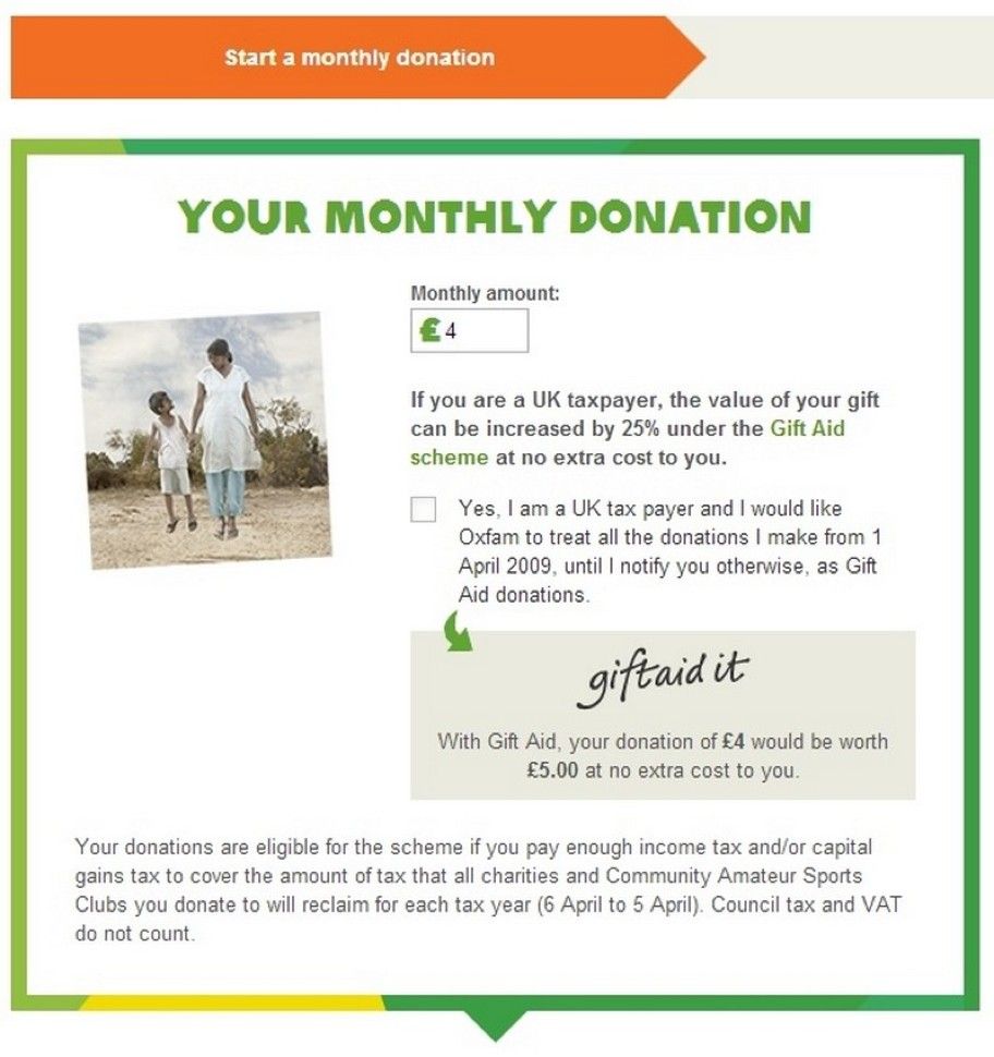
The Oxfam website, shown here in this historical screenshot, didn’t offer the option to give a one-off donation, but forced the user to commit to a monthly bank transfer. A social conscience and the use of free will in helping others are commendable things; however, when they are caged into a long-term commitment, it can be quite off-putting and understandably so.
© Oxfam International, Fair Use
Other companies have also used the monthly charge option as the only way for users to obtain products or services that previously were available with a single purchase. Examples that you may be familiar with from your work as a designer could include the Adobe Creative Cloud and the Microsoft Online Services. These companies used to sell software packages to clients, who purchased these goods that they would then own and be able to access from their own local devices whenever they needed. The trend then witnessed a shift towards subscriptions. This shifts the relationship from that of ‘seller/buyer’ as such to one of, essentially, ‘leaser/renter’—the notion of the transferal of ownership via one transaction has succumbed to the granting of the right to use, for a monthly charge. Another example is the Yoga Today website (at least, as it was in 2017), which we wholeheartedly recommend to any designer who is sitting at his or her desk for hours on end. It used to enable single purchases of yoga videos to download, and then began forcing a monthly subscription to gain access to streaming videos. Other examples of this dark pattern can be found online when signing up for memberships to online gaming communities and cashback groups.
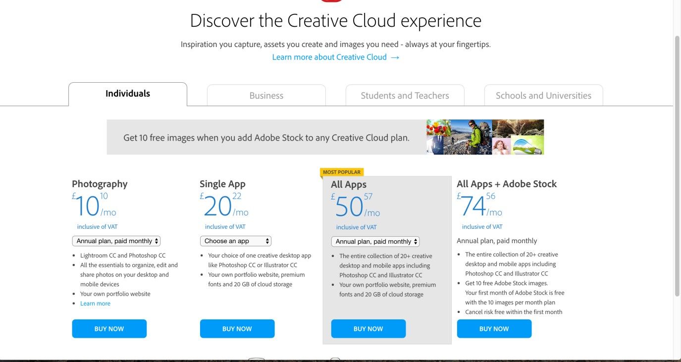
Adobe is one of many software companies that have changed from selling users a product, to selling them a subscription. Hence, users pay on a monthly basis and don’t get to ‘own’ what they pay for. We seem to live in the epoch of the Permanent Renter.
© Adobe, Fair Use
Why is this classed as a dark pattern?
Users have no choice but to accept they will be tied into making monthly donations. The removal of choice forces a user's hand, and he or she must put the effort into cancelling those monthly payments. This method is employed by a number of websites, in the hope users will either forget or not bother ending their direct debit. Put like that, it shows this practice for what it is—not ‘serving’ customers, at least not in the traditional sense of selling them something, but more like retaining them in the name of convenience.
As a responsible designer, you may ask yourself if there is any way that you can implement this design pattern with care, to give clients what they want without negatively impacting the lives of your users. The only way to implement the dark pattern that your client wants so badly—but without forcing your users to cough up the money over and over again—is to make the option to unsubscribe as transparent and easy as possible. If you make it as simple as a single click of a button, and keep it in plain sight, users might realize they can take charge of their own expenses again. If a client questions you on this, you could truthfully defend that showing this option will help let patrons view the organization in a favorable light as an ethical entity.
The Take Away
As companies have been moving from downloadable single purchases to online subscriptions, the monthly charge design pattern continues to become more and more popular. It is a dark pattern, because it coerces users to subscribe. Without a subscription, the service of a product is unavailable. As it’s comparable to a gym subscription, users are likely to forget about cancelling it, especially when they don’t use it anymore. And this is just what these companies are hoping for, to create a continuous revenue stream—an empire partly built on cynical assumptions. In our careers, these sorts of clients will almost certainly turn up. While mutinying against them isn’t an option, designing conscientiously and creatively is, and you may just notice yourself helping both a client and the users because you put control back into the latter’s hands.
References and Where to Learn More
Jenifer Tidwell, Designing Interfaces: Patterns for Effective Interaction Design, 2010
Martijn van Welie, Pattern Library, 2008
Harry Brignull’s website dedicated to dark patterns
Hero Image: © Pixabay, CC0.