A sitemap footer is a design pattern used to provide users with links that are important to all users regardless of their current position within the site hierarchy. In this respect, they act similar to the global navigation section of a webpage. Especially in larger websites, sitemap footers tend to relieve the pressure on global navigation bars.
Sitemap Footers
Your constantly-updated definition of Sitemap Footers and collection of videos and articles.
Be a conversation starter: Share this page and inspire others!
Get 1 Powerful Email Each Week
Join 313,870 subscribers.
What are Sitemap Footers?
Learn More About Sitemap Footers
Make learning as easy as watching Netflix: Learn more about Sitemap Footers by taking the online IxDF Course UI Design Patterns for Successful Software.
Why? Because design skills make you valuable. In any job. Any industry.
Earn Industry-Recognized Certificates
Industry giants trust our courses to train their teams, and prestigious universities integrate our content into their curricula. Add your certificates to your LinkedIn profile, résumé, and job applications.



All Free IxDF Articles on Sitemap Footers


How to Implement Sitemap Footers to Keep Users Going
In your attempts to minimize the effort your users need for performing actions on the website you’re designing, you just might be overlooking one major opportunity: sitemap footers. You might think about footers as a page section where you can dump any links or contact information you couldn’t fit a
- Social shares
- 730
- Published
Read Article
How to Implement Sitemap Footers to Keep Users Going

In your attempts to minimize the effort your users need for performing actions on the website you’re designing, you just might be overlooking one major opportunity: sitemap footers. You might think about footers as a page section where you can dump any links or contact information you couldn’t fit anywhere else. Allow us to convince you of a more relevant way to use the bottom of the page. Let us show you how repeating some of the navigational options from the top of the page here will decrease user effort and increase task efficiency. It’s a small gesture, but your users will love you for it.
The Design Problem
When users reach the end of a webpage, they will probably want to navigate to another section that interests them, or return to a section they were reading before they dived into a specific task. If there is no means of navigation in the footer, they will have to return to the top of the page to use the navigation options available there. This will add to the effort needed from the user, especially if he or she has to negotiate thumbing back to the top on a smartphone with a dwindling battery.
The Design Solution
Include a sitemap in the footer of every webpage, so when your users reach the end of the contents, there is a highly visible and instantly accessible navigation tool waiting to help them move freely around the website, or at the very least to jump to another level within the site hierarchy.
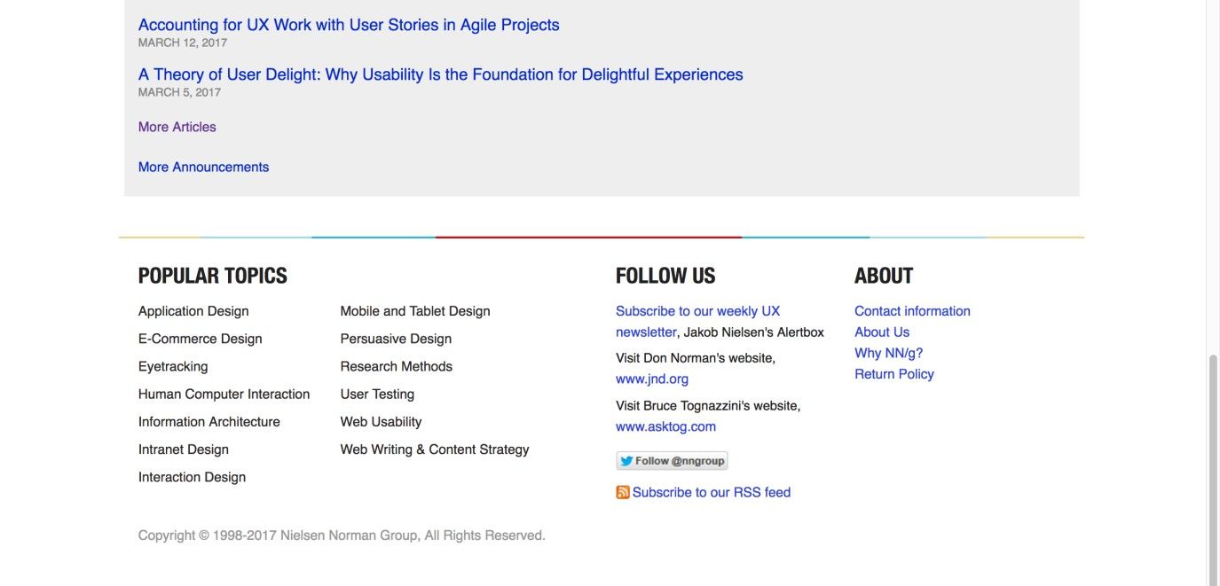
Author/Copyright holder: Nielsen Norman Group. Copyright terms and license: Fair Use.
At the bottom of its page, the Nielsen Norman Group gives users a selection of interesting links that will help them continue their journey of learning about usability and user experience-related issues. Also, some general (contact) information is placed here so that it is accessible from all locations within the website, without having the same priority as the labels in the global navigation area.
Why Choose a Sitemap Footer Design Pattern?
Sitemap footers are what we designers use to provide users with links to sections of the website, or outside websites/webpages, that are important to all users regardless of their current position within the site hierarchy. In this respect, they act in a similar way to the global navigation section of a webpage. The larger the website, the more navigation points the user will require; forcing everything into one user interface design pattern will likely overload the screen and the user, so sitemap footers tend to relieve the pressure on top-level or global navigation bars. In considering a user rolling to the bottom of a page in hopes of figuring out where to go next, we’d do well to bear a nicely apt nugget of advice in mind.
“I may not have gone where I intended to go, but I think I have ended up where I needed to be.”
—Douglas Adams, British sci-fi author and humorist (from ‘The Long Dark Tea-Time of the Soul’)
Sitemap footers are especially useful as a method of showing users different points in the site hierarchy that they might not ordinarily consider, such as the 'Find a Store' function or the 'Gift Cards' in the Nike sitemap footer shown below. Improving the visibility of certain navigation points not only encourages users to consider other pages on your site, but sitemaps also help encourage exploration. By being provided with direct links to other pages, the user is only ever a click away from jumping to a completely new category of contents and new things to discover about your company, business, group, products, or any other element you wish to promote.

Author/Copyright holder: Nike. Copyright terms and license: Fair Use.
The sitemap footer of the Nike online store relieves the pressure from the global navigation bar, namely by giving access to essential customer information such as order status and delivery and return policies. Even lower in the hierarchy are elements such as ‘Terms of Use’ and ‘Cookie Settings’. This information is essential to have available to customers, but you wouldn’t want to attract attention to it.
Sitemap footers also serve an important structural purpose—when you show users various levels within the hierarchy, they can determine how the website is laid out. Such information can also be used to identify where target information is located, so they can instantly switch to another category or page to investigate further. This is especially beneficial to users when they are moving around complex, multi-level websites, as the location of certain categories might not be explicit anywhere else.
Therefore, sitemap footers perform a number of important functions, namely increasing the connection between categories and pages on a multi-level site, encouraging users to consider less visible contents, and representing the overall structure of the site.
Best Practice: How to Implement Sitemap Footers
Start by deciding which features you wish to offer users. Sitemap footers can include a wide range of different features, as you can see from the Nike example above. They can be used to display the major categories of a site, such as the BBC footer below, more specific categories that are not present in other navigation patterns, contact information, help and support, and 'About Us' information. Your job as the designer is to decide which features you feel improve the freedom of movement through your site and to consolidate these different features into one area at the bottom of every page – without sacrificing the space available for the contents of each of those pages. But be aware: you should be as ruthless as possible when selecting these design features, as the sitemap footer should not be too large and the user should be able to identify interesting or important links with immediacy.
Create a page-wide footer, and ensure it is present on each page of the website. Ensure the footer does not consume too much space on each page.
Organize all of the feature links, such as 'Contact Us' and 'Our Partners', into clearly labelled categories.
Arrange the links so there is no confusion which category they belong to. Use, for example, whitespace or lines to indicate groups of labels that belong together. The widely known Gestalt Principles will help you do this properly.
Place any necessary copyright and website information, such as the 'year established', at the very bottom of the sitemap.

Author/Copyright holder: BBC. Copyright terms and license: Fair Use.
The BBC website footer shows (among other things) all the major categories of the site, so users can determine a new section they want to visit, without having to scroll all the way back up. Note the convention of placing copyright information, the year, and a disclaimer at the bottom, a subtle but very effective way of assuring users they are dealing with an official, trustworthy organization that respects laws, values privacy, and encourages fair use.
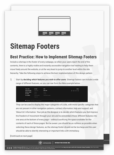
To help you get started implementing sitemap footers, you can download and print our “Sitemap Footer” template:
Advance Your Career With This Free Template
for “Sitemap Footers”
Potential Problems with Sitemap Footers
There is often a tendency to throw more and more things at users in footers, whether they are links to other partner sites or all of the same navigation points offered in the top-level navigation bar. As a designer, you must be ruthless when adding different features and links to your sitemap footers, as the aim should be to offer the user an alternative means of navigating freely through the site and to investigate other options that might not be apparent from the rest of the site. The sitemap footer should not consist of all the residual links, features, options, and information you could not find room for in the rest of the webpage—in the same way the dregs slip to the bottom of a bottle of wine. Instead, you should treat the sitemap footer as precious space for you to introduce users to helpful links and pages that improve their overall experience and the ease with which they can navigate through the site contents.
The organization of categories and links poses another potential problem; if the items appear randomly arranged, the user will probably ignore the sitemap, opting for a more organized means of choosing navigation points instead. Therefore, establishing structure and order within the sitemap is vital, as it will help users identify interesting and useful links and pages without having to wade through a heap of link labels.
The Take Away
A sitemap footer has the ability to minimize the efforts users need to take in navigating through a website. When you design clear and distinct links and place them in the footer at the bottom of the page, you allow users to explore other sections or navigate directly to relevant information, without having to return to the top of the page and navigate through the entire hierarchy. When implemented successfully, footers can take some of the pressure off the global navigation bar at the top of the page, resulting in a less cluttered and more appealing interface. Better still, if you use them consistently, they will serve as reassuring beacons for where to go next, thus lubricating the user’s journey to make it more seamless while helping optimize the whole experience.
References & Where to Learn More
Hero Image: Author/Copyright holder: Andrew Nolan. Copyright terms and license: CC0.
Jenifer Tidwell, Designing Interfaces: Patterns for Effective Interaction Design, 2010
Martijn van Welie, Pattern Library, 2008