Not all fonts are created equal and while we're going to refrain from mocking the oft-derided Comic Sans, there are winners and losers when it comes to working with online typography. Designers need to know some basic best practices for implementing fonts to ensure their designs have the right visual impact on their users and do not leave them clawing at their eyes and howling for the back button instead.
Web Fonts
Your constantly-updated definition of Web Fonts and collection of videos and articles.
Be a conversation starter: Share this page and inspire others!
197 Shares
What are Web Fonts?
Learn More About Web Fonts
Make learning as easy as watching Netflix: Learn more about Web Fonts by taking the online IxDF Course AI for Designers.
Why? Because design skills make you valuable. In any job. Any industry.
Get an Industry-Recognized IxDF Course Certificate
Increase your credibility, salary potential and job opportunities by showing credible evidence of your skills.
IxDF Course Certificates set the industry gold standard. Add them to your LinkedIn profile, resumé, and job applications.

Be in distinguished company, alongside industry leaders who train their teams with the IxDF and trust IxDF Course Certificates.

All Free IxDF Articles on Web Fonts

Web Fonts are Critical to the Online User Experience - Don’t Hurt Your Reader’s Eyes
Bill Gates said; “Content is King” and when it comes to the online user experience it is the 100% truth. Delivering a great user experience doesn’t just mean delivering great content – it also means providing that content in a usable and useful format that encourages reading and interaction rather t
- Social shares
- 897
- Published
Read Article

Web Fonts: Definition and 10 Recommendations
Web fonts bring digital content to life. They enhance readability, set the tone, and ensure consistency across various platforms—all vital ingredients. When you understand web fonts and their impact, it can help you with effective website creation—and greatly so. We’ll provide a comprehensive overvi
- Social shares
- 778
- Published
Read Article
Web Fonts are Critical to the Online User Experience - Don’t Hurt Your Reader’s Eyes
Bill Gates said; “Content is King” and when it comes to the online user experience it is the 100% truth. Delivering a great user experience doesn’t just mean delivering great content – it also means providing that content in a usable and useful format that encourages reading and interaction rather than clicking out of the site because it’s unreadable.
Therefore typography on the web becomes a vitally important part of the designer’s work. More than any other part of the design – choosing the right fonts and displaying those fonts in the right way will either make or break the user experience.
“Typography is the use of type to advocate, communicate, celebrate, edu- cate, elaborate, illuminate, and disseminate. Along the way, the words and pages become art.” James Felici the author of The Complete Manual of Typography.
Author/Copyright holder: Kevin Kirsche. Copyright terms and licence: CC BY-NC-SA 2.0
Typography has a long and interesting history. It’s been important since the production of print media and isn’t something new for the Internet.
Guidelines for Use of Typography on the Internet
There are many guidelines that can be used to inform your choice of typography online. It’s also worth noting that any (and indeed all) of these guidelines can be broken if you are looking to create an effect or if your users prefer you to. There is no “one size fits all” model of typography and user research in this area of UX is as important as it is in other areas of UX.
So let’s take a look at how to get the most from typography online:
Headings
Headings are a vital part of the content experience – they need to be written to grab the user’s attention or they’ll move quickly on to do something else. However, they also need to be displayed right and that means getting the size of the font right and the font itself.
The typical headline heading online now occupies 38 px! That’s a major increase over the last decade or so. It also signifies the increased understanding that if you don’t catch the user’s attention – they’re going elsewhere. Other headings tend to be between 20 and 32px.
As for the fonts themselves; there’s an even split between serif and sans-serif fonts being used online and the most popular serif fonts are Georgia and Chapparal Pro with Arial and Freight Sans Pro being the most popular sans-serif fonts. Don’t be afraid to experiment with fonts but do make sure you get user feedback on their legibility.
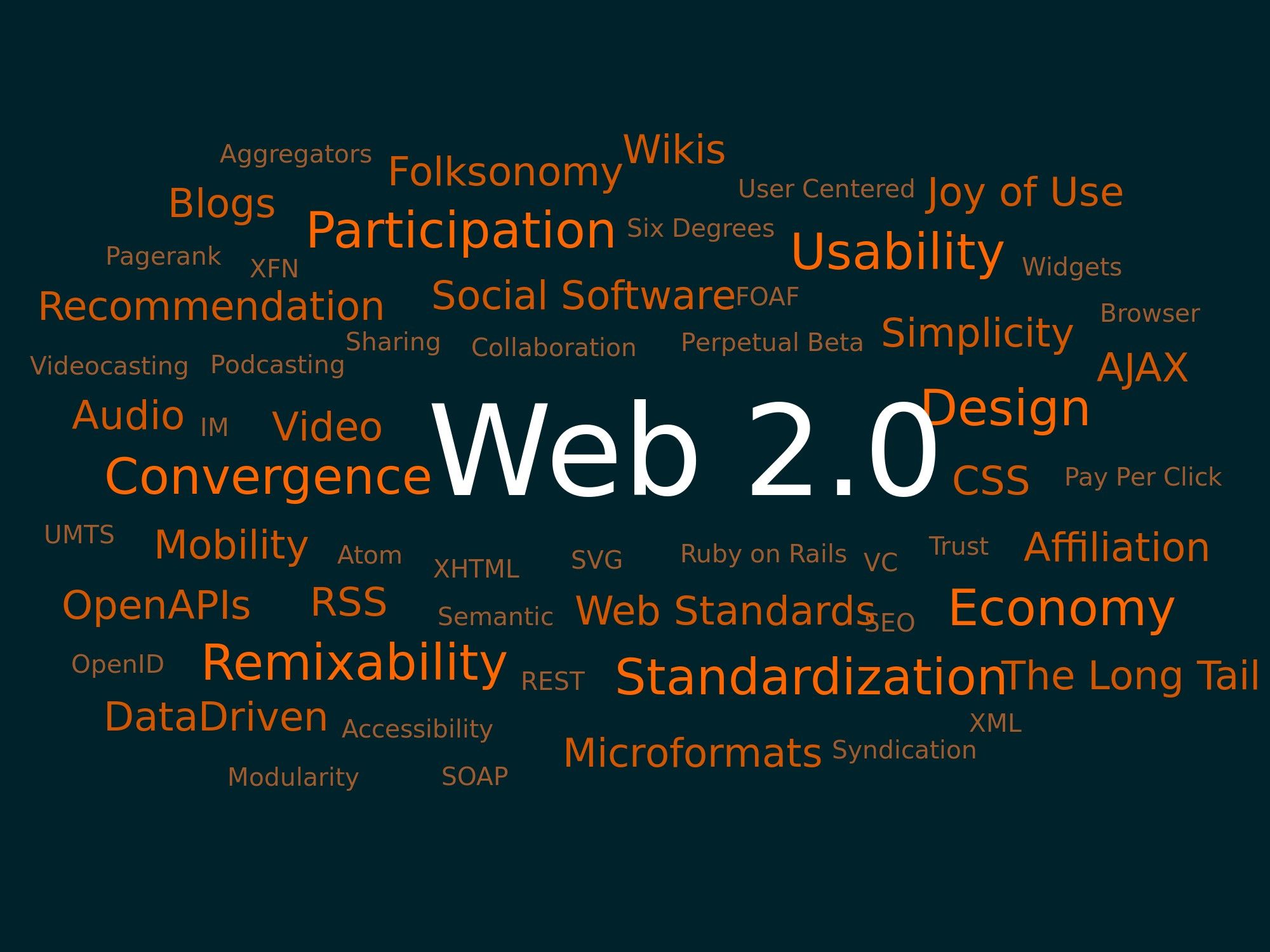
Author/Copyright holder: Markus Angermeier. Copyright terms and licence: CC BY-SA 2.5
You don’t have to be a fan of word clouds to see that the heading in this cloud does the job of catching the eye. Headings need to grab the reader’s attention to make them effective.
Body Text
Body copy is every bit as important as the headings. Headings may pull the readers in but it’s the body text that gets them to hang around. Once again the display of content is vital to this.
The most popular font sizes for body copy are 14-16 px which again has grown over the last decade when smaller fonts were once more popular. The understanding is that copy must be easy to read now.
It’s also worth noting that, commonly, there is a ratio between the font size of the header and the body text that’s employed online and that is headers tend to be 2.5 times larger than the body text.
There is also a set of rules which apply to line spacing and line length for web copy (at least for ordinary websites – mobile sites are handled differently as we’ll see soon). This states that the line height should be 1.46 times larger than the font height and that the optimal line length is 24.9 times the optimal line height. The line length can also be expressed in characters – 85 characters being roughly optimal. This rule of thumb should still enable margins, padding, etc. that make the body copy appealing visually.
As for fonts themselves; the majority of websites (nearly 2/3 of all websites) use serif fonts for body copy with the remainder using sans-serif fonts. The most popular fonts for serif are the same as for headers but with sans-serif it is Arial and Helvetica which win the day.
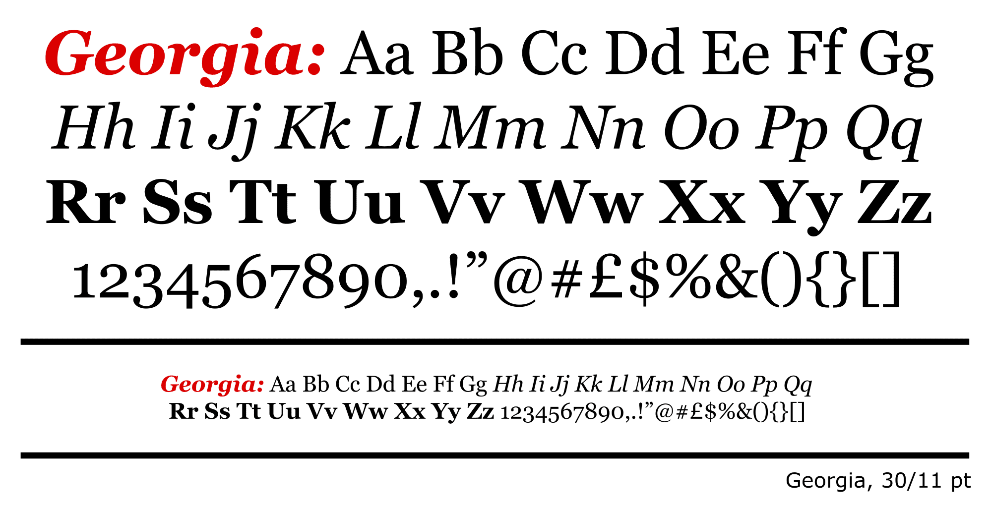
Author/Copyright holder: Fvasconcellos. Copyright terms and licence: Public Domain.
Georgia is one of the most popular fonts online when used “out of the box” but bespoke typography is also incredibly popular and gives designers freedom to create precise experiences.
Custom Fonts
It is worth noting that despite the advice above – the majority of websites don’t use standard fonts at all. They employ bespoke fonts designed for their brands. That means as long as you do a bit of user research – there are plenty of ways to make your copy stand out from your competitor’s.
Going Mobile
The mobile web does not follow the same rules as the standard web and designers will need to examine the way that responsive fonts can be employed to ensure consistent experiences between different platforms.
Font Colors
To make life confusing there are some contradictory bits of advice on the use of font colors for the most readable text. The W3C web standards recommend that you use fonts that contrast with the background at a ratio of 3:1 at a minimum. However, other sources claim that this much contrast can be off putting and may even impact on the ability of dyslexic readers to parse the text. This means that it’s imperative that you test the colors (with real users) of your fonts before setting them in stone.
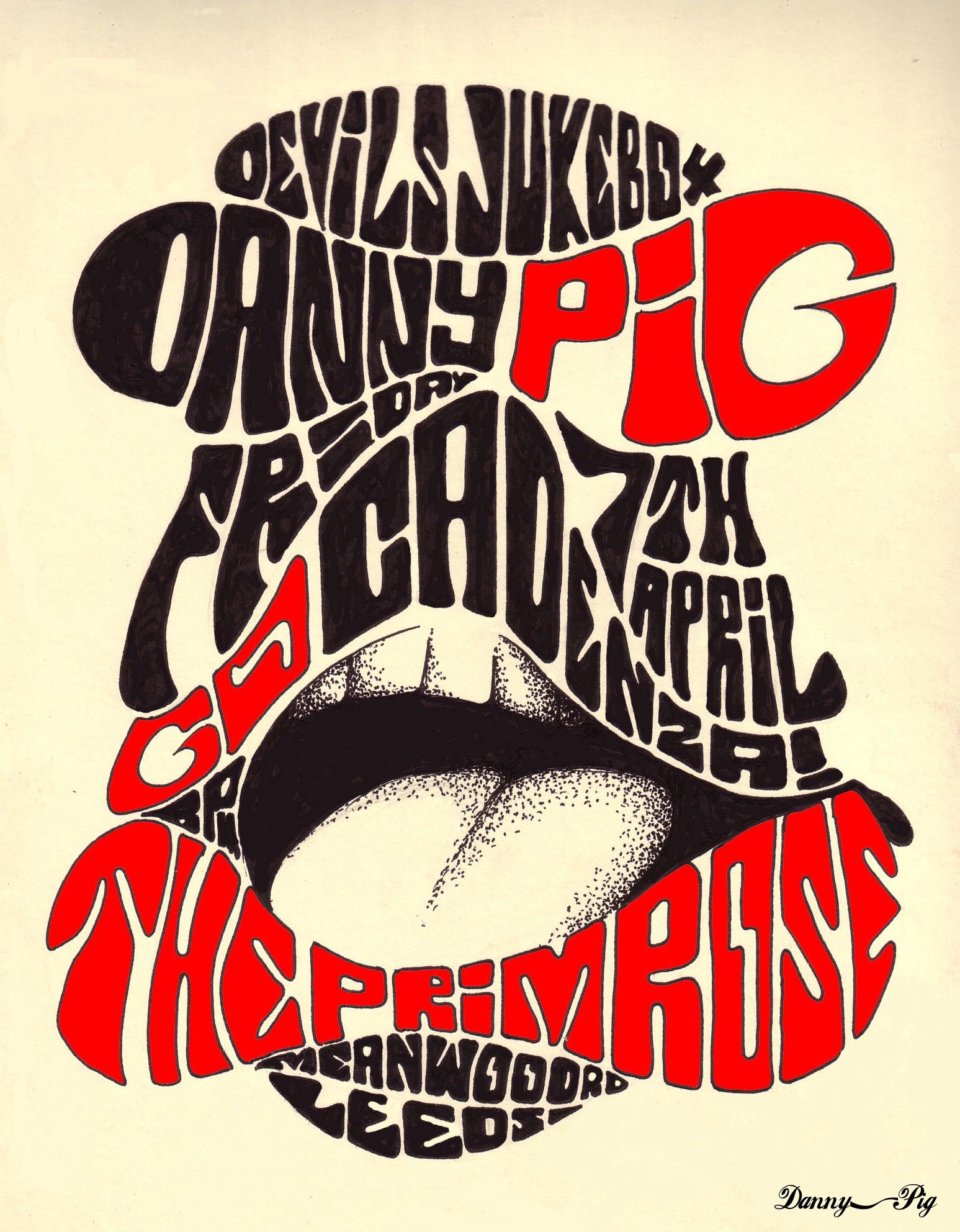
Author/Copyright holder: Danny PiG. Copyright terms and licence: CC BY-SA 2.0
Colors should create contrast but exactly how much contrast is up for debate. There are contradictory guidelines for this and you’ll want to test them with your users to know for sure.
The Take Away
Content really is King online. No matter how lovely your designs or how wonderful your navigation – without content, users are going elsewhere. To maximize the user experience of that content; you will need to display it in such a way that it entices the reader to engage with the content and make the act of reading the content pleasurable. The rules above provide a firm foundation to deliver content that is pleasing to the eye but as always; they are not a substitute for research and testing with your users.
References & Where to Learn More
Course: “Web Design for Usability”.
You can find some interesting and inspiring typography projects on Behance here.
The W3C standards on typography can be found here.
The usability geek gives their take on best typography practices for usability here.
Hero Image: Author/Copyright holder: Kostya Sasquatch. Copyright terms and licence: CC BY-NC 2.0
Feel Stuck?
Want Better Job Options?
AI is replacing jobs everywhere, yet design jobs are booming with a projected 45% job growth. With design skills, you can create products and services people love. More love means more impact and greater salary potential.
At IxDF, we help you from your first course to your next job, all in one place.