Color is a visual perception the eye experiences when different wavelengths of light interact with it, specifically the retina’s cone cells, sensitive to light ranges. UX (user experience) designers use color strategically to shape how users perceive, navigate, and interact with digital products and enhance usability and engagement.
Enjoy some surprising insights as you grasp a firm hold of the power of color and what it can do for your designs, in this video with Arielle Eckstut: Author, Agent-at-large at the Levine Greenberg Rostan Literary Agency, and Co-Founder of The Book Doctors and LittleMissMatched.
How Color Fits into UX Design
With the “rise of the screen” in the Information Age or Digital Age, color in UX design translates to a different level from its place in printed materials such as advertising media. It functions as a sophisticated design language that communicates information, guides behavior, and creates meaningful user experiences through UIs (user interfaces). While traditional art theory views color primarily through artistic expression, UX design treats color as a functional element. With it—or, rather, through it—designers serve user needs, support accessibility requirements, and achieve specific interaction goals.
At its core, color UX design is about the strategic application of color theory. UX and UI designers in particular must understand the theory of color—including the color wheel—to be able to design effectively. They must also appreciate and accommodate the limitations of the human eye, including how they accommodate users with disabilities. Designers learn how to leverage color theory in UX design to apply hues, saturation, brightness, and contrast to create interfaces that are visually appealing, intuitive, and accessible. This approach recognizes the fact that color perception varies significantly among users; factors including cultural background, visual abilities, and personal preferences influence UX design colors significantly.
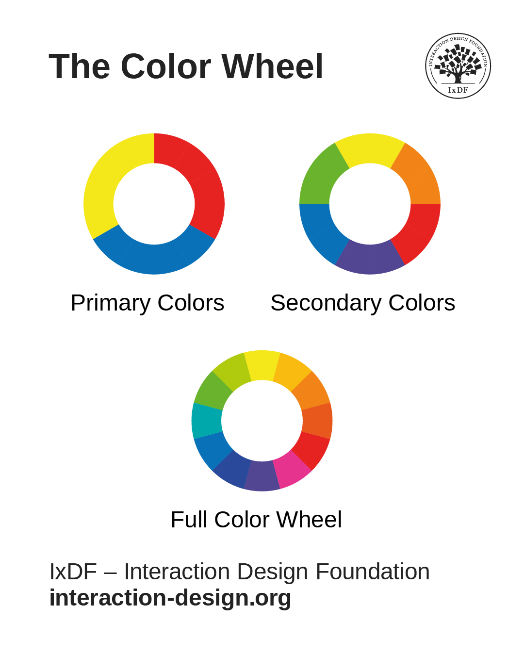
The primary colors are blue, red, and yellow; the secondary colors include orange, green, and purple; and the full color wheel, with 12 colors, includes finer “variations” such as red-orange and yellow-orange.
© Interaction Design Foundation, CC BY-SA 4.0
Color Psychology in UX Design: The Science of Light
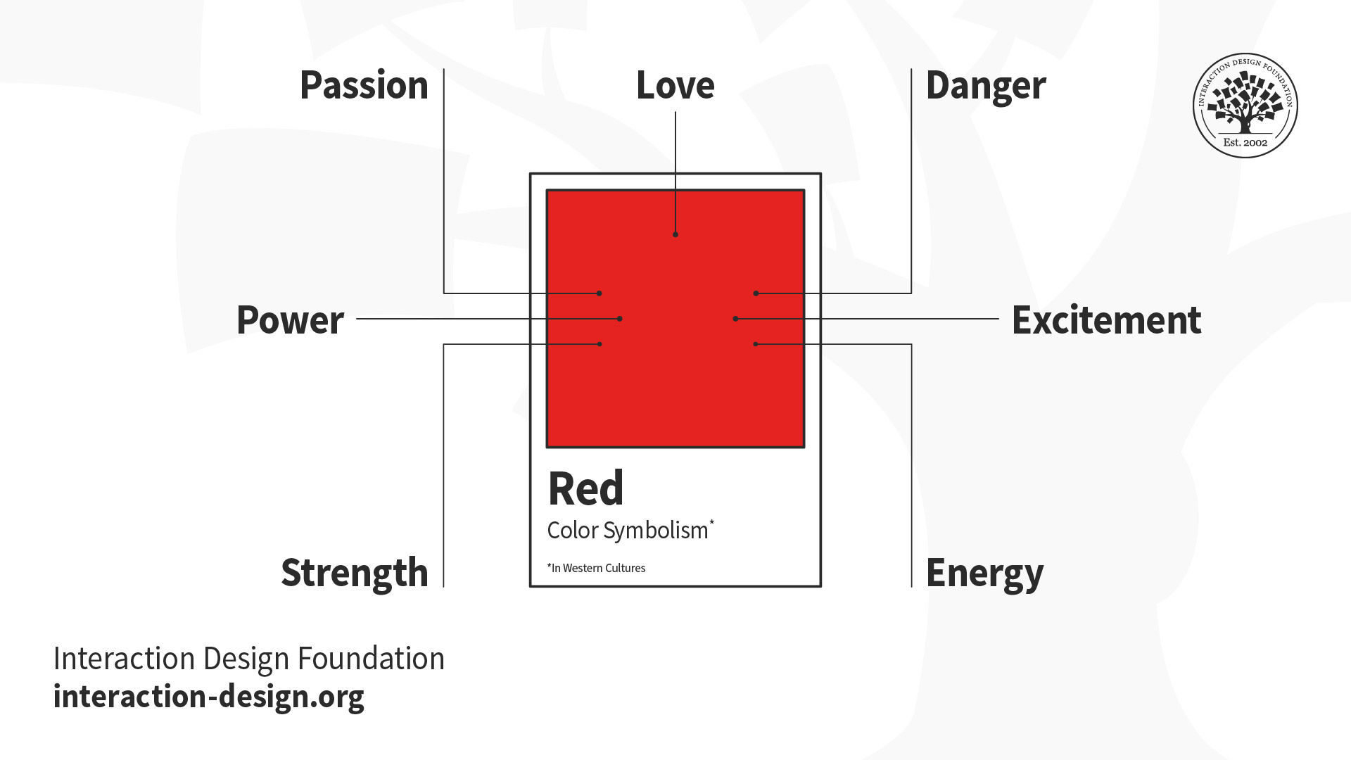
More specifically, color psychology in UI/UX design captures how crucial a role colors play in UX and UI design decisions. Research suggests that colors trigger specific emotional and physiological responses that can influence user behavior. For example, in the West, red typically signals urgency or error states, blue conveys trust and reliability, green indicates success or positive actions, and yellow draws attention or suggests caution. However, experienced UX designers understand that color psychology provides general guidelines rather than universal rules about UI/UX design colors, as cultural contexts and personal associations can override traditional color meanings.
Modern UX design for color also incorporates a scientific understanding of human visual perception. The human eye processes colors through complex interactions between light wavelengths and specialized photoreceptors. It’s a biological foundation that explains why certain color combinations create visual tension while others feel harmonious—and why some users experience difficulty distinguishing between specific color pairs.
Explore how to use the psychology of color as a powerful driver in your design decisions, in this video with Arielle Eckstut and Joann Eckstut: Color Consultant, Founder of The Roomworks, and 1 of the 12 designers chosen by the Color Association of the USA to create the yearly forecast used by industries to keep up with color trends.
How Designers Use Colors to Their Designs’ and Users’ Benefit
Color serves multiple critical functions in user experience design, a fact that makes it an indispensable tool for creating effective digital products that stand out for the right reasons. Designers who understand these functions can leverage color strategically rather than decoratively, especially in the following areas.
Information Architecture and Navigation
Color helps establish visual hierarchies that guide users through complex information structures. Users find information faster on websites that effectively use color contrasts. Primary navigation elements often use distinct colors to differentiate them from secondary content, while breadcrumb trails and section dividers employ subtle color variations to maintain orientation without making the interface overwhelming for users.
Effective color UX design helps users understand their current location within a system and identify available pathways forward. E-commerce sites frequently use color coding to distinguish product categories. Meanwhile, software applications employ color-coded tabs and buttons to organize complex feature sets into manageable visual groups—in both cases offering users great convenience, at a glance.
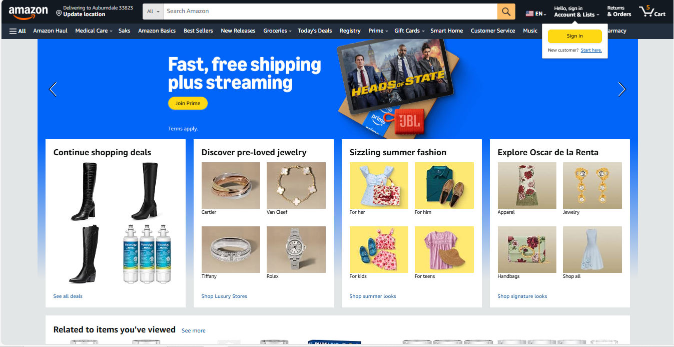
Amazon’s colors offer helpful guidance with, for example, its golden Call-to-action buttons such as “Sign In” and “Join Prime.”
© Amazon, Fair use
Feedback and System Status
Color provides immediate feedback about system states and user actions. For example, form validation relies heavily on color coding:
Red borders indicate errors.
Green checkmarks confirm successful entries.
Yellow highlights draw attention to warnings.
Imagine users filling out a form—especially a longer, governmental-type one—where they couldn’t proceed to the next screen because of some (mysterious) error. How long would it take them to find where they might have made a mistake or omitted a field without color to guide them? Loading states, progress indicators, and completion confirmations all depend on color to communicate status in tandem with other means such as well-considered micro-copy.
Interactive elements use color changes to provide real-time feedback—green for success and red for failure. Hover states, active selections, and disabled buttons all communicate their current status through color variations, such as a greyed-out field when users don’t need to fill it out. This visual feedback creates responsive interfaces that feel alive and reactive to user input.
Brand Recognition and Emotional Connection
Color establishes brand identity and creates emotional associations that influence user trust and engagement. Consistent color application across touchpoints builds recognition and reinforces brand values in users’ minds. For example, Netflix’s distinctive red creates excitement and entertainment associations, while LinkedIn’s professional blue conveys career-focused networking. UX and UI designers need to know there’s a “time and place” for certain colors—as in, which colors suit which industries as a general guideline. To help users while staying true to their brands, they must follow brand guidelines to balance these considerations while maintaining consistency with brand identity and design system requirements.
.png)
Netflix’s signature red buttons and logo underline the excitement of a brand delivering entertainment to countless viewers around the world.
© Netflix, Fair use
For color psychology, UX designers understand its value for guiding user interactions and showcasing their brands at their best, but how important is color to users? Color can, in many contexts, play a major role in how users quickly judge credibility, quality, and relevance. Designers therefore need to ensure color choices align with intended brand perceptions and user expectations every time and everywhere users encounter their brand.
Accessibility and Inclusion
It’s impossible to overstate how color has significant impacts on accessibility—the practice of accommodating users with disabilities. Designers must make digital products usable for people with diverse visual abilities, and it’s a common issue for designers to accommodate properly. Approximately 8% of men and 0.5% of women experience some form of color vision deficiency, while other users may have reduced contrast sensitivity or complete lack of vision. When designers create digital products with color accessibility in mind (and check for visual accessibility issues with, for example, a contrast checker) they can ensure broader usability and often improve the experience for all users.
Discover how to accommodate users with visual disabilities—and all users in the process—in our video about color blindness.
Cognitive Load Reduction
Strategic color use reduces cognitive load since designers apply visual patterns that users can quickly recognize and process. Color-coded categories, status indicators, and functional elements allow users to scan interfaces efficiently without reading every text label. This efficiency becomes particularly important when designers need to create data-heavy applications and mobile interfaces where screen space is limited—the colors quickly “tell” the user what’s going on and what they need to do.
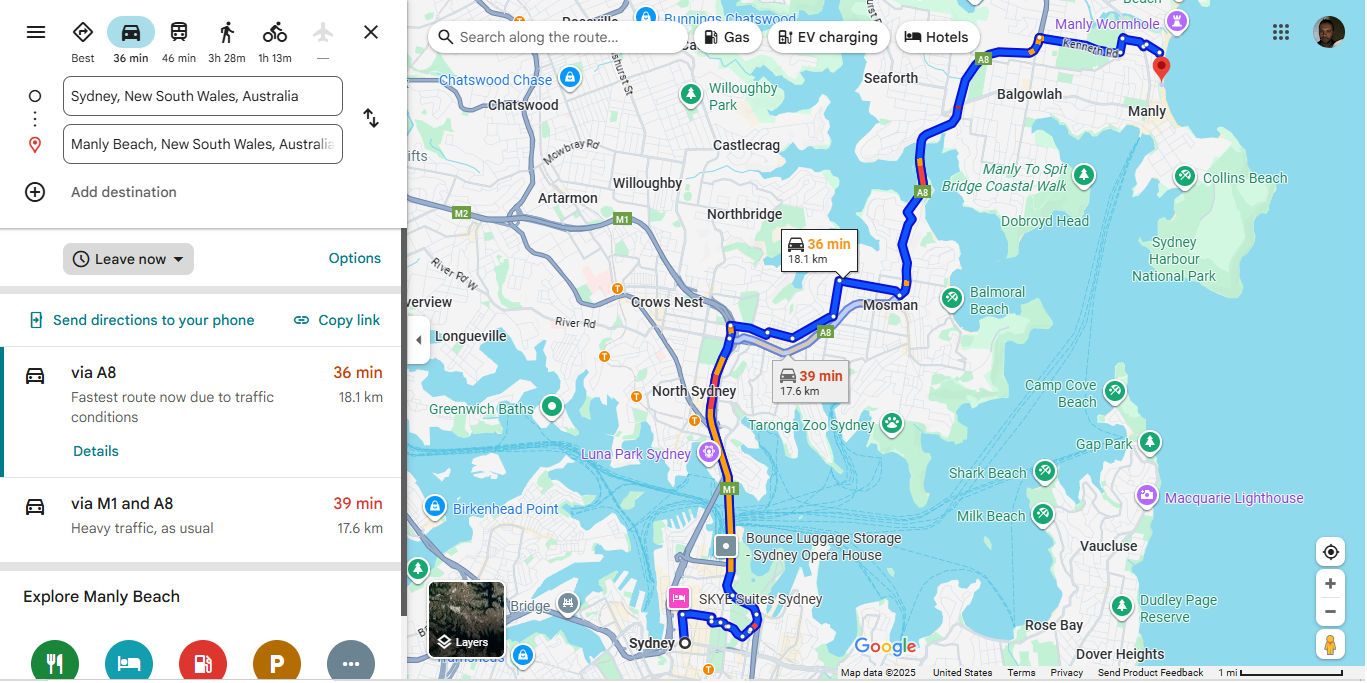
Google Maps considers cognitive load with appropriate colors that show where roads are more and less congested and many other handy features.
© Google, Fair use
How to Design with Color in Mind
To practice effective color UX design particularly well, take a systematic approach that balances aesthetic goals—including your brand guidelines—with functional requirements. The following strategies can help you create and apply color schemes that serve user needs while supporting business objectives.
1. Start with User Research and Context
Before selecting colors or applying brand ones, understand your target users’ needs, preferences, and constraints. Conduct user research thoroughly so you can uncover cultural color associations, accessibility requirements, and environmental factors that influence color perception. For example, B2B software users may prefer subdued, professional color palettes, while gaming applications might benefit from vibrant, high-energy schemes. Match your palette to the purpose.
Explore how to lay the best foundation for your design choices on effective user research, in this video with William Hudson: User Experience Strategist and Founder of Syntagm Ltd.
Conduct context analysis to examine how and where users will interact with the product. Remember the point about how accessible designs can help everyone? Mobile apps used outdoors require higher contrast ratios to maintain readability in bright sunlight. Meanwhile, desktop applications used in office environments can employ more subtle color distinctions.
Discover how, when you know in what contexts users encounter and use your design solution, you can tailor it to exactly what they need—and want—in this video with Alan Dix: Author of the bestselling book “Human-Computer Interaction” and Director of the Computational Foundry at Swansea University.
2. Establish a Color System or Refer to Brand Guidelines
Professional UX design relies on systematic color approaches rather than ad-hoc selections. Unless you’re in a startup that has just “begun,” chances are you will have brand guidelines regarding how to present the organization consistently, including the colors you pick from a dedicated UX color palette.
A well-designed color system includes primary colors for key actions and brand elements, secondary colors for supporting information, neutral colors for backgrounds and text, and semantic colors for status messages and feedback.
Visual consistency is the primary contributor to a polished look, as you can see in successful applications like Spotify. Color systems serve as vital foundations—they ensure consistency across different screens, states, and team members while providing flexibility for future expansion.

Spotify leverages neat consistency and color choices that inspire confidence, such as a trustworthy gradient for the “Sign up free” section, among other effective UI design elements.
© Spotify, Fair use
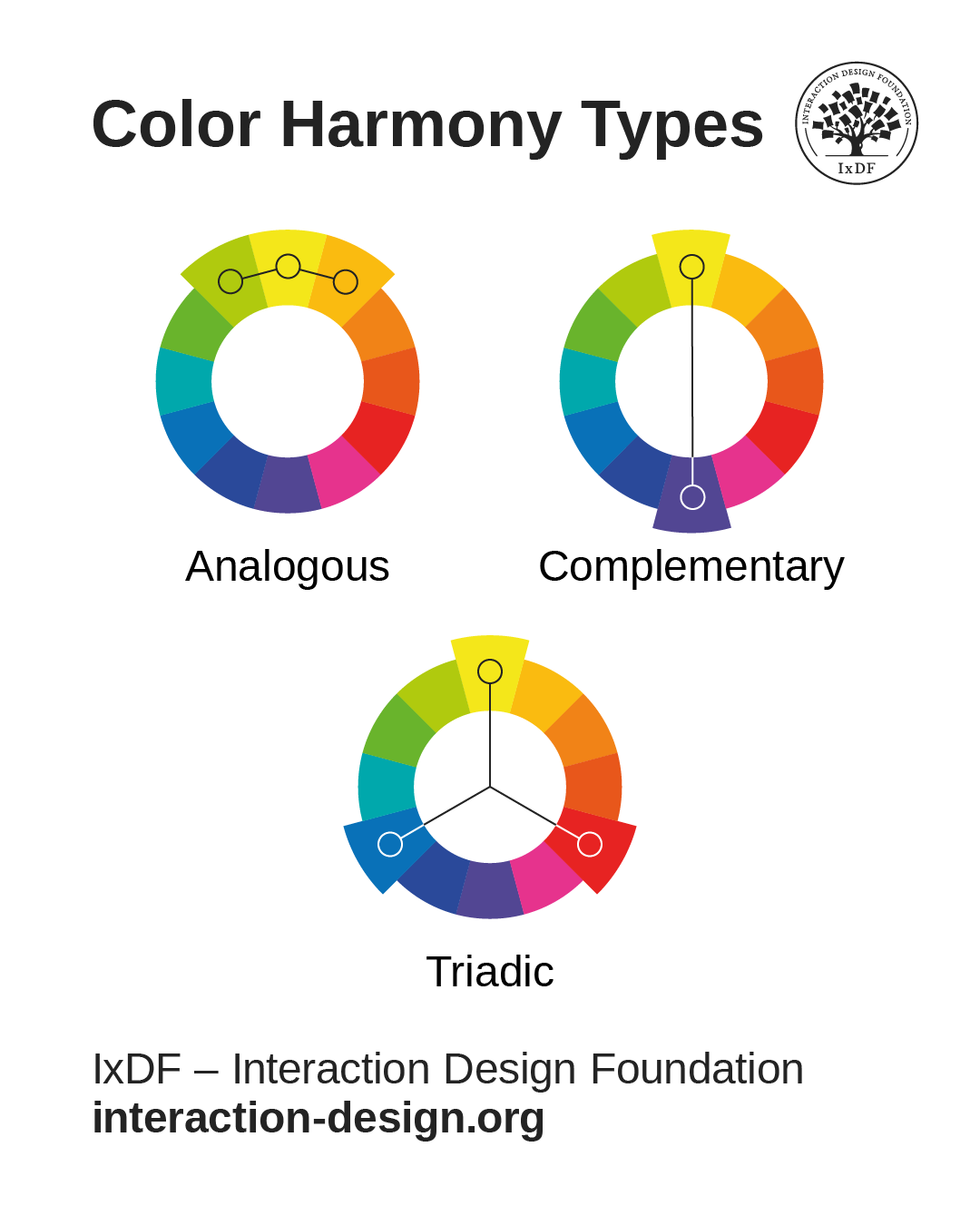
3. Apply Color Theory Principles
Color harmony creates sets of colors that work well together, and common approaches include:
Analogous colors (adjacent on the color wheel) for subtle variations.
Complementary colors (opposite on the color wheel) for high contrast.
Triadic colors for vibrant yet balanced schemes.
© Interaction Design Foundation, CC BY-SA 4.0
Designers must adapt traditional color theory to digital contexts, as screen-based colors behave differently from ones used for printed materials. Another major reason is that user interface requirements often override pure aesthetic considerations. It’s design, not art—the goal is to create functional harmony that supports user tasks rather than merely give users pleasing compositions to look at.
4. Prioritize Accessibility from the Start
Check the current accessibility conventions—such as WCAG (Web Content Accessibility Guidelines). For example, level AA requires a contrast ratio of at least 4.5:1 for normal text and 3:1 for large text, but it’s important to stay current with the guidelines and what your industry calls for. When your designs meet these standards, you ensure readability for users with visual disabilities while improving clarity for all users, such as those outside on a sunny day.
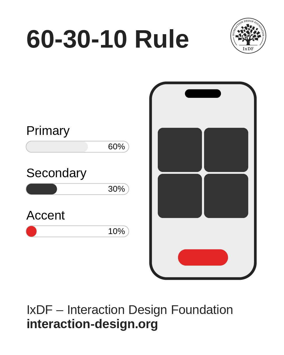
Another ratio is the 60-30-10 rule. It’s a helpful guide, where 60% of a given screen is in the primary color, 30% in the secondary, and 10% in an accent color. This ratio helps elements stand out to users’ eyes with color choices and color spaces that work well for them.
© Interaction Design Foundation, CC BY-SA 4.0
Color accessibility extends beyond contrast ratios. Don’t use color as the only visual means of conveying information, action, or the like. For essential information to remain accessible, you’ll want to convey it through additional visual cues like icons, patterns, or typography variations.
Color Tools and Resources for UX Designers
Contrast Checking Tools
Contrast checkers help designers verify that color combinations meet WCAG accessibility standards—something to integrate into the design workflow rather than use as an afterthought.
Color Palette Generators
Tools like accessible color palette generators help designers create cohesive color schemes that meet accessibility requirements from the start. These tools often provide multiple variations and automatically calculate contrast ratios, helping save designers from having to undo mistakes later.
Color Blindness Simulators
Simulators help designers understand how their color choices appear to users with different types of color vision deficiency—the most common being red-green color blindness. Regular testing with these tools prevents accessibility issues and often reveals opportunities for improved clarity that can help all users.
5. Test with Real Users and Devices
Color appearance can—and will—vary significantly across devices, lighting conditions, and individual perception. Conduct regular testing with target users to reveal issues that automated tools might miss. Usability testing should include participants with various visual abilities and different device types to ensure broad accessibility—specialist agencies can help to test designs with users with disabilities and those who may use assistive technology.
Let Arielle and Joann Eckstut help you find excellent color choices, in this video.
Best Practices for Color in UX Design
Maintain Consistency Across Touchpoints
Color consistency builds user confidence and reduces learning curves, so—if the brand guidelines don’t already state them—establish clear rules for when and how to use each color in your palette. For example, primary buttons should always use the same color family, error messages should follow consistent color coding, and navigation elements should maintain visual coherence across different sections.
Use Color to Support, Not Replace, Other Design Elements
While color is powerful, it should enhance rather than substitute for clear information architecture, intuitive navigation, and readable typography. Well-designed interfaces remain functional when users view them in grayscale—color is supposed to add an additional layer of clarity and polish.
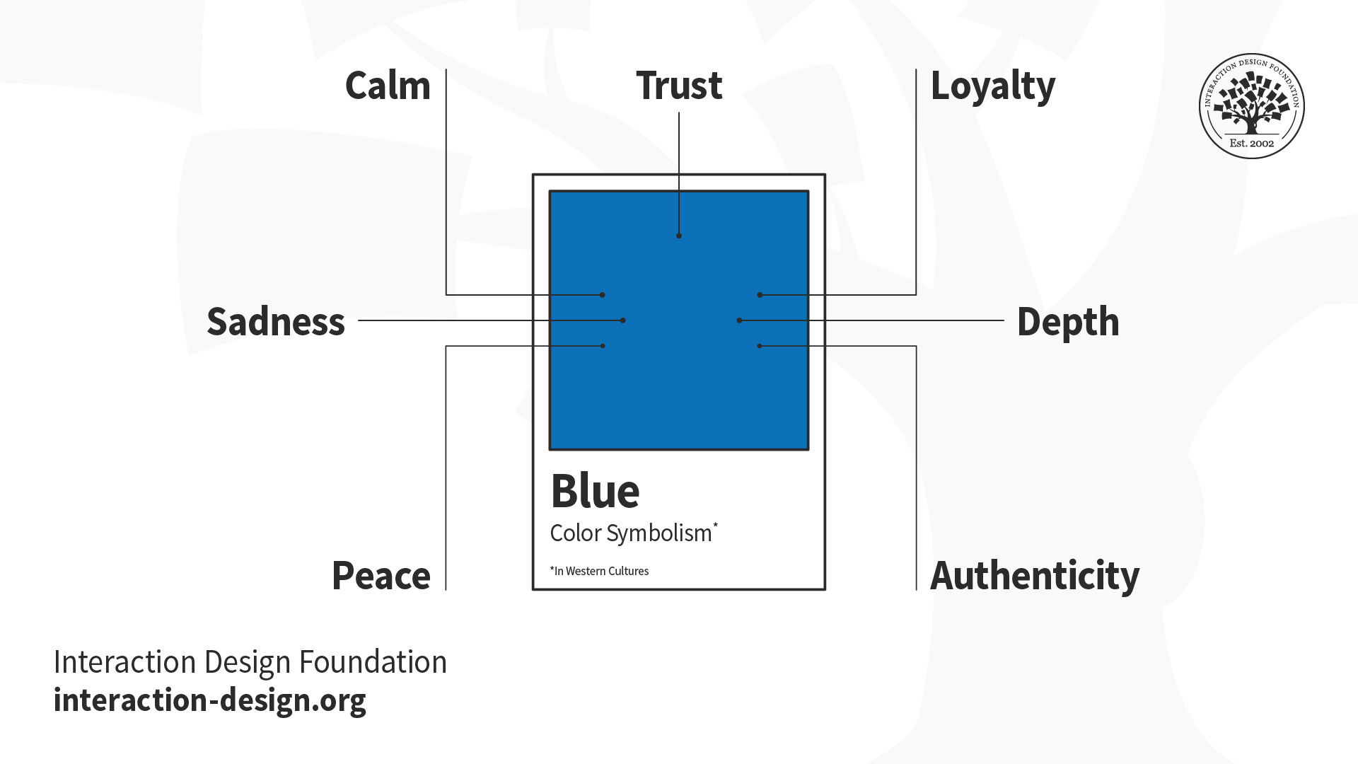
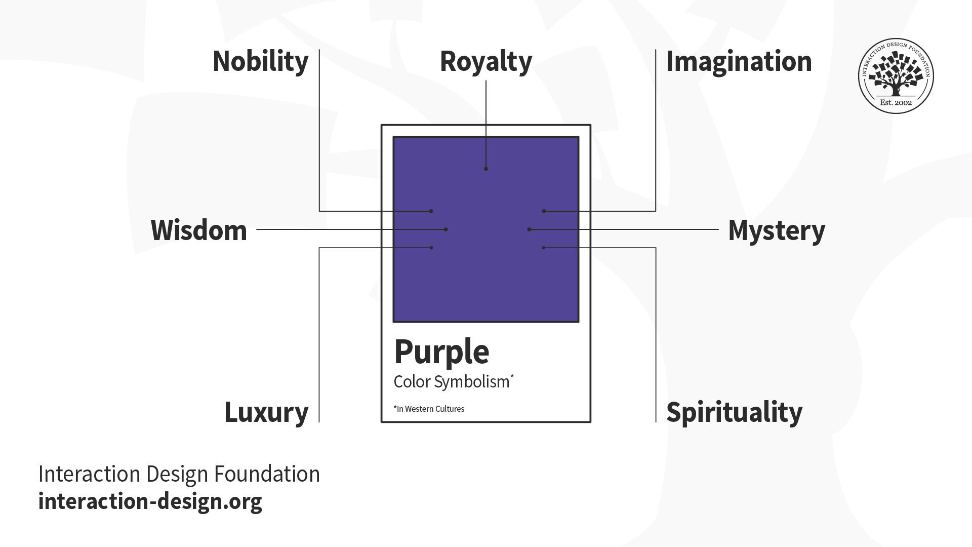
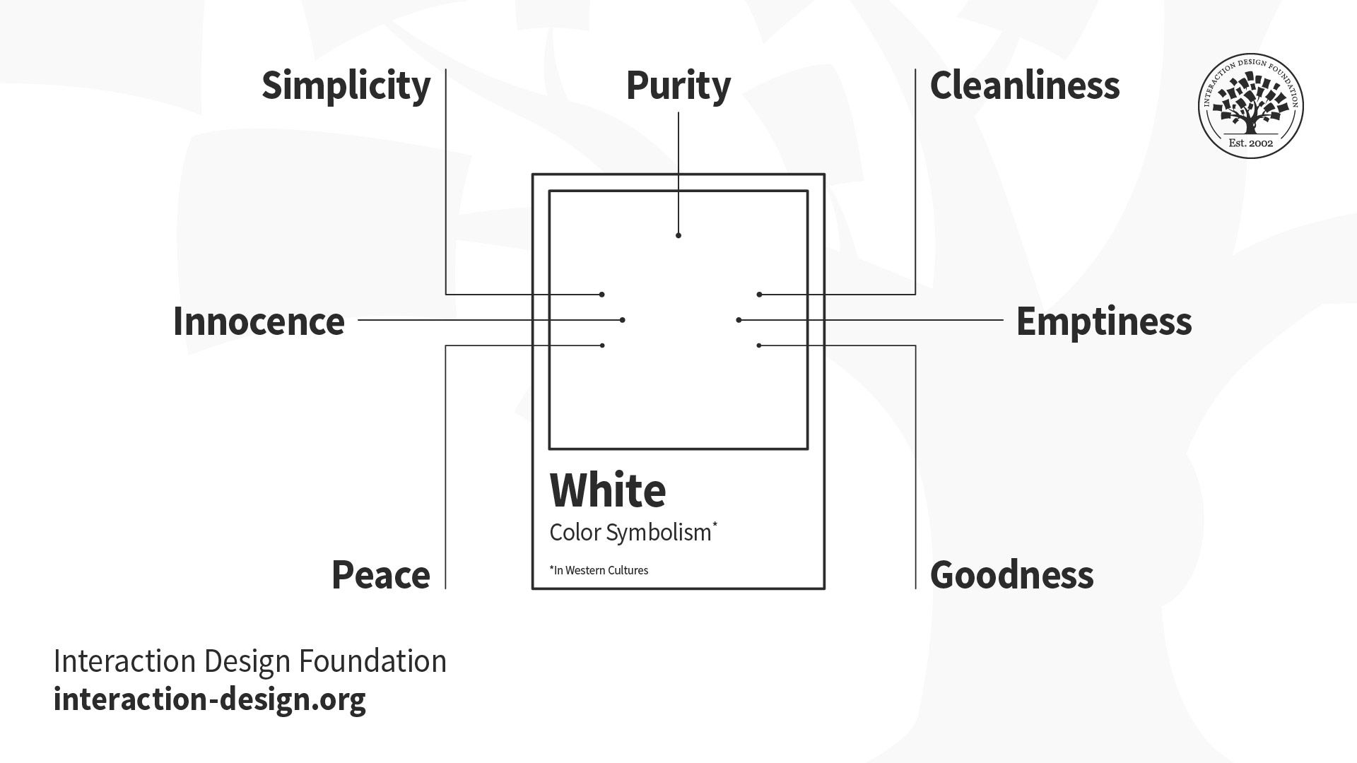
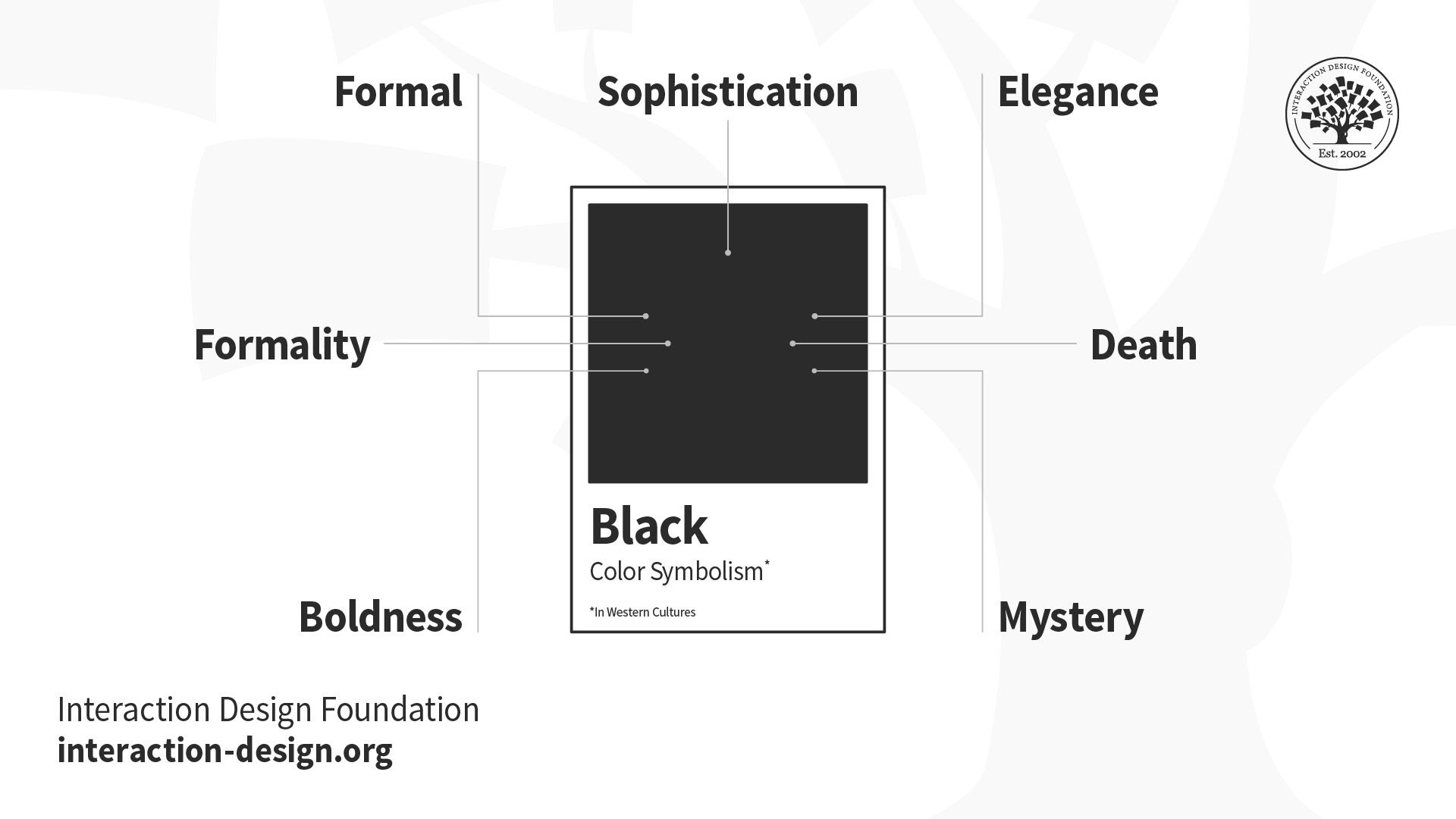
Consider Cultural and Contextual Meanings
Remember, color symbolism varies significantly across cultures and contexts. Red signals danger—and, indeed, passion—in many Western contexts but represents luck and prosperity in Chinese culture, for example. Healthcare applications might avoid red due to its association with medical emergencies, while financial applications might embrace green for its connection to money and growth.
Discover how to design with culture in mind, in this video with Alan Dix.
Optimize for Different Devices and Environments
Mobile devices, desktop monitors, and large displays all render colors differently. High-end smartphones might display vibrant, saturated colors beautifully, but what about older devices or budget models (which many users might rely on)? The latter screen types might show significant color shifts, so be sure to design or apply color palettes that remain functional across this spectrum of display capabilities.
Create Scalable Color Systems
Successful products evolve over time, and call for color systems that can accommodate new features, platforms, and use cases. Build color palettes with sufficient variations to handle expanded functionality while maintaining visual coherence. Many design systems include 5-10 shades of each primary color to provide flexibility for different contexts and emphasis levels. Check your brand guidelines to see what the official word is on color systems so you can do right by your users and your brand.
Remember: A Colorful History Since Early Humans
First and foremost, color depends on the beholder—the cones in a person’s retina decide how they perceive red, blue, yellow, green, and so on. The colors perceived from an object result from the wavelengths of light that the object’s surface reflects (or sometimes emits), or that are distorted by some medium between it and the human observer.
A fundamental tool in art and design since humans first put paint to rock millennia ago, color has served as both a visual element and a communication medium, often for aesthetic purposes. With the advent of graphic design in the early twentieth century, color began to signal more purpose than aesthetics—hence the difference between art and design. On billboards, posters, and other printed media, graphic designers applied color alongside other design principles to establish visual hierarchy, convey meaning, guide user attention, and create emotional connections in advertisements, safety announcements, and more.
Given its properties, color can exist in a strange kind of twilight area between what humans think it is as it seems to emanate from countless objects surrounding them every day, and what it truly is as more of a phenomenon of perception. The emotional links people have formed with colors and the ways they respond to what colors appear to them mirror the intricacies of the natural world—many facets of human life are inextricably bound to the wavelengths of light, or those subtle differences in hues, shades, and tints, that reach billions of eyeballs in countless moments every day.
Discover some fascinating properties of color to appreciate how to use it more effectively in design solutions, in this video with Joann Eckstut.
Other Special Considerations for Color in UX
In addition to color-blindness and cultural accommodations, here are key areas to watch out for when choosing and implementing colors in UX design.
Emotional and Psychological Impact
Colors trigger emotional responses that can significantly impact user behavior and product perception. While these effects are ones you can leverage positively, they can also create unintended negative associations. Overuse of red might create anxiety—you might think of being in a red room with red furniture for an extended period, for example—while excessive bright colors can cause eye strain during extended use.
Technical Limitations and Performance
Complex color implementations can have impacts on loading times and performance, particularly on mobile devices or slower internet connections. On very low-end or older devices, gradients and shadows may increase rendering complexity slightly, but most modern platforms handle them efficiently. So, if you can “get away with” simpler, cleaner looks, why not do it?
Brand and Legal Considerations
Color choices must align with existing brand guidelines while avoiding trademark conflicts with competitors, so be sure to research if that unique shade of red and that unique tint of yellow, for example, aren’t “taken” by someone else. Some industries have established color conventions that users expect—medical applications often use blues and whites, while financial applications frequently employ blues and greens.
Overall, color in UX design can often seem oversimplified as a matter of taste, aesthetics, and putting unique variations on conventions, but it represents a sophisticated discipline that balances aesthetic appeal with functional requirements, accessibility needs, and user psychology. Successful color UX design demands systematic approaches, user-centered thinking, and continuous testing to create interfaces that are both beautiful and usable.
As digital products become increasingly sophisticated—if not more complex—and user expectations continue rising, mastery of color principles remains a critical consideration for designers. The most effective approaches combine a scientific understanding of perception and accessibility with creative problem-solving and user empathy—and, of course, a good eye for visual design.
The “trick” with color use in UX design is to treat it as a powerful communication tool rather than just decorative “icing on the cake.” Visual designers—including UI and UX designers—create digital experiences that are visually compelling, indeed, but they also need to be inclusive, intuitive, and engaging for diverse user communities. The investment in thoughtful color design pays massive dividends through improved usability, stronger brand recognition, and more successful products that truly serve their intended users. And a good-looking digital product that holds up under extensive testing and proves how its accessibility and usability match its surface desirability is worth its weight in gold—or, in keeping with how light and colors behave, at least will be on the same wavelength as what its users deem valuable.


