Designers can choose between adaptive and responsive design to bridge the gap between devices and changing user contexts. Here you’ll learn the merits of each approach, so you’re in a great position to select an approach for your project.
What Are the Main Differences Between Responsive and Adaptive Design?
Responsive design is, in theory, easier and less work to implement. However, responsive design requires good quality assurance to get it right. Responsive design is the standard or default to support device-switching.
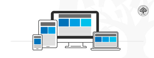
The adaptive design will, in theory, deliver the best user experience regardless of the device. Unlike responsive design, where the same design rearranges its layout according to the screen real estate available, the adaptive design offers tailor-made solutions. This is ideal for mobile user experience (UX) design and a mobile first approach. As designers, you can show users that you’re in tune with their needs and contexts of use on a mobile device. For example, if you were to drive through a long tunnel, wouldn’t you rather have a GPS screen that adapts to the environment and adjusts its brightness? The context-based performance and usability are reassuring. At the same time, it confirms that your device is smart enough to adapt and be extra useful.
Adaptive design has some clear advantages. These designs are faster—two to three times faster than responsive ones. However, to design the best user experience and provide the best solutions, we must remember that we have to take the time to examine our options and the realities of our users. It may take more time to identify the context of use and test proposed solutions with users. However, this should be part of a UX process anyway, so that’s a reason to do adaptive design.
Responsive design is the "default" for web content on any device. Adaptive design is a related technique that allows for UX to be optimized. Which approach you take depends on several factors, the most important of which is your users’ needs and contexts. The trade-off between responsive and adaptive design ultimately comes down to consistency and flexibility. Responsive affords less control over your design on each screen size.
You can start with responsive design as the default and progressively leverage the ideas contained within adaptive design.
The Take Away
The right design approach for your projects depends on several factors, the most important of which is your users’ needs and contexts.
Think about your product or service and practice context awareness. Do users access it in a specific setting? Can you use information about their behavior to offer a better experience? Remember, it's not just mobile devices that are getting smarter. In our homes and offices, we have more than traditional desktops. Now, a wide range of smart devices can sense and react to the environment. Adaptive design can take advantage of all these new possibilities and help you take the UX of your projects to the next level. On the other hand, responsive design is a more straightforward approach which will ensure the accessibility of your products and services.
References and Where to Learn More
We highly recommend this book by Aaron Gustafson on Adaptive Design:
Adaptive Web Design: Crafting Rich Experiences with Progressive Enhancement
To learn more about SEO, read Google’s recommendations on search engine optimization.
Use the Mobile-Friendly test tool to check if your responsive or adaptive design matches Google’s expectations.
Hero image: © Interaction Design Foundation, CC BY-SA 4.0