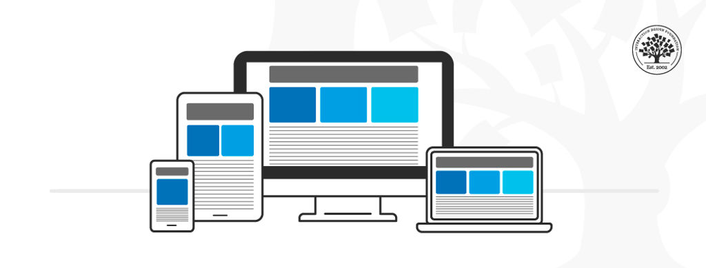
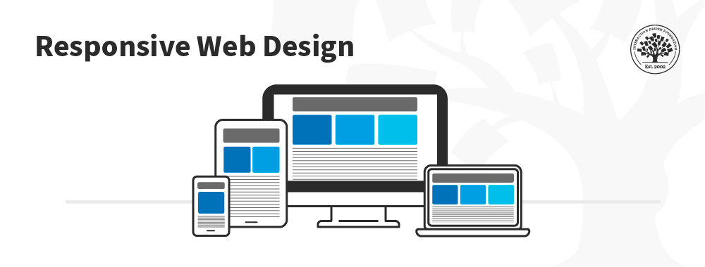
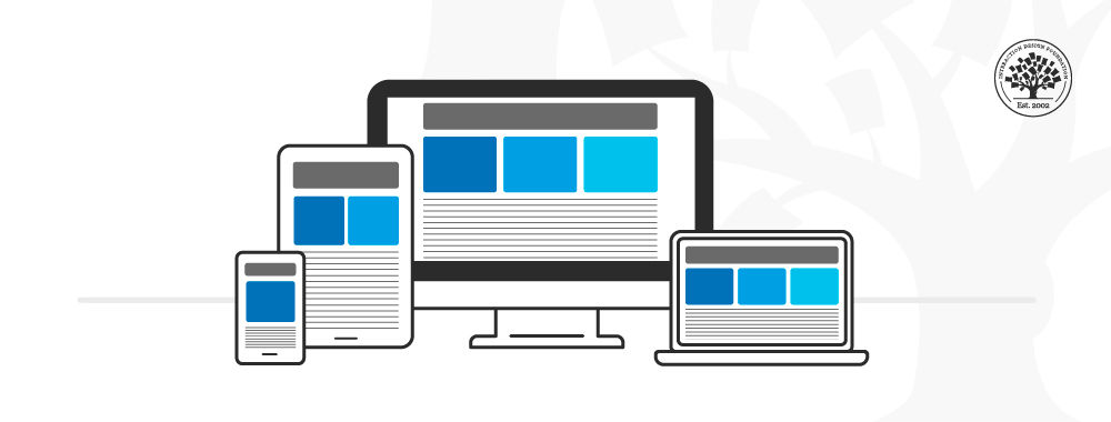
Responsive design is an approach to web design in which the interface adapts to the device's layout to facilitate usability, navigation and information seeking. Responsiveness is possible thanks to media queries, allowing the design to adjust automatically to the browser space to ensure content consistency across devices, and design elements being sized in relative units (%).
Responsive design has significant benefits, and it's a default for web design to support device switching.
With responsive design, you may:
Reach a larger audience: Nowadays, more users access the web through mobile devices, so ensure your mobile User Experience design is well-considered.
Save time and development efforts since designers and developers only focus on one design version.
Improve SEO, as search engines reward mobile-friendly websites with better search positions.
Ensure brand and design consistency across devices, as there is no chance to modify guidelines to fit different design boxes.
Why Responsive Design is so Popular
In the early 2010s, designers had to address a historical phenomenon. More users were starting to access web material on handheld devices than on desktops. There were two main design approaches to deal with designing across devices:
Designers could craft several versions of a design optimized for different devices and make each have fixed dimensions (adaptive design approach).
They could work on a single, flexible design that would stretch or shrink to fit the screen (responsive design approach).
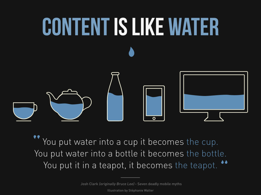
Organizations and designers found the benefits of responsive design hard to ignore. Rather than work with absolute units (e.g., pixels) on separate versions, designers focused on just one design and let it flow like a liquid to fill all "containers."
How to Understand the Language of Responsive Design
Responsive design has three core principles:
Fluid Grid System
Grid systems are aids designers use to build, design, arrange information and make consistent user experiences. In interaction design, multi-column, hierarchical and modular are the most widely-used types of grids.
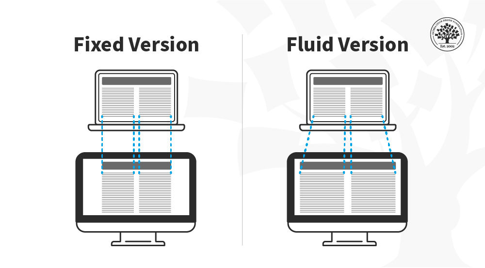
The principle of a grid is simple: every element occupies the same percentage of space, however large or small the screen becomes, which means that the components can be scaled up and down as the user switches devices.
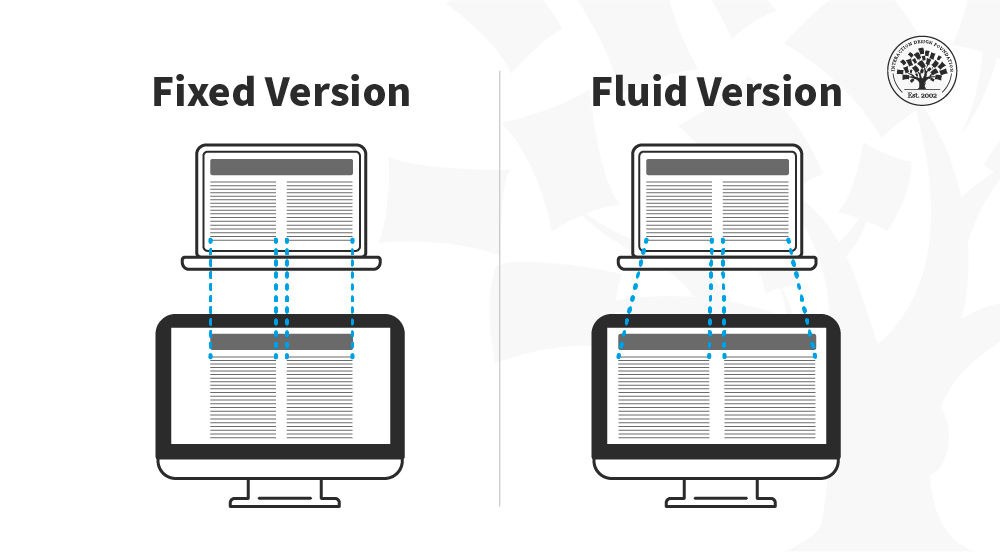
In this image, you can see that the fixed version of the content has the same width regardless of the device whereas in the fluid version the content fills the available space depending on the device size.
© Interaction Design Foundation, CC BY-SA 4.0
Fluid Images
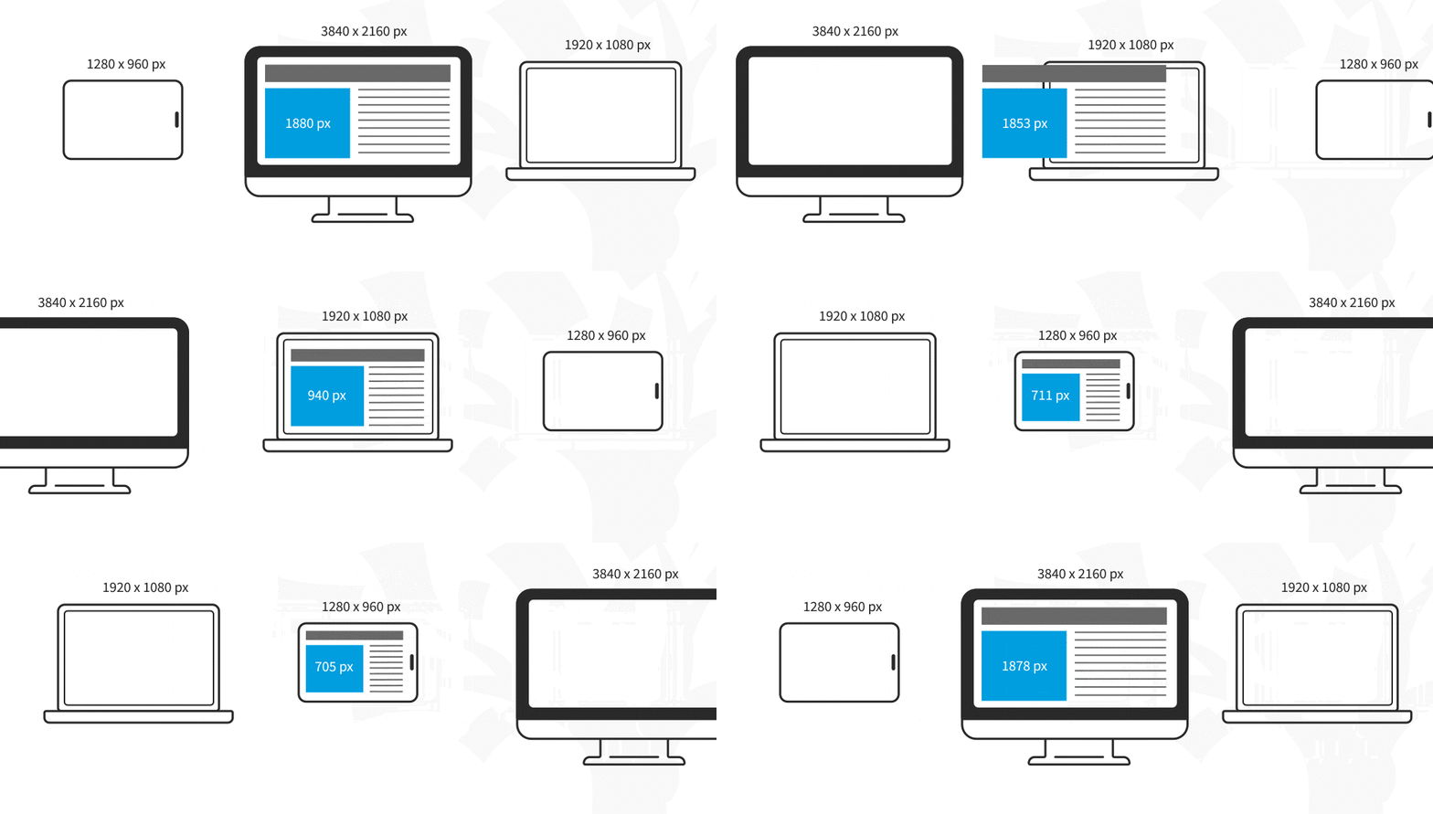
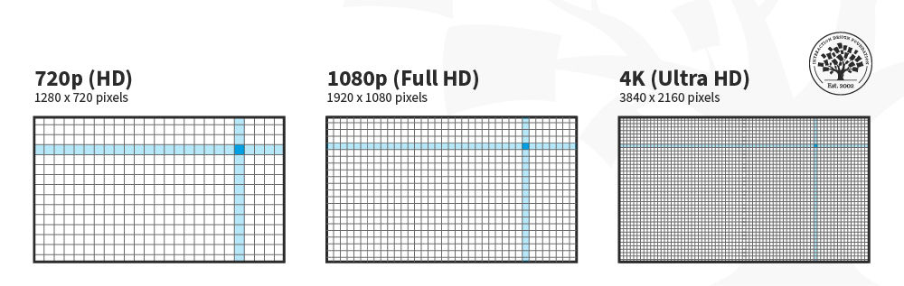
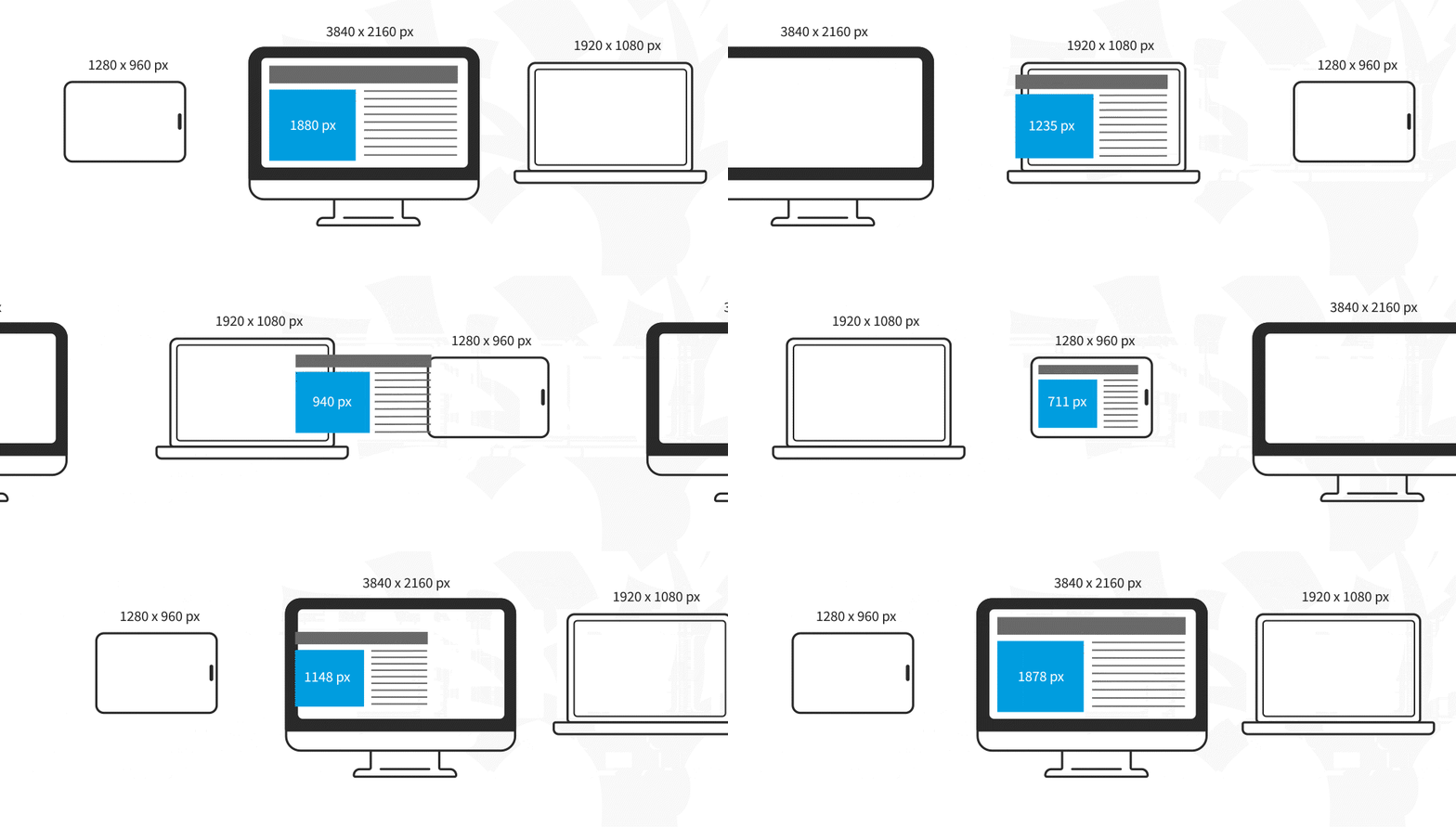
In responsive design, fluid images are images that scale to fit their container, meaning that when the browser reaches a breakpoint, the image will scale up or down to the current window size.
© Interaction Design Foundation, CC BY-SA 4.0
For non-photographic images, such as icons, you can use SVG files—these file formats are lightweight, and you can scale them to any resolution without losing quality.
Media Queries and Breakpoints
Media queries are filters that detect the browsing device's dimensions and make your design appear appropriate regardless of the screen size. To aid media queries, you have breakpoints: these are the values where the content of your website will be rearranged to provide the user with the best possible experience.
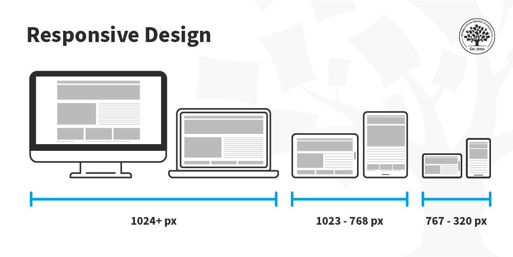
Media queries and breakpoints go hand in hand, and both can be defined in your CSS style sheets. For designers, a breakpoint is a boundary where the design will change to accommodate the features to the new size. Commonly, designers use three sizes when designing responsive websites: 1024 & upwards, 1023-768, and 767-320 px.
In this image, you can see how the placement of the columns is rearranged depending on the screen real estate available. The content is displayed in one column in the smartphone, two on the tablet and three on the desktop.
© Interaction Design Foundation, CC BY-SA 4.0
Media queries work best with a "mobile first" approach where you define what you want on mobile and then scale up from there. You’ll need to test content to see where breakpoints occur and plan them. Eventually, you may find you can predict breakpoints based on a device's screen resolution.
Best Practices & Considerations for Responsive Design
With responsive design, you design for flexibility in every aspect—images, text and layouts. So, you should:
Assume a "mobile-first" mentality: Whether you start to design from the smallest screen or the desktop version, assuming a mobile-first mentality helps you practice the mobile-first approach, a design principle with simplicity at its core. A mobile-first mentality means prioritizing content, leaving complex graphs and images for the desktop version, and creating fat-finger-friendly tap targets (30px minimum).
Use Scalable Vector Graphics (SVGs). These are an XML-based file format for 2D graphics, which supports interactivity and animations.
Include three or more breakpoints (i.e., design for 3+ devices).
Prioritize and hide content to suit users' contexts of use. Check your visual hierarchy and use progressive disclosure and navigation drawers to give users needed items first. Keep nonessential items (nice-to-haves) secondary.
Aim for minimalism.
Apply design patterns to maximize ease of use for users in their contexts and quicken their familiarity: e.g., the column drop pattern fits content to many screen types.
Aim for accessibility with font sizes/styles. Use contrast and background effectively. Consider learning about typographic scales to harmonize body copy and headlines. As some users rely on screen readers, make all your text "real" instead of text within images. See the following sections for more on accessibility with responsive design.
Responsive design is robust and economical, but its "easy" nature is deceptive. You can still run into difficulties if you use it without caution. For example, it can restrict your control over the design's screen sizes; consequently, if you do not set media queries upfront, the elements could shift independently. Also, it is typical to run into issues with advertisement formats, especially on mobile devices.
Still, responsive design aids great UX since, by default, it requires uniformity, seamlessness, and simplicity in your design efforts. It is SEO-friendly, and the multiple CMS and frameworks, such as WordPress and Bootstrap, make it very cheap to implement.
Responsive Design and Accessibility Standards
The accessibility checklist items in the section above are a starting point, but responsive design has deeper connections to accessibility standards that are worth understanding in full. Three areas are particularly important: text resizing and reflow, touch target sizing, and motion sensitivity.
Text Resizing and Reflow
The Web Content Accessibility Guidelines (WCAG) 2.2 include two success criteria that are directly shaped by responsive design decisions. Success Criterion 1.4.4 (Resize Text) requires that text can be resized up to 200% without loss of content or functionality. Success Criterion 1.4.10 (Reflow) goes further: at 400% zoom, or at a viewport width equivalent to 320 CSS pixels, all content must reflow into a single column without requiring horizontal scrolling.
In practice, Reflow is a responsive design test. A layout built with fluid grids and relative units will typically reflow correctly. A layout that uses fixed pixel widths or hides content at narrow viewports rather than reflowing it is likely to fail. Designers can check for Reflow compliance by setting their browser zoom to 400% and verifying that all content remains accessible in a single column without horizontal scrolling.
This is also relevant to users who are not adjusting zoom for disability reasons. Users on small screens, users with lower-resolution displays, and users reading in bright outdoor conditions all benefit from layouts that reflow cleanly at narrow widths.
Touch Target Sizing
The existing best practice note recommends “fat-finger-friendly tap targets (30px minimum).” WCAG 2.2 is more specific. Success Criterion 2.5.8 (Target Size, Minimum, Level AA) requires that interactive targets are at least 24 by 24 CSS pixels, with sufficient spacing between targets to prevent accidental activation. The Level AAA criterion (2.5.5) recommends a minimum of 44 by 44 CSS pixels for all interactive elements.
The 44px recommendation is not arbitrary. It reflects the average width of an adult fingertip and is consistent with platform guidelines from Apple and Google. In responsive design, touch targets that meet this size on desktop (where a mouse provides precision) may shrink below the minimum on mobile if the layout scales them down proportionally. Designers should specify minimum touch target sizes explicitly in design specifications rather than leaving them to scale with the layout.
Respecting User Motion Preferences
CSS media queries are not limited to screen dimensions. The prefers-reduced-motion media query allows a responsive design to detect whether a user has enabled the “reduce motion” setting in their operating system, and to adjust or eliminate animations accordingly.
This matters for users with vestibular disorders, for whom parallax effects, animated transitions, and auto-playing content can trigger nausea or disorientation. It also matters for users with attention-related conditions, for whom motion can be a significant distraction. WCAG 2.3.3 (Animation from Interactions, Level AAA) recommends that motion triggered by interaction can be disabled.
For designers, this means that any responsive layout that includes animated transitions, scroll-triggered effects, or parallax elements should include a reduced-motion alternative. The simplest approach is to design the no-motion state first and treat animation as a progressive enhancement for users who have not enabled reduced motion.
Responsive Design and SEO: Beyond Mobile-Friendly
The existing content notes that responsive design improves SEO because search engines reward mobile-friendly websites. This is true, but the relationship between responsive design and search ranking is more specific than that framing suggests. Two mechanisms are worth understanding in detail.
Mobile-First Indexing
Since 2019, Google has used mobile-first indexing as its default approach. This means that Google’s crawler primarily uses the mobile version of a page, the version a user on a small screen would see, to determine how the page should be ranked in search results, for all users on all devices.
For responsive design, this is generally straightforward: because the same HTML is served to all devices and the layout adapts via CSS, the content Google sees on mobile is the same as the content it sees on desktop. The risk arises when designers make responsive layout decisions that remove or hide content on mobile that is present on desktop. If a section of content is hidden on mobile using display: none, it may not be indexed by Google, regardless of how prominent it is in the desktop layout.
The practical implication is that content priority decisions in responsive design are also SEO decisions. Content that is genuinely important, primary headings, key descriptive text, and calls to action should be present and visible in the mobile layout, not deferred to a desktop-only state.
Cumulative Layout Shift and Core Web Vitals
Google uses a set of performance metrics called Core Web Vitals as ranking signals. One of these metrics, Cumulative Layout Shift (CLS), measures visual instability: the degree to which page elements move unexpectedly as the page loads. A high CLS score indicates that content jumps around as it renders, which is both a poor user experience and a negative ranking signal.
Responsive designs are a common source of layout shift. The most frequent causes are:
Images without declared dimensions. When an image loads into a fluid layout without a declared width and height, the browser does not reserve space for it. The surrounding content shifts when the image appears. The fix is straightforward: always declare image dimensions in HTML, even in fluid layouts.
Web fonts loading late. If a web font takes time to load, the browser initially renders text in a fallback font and then re-renders it in the correct font. This can cause a visible shift. Using the CSS font-display property, and preloading critical fonts, reduces this effect.
Dynamically injected content. Banners, cookie notices, and other elements that are injected into the layout after the initial render push existing content down. Reserving space for these elements in the layout, rather than injecting them into the content flow, eliminates the shift.
CLS is not just an SEO concern. A layout that shifts as it loads is disorienting for all users, and particularly problematic for users with cognitive disabilities or those using screen magnification software, who may lose their place in the content when elements move.
Responsive Design and Dynamic Interfaces
The responsive design principles covered so far, fluid grids, media queries, and breakpoints, assume a relatively stable page: one where the layout adapts to the screen, but the content itself does not change dynamically after load. Modern web interfaces often work differently. Content loads asynchronously, components render conditionally, and layout decisions are made in JavaScript and CSS. These patterns introduce considerations that go beyond traditional responsive design.
CSS-Based vs. JavaScript-Based Responsive Behavior
Responsive behavior can be implemented in two fundamentally different ways, with different consequences for accessibility and SEO.
CSS-based responsiveness uses media queries to show, hide, or rearrange content. The HTML is always present in the document; only its visual presentation changes. This approach is robust: screen readers can access the content regardless of how it is displayed, and search engine crawlers can reliably index it.
JavaScript-based responsiveness conditionally renders components based on screen size or other runtime conditions. A component that is not rendered on mobile is not present in the DOM. It does not exist as far as the browser, screen readers, or crawlers are concerned until the JavaScript runs and creates it.
Neither approach is inherently wrong, but designers and developers need to understand the difference. Content that should be accessible to all users, including screen reader users and search engine crawlers, should be present in the HTML and shown or hidden via CSS, not conditionally rendered into existence by JavaScript.
This distinction also matters for performance. CSS media queries are evaluated by the browser with no additional processing cost. JavaScript that queries the viewport size and makes rendering decisions adds to the work the browser must do before the page is usable, which affects both load time and Core Web Vitals scores.
Hiding Content: display: none vs. Other Approaches
A common responsive pattern is to hide content on certain screen sizes. It is important to understand what “hiding” means in each approach:
display: none removes the element from the visual layout and from the accessibility tree. Screen readers will not announce it, and keyboard users cannot reach it. Use this only for content that genuinely should not be available to users on that device — not for content that is merely inconvenient to show.
visibility: hidden hides the element visually but preserves its space in the layout. Screen readers will not announce it, and keyboard users cannot reach it. It is rarely the right choice for responsive hiding.
Positional or clip-based hiding (moving content off-screen or clipping it to zero size) can make content visually invisible while keeping it in the accessibility tree. This is useful for content that should be available to screen reader users but not visible, such as skip navigation links, but should not be used as a general-purpose responsive hiding technique.
A useful design principle: if content is important enough to include in the desktop layout, it is important enough to be accessible on mobile. If it genuinely does not belong on mobile, consider whether it belongs in the design at all, rather than hiding it.
Responsive Images and Dynamic Loading
Responsive images are a specific area where design decisions have direct consequences for performance, accessibility, and layout stability.
The HTML srcset attribute and the picture element allow browsers to choose the most appropriate image for the current screen size and resolution. A browser on a mobile device downloads a smaller image file; a browser on a high-resolution display downloads a larger one. This reduces data transfer for mobile users and improves load times without compromising visual quality on larger screens.
For accessibility, responsive images still require meaningful alternative text on the img element. The src, srcset, and picture elements change which image file is loaded; they do not affect the alt attribute, which must be set correctly regardless of which variant is served.
For layout stability, all responsive image implementations should include explicit width and height attributes on the img element. Modern browsers use these attributes to calculate an image's aspect ratio before it loads and reserve the correct amount of space in the layout. Without them, the page will experience a layout shift as images load, increasing the CLS score and creating a disorienting user experience.
For further reading: The WCAG 2.2 success criteria referenced in these sections are publicly available at w3.org/TR/WCAG22. Google’s guidance on responsive images, mobile-first indexing, and Core Web Vitals is available at developers.google.com. The MDN Web Docs entries on prefers-reduced-motion, srcset, and the picture element provide practical implementation guidance for developers. |