Adaptive Design

Your constantly-updated definition of Adaptive Design and collection of videos and articles.
Be a conversation starter: Share this page and inspire others!

633 Shares
Save

Get 1 Powerful Email Each Week

Join 313,908 subscribers.

What is Adaptive Design?

Adaptive designs are a range of pre-made layouts that fit different screen sizes. The device's browser selects the best-fitting design from those options. 

Transcript

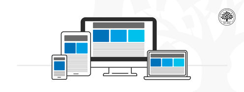
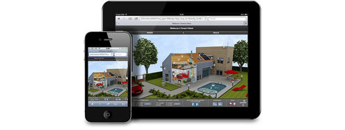
Adaptive design is one method of ensuring webpages function on different-sized devices, which makes it a good option for mobile User Experience (UX) design. Designers might make differently-sized graphical user interfaces (GUIs) ranging from smartwatches to TVs. 

Adaptive design for websites uses multiple fixed layout sizes. The system detects the browser size and selects the most appropriate layout.

Adaptive designs usually include six designs for the six most common screen widths—320, 480, 760, 960, 1200, and 1600 pixels. 

Adaptive and Responsive Design

Adaptive design is like responsive design, which also adapts to different screen sizes. However, responsive designs use a single layout that adjusts in response to screen size. Adaptive design content chooses the best configuration from a selection of fixed layouts.
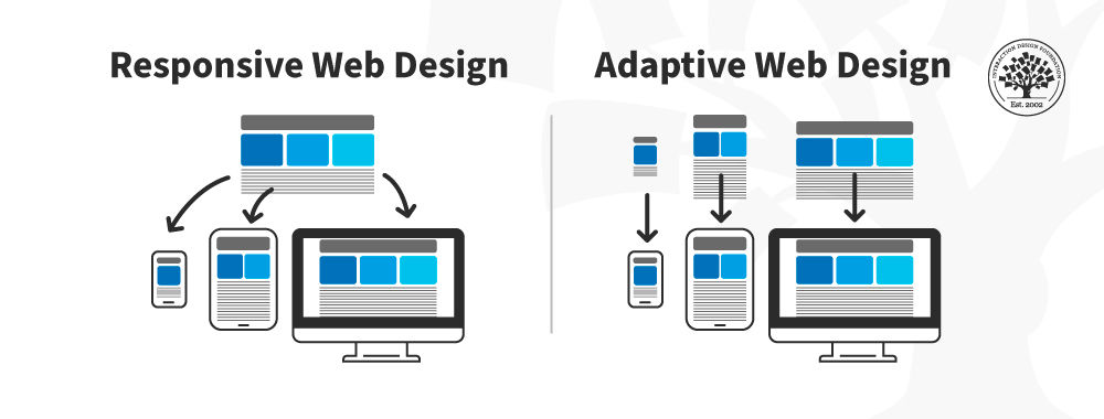
In this image, you can see a comparison between the responsive design approach and the adaptive design approach.

© Interaction Design Foundation, CC BY-SA 4.0

The advantage of adaptive design is that it is a tailor-made solution. The GUI will appear exactly as intended on different screen sizes. The disadvantage is that adaptive design is expensive. The designer creates up to six versions of a webpage to match the screen specifications a user needs. An adaptive design might leave users with non-standard-sized screens with an unoptimized solution. 

Responsive design is the "default" for accessing web content on any device. Adaptive design is a related technique that allows for UX to be optimized. Which approach you take depends on several factors, the most important of which is your users’ needs and contexts of use. The trade-off between responsive and adaptive design ultimately comes down to consistency and flexibility. Responsive affords less control over your design on each screen size. 

Adaptive and responsive design are different approaches to deliver device-specific experiences for users. While responsive design focuses on just the device, adaptive design takes both device and the user’s context into account. Sometimes, a hybrid approach is best.

Questions About Adaptive Design?
We've Got Answers!

What makes adaptive design different from responsive design?

Adaptive design and responsive design both aim to make digital experiences usable across devices, but they use different approaches.

Responsive design uses a single, flexible layout that automatically adjusts based on screen size. The same HTML and CSS respond dynamically to the user's device, whether it's a phone, tablet, or desktop. This approach relies heavily on media queries and fluid grids to “flow” across screen sizes.

Adaptive design, by contrast, delivers different fixed layouts for different screen sizes. Designers create distinct versions of a site; for example, one for smartphones, one for tablets, and one for desktops. When a user visits, the system detects the device and loads the most appropriate version.

Responsive design is often faster to implement and easier to maintain. Adaptive design can offer more tailored experiences, but takes more work upfront.

Explore the differences between adaptive and responsive design in our piece Adaptive vs. Responsive Design.

How many screen layouts should I create in adaptive design?

In adaptive design, you typically create six distinct screen layouts to cover the most common device breakpoints. These layouts are tailored to specific screen widths, ensuring optimal user experiences across a range of devices.

The most commonly used breakpoints are:

  1. 320px – Small mobile (portrait)

  2. 480px – Mobile (landscape)

  1. 768px – Tablet (portrait)

  2. 1024px – Tablet (landscape) or small desktop

  1. 1200px – Desktop

  2. 1600px+ – Large desktop

Designers don't always use all six. The number you need depends on your audience and analytics. For example, if most users visit your site on mobile and desktop, you might prioritize just those breakpoints.

Adaptive design gives you control over how your content appears on different screens—like customization—but it also takes more effort to build and maintain each layout.

Watch as Frank Spillers, CEO of Experience Dynamics, discusses adaptive design and helpful tips to design with:

Transcript

What are the pros and cons of adaptive design?

Adaptive design offers tailored experiences across devices, but it comes with trade-offs. Here are the main pros and cons:

Pros:

  • Optimized performance: Each layout is fine-tuned for a specific device, improving speed and usability.

  • Greater control: You can craft precise experiences for different screen sizes.

  • Better for legacy devices: You can design specifically for older devices or browsers that don't handle responsive design well.

  • Enhanced UX: Fixed layouts let you target unique needs of mobile vs. desktop users more effectively.

Cons:

  • More design work: You need to create and maintain multiple versions of your site.

  • Higher development effort: Developers must code and test each layout individually.

  • Less fluid across devices: Devices that fall between breakpoints may not get an ideal layout.

  • Scalability challenges: Updating design or content means adjusting every layout.

It's best to use adaptive design when you need precise control and know your user's devices well.

Take our course: Mobile UX Design: The Beginner's Guide.

When should I choose adaptive design over responsive?

Choose adaptive design over responsive design when you need precision, control, and tailored experiences for specific devices. Adaptive design lets you create separate layouts for different screen sizes, ideal for situations where content or interactions should change significantly based on the user's device.

The best use cases are when:

  • You know your audience's devices: If analytics show consistent use of specific devices (like iPads or a certain desktop resolution), adaptive design lets you optimize for those targets.

  • Performance is critical: You can deliver lighter versions of your site to mobile users by stripping non-essential content and features.

  • You're working with complex interfaces: Enterprise tools or apps with intricate workflows often benefit from layout control at each breakpoint.

  • Need legacy browser support: Adaptive design can offer fallbacks for older browsers that struggle with responsive CSS.

Just note that it's more work than responsive design, so weigh control against maintenance effort.

Explore the differences between adaptive and responsive design in our piece Adaptive vs. Responsive Design.

What common mistakes should I avoid in adaptive design?

When working with adaptive design, beware of these common mistakes; it can save you time and ensure a smoother user experience across devices:

1. Not using analytics to guide breakpoints

Don't guess screen sizes. Use real user data to identify which devices or resolutions to target. Designing for irrelevant breakpoints wastes time and resources.

2. Creating too many layouts

More layouts mean more design and development overhead. Focus on the most impactful breakpoints, usually 3 to 6, based on your users' devices.

3. Inconsistent user experience

Avoid drastic changes between layouts. Users should feel they're interacting with the same product, regardless of screen size; it's vital for a seamless experience with the brand.

4. Neglecting content hierarchy

Each layout should prioritize the same core content, even if it appears differently. Don't hide key features or messages on smaller screens.

5. Ignoring maintenance challenges

Each new layout adds complexity. Document your decisions and design systems to keep things manageable.

Focus on user behavior and thoughtful design choices, and you can avoid these pitfalls and build more effective adaptive experiences.

Get a solid grasp of the users' contexts of use to help with how you design.

Take our course: Mobile UX Design: The Beginner's Guide.

Can adaptive design help with mobile-first strategies?

Yes; adaptive design can support mobile-first strategies, but with specific trade-offs. A mobile-first approach starts by designing for the smallest screen, then scales up. When you apply adaptive design, you do this by creating a dedicated layout for mobile first, then adding others for tablets and desktops.

This method gives you control to optimize performance and usability on mobile, which is essential since mobile traffic dominates globally. You can fine-tune touch targets, content hierarchy, and interactions for mobile users—something fluid responsive design may struggle with.

However, adaptive design doesn't scale fluidly between breakpoints. That means devices falling between your preset layouts might not get an ideal experience. So, use adaptive design in mobile-first strategies when you need precise control and know your core device targets.

Take our course: Mobile UX Design: The Beginner's Guide.

Can I use adaptive design and responsive design together?

Yes; you can use adaptive design and responsive design together. In many cases, it's a smart strategy. Combining both lets you fine-tune experiences for key devices while still supporting a broad range of screen sizes with fluid layouts.

Here's how it works:

Use adaptive design to serve distinct layouts at specific breakpoints (like mobile, tablet, and desktop). Within those layouts, apply responsive design techniques—like flexible grids and media queries—to handle variations in screen size and orientation.

This hybrid approach offers the precision of adaptive design where it matters most and the flexibility of responsive design across the rest. It's especially useful in complex products or content-heavy sites, where maintaining control over layout and readability is crucial.

Just remember: More complexity means more testing and maintenance.

Watch this video for helpful insights, where Frank Spillers discusses responsive design:

Transcript

How do I design adaptive interfaces for accessibility?

Designing adaptive interfaces for accessibility means ensuring that each layout—no matter the screen size—offers an inclusive, usable experience for all users. Start by applying core accessibility principles like high color contrast, keyboard navigability, and readable typography across every version of your layout.

Here's how to go further with adaptive design:

  • Preserve consistency: Don't strip away accessible elements in smaller layouts. Keep semantic HTML, ARIA labels, and alt text intact across devices.

  • Design for flexibility: Ensure that each layout works well with screen readers and zoom functions. Fixed layouts must not break when users resize text.

  • Test adaptively: Use accessibility tools (like VoiceOver, NVDA, or Axe) for each breakpoint—not just desktop.

  • Avoid hiding critical features: Just because a screen is smaller doesn't mean features like skip links or help text should disappear.

Well-designed adaptive interfaces put usability first and make digital experiences better for everyone.

Explore why accessibility is a vital keyword in design:

Transcript

How do I hand off adaptive designs to developers?

To hand off adaptive designs to developers smoothly, start by clearly documenting how the layout adjusts across breakpoints—mobile, tablet, and desktop. Use tools like Figma or Sketch with organized design systems and responsive constraints. Show how elements resize, reposition, or hide depending on screen size. Don't just hand off static screens; include behavior.

Developers need more than visuals. Provide specs like font sizes, spacing, and interaction rules. Use annotations or prototypes that explain adaptive logic, such as “this grid switches from two columns to one at 768px.” Platforms like Zeplin, Figma Inspect, or Storybook help bridge the gap by translating designs into developer-friendly code snippets and measurements.

Keep communication open. A quick walkthrough with the dev team goes a long way. Clarify priorities and flexibility: what's fixed and what can be adjusted. A clear, shared understanding leads to cleaner builds and fewer handoff headaches.

Discover more about cross-functional collaboration in this video with Laura Klein: Product Management Expert, Principal at Users Know, Author of Build Better Products and UX for Lean Startups:

Transcript

What are some recent or highly cited scientific articles about adaptive design?

Chunchu, A. (2024). Adaptive user interfaces: Enhancing user experience through dynamic interaction. International Journal for Research in Applied Science & Engineering Technology, 12(9), 949–956.

This article explores the concept of Adaptive User Interfaces (AUIs), focusing on how they dynamically adjust to individual user needs and preferences. It delves into key techniques used in AUI development, including personalization, context awareness, machine learning algorithms, user feedback loops, and modular design. The paper examines real-world applications of AUIs in healthcare, education, e-commerce, and smart home systems, highlighting their impact on user experience and efficiency. Additionally, it discusses the benefits of implementing AUIs, such as improved user engagement, increased efficiency, and enhanced accessibility, while also addressing challenges like data privacy and balancing adaptation with user control.

Ramazanov, I. (2025). Approaches to creating adaptive design in mobile applications using React Native. Universal Library of Engineering Technology, 2(1), 20–24.

This article by Ramazanov explores modern methodologies for implementing adaptive design in mobile applications using the React Native framework. It details practical approaches such as media queries, Flexbox, proportional sizing, and device-aware layout adjustment to address diverse screen sizes, pixel densities, and orientations. The paper emphasizes the importance of selecting appropriate tools—like react-native-responsive and PixelRatio—to optimize user interfaces across platforms. The article is grounded in technical specifics and offers actionable recommendations, making it highly relevant for developers and UX professionals. It contributes practical insights for creating user-friendly, efficient, and scalable cross-platform mobile applications.

Gustafson, A. (2015). Adaptive Web Design: Crafting Rich Experiences with Progressive Enhancement (2nd ed.). New Riders.

Aaron Gustafson's Adaptive Web Design is a seminal work that champions the philosophy of progressive enhancement in web design. The book emphasizes building websites that are accessible, functional, and user-friendly across a myriad of devices and browsers. By focusing on content first and layering enhancements based on device capabilities, Gustafson provides a roadmap for creating resilient and future-proof web experiences. This approach ensures that all users, regardless of their technology, receive a meaningful and efficient interaction, making the book a cornerstone in the field of adaptive UX design.

Earn a Gift, Answer a Short Quiz!

1
2
3
4
1
2
3
4
Question 1
Question 2
Question 3
Get Your Gift

Question 1

What is the primary benefit of adaptive design?

1 point towards your gift

  • It offers multiple pre-made layouts to fit different screen sizes.
  • It provides a single flexible layout for all devices.
  • It reduces the need for user research.

Question 2

How does adaptive design differ from responsive design?

1 point towards your gift

  • Adaptive design is less expensive to implement than responsive design.
  • Adaptive design selects the best-fitting layout from multiple fixed layouts.
  • Adaptive design uses a single layout that adjusts to screen size.

Question 3

Why is adaptive design particularly useful for mobile user experience?

1 point towards your gift

  • It eliminates the need for multiple product iterations.
  • It provides faster load times with optimized layouts for different devices.
  • It reduces the complexity of the design process.

Learn More About Adaptive Design

Make learning as easy as watching Netflix: Learn more about Adaptive Design by taking the online IxDF Course Mobile UX Design: The Beginner's Guide.

Why? Because design skills make you valuable. In any job. Any industry.

In This Course, You'll

  • Get excited to stop treating phones and tablets as just smaller screens and apply mobile UX principles built around how people think and make decisions on their devices. Smartphones and tablets differ in usage, attention spans, and session length. You can use those differences to create intuitive, accessible solutions that make people's lives easier, faster, and better. Through the eight goals of mobile UX, the principles of responsive and adaptive design, Google's micro-moments framework, and Josh Clark's three mobile mindsets, you'll understand what people are really trying to do when they pick up their phones. According to Statista, smartphone ownership has nearly doubled since 2019, and mobile devices generate over 62% of all web traffic worldwide. Companies in nearly every industry now build for mobile first: for SEO, for performance, for feature prioritization, and for users who increasingly live on their phones. Mobile UX is one of the most essential skills to invest in, whether you're ready to make the switch into a career in design or take on a more senior or leadership role.

  • Make yourself invaluable when you know how to design a mobile product people return to. According to AppsFlyer, 1 in 2 apps are uninstalled within 30 days of download, so designers who can improve retention are in high demand. You'll learn the five-step human-centered design process built for mobile (assess, understand, define, differentiate, and sketch), and how context of use influences whether people keep your app or delete it. From there, you'll study how to use sociability to build a community that leads to long-term adoption. No matter your background, you'll be able to make the business case for mobile UX, whether you're presenting to your team or interviewing for a role.

  • Gain confidence and credibility as you replace opinions with structured heuristic evaluations. When you understand the trade-offs between native, hybrid, and web apps (cost, capability, and reach), you'll be able to pick the right format for any project. You'll use the heuristic frameworks of Jakob Nielsen, Nadav Savio, and Jared Braiterman to assess mobile interfaces, and the USE Scorecard to score real mobile experiences against the criteria that decide whether users adopt them or not. Finally, the Assumption Buster helps you catch bias early, so your designs stay accessible and inclusive for all your users.

  • Craft your personal portfolio with a series of optional hands-on activities. You'll pick a mobile app, evaluate it against the eight goals of mobile UX, redesign it, layer in a sociability feature, and end with a heuristic evaluation. Apply your new skills immediately with downloadable templates, including the Customer Journey Map and the USE Scorecard. You'll finish the course with a complete case study that walks recruiters through your design process (from research to evaluation) and shows you can step into a mobile UX role.

Learn From Industry Leaders

Master complex skills with proven best practices and toolkits directly from industry leaders. Meet your experts for this course:

  • Frank Spillers: Service Designer and Founder and CEO of Experience Dynamics.

  • Alan Dix: Author of the bestselling book “Human-Computer Interaction” and Director of the Computational Foundry at Swansea University.

  • Mike Rohde: Experience and Interface Designer, author of the bestselling “The Sketchnote Handbook.”

Earn Industry-Recognized Certificates

Industry giants trust our courses to train their teams, and prestigious universities integrate our content into their curricula. Add your certificates to your LinkedIn profile, résumé, and job applications.

Our clients: IBM, Harvard University, University of Cambridge, NASA, Adobe, Stanford, Massachusetts Institute of Technology, LinkedIn
Course Certificate

All Free IxDF Articles on Adaptive Design

Read full article
Responsive Design: Best Practices - Article hero image

Responsive Design: Best Practices

Responsive Design allows people to access content across multiple device resolutions. As more people interact with websites through mobile devices, users now expect websites to be responsive. Here we’ll look at the main principles of responsive design and how it supports accessibility and device-swi

Social shares
1.1k
Published
Read Article
Read full article
5 Steps for Human-Centered Mobile Design - Article hero image

5 Steps for Human-Centered Mobile Design

Many businesses start with the end-point in mind; “We need a mobile app or a mobile website!” They do not consider why their users would want it. Having a mobile website or app isn’t the key to success—you must provide value to your users. When you take a user- and task-centered approach to mobile (

Social shares
908
Published
Read Article
Read full article
One Size Fits All? Definitely Not in Task-Oriented Design for Mobile & Ubiquitous UX - Article hero image

One Size Fits All? Definitely Not in Task-Oriented Design for Mobile & Ubiquitous UX

In the 1980s and ‘90s, our technology-loving civilization rode the wave of Personal Computing – one computer per person. As computers became smaller and less expensive to produce, every worker—or indeed, every person—could have one at his/her disposal. With the rapid rise of Ubiquitous and Mobile co

Social shares
696
Published
Read Article
Read full article
Should You Choose between Responsive and Adaptive Design? - Article hero image

Should You Choose between Responsive and Adaptive Design?

Designers can choose between adaptive and responsive design to bridge the gap between devices and changing user contexts. Here you’ll learn the merits of each approach, so you’re in a great position to select an approach for your project.  What Are the Main Differences Between Responsive a

Social shares
559
Published
Read Article

Should You Choose between Responsive and Adaptive Design?

Should You Choose between Responsive and Adaptive Design?

Designers can choose between adaptive and responsive design to bridge the gap between devices and changing user contexts. Here you’ll learn the merits of each approach, so you’re in a great position to select an approach for your project.  

What Are the Main Differences Between Responsive and Adaptive Design?

Responsive design is, in theory, easier and less work to implement. However, responsive design requires good quality assurance to get it right. Responsive design is the standard or default to support device-switching.

The adaptive design will, in theory, deliver the best user experience regardless of the device. Unlike responsive design, where the same design rearranges its layout according to the screen real estate available, the adaptive design offers tailor-made solutions. This is ideal for mobile user experience (UX) design and a mobile first approach. As designers, you can show users that you’re in tune with their needs and contexts of use on a mobile device. For example, if you were to drive through a long tunnel, wouldn’t you rather have a GPS screen that adapts to the environment and adjusts its brightness? The context-based performance and usability are reassuring. At the same time, it confirms that your device is smart enough to adapt and be extra useful.

Adaptive design has some clear advantages. These designs are faster—two to three times faster than responsive ones. However, to design the best user experience and provide the best solutions, we must remember that we have to take the time to examine our options and the realities of our users. It may take more time to identify the context of use and test proposed solutions with users. However, this should be part of a UX process anyway, so that’s a reason to do adaptive design. 

Responsive design is the "default" for web content on any device. Adaptive design is a related technique that allows for UX to be optimized. Which approach you take depends on several factors, the most important of which is your users’ needs and contexts. The trade-off between responsive and adaptive design ultimately comes down to consistency and flexibility. Responsive affords less control over your design on each screen size. 

You can start with responsive design as the default and progressively leverage the ideas contained within adaptive design.

The Take Away

The right design approach for your projects depends on several factors, the most important of which is your users’ needs and contexts.

Think about your product or service and practice context awareness. Do users access it in a specific setting? Can you use information about their behavior to offer a better experience? Remember, it's not just mobile devices that are getting smarter. In our homes and offices, we have more than traditional desktops. Now, a wide range of smart devices can sense and react to the environment. Adaptive design can take advantage of all these new possibilities and help you take the UX of your projects to the next level. On the other hand, responsive design is a more straightforward approach which will ensure the accessibility of your products and services.

References and Where to Learn More

We highly recommend this book by Aaron Gustafson on Adaptive Design:
Adaptive Web Design: Crafting Rich Experiences with Progressive Enhancement

To learn more about SEO, read Google’s recommendations on search engine optimization.

Use the Mobile-Friendly test tool to check if your responsive or adaptive design matches Google’s expectations.

Hero image: © Interaction Design Foundation, CC BY-SA 4.0

39% of Today's Skills Will Change by 2030

The World Economic Forum expects 39% of today's skills to be transformed or become outdated by 2030.

The good news is that jobs in UX / UI design and AI are among the fastest-growing professions globally.

Build Skills That Keep You Relevant

Privacy Settings

By using this site, you accept our Cookie Policy and Terms of Use.
Customize
Accept all

Be the One Who Inspires

People remember who shares great ideas.

Share on:

Academic Credibility — On Autopilot

Don't waste time googling citation formats. Just copy, paste and look legit in seconds.