The automatic opt-in design pattern is a dark pattern used to secretly subscribe you to newsletters or set an application as your default for a particular action. It uses a checked checkbox which, unless you uncheck it, indicates your agreement to whatever the company wants. Combined with unchecked checkboxes and cleverly phrased labels, a confusing opt-in/opt-out dance appears.
Automatic Opt-In
Your constantly-updated definition of Automatic Opt-In and collection of videos and articles.
Be a conversation starter: Share this page and inspire others!
Get 1 Powerful Email Each Week
Join 313,904 subscribers.
What is Automatic Opt-In?
Learn More About Automatic Opt-In
Make learning as easy as watching Netflix: Learn more about Automatic Opt-In by taking the online IxDF Course UI Design Patterns for Successful Software.
Why? Because design skills make you valuable. In any job. Any industry.
Earn Industry-Recognized Certificates
Industry giants trust our courses to train their teams, and prestigious universities integrate our content into their curricula. Add your certificates to your LinkedIn profile, résumé, and job applications.


All Free IxDF Articles on Automatic Opt-In


How to Get Users’ Agreement with the Opt-in/Opt-out Dance
The dark side is quite resourceful in sneaking things past your attention, thereby ensuring your engagement in their commercial activities. To do this, they rely on our inherent laziness, which prevents us from reading every single piece of text on our way towards completing a task. Phrased carefull
- Social shares
- 614
- Published
Read Article
How to Get Users’ Agreement with the Opt-in/Opt-out Dance

The dark side is quite resourceful in sneaking things past your attention, thereby ensuring your engagement in their commercial activities. To do this, they rely on our inherent laziness, which prevents us from reading every single piece of text on our way towards completing a task. Phrased carefully to deceive you, the automatic opt-in design pattern is used to subscribe you secretly to newsletters or set an application as your default for a particular action. It’s a big, bad, bold and beautiful world out there, so let’s learn how to add this dark pattern to your designer’s skill set. Forewarned is forearmed, after all.
User interface designers who have chosen the dark side are often aiming to sneak things past your attention as you make your way through the different stages of a boring task. As you will see from the Car Trawler registration page screenshot below, designers approach some challenges in a way that will get as many users agreeing to certain conditions as possible. Here, the user is automatically opting-in to an email subscription. The designer has tried to sneak this one past the attention of users by even placing it below the button they need to click so as to continue, thereby minimizing the chance that they see it.
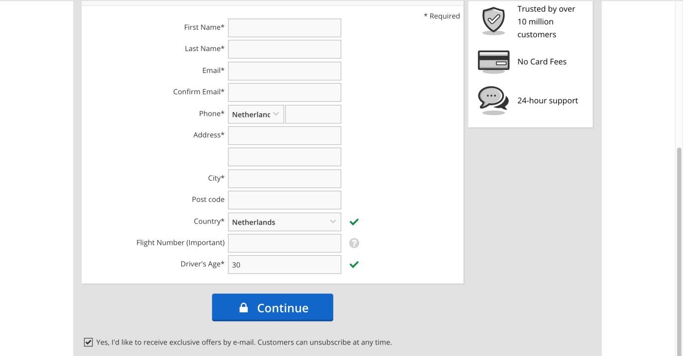
Author/Copyright holder: Car Trawler. Copyright terms and license: Fair Use.
In the Car Trawler web page, the user is tricked into receiving exclusive offers via email, by using an automatic opt-in design pattern and placing it below the button.
Upon opening a web browser, such as Mozilla Firefox (see the example image below), you are asked whether you want to set this as your default browser; you are given two options, 'Yes' or 'No', but unless you deselect the accompanying checkbox, the same message will appear upon every use if you select 'No'. This design encourages the user to accept the prompt in future when declining the change of web browser.
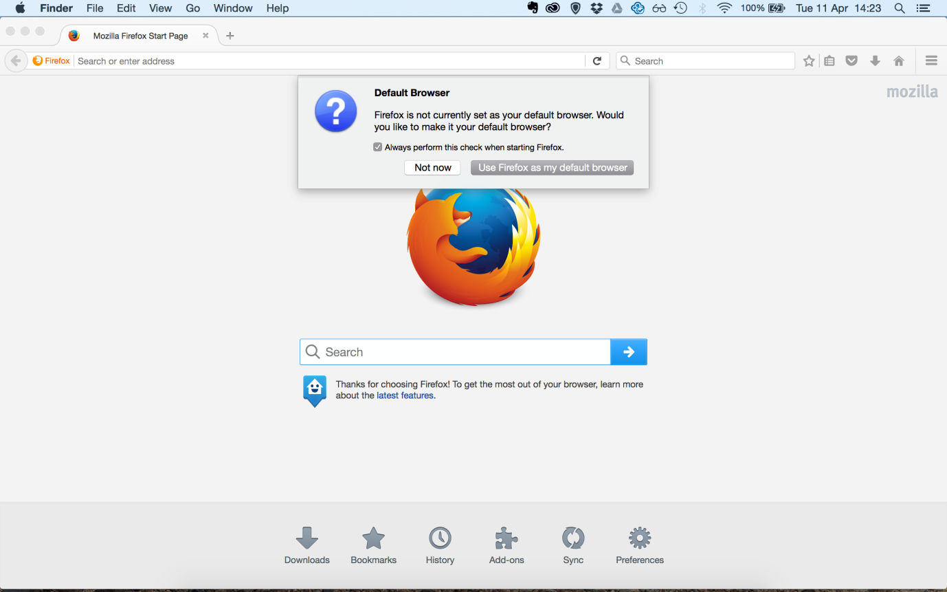
Author/Copyright holder: Firefox. Copyright terms and license: Fair Use.
Firefox will continue to ask whether you want to make it your default browser, until you either agree or explicitly opt out of this suggestion.
Take a look at the checkboxes below; now, why would the designers expect the user to select one checkbox to opt out of a condition then to leave another blank to opt out? If users do not wish to receive what is—effectively—spam from PC World, they must tick the first checkbox; however, if they do not wish to receive spam from third parties associated with PC World, they must leave that particular checkbox blank. Thanks to the designer’s having changed the wording in these two statements, users must pay close attention so as to avoid accidentally opting into something they do not want. Users are expected to read the information and carry out different actions for the same function, or, more accurately, the designer wants them to make a mistake and opt in to one of the company’s mailing lists.
Why is this classed as a dark pattern?
In the outside world (i.e., away from computers), when we want something—or if we want to agree to something—we have to do so actively. For example, when we want a specific meal in a restaurant, we have to ask for it from the menu, instead of having to deselect all of the dishes we do not want then quietly waiting until only the few selected options are brought to us. By using checkboxes that users have to select if they do not want to be added to a mailing list, subscribed to a newsletter, and so on, the designers are tricking them into accepting things they might not actually agree to if they read everything in full.
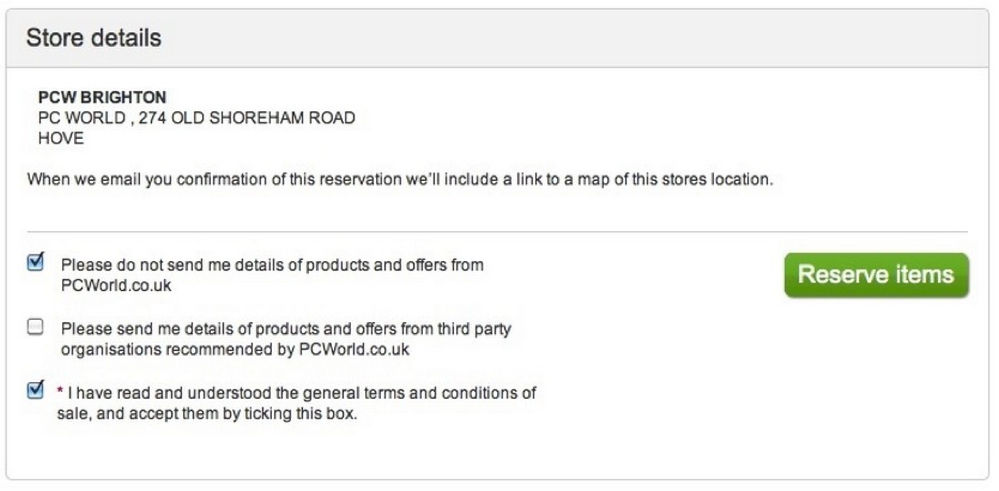
Author/Copyright holder: PC World. Copyright terms and license: Fair Use.
PC World aims to confuse users even more, by taking the automatic opt-in design pattern to the next level by changing the way the different statements are phrased. In the first statement, ticking the box means opting out, whereas in the second statement, ticking the box would be opting in.
In this particular instance, the designers are taking advantage of the user's desire to get the task of registration out of the way; they know very little attention will be given to the task of reading the checkbox information, if any. Most users, particularly inexperienced ones, will probably assume "Oh, the box isn't selected; that means I won't be signed up for anything.", so the use of unselected checkboxes to opt in tricks the users into giving their details to third parties or have them used for purposes they probably do not agree to.
The 'opt-in, opt-out dance' aims to fool the users; why should they have to select one box to opt out and leave another blank to achieve the same effect? This method is purely employed to trick the users and play on the fact they would rather get the task finished quickly than read through all of the information before they can move on. Switching the methods used to carry out an action also trades on the nature of human behavior; once we have established one way of completing a task and we see another similar challenge, we are more than likely to employ the same strategy in this new instance. By being purposefully inconsistent, the designers are introducing the potential for negative transfer, which is a behavioral phenomenon where a previous action has a negative effect on another action. Therefore, the opt-in, opt-out dance is intended to trick users into agreeing to, accepting, or purchasing things they would not have if they were either paying full attention or went through all of the information with a fine-tooth comb.
“Youth is easily deceived because it is quick to hope.”
―Aristotle, Classical Greek Godfather of Logic
Had Aristotle been able to book a flight online to anywhere, he may have realized just how easy stumbling into an opt-in is for people of any age. The need for speed in getting through a transaction is a common human trait—and one our classical philosopher would probably have attributed to the impetuousness of youth, if not ‘laziness’. The organization whose website it is has a strong card to play in this regard if it is reputable. Many big companies, for instance, are household names. Knowing this, users will tend to dismiss any notions they might be ripped off, and proceed through the transaction without scrutinizing the opt-ins and opt-outs.
The ‘magic’ here is pretty much all in the wording. Look again at the image above, and note how different matters would be if we had “Please do not send me…” for the middle option and “I have not read and understood…” for the third. Now, consider how the default positions of the checkmarks would alter the outcome for the user and the company with these options worded in this different way. As you’re doing that, consider how the use of bold text (e.g., “Please do not send me…”) would give the game away. As a designer, you can use the ‘mathematics’ of logic to—yes, indeed—fool the user. Think of expressions such as “I did not tell the user not to do that.” or “The enemy of a friend of an enemy is a friend.” With this in mind, you can tailor the opt-in/opt-out section to suit your client organization’s needs without having to resort to bad grammar.
The Take Away
The opt-in/opt-out dance is an effective way to confuse users into agreeing to things you know they don’t really want. Agreeing to receive newsletters, to distribute personal details to third parties, or to terms and conditions of a purchase can all be achieved with the dark pattern of automatic opt-in. Besides tactical decisions on whether to have an initially checked or unchecked box, you will have to think about the phrasing of the checkbox label thoroughly. Furthermore, to be a responsible designer, you should make sure that the checkboxes are clearly visible before users’ attention is drawn to a confirmation button.
With clever wording and sly default settings for where your checkbox labels are checked or unchecked, most users will do your bidding. The real ‘trick’ for you is to stay as ethical as possible while remembering we live in an era of reviews, feedback, and long-lasting reputations.
References & Where to learn More
Hero Image: Author/Copyright holder: Mattinbgn. Copyright terms and license: CC BY 3.0.
Jenifer Tidwell, Designing Interfaces: Patterns for Effective Interaction Design, 2010
Martijn van Welie, Pattern Library, 2008
Harry Brignull’s website dedicated to dark patterns.