Color Theory

Your constantly-updated definition of Color Theory and collection of videos and articles.
Be a conversation starter: Share this page and inspire others!

734 Shares
Save

Get 1 Powerful Email Each Week

Join 315,222 subscribers.

What is Color Theory?

Color theory is the study of how colors work together and how they affect our emotions and perceptions. It's like a toolbox for artists, designers, and creators to help them choose the right colors for their projects. Color theory enables you to pick colors that go well together and convey the right mood or message in your work.

Transcript

Color is in the Beholders’ Eyes

“Color! What a deep and mysterious language, the language of dreams.”

— Paul Gauguin, Famous post-Impressionist painter

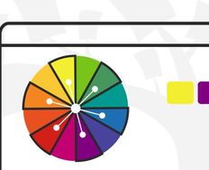
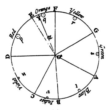
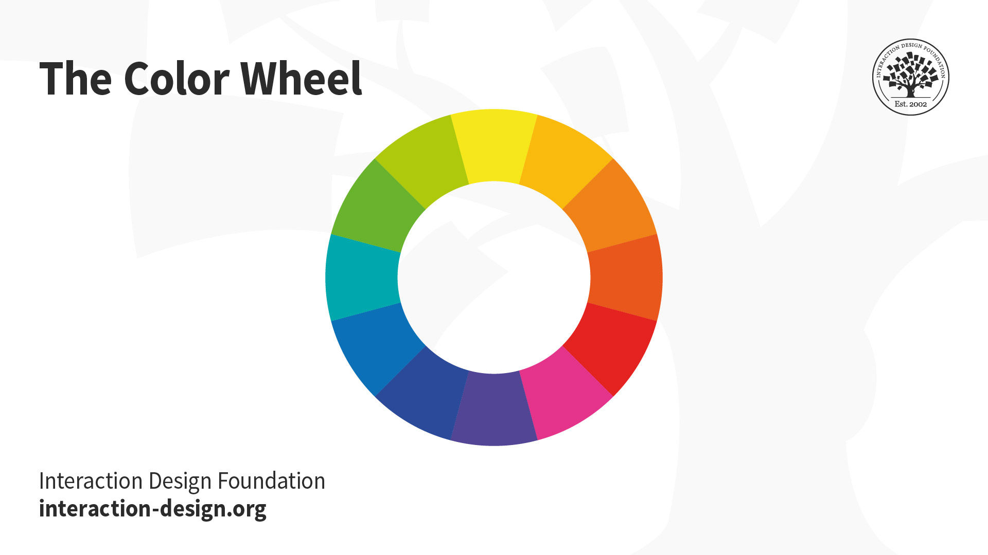
Sir Isaac Newton established color theory when he invented the color wheel in 1666. Newton understood colors as human perceptions—not absolute qualities—of wavelengths of light. By systematically categorizing colors, he defined three groups:

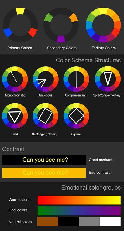
  1. Primary (red, blue, yellow).

  2. Secondary (mixes of primary colors).

  3. Tertiary (or intermediate—mixes of primary and secondary colors).

What Are Hue, Value and Saturation?
© Interaction Design Foundation, CC BY-SA 4.0

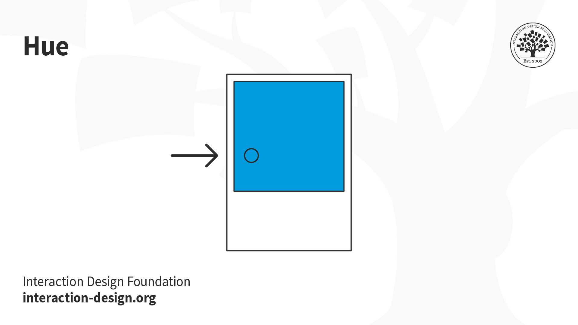
Hue is the attribute of color that distinguishes it as red, blue, green or any other specific color on the color wheel.
© Interaction Design Foundation, CC BY-SA 4.0

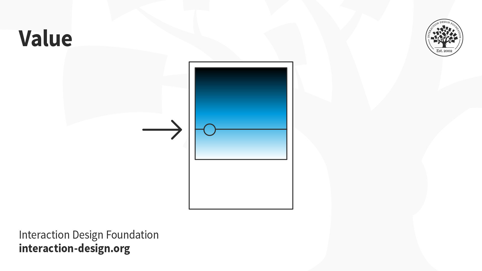
Value represents a color's relative lightness or darkness or grayscale and it’s crucial for creating contrast and depth in visual art.
© Interaction Design Foundation, CC BY-SA 4.0

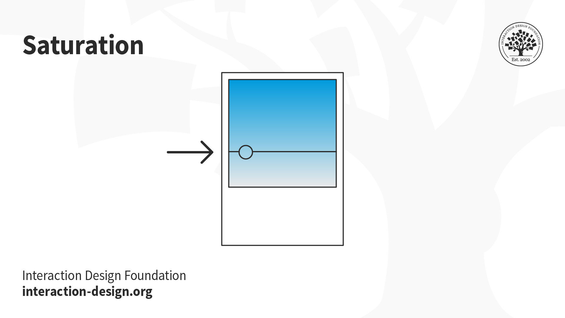
Saturation, also known as chroma or intensity, refers to the purity and vividness of a color, ranging from fully saturated (vibrant) to desaturated (grayed).

In user experience (UX) design, you need a firm grasp of color theory to craft harmonious, meaningful designs for your users.

Use a Color Scheme and Color Temperature for Design Harmony

In screen design, designers use the additive color model, where red, green and blue are the primary colors. Just as you need to place images and other elements in visual design strategically, your color choices should optimize your users’ experience in attractive interfaces with high usability. When starting your design process, you can consider using any of these main color schemes:
© Interaction Design Foundation, CC BY-SA 4.0

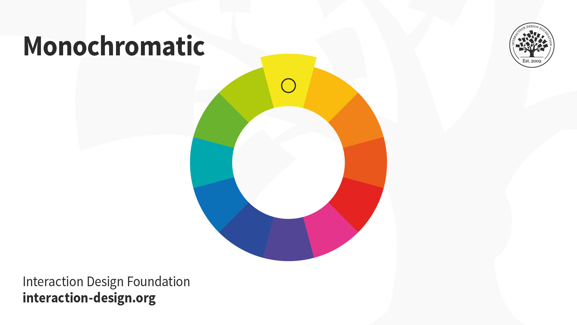
  • Monochromatic: Take one hue and create other elements from different shades and tints of it.
    © Interaction Design Foundation, CC BY-SA 4.0

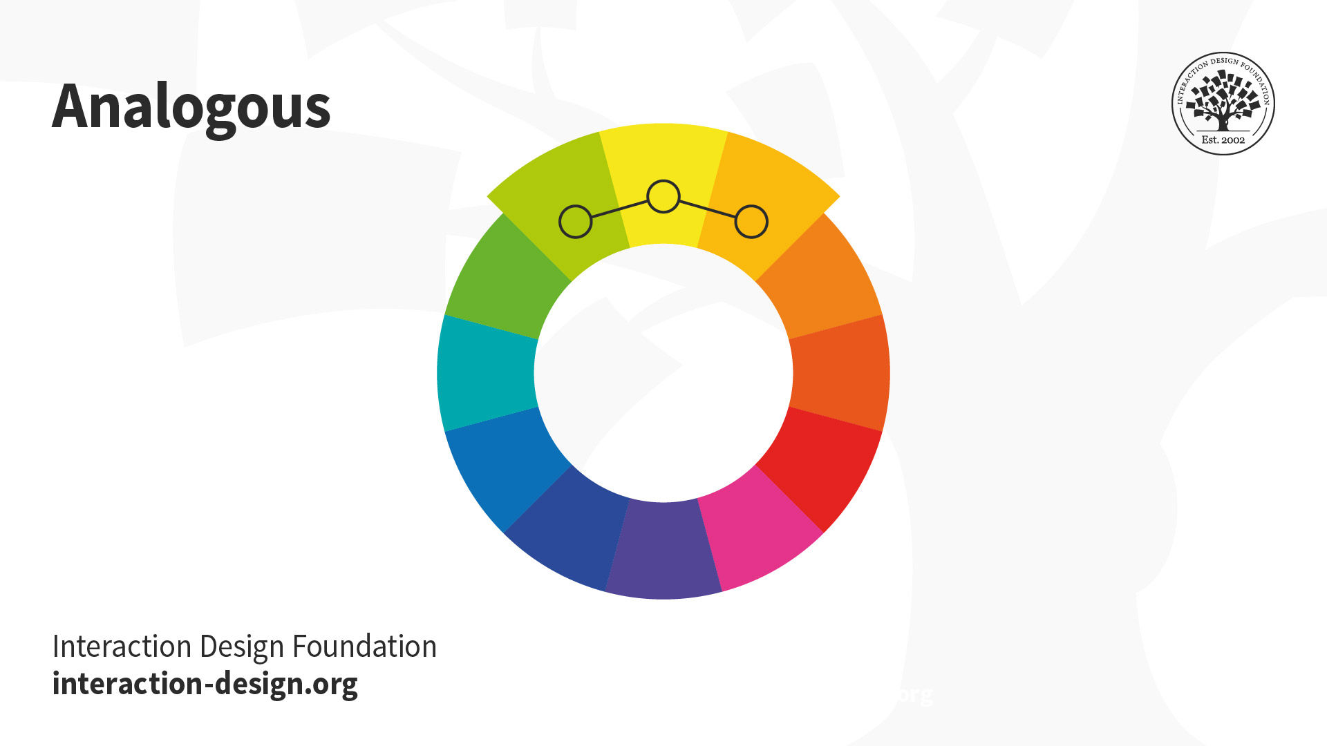
  • Analogous: Use three colors located beside one another on the color wheel (e.g., orange, yellow-orange and yellow to show sunlight). A variant is to mix white with these to form a “high-key” analogous color scheme (e.g., flames).
    © Interaction Design Foundation, CC BY-SA 4.0

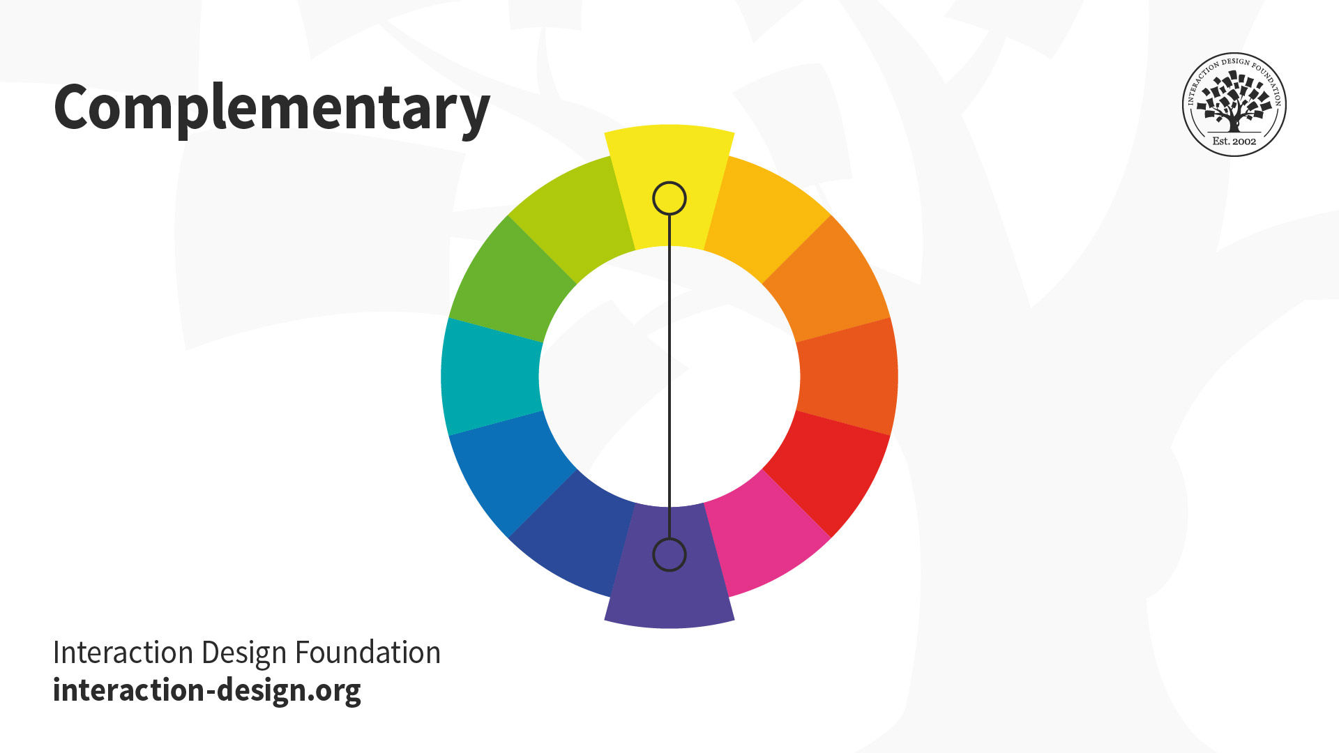
  • Complementary: Use “opposite color” pairs—e.g., blue/yellow—to maximize contrast.
    © Interaction Design Foundation, CC BY-SA 4.0

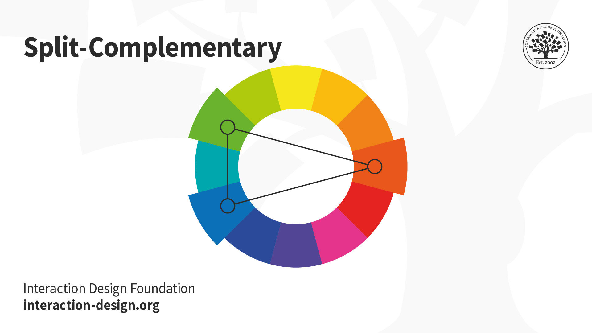
  • Split-Complementary (or Compound Harmony): Add colors from either side of your complementary color pair to soften the contrast.
    © Interaction Design Foundation, CC BY-SA 4.0

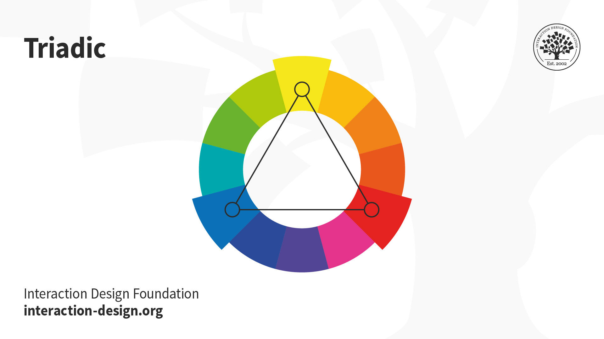
  • Triadic: Take three equally distant colors on the color wheel (i.e., 120° apart: e.g., red/blue/yellow). These colors may not be vibrant, but the scheme can be as it maintains harmony and high contrast. It’s easier to make visually appealing designs with this scheme than with a complementary scheme.
    © Interaction Design Foundation, CC BY-SA 4.0

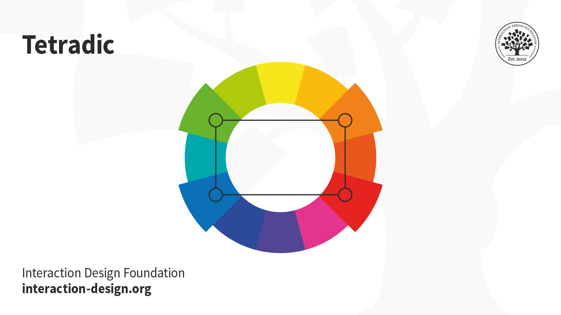
  • Tetradic: Take four colors that are two sets of complementary pairs (e.g., orange/yellow/blue/violet) and choose one dominant color. This allows rich, interesting designs. However, watch the balance between warm and cool colors.
    © Interaction Design Foundation, CC BY-SA 4.0

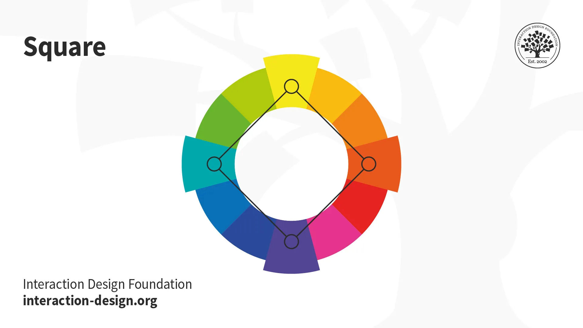
  • Square: A variant of tetradic; you find four colors evenly spaced on the color wheel (i.e., 90° apart). Unlike tetradic, square schemes can work well if you use all four colors evenly.

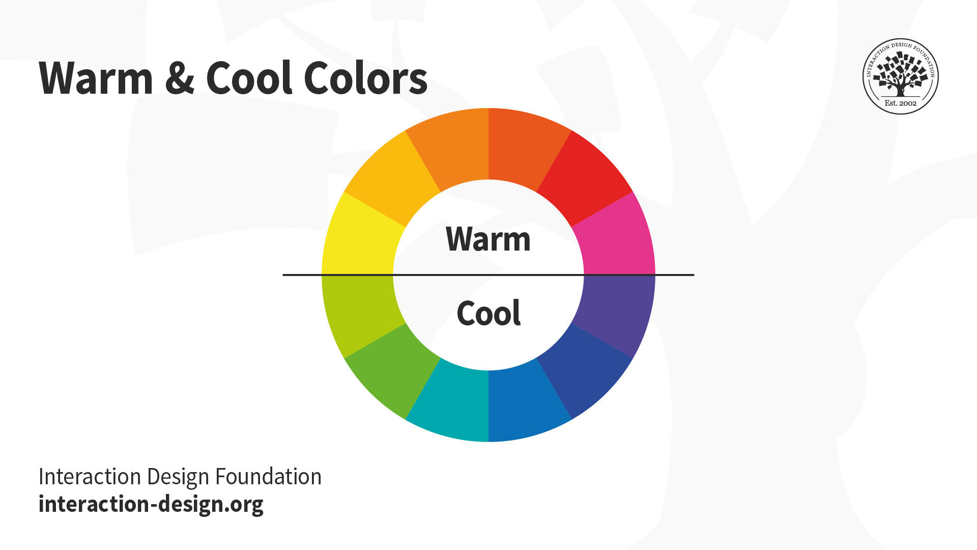
Your colors must reflect your design’s goal and the brand’s personality. You should also apply color theory to optimize a positive psychological impact on users. So, you should carefully determine how the color temperature (i.e., your use of warm, neutral and cool colors) reflects your message.
© Interaction Design Foundation, CC BY-SA 4.0

For example, you can make a neutral color such as grey warm or cool depending on factors such as your organization’s character and the industry.
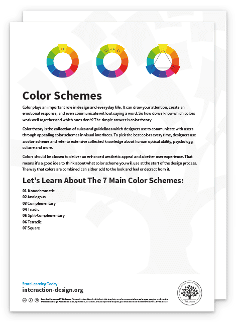
Advance Your Career With This Free Template for “Color Schemes”
Color Schemes
Optional
Optional
We respect your privacy
Get 1 powerful email each week: Learn Design and AI From the Best.

Use Color Theory to Match What Your Users Want to See

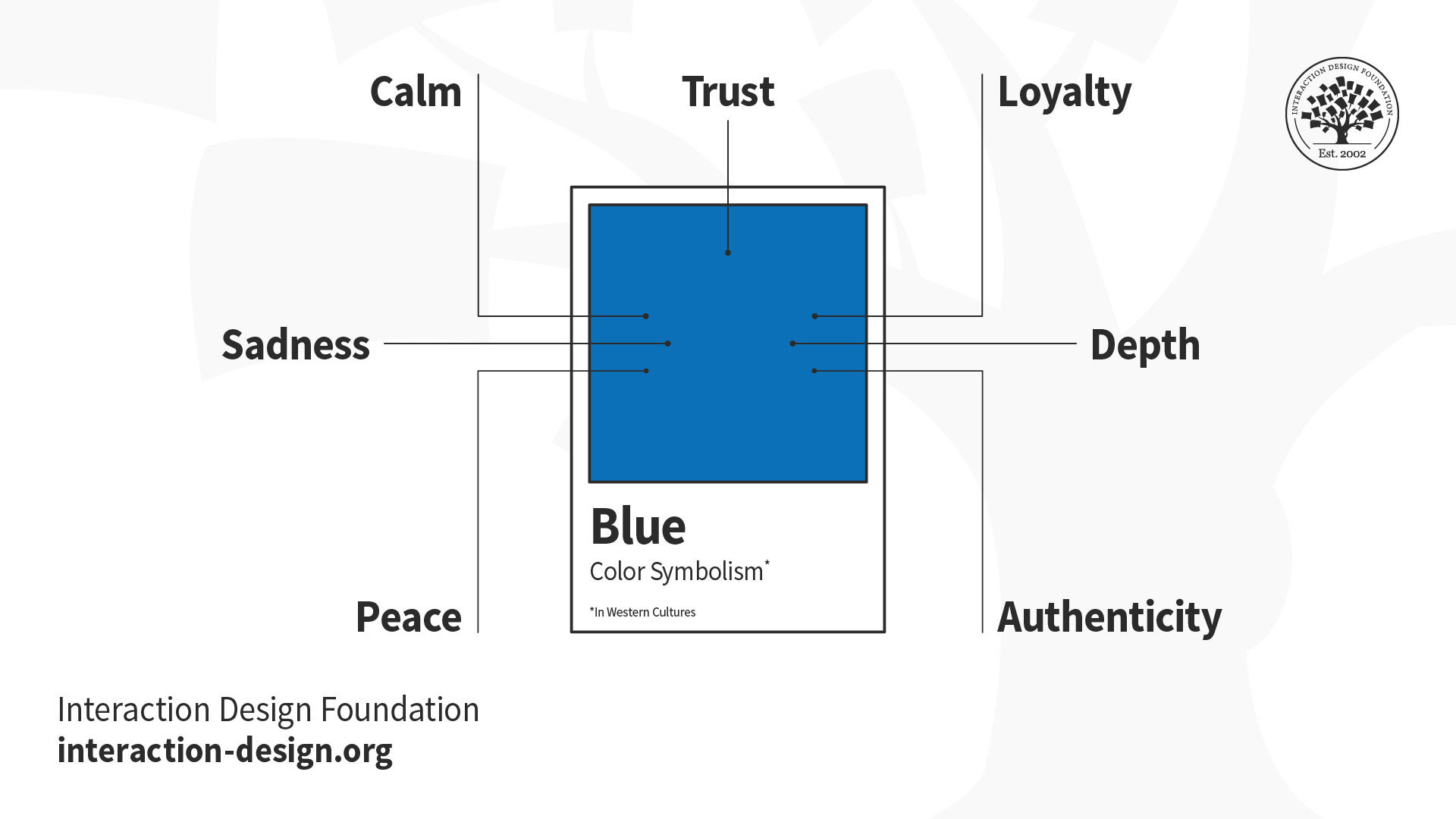
The right contrast is vital to catching users’ attention in the first place. The vibrancy you choose for your design is likewise crucial to provoking desired emotional responses from users. How they react to color choices depends on factors such as gender, experience, age and culture. In all cases, you should design for accessibility—e.g., regarding red-green color blindness. You can fine-tune color choices through UX research to resonate best with specific users. Your users will encounter your design with their expectations of what a design in a certain industry should look like. That’s why you must also design to meet your market’s expectations geographically. For example, blue, an industry standard for banking in the West, has positive associations in other cultures.
© Interaction Design Foundation, CC BY-SA 4.0

However, some colors can evoke contradictory feelings from certain nationalities (e.g., red: good fortune in China, mourning in South Africa, danger/sexiness in the USA). Overall, you should use usability testing to confirm your color choices.

Questions About Color Theory?
We've Got Answers!

What is color theory in art?

As an artist, it's important to have a solid understanding of color theory. This framework allows you to explore how colors interact and can be combined to achieve specific effects or reactions. It involves studying hues, tints, tones, and shades, as well as the color wheel and classifications of primary, secondary, and tertiary colors.

Illustration depicting the color wheel

The Color Wheel © Interaction Design Foundation, CC BY-SA 4.0

Complementary and analogous colors are also important concepts to understand, as they can be used to create stunning color combinations. Additionally, color theory delves into the psychological effects of color, which can greatly impact the aesthetic and emotional impact of your art. By utilizing color theory, you can make informed decisions about color choices in your work and create art that truly resonates with your audience.

How does color theory work?

Color theory is a concept used in visual arts and design that explains how colors interact with each other and how they can be combined to create certain feelings, moods, and reactions. Arielle Eckstut, co-author of 'What Is Color? 50 Questions and Answers on the Science of Color,' explains that color does not exist outside of our perception, and different brains process visual information differently. Our retina, a part of the brain, plays a crucial role in color vision, and our brains constantly take in information from the outside world to inform us about our surroundings.

Watch this video for a deeper understanding of the science behind color:

Transcript

How to learn color theory?

To learn color theory, enroll in the 'Visual Design: The Ultimate Guide' course on Interaction Design Foundation. This comprehensive course covers all aspects of visual design, including color theory. You will learn how colors interact with each other, how to combine them to create specific feelings and reactions, and how to use them effectively in your designs. 

The course includes video lectures, articles, and interactive exercises that will help you master color theory and other key concepts of visual design. Start your journey to becoming a color theory expert by signing up for the course today!

Why is color theory important?

Color theory helps us make sense of the world around us by providing a shorthand for using products, distinguishing objects, and interpreting information. For instance, colors can help us quickly identify pills in a bottle or different dosages.

Designers also consider cultural, personal, and biological influences on color perception to ensure the design communicates the right information. Ultimately, color helps us navigate the world safely, quickly, and with joy. Find out more about the significance of color in design by watching this video:

Transcript

How to use color theory?

To use color theory effectively, consider the following tips from Joann Eckstut, co-author of 'What Is Color? 50 Questions and Answers on the Science of Color, in this video:

Transcript

Understand the effect of light: Daylight constantly changes, affecting the colors we see. Changing the light source will change the color appearance of objects.

Consider the surroundings: Colors appear to change depending on the colors around them, a phenomenon known as simultaneous contrast.

Be aware of metamerism: Colors that match under one light source may not fit under another.

Remember that various factors such as light source and surrounding colors influence color, which is not a fixed entity. Being aware of these factors will prepare you to work effectively with color. Watch the full video for more insights and examples.

Who invented color theory?

Color theory, as we know it today, is a culmination of ideas developed over centuries by various artists and scientists. However, one key figure in its development is Sir Isaac Newton, who, in 1666, discovered the color spectrum by passing sunlight through a prism. He then arranged these colors in a closed loop, creating the first color wheel. Johann Wolfgang von Goethe later expanded on this with his book "Theory of Colours" in 1810, exploring the psychological effects of colors. 

Modern color theory has since evolved, incorporating principles from both Newton and Goethe, along with contributions from numerous other artists and researchers. To learn more about color theory, consider enrolling in the Visual Design - The Ultimate Guide course.

Is color theory hard?

Understanding color theory might seem daunting at first, but it is manageable.

It's advisable to start with fewer colors and gradually incorporate more as you become comfortable. Also, avoid color combinations like red mixed with saturated blue or green, and always test your colors for contrast and accessibility. Mastering color theory ultimately comes down to practice and observation. If it looks good, then it is good. For a comprehensive learning experience, consider enrolling in the Visual Design - The Ultimate Guide course on Interaction Design Foundation. Enroll now

Earn a Gift, Answer a Short Quiz!

1
2
3
4
1
2
3
4
Question 1
Question 2
Question 3
Get Your Gift

Question 1

What are the primary colors according to traditional color theory?

1 point towards your gift

  • Red, blue, green
  • Red, green, violet
  • Red, yellow, blue

Question 2

Why is an understanding of color theory crucial for UX design?

1 point towards your gift

  • It ensures that color use only conforms to brand guidelines.
  • It helps guarantee that designs are visually appealing but not necessarily functional.
  • It optimizes the visual and emotional impact of designs on the user.

Question 3

How do colors influence psychological responses in graphic design?

1 point towards your gift

  • Colors can evoke specific emotions and affect how users understand information.
  • Colors do not significantly impact the viewer’s emotions or perceptions.
  • Colors primarily function to make the design beautiful without influencing user interaction.

Learn More About Color Theory

Make learning as easy as watching Netflix: Learn more about Color Theory by taking the online IxDF Course Visual Design: The Ultimate Guide.

Why? Because design skills make you valuable. In any job. Any industry.

In This Course, You'll

  • Get excited to master the timeless principles behind great visual design and move from "This looks nice" to "I know why this design works and how I can bring that to my own work". Research from the University of Basel and Google has shown that people judge a design's visual appeal in as little as 17 to 50 milliseconds, long before they've read a single word. That split-second reaction is formed through our perception of visual elements like composition, contrast, and color, and it's something you can influence. In this course, you'll build a stronger eye for visual design and learn from legends like Ellen Lupton, author of the bestselling book "Thinking with Type". You'll start with the fundamental elements every strong composition relies on: line, shape, negative space, volume, value, color, and texture. From Bauhaus-era paintings to the Beethoven poster (1955) and the live MTA New York subway map (2020), you'll trace the impact of more than 100 years of iconic design, see how it continues to shape the visual world, and learn to apply that thinking to your own work. Whether you want to break into visual design or are a senior designer who wants to strengthen your fundamentals, this course gives you timeless, human-centered design skills you'll use for the rest of your career.

  • Make yourself invaluable when you can identify the invisible structure behind great design: how layouts guide the eye, typography creates tone, color carries meaning, and composition shapes what people notice first. These visual choices shape users' trust, emotion, and actions, which means they influence engagement, conversion, and revenue. AI has made it easier to produce visuals, but also easier to produce bad ones. With a strong foundation in visual design, you'll know the difference between what looks finished and what actually works. In this course, you'll learn practical skills you can apply immediately, like how to pair typefaces, use alignment to direct visual flow, choose color with cultural context and psychology in mind, and use grid systems to organize information across different media. By analyzing real-world designs, you'll break down what works, what doesn't, and why, so you build the habit of seeing and creating structure in everything. Whether it's websites, decks, apps, physical interfaces, or posters, you'll bring that trained eye to whatever lands on your desk next.

  • Gain confidence and credibility as you learn to articulate your design decisions without second-guessing yourself. You'll discover how type works, from its anatomy to kerning, leading, tracking, and hierarchy, and know how to talk about it precisely. You'll also be able to describe color choices in terms of theory, schemes, symbolism, and cultural context. When a client asks why you chose that typeface, color palette, or composition, you'll have a confident and clear answer that connects design choices to user behavior and business outcomes. Instead of saying "I like it" or "something feels off," you'll name the root problem and know how to fix it.

  • Craft a personal portfolio with optional hands-on activities and downloadable templates. You'll use grid systems, responsive layouts, typographic systems, sketching, journey mapping, and paper prototyping to explore ideas, organize information, and create stronger work across digital and print. By the end, you'll have portfolio pieces that show employers, clients, and collaborators your design expertise and be able to explain every choice with confidence.

Learn From Industry Leaders

Master complex skills with proven best practices and toolkits directly from industry leaders. Meet your experts for this course:

  • Mia Cinelli: Associate Professor of Art Studio and Digital Design at the University of Kentucky.

  • Joann Eckstut: Color Consultant, Founder of The Roomworks, and one of the 12 designers chosen by the Color Association of the USA to create the yearly forecast used by industries to keep up with color trends.

  • Arielle Eckstut: Author, Agent-at-large at the Levine Greenberg Rostan Literary Agency, and Co-Founder of The Book Doctors and LittleMissMatched.

Earn Industry-Recognized Certificates

Industry giants trust our courses to train their teams, and prestigious universities integrate our content into their curricula. Add your certificates to your LinkedIn profile, résumé, and job applications.

Our clients: IBM, Harvard University, University of Cambridge, NASA, Adobe, Stanford, Massachusetts Institute of Technology, LinkedIn
Course Certificate

All Free IxDF Articles on Color Theory

Read full article
The Key Elements & Principles of Visual Design - Article hero image

The Key Elements & Principles of Visual Design

Visual design is about creating and making the general aesthetics of a product consistent. To create the aesthetic style of a website or app, we work with fundamental elements of visual design, arranging them according to principles of design. These elements and principles together form the building

Social shares
1.4k
Published
Read Article
Read full article
UI Color Palette 2026: Best Practices, Tips, and Tricks for Designers - Article hero image

UI Color Palette 2026: Best Practices, Tips, and Tricks for Designers

Color is vital in UI (User Interface) design because not only does it enhance the aesthetics on screens, but it shapes the UX (User Experience), stirs emotions, and influences the decision-making of users who arrive on those screens. Color creates an impactful dialog between what you design for your

Social shares
1.2k
Published
Read Article
Read full article
Everything You Need To Know About Triadic Colors - Article hero image

Everything You Need To Know About Triadic Colors

Here’s a handy statistic that’s worth remembering: over 60% of people accept or reject new products based on color, and that’s a figure you can think about when you consider the link between colors and products—like, for instance, whenever you think of Coca-Cola, you’ll likely think of red, or McDon

Social shares
1.2k
Published
Read Article
Read full article
Complementary Colors: The Ultimate Guide in 2026 - Article hero image

Complementary Colors: The Ultimate Guide in 2026

Part of the magic of how colors work together in impressive designs lies in the art of color selection. Designers often use complementary colors to craft visually appealing and efficient UX (User Experience). Complementary colors sit on the opposite ends of the color wheel, such as orange and blue,

Social shares
1.1k
Published
Read Article
Read full article
Recalling Color Theory Keywords: a way to refresh your memories! - Article hero image

Recalling Color Theory Keywords: a way to refresh your memories!

Choosing the best combination of colors for an interactive design layout is not, as it may appear, a guessing game. Knowing which ones to use will save you time (and headaches). Getting it right will also keep your users connected.Since the early days of art and design, the use of color has followed

Social shares
1.1k
Published
Read Article
Read full article
Dressing Up Your UI with Colors That Fit - Article hero image

Dressing Up Your UI with Colors That Fit

As designers, we have a powerful ally in color. It can let us work towards a number of different goals. You can use it to reinforce or highlight an idea, to provoke an emotional response from the user or to draw attention to a specific part of your website. This is, of course, in addition to making

Social shares
853
Published
Read Article

Recalling Color Theory Keywords: a way to refresh your memories!

Recalling Color Theory Keywords: a way to refresh your memories!

Choosing the best combination of colors for an interactive design layout is not, as it may appear, a guessing game. Knowing which ones to use will save you time (and headaches). Getting it right will also keep your users connected.

Since the early days of art and design, the use of color has followed many rules and guidelines, which are collectively known as color theory.

A color scheme is one of the first elements to communicate the message behind the design on both visual and psychological levels. In fact, the color scheme is one of the most important elements; this is because, when used correctly, color can reflect the niche and even the overall business marketing strategy.

In this article, we will briefly review different color classifications to refresh your memory about those graphic design classes you took at University. We’re sure that the content will both ring a bell and inspire your creativity.

The Color Wheel

The relationship between colors can be shown through use of the color wheel.

The color wheel shows links between different colors based on the red, yellow, and blue content of each color. It was first developed by Sir Isaac Newton in 1666.


Author/Copyright holder: Maximkaaa. Copyright terms and licence: Public Domain

The color wheel’s most useful and most commonly used variant is shown in the image above, which includes red, red-orange, orange, orange-yellow, yellow, yellow-green, green, green-blue, blue, blue-purple, purple, and purple-red combinations. (Stone, 2008).

Bleicher (2011) stated that the color wheel can be categorized into three main types of colors based on the combination of base colors used to create the final color, as follows:

  • Primary colors - yellow, red, and blue. These are basic colors that cannot be broken down into any simpler colors.

  • Secondary colors - these are created by mixing two primary colors. The secondary colors are orange, green, and purple. Mixing yellow and red creates orange; mixing blue and yellow creates green, and mixing blue and red creates purple.

  • Intermediate or tertiary colors are created by mixing both primary and secondary colors to form a hybrid, such as yellow-orange, red-orange, red-purple, blue-purple, blue-green, and yellow-green. On a larger color wheel than the one shown above, a mix between intermediate, secondary, and primary colors would create quaternary colors.

A thorough understanding of the color wheel and the relationship between colors enables designers to understand color better and know how to choose colors for their designs. We’ll come to this shortly.

Achieving Harmony in Color

Colors should be chosen to deliver an enhanced aesthetic appeal and a better user experience. That means it’s a good idea to think about what color scheme you will use at the start of the design process. The way that colors are combined can either add to the look and feel or detract from it.


Author/Copyright holder: Unknown. Copyright terms and licence: Unknown

According to Bleicher (2011), there are five main color schemes (and some combinations and variants of these schemes) that allow designers to achieve harmony in their designs:

Monochromatic Scheme

The monochromatic scheme is based on the colors created from different tints (created by adding black or white to the original color), tones, and shades of one hue. In theory, it’s the simplest of all the schemes. A monochromatic scheme is commonly used in minimal designs because one hue should result in a less distracting layout.

On the other hand, this scheme means that you cannot use multiple colors to help with visualizing information in the User Interface (UI). That is the only price of simplicity.

Analogous Color Scheme

The analogous scheme is based on three colors located next to each other on the color wheel (e.g., red, red-orange, and red-violet). This scheme can easily be found in nature – just think of trees in the autumn as the leaves change color.

There is a variant on this scheme, the “high-key” analogous color scheme. It’s achieved by mixing your analogous shades with white. This version is commonly found in impressionist art – particularly early impressionist art. The effect achieved is one where the colors seem to “shimmer” and “blur” into each other – when viewed from a distance, it can create the illusion that only a single color is in use.

Complementary Schemes

Complementary color schemes use one (or more) pairs of colors that, when combined, “cancel each other out”. For example, when you combine the two colors, they produce white or black (or something very similar from the gray-scale). For that reason, this scheme is also known as the “opposite color” scheme.

When you put two complementary colors next to each other, they show the greatest contrast. In modern color theory, the pairs are red/cyan, green/magenta, and blue/yellow.

Split-Complementary (occasionally “Compound Harmony”) Scheme

This is a combination of using the complementary color scheme and the analogous color scheme. In essence, complementary colors are chosen and then the colors on either side of them on the color wheel are also used in the design. It’s considered to soften the impact of a complementary color scheme, which can, in some situations, be too bold or too harsh on the viewer’s eye.

Triadic

The triadic scheme is based on using three colors at equal distances from each other on the color wheel. The easiest way to find a triadic scheme is to put an equilateral triangle on the wheel so that each corner touches one color. The three colors will be exactly 120° from each other.

These schemes are considered to be vibrant (even when the hues themselves are not) – they keep the harmony but deliver a high level of visual contrast. You can find triadic schemes in a lot of art as it’s easier to deliver a pleasing visual result with a triadic scheme than when using a complementary scheme.

Tetradic

Tetradic schemes utilize two sets of complementary pairs: four colors. These can create very interesting visual experiences, but they are hard to keep in balance. Why? It’s because one color of a tetradic scheme needs to dominate the other colors without completely overwhelming them. An equal amount of each color often leads to a very awkward look, the last thing you want your users to see.

Square (A Variant of Tetradic)

The square scheme is a variant of the tetradic scheme. Instead of choosing two complementary pairs, you place a square on the color wheel and choose the colors that lie on its corners. Therefore, you’ll find four colors that are evenly spaced at 90° from each other. Unlike the tetradic color scheme, this approach often works best when all the colors are evenly used throughout the design.

Color Temperature

Colors can be used to convey emotive content as well as assist with the look and feel of your website. We’re talking about moving people now, evoking passions and feelings in our users. It’s worth noting at this point that people’s culture, gender, experiences, etc. will also affect the way that colors resonate with them and that user research is a better indicator of emotional response to color than the following guidelines based on the color wheel. For instance, did you know that, in China, red is common because it represents happiness and prosperity, but white is considered funerary or representing misfortune? Also, Chinese culture has a unique color – qing – which is a sort of bluish-green gray, or “grue”. In Greece, yellow conveys notions of sadness, while red conveys such notions in South Africa. Color is a big issue in how people from different parts of the world will interpret your design. A little research goes a long way.

However, if you want to follow the color wheel approach, there are three indicators of color temperature: “warm” and “cool” and “neutral”:

  • Warm colors–These are colors located on the half of the color wheel that includes yellow, orange, and red. These colors are said to reflect feelings such as passion, power, happiness, and energy.

  • Cool colors– These are colors located on the other side of the color wheel, including green, blue, and purple. Cool colors are said to reflect calmness, meditation, and soothing impressions.

  • Neutral Colors – These are not said to reflect any particular emotions. These colors include gray, brown, white, and black.

Your choice of color categories will depend on what you are trying to achieve with your website. You should always, wherever possible, test your color palettes with your users to be sure that the choices you have made reflect their realities. It’s almost always easier to set and test a color palette early in the development process than at the end. Apart from anything else, it can save you valuable time.

The Take Away

Color is clearly an important part of a design’s aesthetic appeal. Basing your color palette on one of the existing color schemes can make it easier to strike the right balance from the start.

The Color Wheel is a fundamental tool, created by Sir Isaac Newton in 1666. In it, we find:

  • Primary colors

  • Secondary colors

  • Intermediate or Tertiary colors

We should aim to fine-tune our choice of colors to create maximum harmony, considering the following at the same time in order to pick the most appropriate scheme:

  • Monochromatic scheme

  • Analogous Color scheme

  • Complementary schemes

  • Split-Complementary (Compound Harmony) scheme

  • Triadic

  • Tetradic

  • Square

Color Temperature is another vital consideration; it’s the part that can strike chords in people and make them passionate about our work. You should always do user testing of color schemes, if possible, and ideally at the start of the design process. Also, always keep in mind that colors have many cultural connotations, so make sure that you’re aware of them!

On the other hand, remember that you should not convey meaning only with color. About 8% of people – mostly men –are color blind, and color is not always accessible. Even so, color is a tool that can enhance the other elements of your design. Consider it a large ingredient that can bring your work to life and engage your users, making them care more about your product, service or message.

Where To Learn More

Reference

Hero Image: Author/Copyright holder: George Field. Copyright terms and licence: Public Domain.

39% of Today's Skills Will Change by 2030

The World Economic Forum expects 39% of today's skills to be transformed or become outdated by 2030.

The good news is that jobs in UX / UI design and AI are among the fastest-growing professions globally.

Build Skills That Keep You Relevant

Privacy Settings

By using this site, you accept our Cookie Policy and Terms of Use.
Customize
Accept all

Be the One Who Inspires

People remember who shares great ideas.

Share on:

Academic Credibility — On Autopilot

Don't waste time googling citation formats. Just copy, paste and look legit in seconds.