Tree Diagrams

Your constantly-updated definition of Tree Diagrams and collection of videos and articles.
Be a conversation starter: Share this page and inspire others!

105 Shares
Save

Get 1 Powerful Email Each Week

Join 313,907 subscribers.

What are Tree Diagrams?

Tree diagrams are a common form of information visualization.

You can use a tree diagram to represent hierarchical data. Each node or element is related to the next through the principle of containment. When any two elements are equal on the hierarchy, they are "sibling" entities.

The tree diagram's hierarchy begins with the first node, commonly referred to as the "root entity". From there, relating "child" entities branch out.

Learn More About Tree Diagrams

Make learning as easy as watching Netflix: Learn more about Tree Diagrams by taking the online IxDF Course Information Visualization.

Why? Because design skills make you valuable. In any job. Any industry.

In This Course, You'll

  • Get excited to turn complex, hard-to-read data into clear visuals your team, clients, and stakeholders can understand and act on. According to the International Data Corporation, the world now generates well over 170 zettabytes of data a year. That’s more than 450 million terabytes every single day, and the figure keeps climbing. Big data and AI now let us find and access more than ever before, but all of that is only useful if we can make sense of it. Most people assume data work means heavy math and they count themselves out, but this course gives you a simple framework to turn raw data into visuals people instantly grasp, use them to drive decisions, and prove they actually work. No technical background needed. You already visualize information every day, like sketching a diagram to explain an idea or highlighting important points in a presentation. Whether you work in journalism, marketing, research, UX, or another field, this course will help you communicate complicated ideas quickly and clearly.

  • Make yourself invaluable as the professional who turns confusion into clarity. Anyone can make a chart, but few can design one that makes a situation instantly clear and drives a decision. In this course you'll learn Riccardo Mazza's five-step design framework, and work from defining the problem and the data, to choosing dimensions, mapping the underlying structure, and setting the right level of interaction. From there you'll master visual mapping, the deliberate pairing of data attributes with visual properties, and learn to represent everything from a single variable through multivariate data and hierarchies, using tools like concept maps and mind maps. You'll work with the three levels of interaction (static, transformable, and manipulable), so you can build anything from a fixed infographic to a model users explore for themselves. By the end, you'll have a repeatable process for turning any kind of data into a visualization that's clear and actionable.

  • Gain confidence and credibility as you learn to design using the science of human perception. MIT neuroscientists found the brain can process an entire image in as little as 13 milliseconds, far faster than it reads words or numbers. You'll see how vision and memory work. Then put them to use as you apply the Gestalt laws of grouping and preattentive attributes (the colors, shapes, and positions the brain registers first) so your visuals are understood at a glance. But fast doesn't mean accurate, and a visual can just as quickly send the wrong message. That's why you'll learn to test your work with real users, through heuristic evaluations, cognitive walkthroughs, interviews, and focus groups, so you can confirm whether it’s perceived the way you intended. You won't just hope your visualizations work, you'll know they do, and so will everyone who sees them.

Learn From Industry Leaders

Master complex skills with proven best practices and toolkits directly from industry leaders. Meet your expert for this course:

  • Alan Dix: Author of the bestselling book “Human-Computer Interaction” and Director of the Computational Foundry at Swansea University.

Earn Industry-Recognized Certificates

Industry giants trust our courses to train their teams, and prestigious universities integrate our content into their curricula. Add your certificates to your LinkedIn profile, résumé, and job applications.

Our clients: IBM, Harvard University, University of Cambridge, NASA, Adobe, Stanford, Massachusetts Institute of Technology, LinkedIn
Course Certificate

All Free IxDF Articles on Tree Diagrams

Read full article
How to Show Hierarchical Data with Information Visualization - Article hero image

How to Show Hierarchical Data with Information Visualization

Hierarchical data is essentially a specialized form of network data – in that while entities within the dataset do not have dependent relationships; they are all related to each other by the principle of containment. They, unlike standard data networks, do not use the principle of connection.A hiera

Social shares
856
Published
Read Article

How to Show Hierarchical Data with Information Visualization

How to Show Hierarchical Data with Information Visualization

Hierarchical data is essentially a specialized form of network data – in that while entities within the dataset do not have dependent relationships; they are all related to each other by the principle of containment. They, unlike standard data networks, do not use the principle of connection.

A hierarchy begins with a root entity. This might be the CEO of a company, the name of a book, the title of a folder, etc. and then the root entity has at least one “child node” and every further child node has zero or more children.

An entity which comes below another is a child node to the entity above. Similarly, an entity which comes above another is a parent node to the node below.

Hierarchical data is shown in tree graphs; so called because of their similarity to a tree’s structure (though a tree which has been turned upside down so that the root is at the top and the branches form below it).
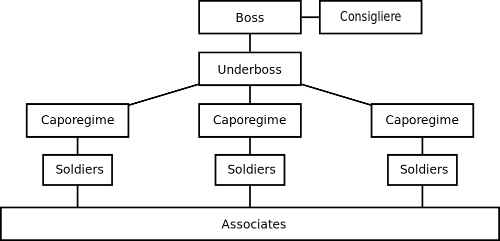
Author/Copyright holder: MaEr. Copyright terms and licence: Public Domain.

Above we see a simple tree diagram for the structure of a mafia family. The root entity is the boss of the family and the underboss is the first child entity. This is a very basic hierarchical relationship and it is possible to map much more complex hierarchies using information visualization techniques.

This diagram also includes a “sibling node” in the form of a consigliere who is not the boss of the organization but whose authority is equal to that of the boss.

The term “tree diagram” was coined by Noam Chomsky in his 1965 work; Aspects of the Theory of Syntax.

1. The File and Folder System

One of the most common hierarchies, which many of us deal with daily, is the computer file system. There is a root directory which then has a selection of child folders, which in turn have child folders, and in some or all of these folders there are files to be found.

The file tree is normally rendered in a visual format by the operating system. To provide a certain level of familiarity it uses images of the classic paper folder to connect the viewer with the property of the abstract file system used on the disc drive. This tree is interactive in nature and clicking on any given folder enables the user to determine what is inside that folder. However, it is also possible to use the command shell of an operating system to present this information textually too.

The Windows file system above is essentially a hierarchical tree and one with which many of us are already incredibly familiar with.

2. Cone Tree Diagram

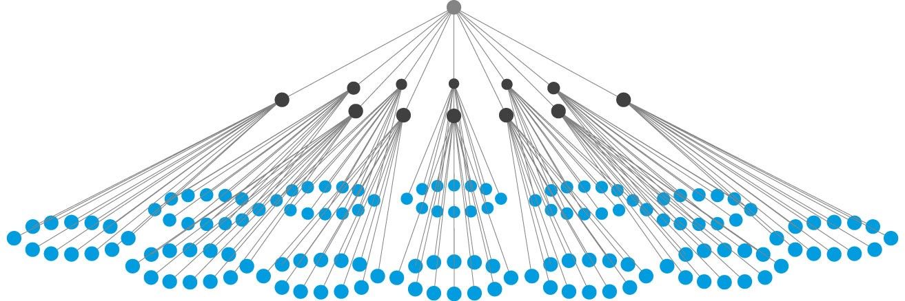
A cone tree is a 3-D hierarchy model which was developed at Xerox PARC in the 1990s. It was designed to enable the representation of hierarchies with large multiples of nodes. The 3D means that the physical limitations of displaying complexity on a flat screen can, to some extent, be overcome.

It works by beginning with a root node and then arranging all the child nodes of that root equidistant from the parent. This forms a cone with some transparency. The process is then performed again and again for each set of child nodes and the diameter of the cone is reduced at each level of the hierarchy.

In general cone tree diagrams are generated using software which enables interactivity and a useful property of these diagrams is the ability to rotate them so that a particular child is occluded (hidden) by another child.

You can also get an idea of the numbers of child entities on any parent simply by observing the density of shading on any given cone. (The edges used to define the cone are properties of the children).
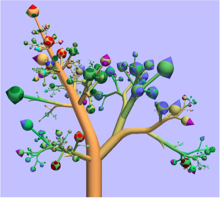
3. The Botanical Tree Diagram

The botanical tree diagram was invented by researchers at Eindhoven University of Technology in the Netherlands. They had noticed that the limitation of tree diagrams was that they can quickly become too complex to be functional and then they noticed that real trees had leaves. They also saw that it didn’t matter how many leaves and branches there were on a tree – these were always distinct entities visually. So they extended the concept of tree diagrams by adding leaves and branches.

4. The Treemap Diagram

The treemap was invented by Ben Shneiderman of the University of Maryland in 1990. It represents hierarchies by using all the available space and in the form of nested rectangles.

The rectangles can be defined in proportion to the “space” that they take up within the data set. These information visualizations can be very useful for comparing nodes and see patterns within them.

The math involved to create a treemap is quite complex but the good news is that you don’t have to do that math; there are plenty of software packages available that can do this for you.
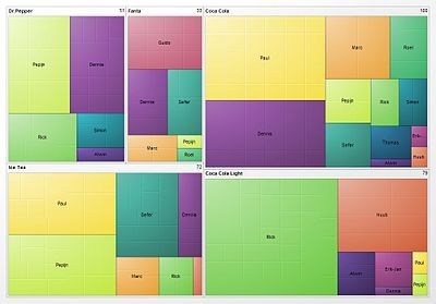
Above is a treemap of market share for different soft drinks. Comparing Coke, Coke Light, Ice Tea, Fanta and Dr. Pepper.

When Al Shalloway, the founder and CEO of Net Objectives, said; “Visualizations act as a campfire around which we gather to tell stories.” we wonder if he had envisioned such complex stories?

The Take Away

Representing hierarchical information is quite straightforward; in the majority of cases the information designer will either use a tree diagram (or a variant of a tree diagram) or a treemap to display the data in an efficient format for the user.

References & Where to Learn More:

Botanical Visualization of Huge Hierarchies

Learn about Ben Shneiderman.

Hero Image: Author/Copyright holder: Jurgen Appelo. Copyright terms and licence: CC BY 2.0

39% of Today's Skills Will Change by 2030

The World Economic Forum expects 39% of today's skills to be transformed or become outdated by 2030.

The good news is that jobs in UX / UI design and AI are among the fastest-growing professions globally.

Build Skills That Keep You Relevant

Privacy Settings

By using this site, you accept our Cookie Policy and Terms of Use.
Customize
Accept all

Be the One Who Inspires

People remember who shares great ideas.

Share on:

Academic Credibility — On Autopilot

Don't waste time googling citation formats. Just copy, paste and look legit in seconds.