Information Visualization – A Brief Introduction
- 869 shares
- 5 years ago
Information visualization is the process of representing data in a visual and meaningful way so that a user can better understand it. The principles of information visualization guide how to turn data into visuals that reveal meaning, guide attention, and support decisions. They show you how to structure, simplify, and highlight information so users and audiences can find patterns, understand context, and act on insights with speed and confidence in a well-presented, relatable source of truth.
Explore valuable points about showing meaningful information to present your target audiences with, in this video with William Hudson: User Experience Strategist and Founder of Syntagm Ltd.
We live in an information-saturated world, with countless screens constantly updating to reflect wave after wave after wave of new information for millions of people every moment. Whenever people reach for a mobile phone, turn on a desktop, or attend a presentation, sooner or later something will be on show for them to consume.
However, users on their phones or computers or audience members at a presentation will have a difficult task if all they find is raw information or data. Numbers can make sense “in the wild” to some specialists who have the training and the eye to “decode” them. However, what about those who can’t: the people who need a frame of reference or clearly introduced, well-presented visuals of what they need to know and why they should care? The reality is that humans make better decisions when they can see the story in the data.
That is the promise of information visualization done well. When you apply a few reliable principles, people can find meaning faster in your product and stay engaged with your slides. You can reach for practical patterns which you can reuse in dashboards, product screens, and talks, along with simple checks to help you keep your visuals clear, credible, and audience-friendly. Impact and responsiveness depend on this.
More specifically, what helps you and your target audience is a group of benefits of information visualization:
Good visuals cut down on reading and hunting; a picture really can be worth a thousand words. You help people think clearly when you show information clearly. People can grasp the point and act sooner when it’s served up well, right there.
When you show a clean structure, honest scales, and clear labels, you signal rigor and that you know your material. That confidence makes collaboration easier and can help win over a roomful of stakeholders who see and get what’s important.
Get more from how you present carefully crafted information to your target audiences in live presentations through trust frameworks, in this video with Morgane Peng, Managing Director, Global Head of Product Design and AI Transformation.
People remember images and structure better than they remember dense text. A strong headline that leads into a relatable meaning and a clear next step turn insight into decision, slashing the TL;DR (“too long; didn’t read”) risk of an ignored wall of facts.
Visuals help cross-functional teams talk about the same thing and stay interested. They reduce ambiguity and keep meetings on track. Information visualization turns numbers, categories, and relationships into visual form so you can spot patterns, compare items, and see change over time. Among UX (user experience) design teams and other stakeholders, it may be a simple sparkline or a full analytics view. In UX presentations and other types of public speaking, it includes charts, diagrams, and annotated screenshots. In both settings you want the right people to understand the right message at the right moment, and then take the next step on board with you.
In presentations, you can deliver the right amount of information to suit the purpose of each point and stage your message so the audience follows your flow, rather than racing ahead or tuning out. Take time as your ally and pace your presentation with well-explained visuals that do the job required.
“Graphical excellence is that which gives to the viewer the greatest number of ideas in the shortest time with the least ink in the smallest space.”
― Edward R. Tufte, Statistician and Professor Emeritus of Political Science, Statistics, and Computer Science at Yale University, from The Visual Display of Quantitative Information
You have these four principles, which combine well-supported concepts from human-computer interaction (HCI), perception, and presentation practice, to help in digital products and in slides.
Define the decision and the target audience before you draw or generate a visual. Every visual should answer a specific question for a specific person, and so you’ll want to match the visual to the question or point you are making.
Write the question in plain language and then choose the least complicated visual that answers it.
In UX (user experience) design: A sorted bar chart beats a radial chart for category comparison. A simple trend with a threshold line beats a dense multi-metric mashup when someone needs to spot something like churn risk. You want to invite exploration where it helps, and hide detail when it distracts.
On slides: Replace vague titles with headline conclusions. If the question is “Did the new onboarding help?” a useful title is “Onboarding change cut support tickets by 22 percent.”
Match data to the right marks and keep scales honest. Position on a shared axis is more precise than angle or area for comparison; people can get their minds around the realities you’re delivering to them when they see data visualized well.
In UX design: Use bars for categories, lines for time. Start bar axes at zero. Be careful with pie charts; use pies only for a few parts of a whole when a rough share is enough.
On slides: If you tighten a y-axis (the vertical axis) to show small changes, explain why. Avoid 3D and perspective since they’ll distort values.
Use a fact about perception to your advantage regarding position and alignment. People compare aligned values more accurately than angles or areas, and if they can compare accurately, they can trust you more.
Guide the eye with structure: a strong visual hierarchy will do the job and help reduce cognitive load. Create one clear entry point and then clear levels. Use size, weight, alignment, spacing, and restrained color. A single saturated color can call attention to the key mark you want people to see in a structure they’ll recognize.
In UX design: Give each view a dominant key performance indicator (KPI) with a clear label. Group related metrics and keep headings consistent.
On slides: Lead with a strong headline. Stage supporting visuals so they don’t tidal-wave at viewers’ eyes all at once. Add short annotations for peaks, troughs, and thresholds.
You want to make the best use of preattentive features to draw your audience to the point on the screen. Size, color, orientation, and simple motion pop out fast; use one to highlight the key point.
Secure a strong grasp of what KPIs are and why they matter to various audiences, in this video with Vitaly Friedman, Senior UX Consultant, European Parliament, and Creative Lead, Smashing Magazine
Another tool you can use to great effect is Gestalt grouping. Gestalt psychology suggests (and viewers’ eyes can confirm) that proximity, similarity, and connection form structure. Tight space within groups and generous space between groups signal logic, which helps viewers digest data and trust you at the same time.
Secure a greater grasp of Gestalt principles with this video from Mia Cinelli, Associate Professor of Art Studio and Digital Design, University of Kentucky.
Reveal detail when it helps and hide it when it distracts.
In UX design: Begin with an overview. Let your target audience filter or drill down, themselves. Keep controls simple and visible, vital for an intuitive experience.
On slides: Reveal one step at a time so your voice and the visual stay in sync. If you’re using animations, they should support the story, not show off effects.
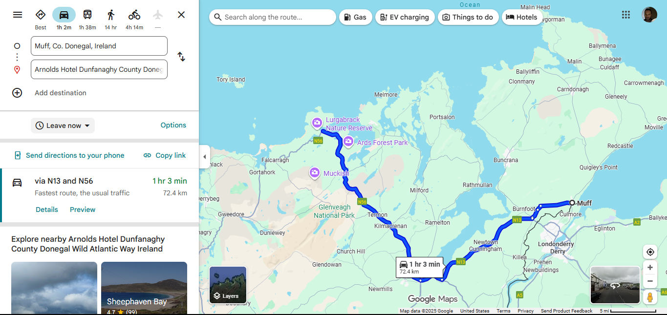
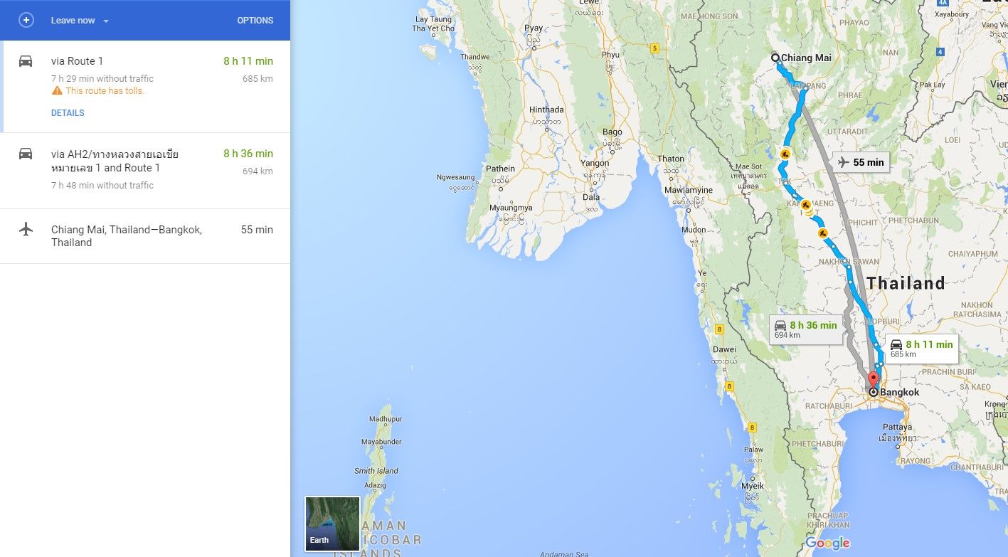
Two ways to capture the information: straightforward driving directions and a map with potential places of interest to perhaps call in at on the way or check out later.
© Google, Fair use
Whether the target audience is users on mobile screens or viewers in your presentation, try this playbook to design for screens in a way where you can command attention and get results.
Write the question or decision and the audience. Capture the question you want to ask or the decision you want to support and who will make it. Determine what needs to be meaningful to them and why; have this totally clear, and it’s where a stakeholder map comes in extremely handy.
Discover how to get a clear idea of who needs to know what when you have to present to audiences, using a stakeholder map, in this video with Morgane Peng.
Write a meaningful title. State the take-away, not the topic. For example, don’t put, “Results”; instead, put: “Checkout completion rose 12 percent this quarter.” Strong headlines carry real information and set expectations for both users and audiences.
Include the right level of detail. Meet people at their level of interest and knowledge base. Give executives outcomes and impact: the bottom-line material. Give practitioners the diagnostics they need. Give users what they need to know so they can make solid decisions in the moment and without confusion, and they’ll be able to trust more in a brand that proves empathy with them.
Explore why empathy is key in any design and how to build it, in this video.
Choose for the task, not for novelty or show. For example, business stakeholders will tend to want the “short version.” Users on their phones will also tend to prefer a quick view of results, such as a pie chart to show simple spending habits on a banking app. Here are some examples of which chart to use for which purpose:
To compare categories, use sorted bar charts. Use horizontal bars for long labels.
For change over time, use line charts for continuous data. Keep gridlines light and mark key events sparingly.
For part to whole, use stacked bars for accurate comparisons across categories. Pies are helpful only when there are a few slices and rough proportions are fine.
For distribution, use histograms, box plots, or dot plots to reveal spread and outliers.
For relationships, use scatterplots to show correlation; add a simple trend line if it clarifies.
Try this fast test to see which information visualization method might work best. Sketch two options and then ask a colleague to answer the main question in ten seconds, such as “How many users are we losing to churn since this new feature came out?”. Choose the one that gives the answer fastest and makes it most accurate.
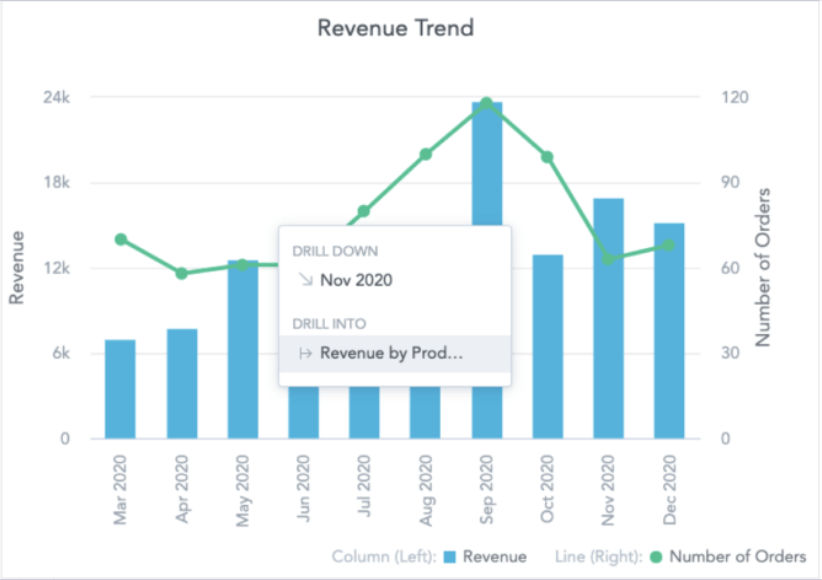
The numbers clearly show what’s going on, especially a good September for the brand.
© GoodData, Fair use
Now it’s time to try your visualization choice, so:
Start on paper and explore layout and sequencing before you commit.
Build the simplest working version of, for example, a chart and add only what improves comprehension.
Use progressive disclosure. In product design, show an overview and let users drill in for more features or detail when they need them. In public speaking and talks, reveal content step by step so people follow your voice instead of reading ahead.
Peak at the power of progressive disclosure in this video.
Make the important thing the most visible thing with a strong visual hierarchy.
Explore how to get a good visual hierarchy working for you and helping get audiences on board with what you want them to see, in this video.
Use one clear entry point. Lead with the key KPI or the headline.
Levels that read instantly. Keep spacing between title and content larger than spacing between paragraphs.
Group related items. Proximity signals structure and a confident designer or presenter. Pair proximity with similarity and visual alignment to help audiences scan even faster.
Use color sparingly. Fix the structure first and then use color to code categories or to highlight what matters.
Direct labels typically beat legends. Place labels near marks to reduce eye travel; if audiences have to keep looking from place to place, they’ll get tired and perhaps become tired of the presentation.
Check contrast and readability. Use font sizes and line weights that work at a distance. Choose colors that still work for common color vision differences; some viewers may have color blindness to some degree.
Discover how to reach more audience members more effectively, in this video about color blindness and how to accommodate it.
Bring some storytelling in presentations into the picture and:
Turn topics into messages. “Support tickets fell after new onboarding.” beats “Support tickets by week.”; you’ve got a happy ending in there, too.
Annotate to explain, not decorate. Label notable highs, lows, and thresholds with short, helpful callouts. Keep decimals to meaningful precision and scale.
Use honest scales. Bars should start at zero. If a line chart uses a non-zero baseline to show small but meaningful shifts, label it and explain why it’s like that.
Let the stories in the charts help convince your audience, not prettiness. So:
Cut decoration. Remove drop shadows, heavy gradients, and any ornaments that don’t carry information.
Avoid distortion, especially important in live presentations. Skip 3D and perspective effects; they can trick the eye, confuse, and harm the trust you want to foster.
Avoid dual y-axes. They can confuse quickly and take a great deal of explanation. If you must use them, label very clearly or normalize values to compare on one scale.
Use color with discipline. That means encode, don’t decorate. Use categorical palettes for discrete groups, sequential palettes for ordered values, and diverging palettes when you show values above and below a meaningful midpoint. Limit hues to keep structure clear.
Use a clear layout and type. Use a simple type system of one or two families with a clear size and weight scale. Left-align longer text for Western audiences. Use a grid to keep space and alignment consistent. Give content room to breathe with white space so the main point pops.
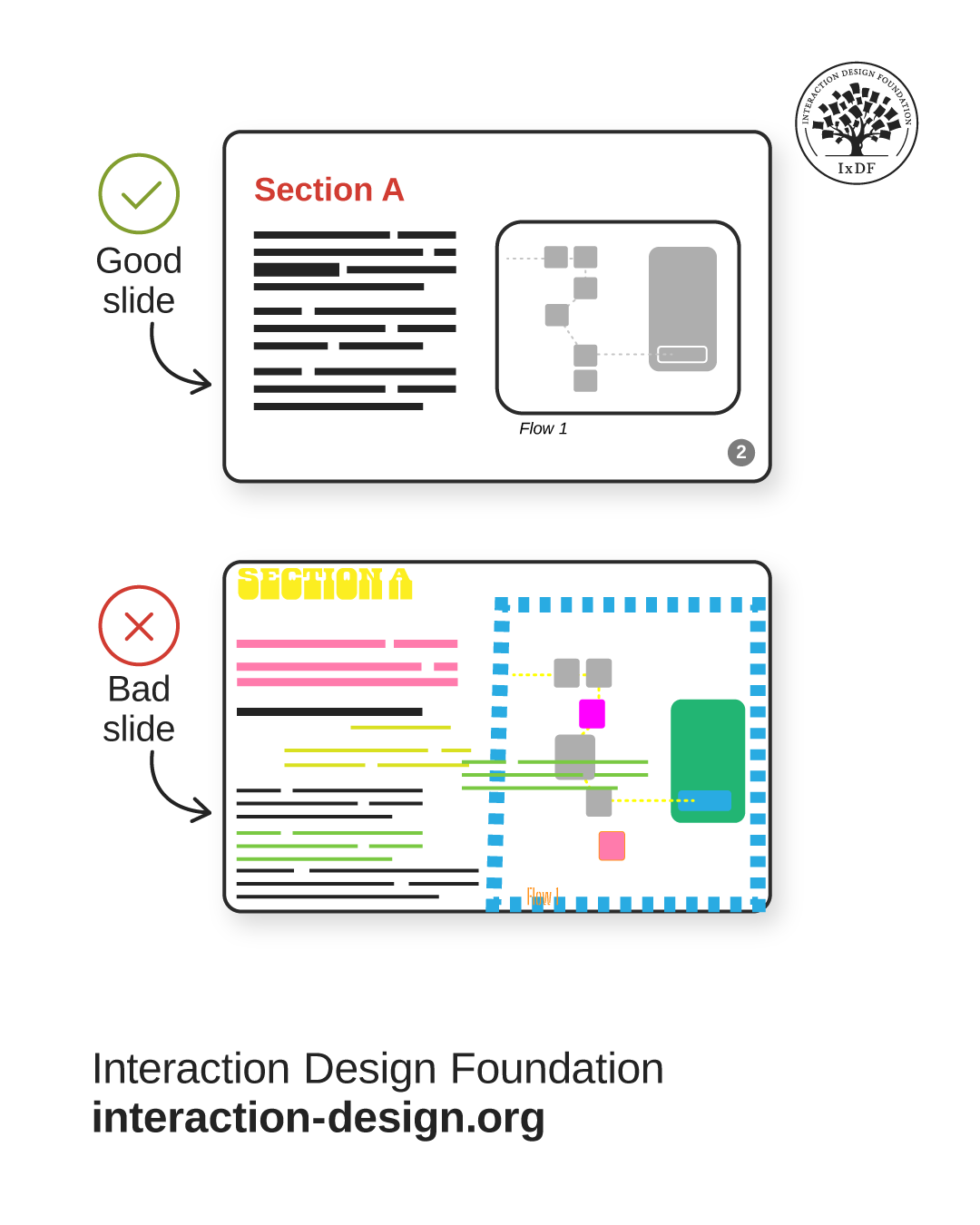
Information visualization includes the framework that accompanies charts or graphs. Beware of chartjunk and remove nonessential ink and color. Get your alignment sharp and clean and don’t overload slides. Move reminders to speaker notes and keep visuals simple.
© Interaction Design Foundation, CC BY-SA 4.0
Now it’s time to see if what you have to present works.
Do a ten-second test. Ask someone new to tell you the point or take-away in ten seconds. If they can’t, adjust hierarchy, labels, or chart choice until they know exactly what, for example, your bar chart is telling them.
Run an ethics and inclusion check. Confirm honest comparisons (“apples for apples” comparisons will help your audience trust you, too), sensible axes, and sufficient contrast. Contrast and color choices form major parts of accessible design for good reason. Cite data sources to show you know your material and that it’s legitimate. If you have any areas of uncertainty, explain them rather than cover up. When you’ve got the right and true information visualized and not cherry-picked or exaggerated for effect, you can ethically proceed to present well.
Run a final check (in dashboards) to see if you:
Define the job of the information visualization (e.g., a chart): who is this for and what decisions should it support?
Place primary KPIs at the top; group related trends below; keep units and time windows aligned.
Prefer small multiples rather than toggles for comparison.
Avoid overload. If you need more, add a second view or deep dives; don’t cram the screen.
Run a final to check (in slide delivery) to see if you:
Pick the right deck type. If you’re presenting live, make sure your deck stays light with staged reveals. Circulated decks include full sentences, clear sections, and pagination so they can stand alone.
Manage the environment. In person, arrive early, clear clutter, and check sightlines. If you’re presenting online, close stray tabs, hide your bookmark bar, and slow your screen movement. Rapid jumping and jittery movement can cause motion sickness and break focus, and trust.
Rehearse the flow of your presentation. Even one run-through can improve your pacing and confidence immensely. Don’t do live editing unless it’s essential (such as if you’re collaborating with audience members).
Use your voice and presence to complement your slides. Vary your pace, pause for emphasis, and use natural eye contact.
Explore how to feel the room with emotional intelligence and adapt to deliver the best presentation, in this video with Morgane Peng.
Overall, information visualization is a practical craft, one that takes an empathetic eye for what target audience members or users need to know and why. Unlike in raw data visualization, you often need to show information so as to influence or persuade, hence the need for ethics and inclusiveness arguably here more than ever. Plus, you’ll want to reap the rewards of positive responses from target audiences who feel motivated to act. Be it a call to action or stakeholder buy-in, that’s why you’re there to use the truth to inspire. It’s also why you want to steer clear of flattening attention spans with “dead” walls of numbers with buried insights or a phenomenon termed “death by PowerPoint.”
In digital products, the principles of good information visualization translate to clean hierarchy, honest scales, intuitive interaction, and dashboards that support decisions. In presentations, it means meaningful headlines, staged reveals, and calm, confident delivery. Use the principles, lean on perception basics, and test your information visualizations as thoroughly as you would any design you’d test, like a design within a design. When you visualize and present information in the best way to the target audience, your visuals will feel lighter, your message will land faster, and your audience will know what to do next, secure in the knowledge that you’re a competent, caring, and consistent source of truth.
Get right into the deep dive so you can come up with superbly designed visuals for all occasions, in our Information Visualization course.
Discover how to unleash your presentation skills potential and much more in our course Present Like a Pro: Communication Skills to Fast-track Your Career with Morgane Peng, Managing Director, Global Head of Product Design and AI Transformation.
Enjoy our Master Class Data-Driven Design: Metrics That Drive Real Results with Adam Thomas, Product Management Expert and Technologist.
Explore further fascinating insights and tips on how to visualize information well, in our article Information Visualization – A Brief Introduction.
Get further insights on how to present information that can inspire action, in the GoodData article Data Storytelling: 6 Tips To Help You Tell Effective Data Stories.
Information visualization and data visualization are closely related, but they aren’t the same. Data visualization focuses on representing quantitative data, like numbers and statistics, in charts or graphs. It helps users to compare values, track changes, or identify patterns in numerical datasets.
Information visualization goes broader by presenting abstract information, relationships, and hierarchies, not just raw numbers. For example, a mind map or a network diagram falls under information visualization since it shows how ideas or entities connect.
The main difference is scope: data visualization is usually numeric, while information visualization includes qualitative and abstract data. Both aim to simplify complexity, but information visualization emphasizes insight, exploration, and understanding in contexts beyond just numbers, and often has a purpose to persuade viewers or users.
Discover helpful insights to get further into it in our article How to Design an Information Visualization.
Information visualization includes many types, with each suited to different purposes, such as:
Bar charts are ideal for comparing categories.
Line charts reveal changes over time.
Scatterplots highlight correlations between variables.
Heatmaps display intensity or frequency with color, making them great for spotting density patterns.
Treemaps organize hierarchical data into nested rectangles, helping viewers compare proportions.
Network diagrams show relationships among entities, such as social connections or system flows.
Gantt charts visualize project timelines and dependencies.
Bubble charts combine size and position to represent multiple dimensions.
Flow diagrams track processes or movement.
Each type serves a unique role in how it can make complex data understandable, so when you know their strengths, you can pick the right one for your communication goals and target audience.
Keep a handle on the best way to get your information across to your audience with some additional insights from our article Preattentive Visual Properties and How to Use Them in Information Visualization.
You should use a bar chart when you need to compare different categories side by side. Bar charts make it easy to see differences in size, frequency, or amounts, which is why they’re common in business reports, surveys, and marketing dashboards.
They are most effective when the categories are discrete or distinct, like sales by product line, expenses by department, or votes by candidate. Bar charts work well for ranking items from highest to lowest, too.
However, they’re less effective for showing trends over time, where line charts or area charts perform better. From how it can keep scales consistent and labels clear, a bar chart ensures the audience quickly sees which categories outperform others.
Explore a treasure trove of tips and points to help you make better charts to reach your audience more clearly, in our article Guidelines for Good Visual Information Representations.
A line chart is most effective when you want to show trends or changes over time. It connects data points with lines, which highlights direction, growth, or decline. This makes it ideal for tracking metrics like revenue over months, website traffic over weeks, or temperature over years.
Line charts are good for helping audiences to see patterns such as seasonality, cycles, or long-term growth. They’re also useful for comparing multiple trends at once, provided you use clear labels and avoid clutter. Unlike bar charts, line charts focus on continuity and progression. If you want viewers to understand how a variable evolves rather than how categories compare, a line chart is the clearest and most intuitive choice.
Pick up a wealth of helpful insights for your chart-making and more, in our article Visual Mapping – The Elements of Information Visualization.
A scatterplot helps identify relationships, patterns, and correlations between two variables. When you place data points on a two-axis graph, you can quickly see if a relationship exists, such as positive, negative, or no correlation. For example, scatterplots can reveal how advertising spend relates to sales or how study hours relate to exam performance.
Scatterplots are particularly valuable for spotting clusters, gaps, or outliers that may not be obvious in tabular data. Scatterplots allow you to add regression lines, too, helping highlight predictive trends. When you want to test hypotheses, explore cause-and-effect, or showcase variability across data, scatterplots can be a great way to offer clear, evidence-based insights that guide decision-making.
Explore how to manage and prevent a risk in information visualization presentations, in our article Information Overload, Why it Matters and How to Combat It.
A heatmap is useful for visualizing the intensity or concentration of data across a space or set of categories. It uses color gradients to indicate frequency, density, or performance, which makes it easy to spot areas of interest.
In web analytics, heatmaps show where users click most often on a webpage. In biology, they reveal gene expression levels across samples. In business, they highlight which products sell best in different regions.
Heatmaps are a great way to simplify large datasets by converting numbers into intuitive color patterns. They work best when you want to emphasize magnitude differences and quickly guide the eye to hotspots that deserve attention, analysis, or further action.
Harvest helpful tips on how to use heatmaps from their application in eye tracking studies.
To choose the right visualization type, begin by asking what question you want your data to answer. If you have to compare categories, use a bar chart. To show trends over time, go for a line chart. If your goal is to highlight relationships between variables, scatterplots work well. To show proportions in parts of a whole, consider pie charts or treemaps. For geographic data, maps are the clearest option.
Always match the chart to the story the information tells. Don’t use complex visuals when a simple one communicates better, anyway. Moreover, consider your audience’s familiarity with certain charts, ensuring they can interpret your visualization quickly and accurately without extra explanation. Your information visualization needs to give a good user experience, one that’s neat and seamless and doesn’t make your target audience pause in confusion.
Get a greater understanding of how to accommodate your target audience well, in our article The Properties of Human Memory and Their Importance for Information Visualization.
Gestalt principles, also known as Gestalt laws, explain how people naturally group and interpret visual elements, and they apply directly to effective information visualization. Here are main ones:
The principle of proximity encourages viewers to see items near each other as related, which helps organize categories.
The principle of similarity groups elements with the same color or shape, and makes comparisons intuitive.
The principle of continuity guides the eye smoothly through aligned data points, improving flow in charts like line graphs.
The principle of closure lets people mentally complete shapes or trends, which helps fill in missing information.
The principle of figure-ground ensures the main message stands out from the background.
By applying these principles, you can create visualizations that feel natural, reduce cognitive effort, and let your audiences grasp insights more quickly and reliably.
Grab a greater grasp of Gestalt principles to supercharge your information visualizations and designs of many types.
Scale is critical in charts and graphs since it directly influences how audiences interpret data. A poorly chosen scale can exaggerate or minimize differences and lead to audiences misinterpreting what you intended them to understand. For instance, a truncated y-axis might make small changes look dramatic, while an overly stretched axis can hide significant trends.
Consistent scales permit fair comparisons across categories or time periods. Proper scaling supports accessibility, too, ensuring that visuals communicate accurately to diverse viewers. When you’re working with data of very different magnitudes, logarithmic scales can help reveal proportional relationships. Ultimately, scale sets the context for interpretation, and you should apply it carefully to maintain accuracy, fairness, and trust in the visualization’s message.
Investigate further helpful points about how to get information visualization done well for target audiences, in our article Information Visualization – An Introduction to Multivariate Analysis.
The first step in designing an information visualization is to define your purpose and the question you want the data to answer. Without a clear goal, even the most polished chart may confuse rather than clarify. So, ask yourself what insight the audience should walk away with, such as identifying a trend, comparing performance, or understanding relationships.
Once you’ve defined the purpose, you can choose the right dataset, clean it for accuracy, and decide on the best type of visualization. Begin with clear intention and you can help ensure the final design is relevant, focused, and actionable. It prevents common pitfalls, too, like overloading visuals with unnecessary details that distract from the core message.
Discover a wealth of points to watch out for with presenting to audiences, in this video with Morgane Peng, Managing Director, Global Head of Product Design and AI Transformation.
Audience awareness is an essential part of information visualization because people interpret visuals differently depending on their background and needs. For example, a visualization designed for data scientists might include statistical models, while one for executives should highlight key takeaways and bottom-line business implications.
When you understand your audience, it helps you adjust complexity, vocabulary, and level of detail so the message you cast lands with those it’s intended for, crystal-clear. For instance, avoid technical jargon with general audiences but provide precise labels for specialized viewers. Tailor the design and you can ensure clarity, engagement, and relevance and keep confusion and disengagement at bay. So, consider what your audience values most, and from there make your visualization more effective, persuasive, and impactful in real-world decision-making contexts.
Find out how to own the room you present to through the audience-awareness technique of active listening, in this video with Morgane Peng, Managing Director, Global Head of Product Design and AI Transformation.
Storytelling connects to information visualization by giving data context, emotion, and direction. A chart or graph alone shows numbers, but a narrative explains why those numbers matter and lifts them off the screen to become more “alive.”
For example, a line chart of rising sales becomes more engaging when you frame it as a story of customer growth that happened because product improvements drove it. Storytelling guides the audience through beginning, middle, and end, using data as evidence. It helps to highlight conflict, resolution, or opportunity, and so makes the message memorable. Good visualization doesn’t just display facts; it frames them in a way that inspires action or deeper understanding. So, when you pair visuals with a clear story, you can transform data into insights that stick.
Find out how to cast yourself well as a trustable presence in more effective presentations where people listen to compelling information, including information empowered with storytelling, in this video with Morgane Peng.
Color plays a vital role in information visualization by highlighting patterns, emphasizing contrasts, and encoding categories. It draws attention to important data points, such as outliers or high-performing segments, essential especially for business stakeholders who want to know important things quickly.
Warm colors like red or orange can signal urgency or intensity, while cool colors like blue or green often suggest calm or positive outcomes. However, misuse of color can distort interpretation or overwhelm viewers. Designers and presenters alike need to use color intentionally and sparingly, and ensure that meaning stays clear and accessible and that meaning isn’t conveyed through color alone.
Color schemes should consider accessibility for color-blind audiences, too. When you apply it effectively, color enhances clarity, strengthens storytelling, and makes visualizations more engaging and easier to interpret for your audiences.
Explore how to stay on point when you apply color in UX design and presentations.
Designers should use shapes to differentiate categories, highlight relationships, and add meaning beyond color. Shapes work well in scatterplots to distinguish multiple groups, such as circles for one category and squares for another.
In network diagrams, different node shapes can indicate roles or functions. Arrows and directional shapes guide the eye and suggest flow, making them useful in process charts.
Shapes also support accessibility as color alone may not be sufficient, ensuring everyone can interpret the visualization. The key is consistency: each shape must carry the same meaning throughout the design. Use shapes strategically and you can make visualizations clearer, more inclusive, and more effective in communicating complex information.
Discover a treasure trove of fascinating and helpful insights in our article How to Display Complex Network Data with Information Visualization.
Tufte, E. R. (2001). The Visual Display of Quantitative Information (2nd ed.). Cheshire, CT: Graphics Press.
This seminal book by Edward Tufte emphasizes clarity, precision, and integrity in presenting data. Tufte introduces principles like the data-ink ratio, which guides designers to minimize nonessential elements and maximize the communication of data itself. He critiques misleading practices such as chartjunk and distorted scales while showcasing historical graphics that set enduring standards. For designers, this book is crucial since it combines theory with visual examples, showing how even simple graphics can powerfully convey truth. Its focus on honesty and simplicity continues to influence modern visualization and is especially relevant in fields where credibility is paramount.
Munzner, T. (2014). Visualization Analysis and Design. Boca Raton, FL: CRC Press.
Munzner’s work provides a comprehensive framework for analyzing and designing information visualizations. Central to the book is the Nested Model, which breaks down the design process into layers of tasks, data, design choices, and validation. This approach helps practitioners align design decisions with user needs and evaluation criteria. Unlike purely theoretical texts, the book offers actionable frameworks and examples applicable to diverse fields, from business dashboards to scientific data. For designers, it serves as both a teaching text and a reference for ensuring visualization quality and usability. Its blend of analysis and practice makes it indispensable for serious visualization work.
Evergreen, S. (2019). Evergreen Data Blog: Storytelling with data visualization. Retrieved from https://stephanieevergreen.com/blog/
Stephanie Evergreen’s blog provides accessible, practice-oriented advice for creating clear and engaging data visualizations. Her posts often feature real-world chart makeovers, illustrating how small design tweaks, such as decluttering, using color strategically, or refining typography, dramatically improve communication. She emphasizes storytelling as a central principle, showing how visuals should connect data with human understanding. For designers, evaluators, and educators, this blog is especially useful because it translates theory into everyday application. Its approachable style and frequent updates make it an ongoing resource for keeping skills sharp and applying best practices without jargon or unnecessary complexity.
Datawrapper. (n.d.). Datawrapper Blog. Retrieved from https://blog.datawrapper.de/
The Datawrapper blog is a practical, open resource created by the team behind the Datawrapper charting tool. Posts explore visualization design principles with case studies drawn from journalism, research, and public communication. Topics include choosing the right chart type, improving accessibility, using color responsibly, and avoiding common design pitfalls. Each post provides actionable insights, often with interactive examples that readers can replicate. For designers, the blog serves as both inspiration and a guide for implementing best practices in professional contexts. Its focus on real-world use cases makes it one of the most relevant ongoing resources for visualization practitioners.
Information visualization and data visualization are closely related, but they are not the same. Data visualization focuses on representing quantitative data, like numbers and statistics, in charts or graphs. It helps users to compare values, track changes, or identify patterns in numerical datasets.
Information visualization goes broader by presenting abstract information, relationships, and hierarchies, not just raw numbers. For example, a mind map or a network diagram falls under information visualization since it shows how ideas or entities connect.
The main difference is scope: data visualization is usually numeric, while information visualization includes qualitative and abstract data. Both aim to simplify complexity, but information visualization emphasizes insight, exploration, and understanding in contexts beyond just numbers, and often has a purpose to persuade viewers or users.
Discover helpful insights to get further into it in our article How to Design an Information Visualization.
Information visualization includes many types, with each suited to different purposes, such as:
Bar charts are ideal for comparing categories.
Line charts reveal changes over time.
Scatterplots highlight correlations between variables.
Heatmaps display intensity or frequency with color, making them great for spotting density patterns.
Treemaps organize hierarchical data into nested rectangles, helping viewers compare proportions.
Network diagrams show relationships among entities, such as social connections or system flows.
Gantt charts visualize project timelines and dependencies.
Bubble charts combine size and position to represent multiple dimensions.
Flow diagrams track processes or movement.
Each type serves a unique role in how it can make complex data understandable, so when you know their strengths, you can pick the right one for your communication goals and target audience.
Keep a handle on the best way to get your information across to your audience with some additional insights from our article Preattentive Visual Properties and How to Use Them in Information Visualization.
You should use a bar chart when you need to compare different categories side by side. Bar charts make it easy to see differences in size, frequency, or amounts, which is why they are common in business reports, surveys, and marketing dashboards.
They are most effective when the categories are discrete or distinct, like sales by product line, expenses by department, or votes by candidate. Bar charts work well for ranking items from highest to lowest, too.
However, they are less effective for showing trends over time, where line charts or area charts perform better. From how it can keep scales consistent and labels clear, a bar chart ensures the audience quickly sees which categories outperform others.
Explore a treasure trove of tips and points to help you make better charts to reach your audience more clearly, in our article Guidelines for Good Visual Information Representations.
A line chart is most effective when you want to show trends or changes over time. It connects data points with lines, which highlights direction, growth, or decline. This makes it ideal for tracking metrics like revenue over months, website traffic over weeks, or temperature over years.
Line charts are good for helping audiences to see patterns such as seasonality, cycles, or long-term growth. They are also useful for comparing multiple trends at once, provided you use clear labels and avoid clutter. Unlike bar charts, line charts focus on continuity and progression. If you want viewers to understand how a variable evolves rather than how categories compare, a line chart is the clearest and most intuitive choice.
Pick up a wealth of helpful insights for your chart-making and more, in our article Visual Mapping – The Elements of Information Visualization.
A scatterplot helps identify relationships, patterns, and correlations between two variables. When you place data points on a two-axis graph, you can quickly see if a relationship exists, such as positive, negative, or no correlation. For example, scatterplots can reveal how advertising spend relates to sales or how study hours relate to exam performance.
Scatterplots are particularly valuable for spotting clusters, gaps, or outliers that may not be obvious in tabular data. Scatterplots allow you to add regression lines, too, helping highlight predictive trends. When you want to test hypotheses, explore cause-and-effect, or showcase variability across data, scatterplots can be a great way to offer clear, evidence-based insights that guide decision-making.
Explore how to manage and prevent a risk in information visualization presentations, in our article Information Overload, Why it Matters and How to Combat It.
A heatmap is useful for visualizing the intensity or concentration of data across a space or set of categories. It uses color gradients to indicate frequency, density, or performance, which makes it easy to spot areas of interest.
In web analytics, heatmaps show where users click most often on a webpage. In biology, they reveal gene expression levels across samples. In business, they highlight which products sell best in different regions.
Heatmaps are a great way to simplify large datasets by converting numbers into intuitive color patterns. They work best when you want to emphasize magnitude differences and quickly guide the eye to hotspots that deserve attention, analysis, or further action.
Harvest helpful tips on how to use heatmaps from their application in eye tracking studies.
To choose the right visualization type, begin by asking what question you want your data to answer. If you have to compare categories, use a bar chart. To show trends over time, go for a line chart. If your goal is to highlight relationships between variables, scatterplots work well. To show proportions in parts of a whole, consider pie charts or treemaps. For geographic data, maps are the clearest option.
Always match the chart to the story the information tells. Do not use complex visuals when a simple one communicates better, anyway. Moreover, consider how familiar your audience is with certain charts, ensuring they can interpret your visualization quickly and accurately without extra explanation. Your information visualization needs to give a good user experience, one that is neat and seamless and does not make your target audience pause in confusion.
Get a greater understanding of how to accommodate your target audience well, in our article The Properties of Human Memory and Their Importance for Information Visualization.
Gestalt principles, also known as Gestalt laws, explain how people naturally group and interpret visual elements, and they apply directly to effective information visualization. Here are main ones:
The principle of proximity encourages viewers to see items near each other as related, which helps organize categories.
The principle of similarity groups elements with the same color or shape, and makes comparisons intuitive.
The principle of continuity guides the eye smoothly through aligned data points, improving flow in charts like line graphs.
The principle of closure lets people mentally complete shapes or trends, which helps fill in missing information.
The principle of figure-ground ensures the main message stands out from the background.
By applying these principles, you can create visualizations that feel natural, reduce cognitive effort, and let your audiences grasp insights more quickly and reliably.
Grab a greater grasp of Gestalt principles to supercharge your information visualizations and designs of many types.
Scale is critical in charts and graphs since it directly influences how audiences interpret data. A poorly chosen scale can exaggerate or minimize differences and lead to audiences misinterpreting what you intended them to understand. For instance, a truncated y-axis might make small changes look dramatic, while an overly stretched axis can hide significant trends.
Consistent scales permit fair comparisons across categories or time periods. Proper scaling supports accessibility, too, ensuring that visuals communicate accurately to diverse viewers. When you are working with data of very different magnitudes, logarithmic scales can help reveal proportional relationships. Ultimately, scale sets the context for interpretation, and you should apply it carefully to maintain accuracy, fairness, and trust in the message of the visualization.
Investigate further helpful points about how to get information visualization done well for target audiences, in our article Information Visualization – An Introduction to Multivariate Analysis.
The first step in designing an information visualization is to define your purpose and the question you want the data to answer. Without a clear goal, even the most polished chart may confuse rather than clarify. So, ask yourself what insight the audience should walk away with, such as identifying a trend, comparing performance, or understanding relationships.
Once you have defined the purpose, you can choose the right dataset, clean it for accuracy, and decide on the best type of visualization. Begin with clear intention and you can help ensure the final design is relevant, focused, and actionable. It prevents common pitfalls, too, like overloading visuals with unnecessary details that distract from the core message.
Discover a wealth of points to watch out for with presenting to audiences, in this video with Morgane Peng, Managing Director, Global Head of Product Design and AI Transformation.
Audience awareness is an essential part of information visualization because people interpret visuals differently depending on their background and needs. For example, a visualization designed for data scientists might include statistical models, while one for executives should highlight key takeaways and bottom-line business implications.
When you understand your audience, it helps you adjust complexity, vocabulary, and level of detail so the message you cast lands with those it is intended for, crystal-clear. For instance, avoid technical jargon with general audiences but provide precise labels for specialized viewers. Tailor the design and you can ensure clarity, engagement, and relevance and keep confusion and disengagement at bay. So, consider what your audience values most, and from there make your visualization more effective, persuasive, and impactful in real-world decision-making contexts.
Find out how to own the room you present to through the audience-awareness technique of active listening, in this video with Morgane Peng, Managing Director, Global Head of Product Design and AI Transformation.
Storytelling connects to information visualization by giving data context, emotion, and direction. A chart or graph alone shows numbers, but a narrative explains why those numbers matter and lifts them off the screen to become more “alive.”
For example, a line chart of rising sales becomes more engaging when you frame it as a story of customer growth that happened because product improvements drove it. Storytelling guides the audience through beginning, middle, and end, using data as evidence. It helps to highlight conflict, resolution, or opportunity, and so makes the message memorable. Good visualization does not just display facts; it frames them in a way that inspires action or deeper understanding. So, when you pair visuals with a clear story, you can transform data into insights that stick.
Find out how to cast yourself well as a trustable presence in more effective presentations where people listen to compelling information, including information empowered with storytelling, in this video with Morgane Peng.
Color plays a vital role in information visualization by highlighting patterns, emphasizing contrasts, and encoding categories. It draws attention to important data points, such as outliers or high-performing segments, essential especially for business stakeholders who want to know important things quickly.
Warm colors like red or orange can signal urgency or intensity, while cool colors like blue or green often suggest calm or positive outcomes. However, misuse of color can distort interpretation or overwhelm viewers. Designers and presenters alike need to use color intentionally and sparingly, and ensure that meaning stays clear and accessible and that meaning is not conveyed through color alone.
Color schemes should consider accessibility for color-blind audiences, too. When you apply it effectively, color enhances clarity, strengthens storytelling, and makes visualizations more engaging and easier to interpret for your audiences.
Explore how to stay on point when you apply color in UX design and presentations.
Designers should use shapes to differentiate categories, highlight relationships, and add meaning beyond color. Shapes work well in scatterplots to distinguish multiple groups, such as circles for one category and squares for another.
In network diagrams, different node shapes can indicate roles or functions. Arrows and directional shapes guide the eye and suggest flow, making them useful in process charts.
Shapes also support accessibility as color alone may not be sufficient, ensuring everyone can interpret the visualization. The key is consistency: each shape must carry the same meaning throughout the design. Use shapes strategically and you can make visualizations clearer, more inclusive, and more effective in communicating complex information.
Discover a treasure trove of fascinating and helpful insights in our article How to Display Complex Network Data with Information Visualization.
Tufte, E. R. (2001). The Visual Display of Quantitative Information (2nd ed.). Cheshire, CT: Graphics Press.
This seminal book by Edward Tufte emphasizes clarity, precision, and integrity in presenting data. Tufte introduces principles like the data-ink ratio, which guides designers to minimize nonessential elements and maximize the communication of data itself. He critiques misleading practices such as chartjunk and distorted scales while showcasing historical graphics that set enduring standards. For designers, this book is crucial since it combines theory with visual examples, showing how even simple graphics can powerfully convey truth. Its focus on honesty and simplicity continues to influence modern visualization and is especially relevant in fields where credibility is paramount.
Munzner, T. (2014). Visualization Analysis and Design. Boca Raton, FL: CRC Press.
This work provides a comprehensive framework for analyzing and designing information visualizations. Central to the book is the Nested Model, which breaks down the design process into layers of tasks, data, design choices, and validation. This approach helps practitioners align design decisions with user needs and evaluation criteria. Unlike purely theoretical texts, the book offers actionable frameworks and examples applicable to diverse fields, from business dashboards to scientific data. For designers, it serves as both a teaching text and a reference for ensuring visualization quality and usability. Its blend of analysis and practice makes it indispensable for serious visualization work.
Evergreen, S. (2019). Evergreen Data Blog: Storytelling with data visualization. Retrieved from https://stephanieevergreen.com/blog/
This blog by Stephanie Evergreen provides accessible, practice-oriented advice for creating clear and engaging data visualizations. Her posts often feature real-world chart makeovers, illustrating how small design tweaks, such as decluttering, using color strategically, or refining typography, dramatically improve communication. She emphasizes storytelling as a central principle, showing how visuals should connect data with human understanding. For designers, evaluators, and educators, this blog is especially useful because it translates theory into everyday application. Its approachable style and frequent updates make it an ongoing resource for keeping skills sharp and applying best practices without jargon or unnecessary complexity.
Datawrapper. (n.d.). Datawrapper Blog. Retrieved from https://blog.datawrapper.de/
The Datawrapper blog is a practical, open resource created by the team behind the Datawrapper charting tool. Posts explore visualization design principles with case studies drawn from journalism, research, and public communication. Topics include choosing the right chart type, improving accessibility, using color responsibly, and avoiding common design pitfalls. Each post provides actionable insights, often with interactive examples that readers can replicate. For designers, the blog serves as both inspiration and a guide for implementing best practices in professional contexts. Its focus on real-world use cases makes it one of the most relevant ongoing resources for visualization practitioners.
Here's the entire UX literature on Information Visualization by the Interaction Design Foundation, collated in one place:
Take a deep dive into Information Visualization with our course Information Visualization .
Master complex skills effortlessly with proven best practices and toolkits directly from the world's top design experts. Meet your expert for this course:
Alan Dix: Author of the bestselling book “Human-Computer Interaction” and Director of the Computational Foundry at Swansea University.
We believe in Open Access and the democratization of knowledge. Unfortunately, world-class educational materials such as this page are normally hidden behind paywalls or in expensive textbooks.
If you want this to change, , link to us, or join us to help us democratize design knowledge!