Continuum of Understanding

Your constantly-updated definition of Continuum of Understanding and collection of videos and articles.
Be a conversation starter: Share this page and inspire others!

105 Shares
Save

Get 1 Powerful Email Each Week

Join 313,907 subscribers.

What is Continuum of Understanding?

Information visualization is most commonly employed in the process of understanding data but how does that work in practice? At what stage in that process is information visualization valuable and what does the process as a whole look like? It's important for you to know the process of understanding data to be able to best employ information visualization techniques in your work. The process is best known as the continuum of understanding.

The continuum of understanding is a process that theorizes how people understand and learn from data.

Nathan Shedroff first proposed this model, describing it as a 4-step process where one’s understanding will shift and transform until it culminates as wisdom.

The 4-step process happens as follows:

1. Data

2. Information

3. Knowledge

4. Wisdom

Data gains meaning and becomes useful when it is processed and transformed into information.

One way to propel the continuum of understanding is by using the tools and methodologies specific to information visualization. When designing information visualization, designers process and sort data and present it in a context that enables the audience to glean insights.

Learn More About Continuum of Understanding

Make learning as easy as watching Netflix: Learn more about Continuum of Understanding by taking the online IxDF Course Information Visualization.

Why? Because design skills make you valuable. In any job. Any industry.

In This Course, You'll

  • Get excited to turn complex, hard-to-read data into clear visuals your team, clients, and stakeholders can understand and act on. According to the International Data Corporation, the world now generates well over 170 zettabytes of data a year. That’s more than 450 million terabytes every single day, and the figure keeps climbing. Big data and AI now let us find and access more than ever before, but all of that is only useful if we can make sense of it. Most people assume data work means heavy math and they count themselves out, but this course gives you a simple framework to turn raw data into visuals people instantly grasp, use them to drive decisions, and prove they actually work. No technical background needed. You already visualize information every day, like sketching a diagram to explain an idea or highlighting important points in a presentation. Whether you work in journalism, marketing, research, UX, or another field, this course will help you communicate complicated ideas quickly and clearly.

  • Make yourself invaluable as the professional who turns confusion into clarity. Anyone can make a chart, but few can design one that makes a situation instantly clear and drives a decision. In this course you'll learn Riccardo Mazza's five-step design framework, and work from defining the problem and the data, to choosing dimensions, mapping the underlying structure, and setting the right level of interaction. From there you'll master visual mapping, the deliberate pairing of data attributes with visual properties, and learn to represent everything from a single variable through multivariate data and hierarchies, using tools like concept maps and mind maps. You'll work with the three levels of interaction (static, transformable, and manipulable), so you can build anything from a fixed infographic to a model users explore for themselves. By the end, you'll have a repeatable process for turning any kind of data into a visualization that's clear and actionable.

  • Gain confidence and credibility as you learn to design using the science of human perception. MIT neuroscientists found the brain can process an entire image in as little as 13 milliseconds, far faster than it reads words or numbers. You'll see how vision and memory work. Then put them to use as you apply the Gestalt laws of grouping and preattentive attributes (the colors, shapes, and positions the brain registers first) so your visuals are understood at a glance. But fast doesn't mean accurate, and a visual can just as quickly send the wrong message. That's why you'll learn to test your work with real users, through heuristic evaluations, cognitive walkthroughs, interviews, and focus groups, so you can confirm whether it’s perceived the way you intended. You won't just hope your visualizations work, you'll know they do, and so will everyone who sees them.

Learn From Industry Leaders

Master complex skills with proven best practices and toolkits directly from industry leaders. Meet your expert for this course:

  • Alan Dix: Author of the bestselling book “Human-Computer Interaction” and Director of the Computational Foundry at Swansea University.

Earn Industry-Recognized Certificates

Industry giants trust our courses to train their teams, and prestigious universities integrate our content into their curricula. Add your certificates to your LinkedIn profile, résumé, and job applications.

Our clients: IBM, Harvard University, University of Cambridge, NASA, Adobe, Stanford, Massachusetts Institute of Technology, LinkedIn
Course Certificate

All Free IxDF Articles on Continuum of Understanding

Read full article
The Continuum of Understanding and Information Visualization - Article hero image

The Continuum of Understanding and Information Visualization

Information visualization is a process by which data (or information) is represented to help the recipient of the information build an accurate representation of it in their mind. It is most common for information visualization to be constructed graphically (e.g. to facilitate visual understanding)

Social shares
681
Published
Read Article

The Continuum of Understanding and Information Visualization

The Continuum of Understanding and Information Visualization

Information visualization is a process by which data (or information) is represented to help the recipient of the information build an accurate representation of it in their mind. It is most common for information visualization to be constructed graphically (e.g. to facilitate visual understanding) but it may also be carried out in sound (e.g. to facilitate aural understanding) often, but not always, for the visually impaired to be able to understand data.

The term “information visualization” was coined at the Xerox PARC labs in the 1980s and was meant to signify that a new discipline in design was needed to create artifacts that would aid in the comprehension of data. While the term may be relatively new – the concept is not and though computers are commonly employed today to visualize information; information visualization may still be carried out with nothing more than a pen and paper (for visual) or a tape recorder (for aural).
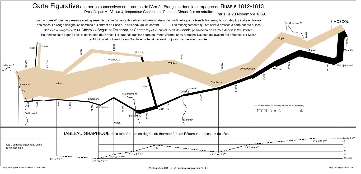

Author/Copyright holder: MartinGrandjean. Copyright terms and licence: CC BY-SA 3.0

This diagram (above), Minard’s Map, is one of the earliest complex pieces of information visualization. It shows the march of Napoleon’s army during the invasion of Russia in 1812. It was done completely without the use of computers (though the version pictured above has been rendered “prettier” with the use of graphic design).

The Process of Understanding Data

Nathan Shedroff, the renowned interaction designer, proposed in his paper “Information Design” a process by which we understand data. He offers a “continuum of understanding” which begins with data and culminates in wisdom. Along the way, the data is transformed in order to help us gain that wisdom.
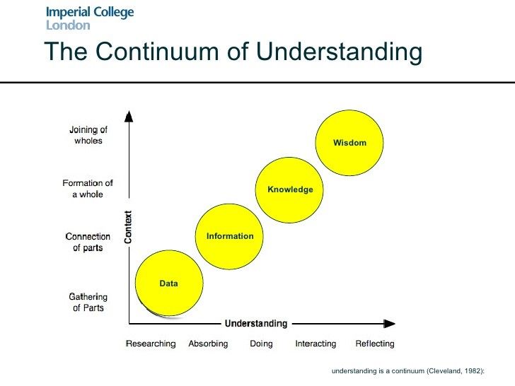

Author/Copyright holder: Imperial College London. Copyright terms and licence: All rights reserved.

1. Data

We begin the process of understanding with data. Data, itself, has no intrinsic meaning. It is the first building block in the process of extracting information. For example, I may have data on the occurrence of cancer in a population but that data is relatively meaningless without context. It is only through the act of comparison with other populations or other time intervals that I can create meaning from these figures.

2. Information

The next step in the process is to give the data meaning and transform it from data into information. This involves sorting data, processing it, and presenting it in a format which brings substance to that data. The National Health Service, in the United Kingdom, for example will take data on the incidence of cancer in many populations – it will compare rates across time and geography and tabulate it to enable it be examined for trends.

3. Knowledge

Knowledge is the process by which we put information to use. We test hypotheses and develop practical applications for the information at this stage. We examine the information in a viable context so that we can discover the value of that information and how it can be put to work for us. Without application, information is also relatively useless but when we apply information to the world around us – it enables us to learn and grow.

4. Wisdom

Wisdom is the final step in the continuum of understanding. It is the point at which we have gained so much knowledge and expertise from the data that we have become able to judge the data itself (in a qualified manner). Wisdom is something we create for ourselves throughout this process; it is not something that we can teach to others – it is something that is brought about through study and careful interpretation of knowledge derived from data.

Where Does Information Visualization Come Into the Continuum of Understanding?

Information visualization will be used to help transform data into information. It provides us with a set of tools and methodologies by which we can sort, process and represent data to deliver valuable information in context.

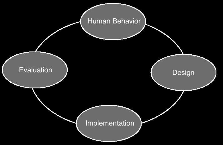
Information visualization, for a long time, was a subset of HCI (Human Computer Interaction) that is the study of how users interact with the computer equipment they employ; a basic explanation of the HCI process can be found in the diagram below. However, information visualization is now very much considered to be a separate discipline.

Author/Copyright holder: Sanilshah. Copyright terms and licence: CC BY-SA 3.0

Its focus is very much on aiding the cognitive processes of human beings to fully understand the data that they are presented with. This may be done visually or auditorily. It is most commonly done through the use of computing and this explains why information visualization was once part of the HCI discipline – there is a natural overlap between the two disciplines. This is because over the past decades computers have become increasingly powerful tools capable of crunching even the largest data sets and turning them into representative models. However, there is no requirement for computer modeling within the field of information visualization – it just makes the job much easier.

The Take Away

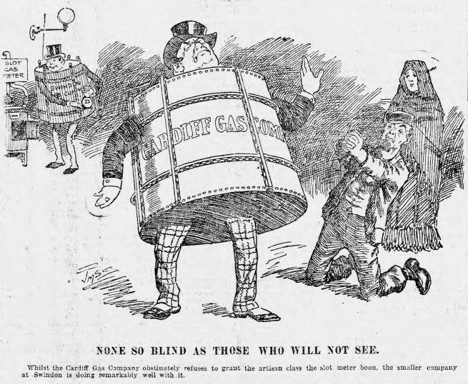
John Heywood, coined the term “There is none so blind as those who will not see” in 1956 according to the Random House Dictionary of Popular Proverbs and Sayings. It is often a fair assessment of people but in this age of increasingly complex data, it is fair to say that many cannot see deeply into information without the assistance of information visualization.

Author/Copyright holder: Joseph Morewood Staniforth. Copyright terms and licence: Public Domain.

The discipline bridges the gap on the continuum of understanding between data and information and allows us to go on and develop both knowledge and, hopefully, wisdom from that data.

References and Resources

Nathan Shedroff’s original paper on Information Design – Edited by Robert Jacobson. Information Design. MIT Press, Cambridge, MA, 1999.

Nathan Shedroff is still very active in the field of Interaction Design. Check out his thoughts on a range of topics.

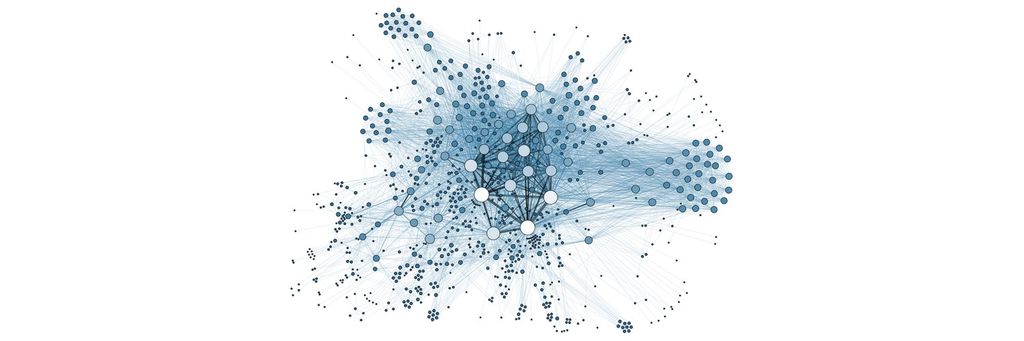
Hero Image: Author/Copyright holder: Martin Grandjean. Copyright terms and licence: CC BY-SA 3.0

39% of Today's Skills Will Change by 2030

The World Economic Forum expects 39% of today's skills to be transformed or become outdated by 2030.

The good news is that jobs in UX / UI design and AI are among the fastest-growing professions globally.

Build Skills That Keep You Relevant

Privacy Settings

By using this site, you accept our Cookie Policy and Terms of Use.
Customize
Accept all

Be the One Who Inspires

People remember who shares great ideas.

Share on:

Academic Credibility — On Autopilot

Don't waste time googling citation formats. Just copy, paste and look legit in seconds.