Embrace Opposites

Your constantly-updated definition of Embrace Opposites and collection of videos and articles.
Be a conversation starter: Share this page and inspire others!

105 Shares
Save

Get 1 Powerful Email Each Week

Join 313,907 subscribers.

What is Embrace Opposites?

Embrace opposites is an ideation method which designers use to explore their design space by finding overlaps between different categories or opposites. When they chart and compare two apparent opposites, they might find features that are common to both—and ones that are not—and spot new design opportunities.

“The opposite of a correct statement is a false statement. But the opposite of a profound truth may well be another profound truth.”

— Niels Bohr, Pioneering physicist behind atomic structure and quantum theory

In this video, Alan Dix, author of the bestselling book “Human-Computer Interaction” and director of the Computational Foundry at Swansea University, explains how to find design possibilities by comparing utterly different things.

Transcript

Appearances can Deceive – Go Behind the Scenes with Embrace Opposites

In our complex world, it’s simpler to differentiate things by thinking in terms of dichotomies or opposites (e.g., books and websites) even when they have overlapping attributes. Distinguishing things this way helps us make quick decisions: (e.g.) “good” or “bad” as absolute values, without considering the many degrees in between that describe something’s/someone’s qualities. However, reality is usually too complicated to categorize with “either/or” labels. Often, things that seem totally opposed (e.g., political parties, personalities) share characteristics. For example, what does an “introvert” look like? Or an “extrovert”? Can someone be both?

In ideation, you can embrace opposites to see if you can enrich a problem and focus on designing innovative features. For example, consider a simple switch:

© Interaction Design Foundation, CC BY-SA 4.0

If A is “Off” and B is “On”, these are categorical distinctions. However, if A and B were other items that were opposed or distinct (e.g., menus and radio buttons), you might see them in dimensional terms, instead, and ask if they share features. Also, you might be able to design for a combination of these, perhaps with more of one than the other:
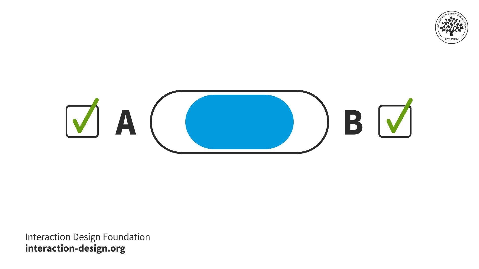
  or:

© Interaction Design Foundation, CC BY-SA 4.0

© Yu Siang and Interaction Design Foundation, CC BY-SA 3.0

So, you can get a deeper understanding of a design problem and the elements you’re working with if you analyze the categories and dichotomies you perceive. Dimensions tend to be richer than categories, but trickier to work with. To envision this, let’s re-approach our extrovert-introvert dichotomy. We might flip it into a graph, so:
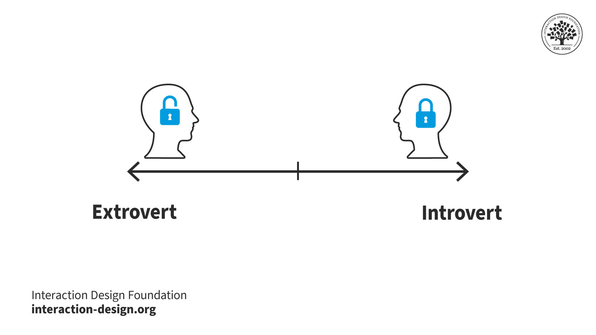
© Interaction Design Foundation, CC BY-SA 4.0

becomes:
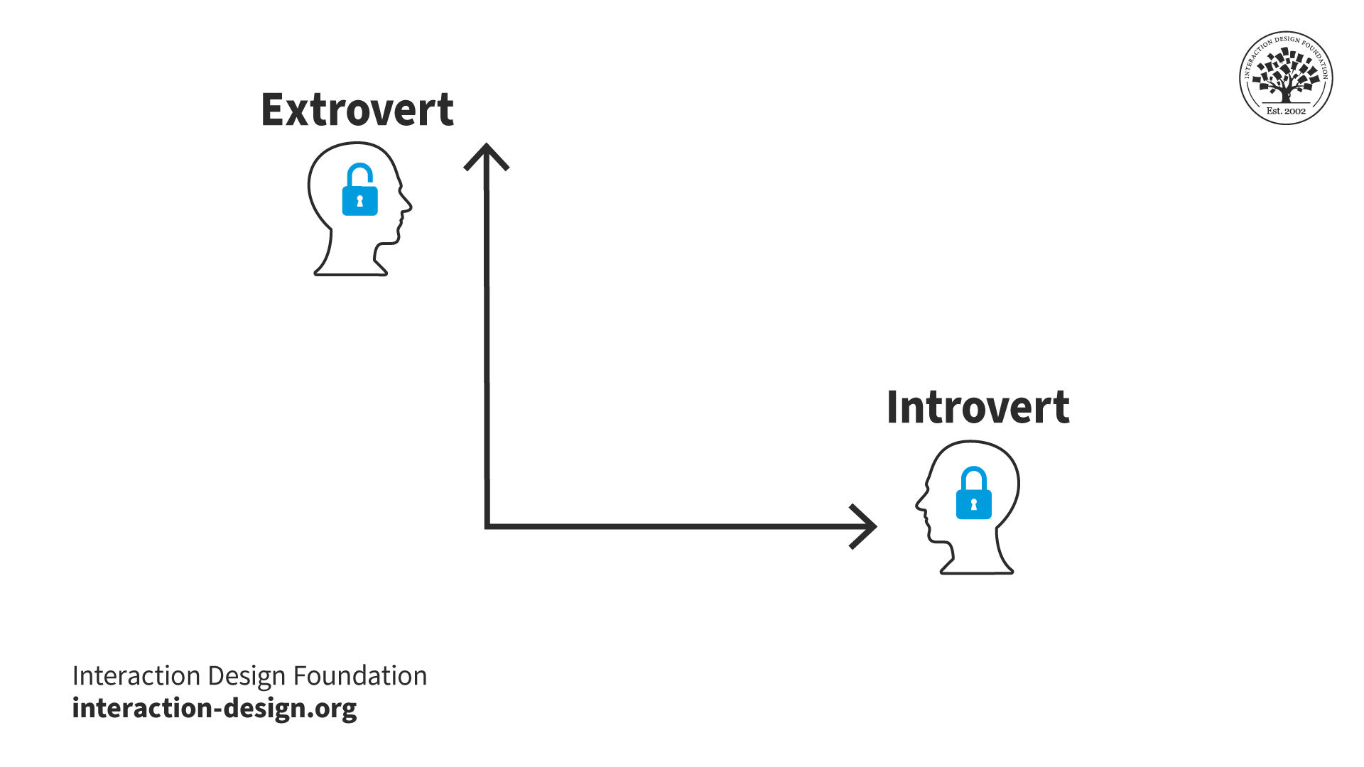
© Interaction Design Foundation, CC BY-SA 4.0

This makes it easier to look for common elements and neutral ones if we divide our graph into 4 squares, where:

Top left = More Extroverted

Top right = Design Possibilities!

Bottom left = Neutral

Bottom right = More Introverted

So, you might find a dimension to manipulate in your own project. It might be (e.g.) a menu (A) that pulls down and includes radio buttons (B) – anywhere where elements of both apparent opposites work simultaneously. At least, you can confirm when “opposites” are indeed distinct.

How to Embrace Opposites

Try these steps to identify design possibilities:

  1. Create an overview of your different categories or opposites in a current design problem. You might say that the desktop version of an application and the mobile version of the application belong in two different categories: desktop and mobile.

  1. Dissolve the categories and ask yourself, “In what ways can my application be both desktop and mobile?”. On the surface, it can’t (users either use their phones or desktops to view your application). But are there any situations where it can? A tablet is in some ways between the two. It has a big screen like a desktop, but a smartphone’s touchscreen interactivity.

  1. List all the overlaps you find.

  1. Go through your list and consider how significant the overlap for each item is, whether it’s mostly one or the other (remember our x-and-y-axis graph above). Now, place the items on your list there. For example, a tablet is probably midway between a desktop and a smartphone, but a laptop with a touchscreen is more like a desktop computer than a smartphone.

Consider the consequences of the overlaps for your design. Should you use the same interaction principles for all these devices? If not, how many versions do you need? If your application is specialized, maybe the mobile with a touchscreen is the perfect device, and you should forget about all the other versions.
© Interaction Design Foundation, CC BY-SA 4.0

Make Things Opposite 

Embrace opposites is also helpful if you disagree with the design goal:

  1. Reverse your problem statement. E.g., you wanted to help people feel more inclined to use public transportation than their cars. Now, imagine you wanted to make people more inclined to use their cars. What would that take? How can you try to make people spend even more time in their cars? How can you make it even nicer to drive the car and less attractive to use public transportation? E.g., you could:

  • Simply decrease the number of bus routes in the area;

  • Have it so there’s only one bus in the morning, one in the evening;

  • Make bus tickets more expensive;

  • Lengthen the routes;

  • Have the driver play really loud techno music on routes which elders often use. 

  1. Now, turn those insights around. E.g., you could research to see what areas most people are taking busses in. Then, you could make more busses available more frequently in those areas and offer fewer busses where there are rarely any passengers. 

Overall, remember that determining the opposite of something can be complicated. However, the effort can pay big dividends.

Questions About Embrace Opposites?
We've Got Answers!

How can I use opposite ideas to spark better design solutions?

Using opposite ideas, contrasting thinking, can spark fresh, innovative design solutions by pushing you out of default assumptions. The idea is to flip, exaggerate, or reverse a concept so you can find new possibilities.

For example, if you design an app for experts, imagine how it would look for total beginners. If your product assumes always-online use, explore what happens if it must work offline. This contrast uncovers overlooked features and inspires inclusive, flexible designs.

Use exercises like “what if the opposite were true?” during brainstorming sessions, or sketch two radically different versions of a feature; you might be surprised at what reframing norms can do.

Find a convenient template to use this technique with in our article Ideation Method: Embrace Opposites.

How do designers balance opposites without creating chaos?

Designers balance opposites (simplicity and complexity, consistency, and novelty) by using clear priorities and design principles as guideposts. Instead of randomly mixing contrasts, they define which element should dominate and which should support the experience.

For instance, an app might stay simple on the surface but permit complex actions through advanced menus. Similarly, designers introduce novel touches without breaking familiar patterns, so users feel engaged but not lost.

The key is intentional trade-offs: every opposite serves a purpose tied to user needs. When blending contrasts, techniques like user testing and design systems help ensure harmony, not chaos.

Dig deeper into design principles to guide better decisions for what you plan and create for users in the real world.

How do I apply “embrace opposites” in UI design?

Applying “embrace opposites” in UI design means intentionally using contrasting ideas to spark fresh solutions. First, identify pairs of opposites—like minimal vs. detailed, static vs. dynamic, or playful vs. serious—and explore how each side could shape your interface.

For example, you might design a clean, minimal home screen but pair it with rich, detailed subpages for advanced users. Alternatively, you could balance familiar navigation patterns with unexpected micro-interactions to keep the design engaging.

Run workshop exercises or brainstorming sessions around themes like “design the worst possible UI” or “remove everything essential” to uncover insights you wouldn’t find otherwise. This structured contrast leads to more innovative, balanced, and user-friendly designs.

Discover how the worst possible idea might help you find better ones.

How do I design for users who want opposite things?

To design for users who want opposite things, look for common ground while offering flexibility. Begin by identifying both groups' core needs, such as speed, clarity, or trust. Then, layer in optional pathways or customizable features to satisfy different preferences without overcomplicating the experience.

For instance, some users want a minimal interface, while others crave detailed controls. A solution might be a clean default layout with expandable advanced settings. Testing with both user types helps ensure you don’t tip too far towards one side.

By prioritizing shared goals and designing adaptable solutions, you turn conflicting demands into opportunities for more innovative, inclusive products.

Speaking of inclusive, enjoy our Master Class How to Design for Neurodiversity: Inclusive Content and UX with Katrin Suetterlin, Senior Professional Content Designer, SIXT SE to understand essential points about what to consider including in your digital products.

How do I gather user insights that reflect opposite needs?

Focus on diverse, balanced research methods to collect user insights that reflect opposite needs. Start by recruiting participants from both ends of the spectrum, such as beginners and experts, minimalists and detail-seekers, to investigate their problems and get ideas about what might suit them as a solution.

Use qualitative research methods like interviews and contextual inquiries to hear why users prefer specific approaches, and quantitative tools like surveys or analytics to spot patterns across groups. Frame open-ended questions that reveal motivations and frustrations, not just preferences, such as “What’s missing for you?” or “What feels overwhelming?”

Analyze insights side by side to uncover shared goals and critical differences. Layered research like this helps you challenge assumptions and design solutions that respect conflicting needs without losing focus.

Explore how assumptions can derail design efforts and how to manage them.

How can opposite personas help me understand edge cases?

Using opposite personas helps you uncover edge cases by exploring the extremes of your user base. Instead of only designing for an “average” user, you create personas that sit at opposite ends of the spectrum—like tech-savvy experts vs. complete beginners, or heavy users vs. occasional ones.

These contrasting personas highlight conflicting needs and reveal scenarios where your design might break. For example, a feature that feels intuitive to an expert might overwhelm a novice, or vice versa.

By testing ideas against these extremes, you can identify edge cases early and design solutions that stay usable and inclusive for everyone, while still delighting the core audience.

Put powerful perspective into your user research and personas—fictitious representations of real users—in our course Personas and User Research: Design Products and Services People Need and Want.

What are common pairs of opposites that designers work with?

Designers often work with opposite pairs to create balanced, engaging products and use these contrasts to help shape decisions and spark creativity. Some of the most common include the following:

Simple vs. Complex – Clean layouts vs. deep functionality.

Consistent vs. Novel – Familiar patterns vs. surprising moments.

Minimal vs. Detailed – Essential elements vs. rich information.

Static vs. Dynamic – Fixed layouts vs. responsive or animated ones.

Universal vs. Personalized – Broad appeal vs. tailored experiences.

Note that balancing these opposites isn’t about choosing one side but about intentionally mixing them. For example, an app might use a simple main screen but provide complex, optional tools for advanced users to enjoy high convenience and usability. Exploring these pairs helps designers keep designs flexible, innovative, and user-centered.

Understand core aspects of usability to help tailor prototypes and designs which users will be more likely to enjoy.

How do I address the tension between aesthetics and usability?

Designers address the tension between aesthetics and usability by making them work together instead of competing. Beautiful interfaces can draw users in, but if they’re hard to navigate, frustration will soon follow. Likewise, purely functional designs risk feeling dull or uninspiring.

The key is to prioritize clarity first and then layer aesthetics that support—not distract from—user goals. For instance, minimalist visuals can improve focus, while thoughtful color and typography guide attention. Testing early mockups with users ensures that visuals don’t compromise usability.

By aligning form and function, you create products that are both delightful and easy to use, turning this tension into an opportunity for stronger design.

Understand core aspects of usability to help tailor prototypes and designs which users will be more likely to enjoy.

How do I know when to keep or discard an opposite idea?

You know when to keep or discard an opposite idea by testing it against user needs, design goals, and real-world context. Begin by asking: Does this idea solve a problem or create confusion? If it adds meaningful value, keep refining it. If it only adds novelty or complexity, it may need to go.

Use prototyping and usability testing to see how users respond. For example, if a “radically minimal” version frustrates users who need key details, scale it back. If an “overly complex” idea sparks new solutions, refine it into something usable.

The key is iteration: opposites aren’t all-or-nothing; they guide you to better designs when you test, adapt, and filter them with purpose.

Pinpoint what prototyping does for design teams and the valuable lessons it can teach, in this video with Alan Dix: Author of the bestselling book “Human-Computer Interaction” and Director of the Computational Foundry at Swansea University.

Transcript

How does embracing opposites connect to divergent and convergent thinking?

Embracing opposites connects directly to divergent and convergent thinking, two key stages of the design process.

In divergent thinking, you explore as many ideas as possible, even contradictory ones. Using opposites, such as imagining “the simplest version” and “the most complex version,” pushes you to think beyond defaults and generate unexpected solutions.

In convergent thinking, you narrow those ideas down, combining the best aspects of opposites into one strong direction. For example, you might blend one concept's simplicity with another's richness to create a balanced design.

This interplay turns tension into innovation and makes opposite thinking a powerful tool for structured creativity in UX.

Discover how to leverage convergent thinking to help arrive at better ideas and move the UX design process forward in the right direction.

What are some helpful resources about embrace opposites?

Shannon, N., Mascolo, M. F., & Belolutskaya, A. (Eds.). (2024). The Routledge International Handbook of Dialectical Thinking. Routledge.

This landmark handbook offers a comprehensive, multi‑disciplinary survey of dialectical thinking as a psychological phenomenon across the lifespan. It integrates philosophical traditions and contemporary developmental models, showing how dialectical cognition emerges, develops, and can be cultivated across domains like education, decision‑making, creativity, and conflict resolution. It serves as a foundational reference for scholars exploring cognitive complexity, development, and interdisciplinary applications.

Hanhijärvi, T. J. (2015). Dialectical Thinking: Zeno, Socrates, Kant, Marx. Algora Publishing.

Hanhijärvi provides an accessible journey through the evolution of dialectical reasoning from Zeno’s paradoxes, through Socratic dialogue, Kantian transcendental dialectics, to Marx’s materialist dialectic. Drawing also on Popper and the Frankfurt School, the book explains how dialectical thought patterns persist beyond academic philosophy. Its clarity makes it a valuable introduction for readers seeking to apply dialectics to critical reasoning, ethics, and contemporary ideological critique.

Earn a Gift, Answer a Short Quiz!

1
2
3
4
1
2
3
4
Question 1
Question 2
Question 3
Get Your Gift

Question 1

What is the primary goal of the "Embrace Opposites" ideation method?

1 point towards your gift

  • To identify differences between two concepts and avoid combining them.
  • To explore overlaps between contrasting categories and discover new design opportunities.
  • To eliminate ambiguity by focusing on only one perspective.

Question 2

How can reversing a problem statement help in the "Embrace Opposites" approach?

1 point towards your gift

  • It helps eliminate unnecessary design elements.
  • It allows designers to understand the problem from a completely opposite perspective, uncovering hidden insights.
  • It prevents designers from exploring alternative solutions.

Question 3

How can analyzing dichotomies like "introvert/extrovert" enhance design ideation?

1 point towards your gift

  • It limits creativity to one end of the spectrum.
  • It allows designers to see common traits and blend opposites, leading to richer solutions.
  • It discourages exploring middle ground ideas

Learn More About Embrace Opposites

Make learning as easy as watching Netflix: Learn more about Embrace Opposites by taking the online IxDF Course Creativity: Methods to Design Better Products and Services.

Why? Because design skills make you valuable. In any job. Any industry.

In This Course, You'll

  • Get excited to innovate and get creative, even when you feel blocked. Learn a repeatable creative approach that'll help you generate strong concepts on demand, break through when you're stuck, and turn your best ideas into solutions users love. In this course, design legend and author of the bestselling book "Human-Computer Interaction (HCI)," Professor Alan Dix, shows you why the best ideas come from a structured process and gives you the toolkit to do it yourself. The World Economic Forum ranks creative thinking among the top skills employers want in any profession, today and through 2030. Whether you're starting out, switching careers, or in a senior role and want a process you can rely on, you'll turn creativity from something that happens to you into something you can switch on. No creative background needed.

  • Make yourself invaluable by mastering a wide range of ideation methods so you never get stuck in one approach. To generate and explore new ideas, you'll apply Bad Ideas, Random Metaphors, and Arbitrary Constraints, and to refine and develop them, you'll apply Embrace Opposites, Multiple Classifications, and Teasing Apart, Piecing Together (TAPT). With Edward de Bono's Six Thinking Hats, you'll learn to guide a team to see a problem from every angle. You'll also learn to build an environment that nurtures creativity and to remove the hidden barriers that hold people back. You won't just have better ideas, you'll help everyone around you have them too. As AI churns out endless options, it's your timeless, human-centered design skills, like understanding people and what they actually need, that ensure your solutions are genuinely new and useful.

  • Gain confidence and credibility with a creative process that helps you be productive even under pressure. You'll learn to plan and time-manage your work so good ideas arrive when you need them, and apply proven strategies to beat procrastination, bias, and fixation. You'll keep momentum going with busywork, recognize when stepping back to let an idea incubate is the smartest move, and tackle big, messy "wicked problems" without stalling. When you hit a wall, you'll know whether to push through, switch to something else, or step away, instead of forcing it. And because your best ideas often arrive in the shower or on a walk, not at your desk, you'll learn simple ways to capture them before they slip away. The result is a process you can rely on, so you deliver strong work whether the spark comes on schedule or not.

  • Craft your personal portfolio with a piece that clearly captures your entire creative process. With optional, hands-on activities, you'll build a case study that shows how you ideate, from a ready-made persona and empathy map through to a fully developed concept. Downloadable templates let you apply your new skills immediately. You walk away able to show employers and clients what a polished mockup alone doesn't: how you actually approach and solve problems.

Learn From Industry Leaders

Master complex skills with proven best practices and toolkits directly from industry leaders. Meet your experts for this course:

  • Alan Dix: Author of the bestselling book "Human-Computer Interaction" and Director of the Computational Foundry at Swansea University.

  • Don Norman: Father of User Experience (UX) Design, author of the legendary book "The Design of Everyday Things," and co-founder of the Nielsen Norman Group.

Earn Industry-Recognized Certificates

Industry giants trust our courses to train their teams, and prestigious universities integrate our content into their curricula. Add your certificates to your LinkedIn profile, résumé, and job applications.

Our clients: IBM, Harvard University, University of Cambridge, NASA, Adobe, Stanford, Massachusetts Institute of Technology, LinkedIn
Course Certificate

All Free IxDF Articles on Embrace Opposites

Read full article
Ideation Method: Embrace Opposites - Article hero image

Ideation Method: Embrace Opposites

It is easy to see the world in terms of dichotomies: black/white, left/right, introvert/extrovert, concrete/abstract. But if we instead explore an area more closely, we find that the reality is often more nuanced. In this video, we’ll teach you a method for how to embrace opposites to get a clearer

Social shares
460
Published
Read Article

Ideation Method: Embrace Opposites

Ideation Method: Embrace Opposites

It is easy to see the world in terms of dichotomies: black/white, left/right, introvert/extrovert, concrete/abstract. But if we instead explore an area more closely, we find that the reality is often more nuanced. In this video, we’ll teach you a method for how to embrace opposites to get a clearer and more detailed understanding of your design space.

Transcript

Download our Embrace Opposites Template Right Here

To help you, we’ve created a step-by-step guide on how to use the Embrace Opposites method here.

Advance Your Career With This Free Template for “Embrace Opposites”
Embrace Opposites
Optional
Optional
We respect your privacy
Get 1 powerful email each week: Learn Design and AI From the Best.

39% of Today's Skills Will Change by 2030

The World Economic Forum expects 39% of today's skills to be transformed or become outdated by 2030.

The good news is that jobs in UX / UI design and AI are among the fastest-growing professions globally.

Build Skills That Keep You Relevant

Privacy Settings

By using this site, you accept our Cookie Policy and Terms of Use.
Customize
Accept all

Be the One Who Inspires

People remember who shares great ideas.

Share on:

Academic Credibility — On Autopilot

Don't waste time googling citation formats. Just copy, paste and look legit in seconds.