The UX Tools Series: Great Tools for Mind Mapping, Flow Charting and Site Mapping

- 510 shares
- 1 year ago
Flowcharts are diagrams of user flows and tasks in processes. Designers use these versatile tools and activity diagrams from UML to visualize the interactions in designs and present easy-to-understand maps of designs to stakeholders. They connect labeled, standardized symbols with lines to show everything users might do in interactive contexts.
“You cannot understand good design if you do not understand people; design is made for people.”
— Dieter Rams, Industrial designer and pioneer of “less is better”
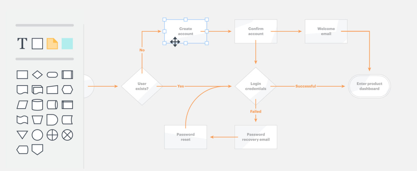
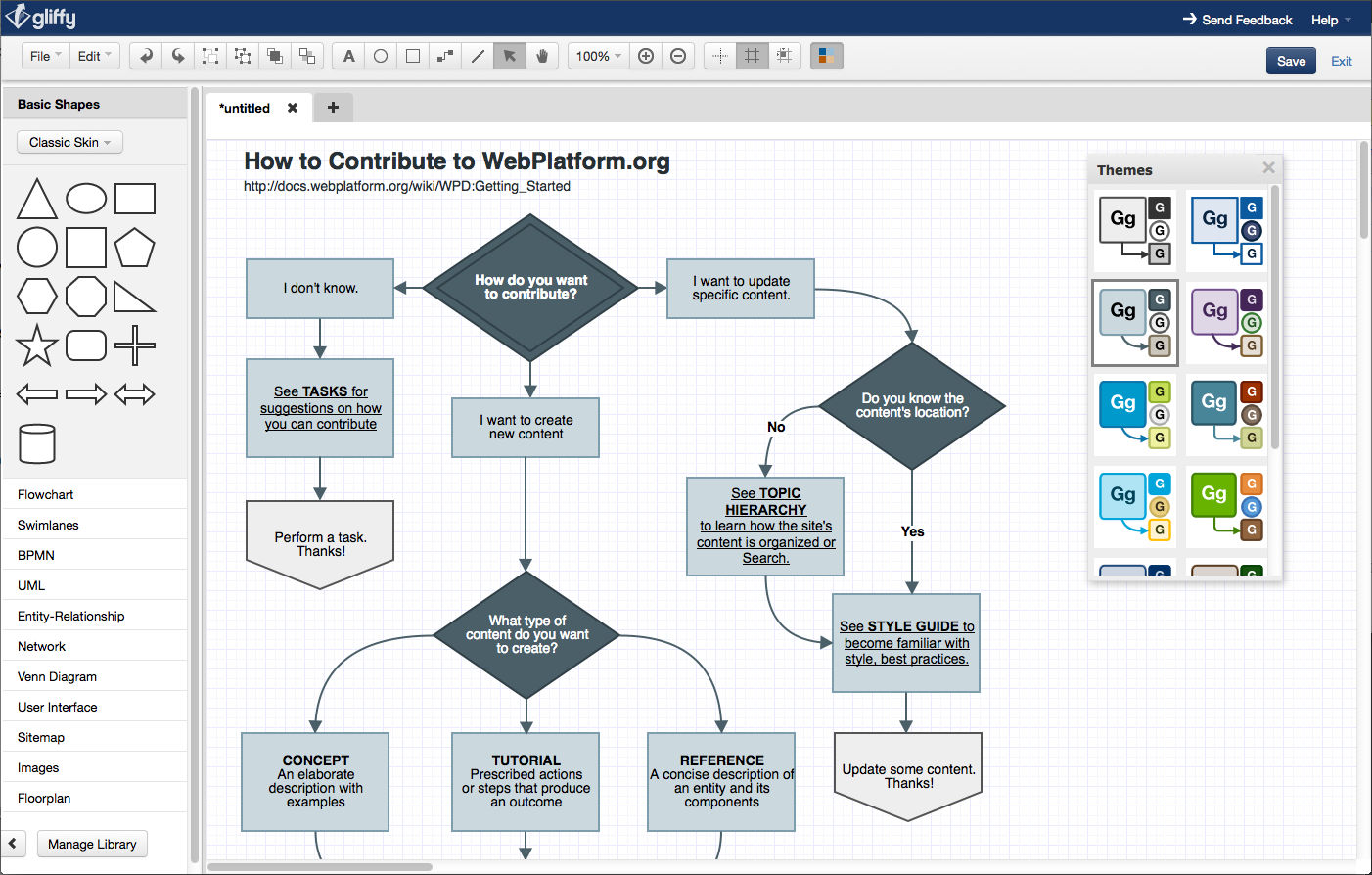
Author/Copyright holder: LucidChart. Copyright terms and license: Fair Use.
LucidChart has an intuitive drag-and-drop interface.
In user experience (UX) design, designers use flowcharts mainly to plot how users move through an interface, such as an app, to achieve their goals (e.g., to purchase clothes online). They describe the relationships between pages/screens and show all interactive possibilities—the starting points, actions required, moments of decision and endpoints—as users encounter and use interfaces. They also aim to account for the various factors that impact users’ interactions (e.g., busy environments). Since flowcharts are highly visual, they’re valuable reference points throughout projects. Flowcharts have a standardized set of:
Symbols – e.g., typically, a rectangle represents an app screen or webpage, a line with an arrow represents the direction users move through a user flow, and a diamond represents a decision point where users must choose an option (so, it’s crucial to show all the directions users can go); and
Conventions – e.g., you present data from left to right and top to bottom.
As paper or digital deliverables, flowcharts represent interactive sequences at two levels:
User flows – Overviews of the complete process of steps which users might take through a whole app, service or website (e.g., from accessing a webshop’s landing page to confirming purchases).
Task flows – Specific aspects of the above (e.g., just the checkout process).
You can use flowcharts especially effectively to:
Visualize interactions for ideation and exploration – to:
Account for all possible interactions (at the start of the design process, to shape user flows).
Evaluate your design’s efficiency – anytime during or after development: e.g., you can spot a user flow which takes too many steps to complete, or a dead end that will likely confuse users (e.g., if they find an item is out of stock and don’t know what to do next).
Present to stakeholders:
Internal stakeholders can examine flowcharts whenever you need approval/buy-in before you can proceed to prototyping (although time and resource constraints might suggest you just prototype instead).
External stakeholders (e.g., clients) can understand your project’s scale and scope when you use a flowchart to help explain how your UX deliverables will ultimately appear.
Paper flowcharts work best here, as your design team can easily erase and redraw these while bouncing ideas around.
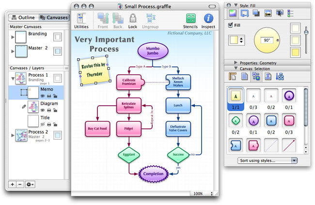
You can dissect even the most complex processes into concise, attractive flowcharts on paper or choose from an array of software to create digital flowcharts with varying features (e.g., real-time collaboration, drag-and-drop functionality). Popular flowcharting UX tools include LucidChart and OmniGraffle (OmniGraffle is only available on MacOS).
Also, there are activity diagrams from UML (Unified Modeling Language: a general-purpose modeling language for visualizing, constructing, and documenting software systems). Activity diagrams look similar to flow charts and designers use them to show user flow. Designers and design teams have dozens of tools that support them, such as Umbrello UML Modeller, a KDE-based UML modeling tool, and ArgoUML, a Java-based UML modeling tool.
To accurately reflect what your users experience via a flowchart, it’s best to define:
Your users and their needs through UX research.
What you want your solution to help users do.
The tasks and subtasks from point of entry to goal completion: From a point of entry (e.g., when a user Googles and finds your site), you can break each task (e.g., purchasing tickets) into 4–8 subtasks (from clicking an app to completing checkout).
Decision points: Discover the critical times users must think about their activities, and how they’ll form impressions of your product/design.
Various paths users can take: Map out task sequences so users can complete actions easily and without wondering how to use your product/design. (In seamless experiences, users shouldn’t have to think about your product/design itself.)
Your best flowcharts will show you empathize with users at each stage corresponding to their customer journey maps.
Wireflows are alternatives to flowcharts. You need wireframing skills to make these. In a wireflow, you connect the wireframes of various pages according to how users will interact with them. So, you’ll have a more realistic-looking, concrete solution to ideate with and spot potential usability problems. However, wireflows tend to be better for showing more simple designs—e.g., websites with few pages—and they can vary in fidelity, or sophistication. Also, in dynamic solutions where users can interact in more complicated workflows, flowcharts may be better due to limitations in space or resources. Plus, there’s a risk of overinvestment (especially earlier on) if your high-fidelity wireflow gets discarded.
Overall, always approach flowcharts with a designer’s eye for visuals. When you diagram tasks thoughtfully for users’ contexts, you can better plan how to help them move as easily as possible from start to finish in each process. Your solutions will therefore more likely resonate with users.
Take our UX Portfolio course, which addresses many aspects of organizing information.
This Justinmind blog offers helpful flowcharting hints.
Read some additional in-depth insights on flowcharts here.
UX (user experience) designers use flowcharts to visualize how users interact with a product or system. Flowcharts map out decision points, actions, and paths in a clear, step-by-step format. This helps designers spot confusion, remove extra steps, and ensure smooth navigation.
Each element, like boxes for actions or diamonds for decisions, shows how users move through a process. Designers use flowcharts to plan user journeys, sign-up flows, error handling, or even feature logic. These diagrams make complex systems easy to understand and share with stakeholders.
By using flowcharts early in the design process, UX teams can catch usability issues before they become expensive. Flowcharts also support alignment across teams by creating a shared visual language.
Get more in the flow of understanding user flows.
A UX flowchart differs from a user journey map in purpose, structure, and detail. Flowcharts focus on system logic; they show all possible user actions and decision points in a product or interface. Each step is technical and precise, which designers and developers often use to build or refine flows like onboarding, checkout, or account recovery.
A user journey map, in contrast, captures the user’s experience, including thoughts, emotions, goals, and pain points across multiple touchpoints. Journey maps are more narrative and holistic; designers and teams use them to empathize with users and identify opportunities for improvement.
Flowcharts answer: “What happens if the user clicks X?”
Journey maps ask: “How does the user feel and think while doing X?”
Both tools are valuable, but they serve different stages of UX strategy.
Explore some fine points about how to clarify journeys in Customer Journey Maps — Walking a Mile in Your Customer’s Shoes.
A typical UX flowchart includes key elements that outline how users interact with a system step-by-step. These elements help designers visualize functionality and decision-making paths clearly and logically.
Start/End points: Represented by ovals, these mark where the user journey begins and ends (e.g., “User visits homepage” or “User completes purchase”).
Processes: Shown as rectangles, they describe user actions or system operations (e.g., “Enter email” or “Display confirmation”).
Decisions: Shaped as diamonds, these indicate branching logic (e.g., “Is password valid?”). They lead to different outcomes based on user input.
Connectors/Arrows: These define flow direction, ensuring the map reads logically from one step to the next.
Labels: Clear labels on all elements explain the action or choice. In UX, this clarity supports collaboration between designers, developers, and stakeholders.
Flowcharts streamline design discussions, reduce ambiguity, and help ensure smooth user navigation.
Enjoy our article The UX Tools Series: Great Tools for Mind Mapping, Flow Charting and Site Mapping to get more out of flowcharting.
Create a flowchart early in your UX project—ideally during the planning or wireframing stage—to clarify how users interact with your product. This tool helps visualize user paths, decision points, and system responses before any work on high-fidelity designs begins.
Use flowcharts when you’re:
Defining task flows like sign-ups, checkouts, or error handling.
Explaining logic-heavy features such as onboarding or filters.
Collaborating with developers on implementation details.
Identifying redundant steps or potential user drop-offs.
Flowcharts are especially useful when redesigning existing flows or integrating new features. They support agile sprints by aligning teams on user logic. They also reveal usability issues before design or development investment kicks into gear.
The earlier you chart flows, the fewer problems you’ll face down the line and more money you’ll save.
Wireframes are basic visual representations of a user interface; they outline the structure and layout of a webpage or app. They’re a key deliverable of UX (user experience) design. See how wireframing fits into the design process in this video:
Flowcharts help identify pain points in UX by making user interactions, decisions, and system responses visible in a step-by-step format. When designers map out every screen, choice, and outcome, it becomes easier to spot friction—like extra steps, confusing loops, or dead ends.
For example, if a checkout flow includes three decision points before payment, the chart exposes this complexity. Designers can then ask, “Do we need all of these?” or “Where might users drop off?” Similarly, missing feedback steps or unclear outcomes become obvious when they’re absent from the chart.
Flowcharts also support usability testing and journey mapping by aligning what should happen with what users actually do. They provide a visual reference to compare intended paths with real behavior, highlighting mismatches or breakdowns and aligning team members around an empathic view of users’ needs.
Watch this video to see why designing with empathy is a must for successful products and services:
To build a user flow chart for a mobile app, follow these steps to map out clear, intuitive interactions:
Define the user’s goal: Start with what the user wants to achieve, like “Book a ride” or “Upload a photo.” This becomes the endpoint of your flow.
List key actions: Break the journey into individual steps (e.g., “Open app,” “Tap menu,” “Select option”). Think from the user’s perspective, not the system’s.
Map screens and decisions: Use shapes, rectangles for screens, diamonds for decisions. For example, “Login?” might lead to either “Enter credentials” or “Sign up.”
Use clear labels and arrows: Arrows show direction; labels explain actions. Make the flow readable and logical.
Test and iterate: Share the chart with your team. Test with users to find missing steps or unclear logic.
This process helps UX and UI designers align on app behavior before wireframing, saving time and reducing errors such as—a particularly problematic one—assuming mobile solutions are like desktop ones, only shrunken for smaller screens.
Consider the users’ context of use, for a fuller picture of what users likely go through, which Alan Dix, Author of the bestselling book “Human-Computer Interaction” and Director of the Computational Foundry at Swansea University, discusses in this video:
Avoid these common mistakes in UX flowcharts to ensure clarity, accuracy, and usability:
Skipping user decisions: Omitting decision points oversimplifies the flow. Always include “yes/no” steps like “Is the password valid?” to reflect real user paths.
Overloading the chart: Cramming too many steps or details makes the chart hard to follow. Focus on critical flows and split complex processes out into linked diagrams.
Vague labels: Generic labels like “Continue” or “Process” confuse teams. Use clear, descriptive terms that explain exactly what happens.
Disconnected flows: All elements must link logically. Unconnected shapes or floating steps lead to ambiguity in how users progress.
No feedback loops: Users often make mistakes or change paths. Ignoring “back” actions or error states leaves gaps in the design logic.
Missing or inadequate error handling: Be sure to anticipate and deal with all the errors that may occur in a process. They are much easier to plan for in a flowchart than in software development, and poor or absent error handling is a major, often-overlooked issue.
By avoiding these mistakes, you can build flowcharts that support better decision-making and smoother user experiences.
Explore some points about how to clarify journeys in Customer Journey Maps — Walking a Mile in Your Customer’s Shoes.
Include just enough detail in a UX flowchart to explain the user’s path clearly, without overwhelming viewers. The level of detail depends on the chart’s purpose:
High-level flowcharts map out major screens and decisions (e.g., “Login → Home → Checkout”). Use these in early planning to align teams and define scope.
Detailed flowcharts drill into specific steps like input validation, error messages, or conditional logic. Use these during wireframing or handoff to developers.
Don’t add visual elements like button positions or colors—these belong in wireframes. Instead, focus on actions, decisions, and system responses. Use labels that are precise but brief (e.g., “User taps ‘Next’” or “System checks password”).
If in doubt, start simple and layer detail as the design progresses.
Enjoy our article The UX Tools Series: Great Tools for Mind Mapping, Flow Charting and Site Mapping to get more out of flowcharting
A UX flowchart guides interface layout decisions by showing the sequence of actions users take and the decisions they face. This helps designers understand what content, components, and interactions each screen must support.
For example, if a flowchart shows that “Choose Plan” leads to “Enter Payment Info,” the interface must support a clear transition to reduce user friction. Decision points like “Is the user logged in?” help define conditional layouts; one for new users, another for returning ones.
Flowcharts also clarify where users may loop back, need feedback, or require support. This ensures interfaces include confirmation messages, error handling, or quick exits—features often missed without flow visualization.
Designers use these insights to prioritize UI elements, reduce cognitive load, and streamline user goals.
Enjoy our article The UX Tools Series: Great Tools for Mind Mapping, Flow Charting and Site Mapping to get more out of flowcharting.
UX flowcharts support collaboration between designers and developers by acting as a shared blueprint for how a system behaves. They outline every user action, decision point, and system response in a visual format that’s easy for both teams to understand.
For designers, flowcharts clarify what screens and interactions they need to create. For developers, they provide the logic behind those screens, like when to validate input, load content, or handle errors. This reduces miscommunication and prevents surprises during handoff.
Flowcharts also highlight edge cases, alternative flows, and conditions early, before design or code begins. This leads to faster feedback, fewer revisions, and smoother implementation.
By aligning on logic before visuals, teams save time and build more consistent, user-friendly products.
Discover more about cross-functional collaboration in this video with Laura Klein: Product Management Expert, Principal at Users Know, Author of Build Better Products and UX for Lean Startups:
Relevant Subjects
Unified Modeling Language: Activity Diagrams
Activity diagrams are visual flowcharts that show how things get done in a system or business process. They map out the sequence of actions, decisions, and conditions that control how work flows from start to finish. Think of them like a roadmap that shows all the steps someone or something needs to take to complete a task, including what triggers each action and what happens when decisions need to be made.
Activity diagrams use standard symbols and connecting arrows to represent different elements: activities (the work being done), partitions (which often represent different departments or people responsible for different parts), and edges (the connections that show how the flow moves from one step to another). You can organize the diagram using "swimlanes" – horizontal or vertical sections that show which person or department is responsible for each action. The diagrams can handle complex scenarios including parallel activities happening at the same time, decision points where the flow branches in different directions, and even interruptions that can stop or redirect the entire process.
Blogs
b13 GmbH. (2024, February 29). Mastering web flow charts: Design, development, and utilization in UX. b13 Blog.
This blog article from b13 GmbH offers a practical guide to creating and utilizing flowchart diagrams within UX design workflows. It outlines best practices for mapping user journeys, structuring navigation, and visually articulating decision paths. The post emphasizes the strategic value of flowcharts in communicating design logic clearly across multidisciplinary teams and enhancing user interface development.
Remember, the more you learn about design, the more you make yourself valuable.
Improve your UX / UI Design skills and grow your career! Join IxDF now!
You earned your gift with a perfect score! Let us send it to you.
We've emailed your gift to name@email.com.
Improve your UX / UI Design skills and grow your career! Join IxDF now!
Here's the entire UX literature on Flowcharts in UX/UI Design by the Interaction Design Foundation, collated in one place:
Take a deep dive into Flowcharts with our course AI for Designers .
Master complex skills effortlessly with proven best practices and toolkits directly from the world's top design experts. Meet your expert for this course:
Ioana Teleanu: AI x Product Design Leader (ex-Miro, ex-UiPath). Founder, UX Goodies.
We believe in Open Access and the democratization of knowledge. Unfortunately, world-class educational materials such as this page are normally hidden behind paywalls or in expensive textbooks.
If you want this to change, , link to us, or join us to help us democratize design knowledge!