Input fields are an essential user interface design element, providing users with the means to enter non-standardized responses. They are used in many different situations, but most people will have come across them when entering personal details and delivery addresses on e-commerce web forms or sending online queries. Prompting customized information, these fields can expedite and enhance interaction.
Input Fields
Your constantly-updated definition of Input Fields and collection of videos and articles.
Be a conversation starter: Share this page and inspire others!
Get 1 Powerful Email Each Week
Join 313,907 subscribers.
What are Input Fields?
Learn More About Input Fields
Make learning as easy as watching Netflix: Learn more about Input Fields by taking the online IxDF Course UI Design Patterns for Successful Software.
Why? Because design skills make you valuable. In any job. Any industry.
Earn Industry-Recognized Certificates
Industry giants trust our courses to train their teams, and prestigious universities integrate our content into their curricula. Add your certificates to your LinkedIn profile, résumé, and job applications.




All Free IxDF Articles on Input Fields


Giving Your Users Freedom with Editable Input Fields
When you want to purchase something on the internet, no matter what it is, or which e-commerce service you use, you don’t want to encounter any restrictions. Just imagine what your user experience would be like if a web shop presented you with a limited set of options to choose from when asking for
- Social shares
- 729
- Published
Read Article
Giving Your Users Freedom with Editable Input Fields

When you want to purchase something on the internet, no matter what it is, or which e-commerce service you use, you don’t want to encounter any restrictions. Just imagine what your user experience would be like if a web shop presented you with a limited set of options to choose from when asking for your contact details. And what would you say if Firefox started to present input for an online complaint form based on what they predicted you to be disappointed with? The design solution in this case is so obvious and omnipresent that you might underestimate the power of this design pattern. Here, we will have a closer look at the benefits and attention points of implementing editable input fields that will allow you to give full control to your users.
The Design Problem
You require input from your users, but their responses are things that no one but the users can predict; nor are users required to select an option from a constrained and preset list. In other words: users need to be free to generate input in their own words. If you were to fail to give them this liberty—instead constraining them to one of, for example, ten or twenty choices to put a checkmark beside—it would speak volumes about how dimly your organization viewed uniqueness. As each user is unique, he or she will feel more valued if you provide the means to reflect that individuality, and all users will likely become more engaged if you give them this chance. Tangent to this is the issue of expediting contact between the user and the organization. So as to illustrate this point—and for our amusement—imagine a parallel universe, one in which you couldn’t express information directly on a screen but instead had to go through a series of, say, dropdown menus. For someone called John Smith to declare himself, he would have to go through nine dropdown menus (or ten, if we include the space) in order to indicate ‘J’ for the first letter, ‘O’ for the second, ‘H’ for the third, and so on. If you had to endure that each and every time so as to convey information across the Internet, just think how long your sanity could hold out.
The Design Solution
Provide users with editable input fields that they can clearly distinguish from the rest of the display, so they know the region in which they can enter data is different from the non-editable background. By setting white (or very light-colored) input fields against darker backgrounds, you will pretty much instantly guide the user’s eye to compute how much information he or she needs to enter.
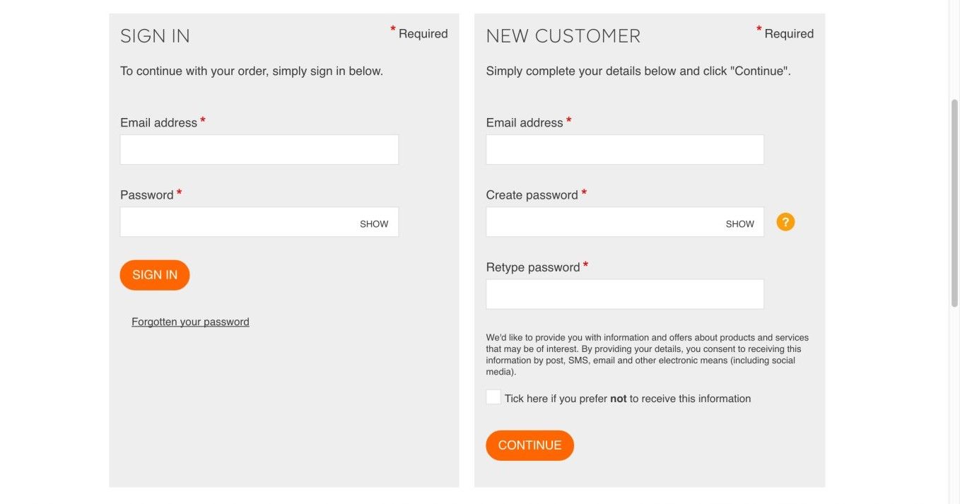
The customer at the B&Q online DIY store has the option to sign in or register with editable input fields. Not allowing editable input fields would restrict users greatly in their ability to create a personalized profile. Can you imagine how hard it would be to try distinguishing yourself and showing your identity by filling in circles or ticking boxes?
© B&Q, Fair Use.
Why Choose an Input Field Design Pattern
Input fields are an essential user interface design element, providing users with the means to enter non-standardized responses. They are used in many different situations, but most people will have come across them when entering personal details and delivery addresses on e-commerce web forms, or sending online queries (see example image above).
Editable input fields have become a ubiquitous element in graphical user interfaces, so almost every user will be familiar with them and how to interact with them. However, you must make sure you implement these fields in a way that enables users to see that they can enter data into these regions; otherwise, users might overlook them or struggle to see where they must enter their responses. Therefore, editable input fields are an absolute must in many different situations, but improper design can adversely affect the user experience. For instance, anyone who has gone through the process of completing a more involved set of input fields on a screen—be it for a job application, a study questionnaire, or what have you—can attest to the sheer frustration that comes from thinking you’re done, clicking, and then seeing a red exclamation mark at the top that says “You do not seem to have filled out all the fields. Please try again.”
If you have a constrained group of possible answers, you should probably use a dropdown menu or scrolling list, as this will save users from having to enter their choices manually. For example, ‘Dr.’, ‘Mr.’, ‘Mrs.’, and ‘Ms.’ cover virtually all the options regarding how a user wants to be addressed. But what if the user wants to be called ‘Professor’ or ‘Reverend’? Sometimes, we as designers allow users to enter their response freely and we provide a list of possible inputs as well. This allows the users to enter their choice independently if they do not need help, or scan the list first if they do. In the case of titles, we could allow the user to select ‘Other’ from the list and offer a field in which to type the title he or she prefers.
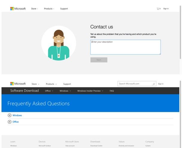
Microsoft uses an editable input field to help the user find solutions to problems. Additionally, Microsoft allows users to browse a list of frequently asked questions (FAQs) that may help them find what they need. Unfortunately, these two strategies to finding answers are neither linked nor presented in the same location, meaning the user may well get distracted by having to jump between areas of focus.
© Microsoft, Fair Use.
Before we continue, while we bear in mind that there’s more to designing a well-considered series of input fields on a given screen than may meet the eye, we might draw some inspiration from the words of the Great-grand-godfather of the computer:
“Errors using inadequate data are much less than those using no data at all.”
—Charles Babbage, English mathematician, philosopher, inventor and mechanical engineer
Best Practice: How to Implement Input Fields
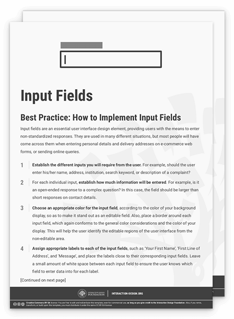
Establish the different inputs you will require from the user. For example, should the user enter his/her name, address, institution, search keyword, or description of a complaint?
For each individual input, establish how much information will be entered. For example, is it an open-ended response to a complex question? In this case, the field should be larger than short responses on contact details.
Choose an appropriate color for the input field, according to the color of your background display, so as to make it stand out as an editable field. Also, place a border around each input field, which again conforms to the general color considerations and the color of your display. This will help the user identify the editable regions of the user interface from the non-editable area.
Assign appropriate labels to each of the input fields, such as 'Your First Name', 'First Line of Address', and 'Message', and place the labels close to their corresponding input fields. Leave a small amount of white space between each input field to ensure the user knows which field to enter data into for each label.
For a useful piece of informative feedback, when the user has clicked in a particular input field, you can use an intermittently visible vertical black line, the same as the cursor you see when typing a Word document. This way, you’ll provide the user with an instantly perceptible clue as to where he/she last entered data or where the text will appear when he/she begins typing.
To help you get started implementing input fields, you can download and print our “Input Fields” template:
Advance Your Career With This Free Template
for “Input Fields”
Potential Problems with Input Fields
There are three major considerations when implementing input fields in your user interface: color, size, and arrangement.
Color – The user must be able to determine which parts of the screen are editable and which regions are not. In order to help users immediately identify input fields, we use different colors for the editable and non-editable regions of the user interface. Traditionally, the input field is white, while the rest of the online form is grey or some other contrasting color (like in the contact form on the Microsoft website, and the registration form on the B&Q store above). However, some designers simply use the same color for the whole display. This might not be a problem when the input fields are clearly delineated with a dark border and the display color is white, but it might be a serious problem if the user interface is any other color and the borders are less apparent. A sensible choice of color scheme involves playing colors off one another so as to make the best use of contrast and draw the user’s eye towards a field like it is a bulls-eye. A good ‘insurance’ is to provide hints such as a flashing cursor and a greyed-out cue.
Size – The input field should provide the user with an implicit indication of how much information is required. For example, the largest input field in the online form below is the ‘Describe yourself’ section, which indicates that users can insert a larger amount of information than in the following fields. This also allows users to view the previous contents of their message as they enter more and more information; if the input field were the same size as those below, such as ‘Website name’ and ‘Country', then users would have to backtrack continually through their comment to check what they had previously written. Field size can also help users know whether they entered the correct input—for example, in online forms that require a specific number of digits or letters. When entering credit card details, a user will know he is not finished when the input field is not filled completely. However, for a longer, more intricate series of fields (such as an application form), remember that the use of very many fields, especially small ones, combined with the need to do a lot of scrolling, can cause oversights and impair the user experience when the system flags missing data in a field—especially if you haven’t designed it to take the user directly to the problem field/s.
Arrangement – Input fields relate to specific labels; when an input field is too far from its corresponding label or too near to an unconnected label, the user might get confused. Therefore, arranging the input fields and their labels so they promote prompt identification of each individual field—without inhibiting detection of another field when moving from one to the other—is vital. Part of preventing confusion involves ensuring the user interface is not cluttered; so, make sure you arrange the input fields and their labels with a small amount of space between each one, rather than bunching them all together to conserve space. Space-wise, less is not more; less causes stress.
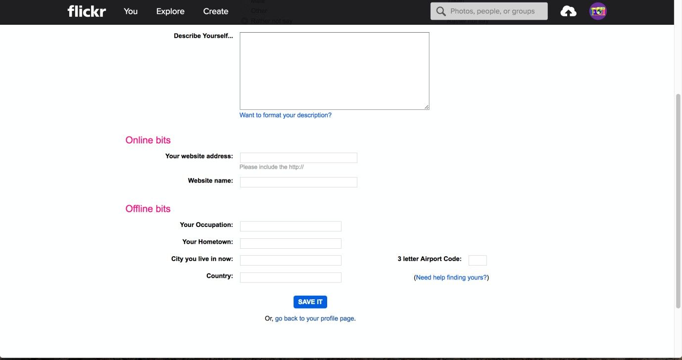
The Flickr profile page allows users to describe themselves and their contact information freely. So as to distinguish the editable input fields from the background, they merely use a thin grey line. While the design is essentially sound, the ‘interactability’ with the fields could be emphasized more by using color.
© Flickr, Fair Use.
The Take Away
Editable input fields are a great way to give control to your users. They will enjoy the freedom of creating their own input so as to accomplish their tasks. As simple and straightforward as a screen containing a few of these fields may seem, there is a science (and an art) to optimizing the experience for your users, and implementing these fields requires attention to a few key points: color, size, and arrangement. Considering these elements in the design process allows you to create interfaces that are easy to use and user experiences that will not frustrate, thereby driving more interaction with the organization you represent.
References & Where to Learn More
Hero Image: © Monoar, Fair Use
Jenifer Tidwell, Designing Interfaces: Patterns for Effective Interaction Design, 2010
Martijn van Welie, Pattern Library, 2008.