Graphical user interfaces (GUIs) are visual systems that let users interact with digital devices through elements like buttons, icons, and menus. UX (user experience) designers shape these interfaces to support intuitive, efficient user journeys and help users achieve their goals with clarity and confidence.
Explore how to make the most of screen design and build strong bridges to reach your users, in this video with Alan Dix: Author of the bestselling book “Human-Computer Interaction” and Director of the Computational Foundry at Swansea University.
How GUIs Became The Dominant Form of User Interaction
Screens were the natural choice for human-computer interaction. The first computers emerged in the 1940s. By the end of the 1960s, innovators such as Ivan Sutherland (with his lightpen-oriented display) and Douglas Engelbart (whose team developed the oN-Line System) had helped advance the state of the art substantially. The sign of the times, however, was that early computer users had to input typed instructions on primitive command-line interfaces to execute actions—something that computer users still do whenever they use command prompts.
Things changed in the 1970s when the first graphical user interface emerged at Xerox PARC, where researchers developed the Xerox Alto. GUIs now meant that a visual layer of software permitted users to interact with digital systems through graphical elements instead of typing commands. GUIs use visual cues—like icons, buttons, scrollbars, sliders, and tabs—to help users navigate, control, and engage with digital products.
To the question of “What is a graphical user interface (GUI) and its significance?” history provides clear answers. GUIs transformed computing from a specialized skill into an everyday activity. The rise of consumer-friendly interfaces in the 1980s—starting with Apple’s Macintosh and Microsoft’s Windows—made personal computing accessible to non-technical users. The stage was set for GUIs to rise to the point where they’ve come to power everything from smartphone apps and car dashboards to kiosks, smart TVs, and operating systems.
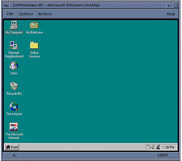
Released in summer 1995, Windows 95 was a cultural and technological milestone. Its intuitive graphical user interface and built-in support for multitasking made personal computing mainstream for the masses.
© Techpubs.Jurassic.Nl, Fair use
Why The Screen Scene Matters to UX Designers
GUIs are more than visual decoration—they’re where the user meets the system. They are how people complete tasks, find answers, and solve problems. That makes them central to UX design—shaping how billions of users interact with technology daily and engage with brands; by far and away, most digital experiences in the early 21st-century are GUI-based.
The Designer’s Role in GUI Creation
UX designers focus on how users experience interfaces. Their goal is to create designs that match—if not exceed—user expectations, reduce effort, and maximize satisfaction. For example, designers must know why users pick up their smartphones in the first instance to get something done, like pick items and place an order on Amazon.com. However, it could also be a workplace intranet where choices come from different “sources” than wanting a product. In any case, GUI development means designers shape layouts, flows, interactions, and visual hierarchy to support usability and clarity.
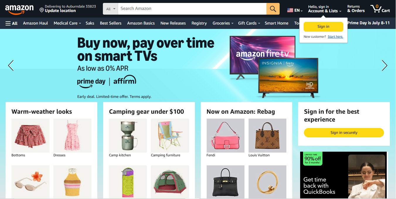
With its clear visual hierarchy and solid understanding of why users visit, Amazon’s iconic site features icons, buttons, and much more that GUI designers can learn from.
© Amazon, Fair use
GUIs and UX: What’s the Difference?
It’s important to understand the distinction between UI (user interface) design and UX design here. UI design is a subset of the broader UX discipline. UI designers handle the aesthetics and functionality of GUIs, using well-considered elements, colors, typography, and spacing. UX designers shape the structure and logic of the interface; to do this, they ask:
What does the user need to accomplish?
What information or controls do they need to do it?
How can we reduce friction and confusion?
Where might people get stuck?
When UX designers find answers to these questions and apply useful insights, they can ensure the GUI doesn’t just look good—it works well, too.
Explore the difference between UI and UX design in this video to get a clearer picture of how effective GUIs take form.
What’s On-Screen and Why – The Anatomy of a GUI
Most GUIs consist of:
Windows: Frames or panels where content appears.
Icons: Small graphic representations of tools or actions.
Menus: Lists of commands or options.
Buttons: Clickable elements that trigger actions from users.
Toolbars: Sets of frequently used tools or commands.
Text fields: Input areas where users can enter information.
Scrollbars, sliders, tabs: Navigational aids.
Dialog boxes: Pop-up interfaces for messages or inputs.
Designers ensure that every element in a GUI works in concert to support usability and reduce cognitive load. The challenge is to make all of this feel seamless. A seamless experience feels almost magical—users get what they want, enjoy the experience, and forget there’s even a screen between them. The interface essentially fades into the background, and the user focuses on their goal while interacting with the product, service, or experience.
Explore the vital area of navigation to understand more about how users get around in digital products and what good navigation means, in this video with Alan Dix.
How to Design Effective GUIs, Step by Step
A structured design process helps power the way to creating an effective GUI. Here’s a step-by-step approach for UX and UI designers.
1. Start with User Research
Before you sketch anything, learn what your users need. Interview them in ethnographic research, for example. Observe how they work, and gather insights into their goals, pain points, and habits. Focus on context; the best interface for a desktop dashboard won’t work for a user who’s constantly on mobile.
Discover why research is where it all begins and why it helps designers set the best foundations on which to build, in this video with William Hudson: User Experience Strategist and Founder of Syntagm Ltd.
2. Define Use Cases and Requirements
Now that you know the users’ needs and problems, define and clarify what users must do within a potential interface. List features and tasks. Prioritize core actions over nice-to-haves. This is still an “embryonic” stage—you’re building towards the beginnings of what a solution might look like, not anywhere close to committing to a design solution.
3. Sketch Information Architecture
Plan the layout of information and functionality. Use flowcharts and site maps to understand how users will navigate between screens and sections.
Investigate how a strong information architecture (IA) helps your design build further from solid UX research foundations that underpin it, in this video.
4. Create Wireframes
Design wireframes to block out the structure of each screen. Focus on placement, hierarchy, and interactions—it’s still “early days” for your design ideas, so don’t get into color or style yet.
Get closer to wireframing and what it can do for your designs, in our video.
5. Build Interactive Prototypes
Turn wireframes into clickable prototypes using UX or prototyping tools. You’ll have your first representation of a GUI where you can test flows and behaviors without writing code. That’s important as you’ll want to see how intuitive the first users will find it.
Put yourself in the picture of what effective prototyping looks like and why, in this video with Alan Dix.
6. Conduct Usability Testing
It’s time to test your prototype with real users. Watch where they succeed—and where they stumble. Ask open-ended questions while you pay close attention to what users do. Analyze that test data and use the insights to refine your design.
7. Design Visuals and Microinteractions
Once the structure works (note that it may take several prototypes, and testing of those, to get to this level), layer in branding, color, typography, and microinteractions. Microinteractions—the subtle, often animated responses that guide and reassure users with feedback—serve as critical parts of GUI design because they show the system is listening. These subtle points should provide the delightful factors, making the interface feel polished.
A vital ingredient needs to come through in your website or app by this point. Ensure accessibility is alive and well in your digital product. It’s a vital consideration because it’s the law in many countries and a significant aid for all users, too. For example, YouTube’s subtitles help both users with hearing disabilities and those without but who are in loud environments.
Explore how to extend the reach of your design work to cover everybody’s needs, in our video about accessible design.
8. Hand Off to Developers
Prepare specs, design systems, and documentation for the development team. Work closely with them to ensure the final product matches your vision.
9. Test the Built Product
Conduct usability and accessibility tests on the live product. Fix bugs and weed out any flaws that emerge. The harder-to-spot problems can surface when you track behavior through analytics. Keep improving and keep watching how user delight translates into business success.
Grab a smart set of insights into what a “finished” product can mean. A Minimum Desirable Product might be the best first step out into the marketplace, as Frank Spillers: Service Designer, Founder and CEO of Experience Dynamics, discusses.
Some Best Practices for GUI Design
Effective GUIs don’t just happen and wow users—they result from deliberate, user-focused decisions that purposefully delight and slash the chances of frustration and confusion. Some guiding principles every designer should apply are to:
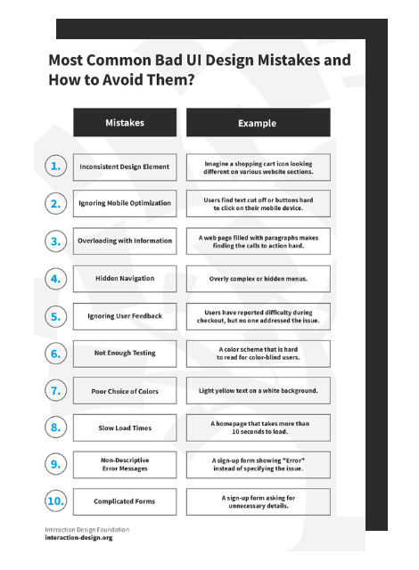
Keep It Consistent
Uniformity builds trust and reduces the user’s mental load. Use consistent iconography, spacing, alignment, colors, and typography. Familiar patterns make interfaces easier to learn and navigate.
Example:
When the "Submit" button always appears at the bottom right of a form—and always looks the same—users know where to go next.
Watch this video to explore how consistent design patterns create more intuitive and effective digital experiences.
Prioritize Clarity
Users shouldn't have to guess what something does. Label buttons clearly with consistent microcopy. Use standard icons and write concise instructions with simple language. For example, a button that says, “Buy now” is better than one that says, “Purchase now.”
Design for Predictability
When users click something, they should know what will happen. Avoid hidden behaviors or surprising results—even ones you think might be “pleasant” for users. Many people might be in stressful situations or extremely busy; things must work as they expect them to. Design based on established interface conventions unless you have a strong reason to break them.
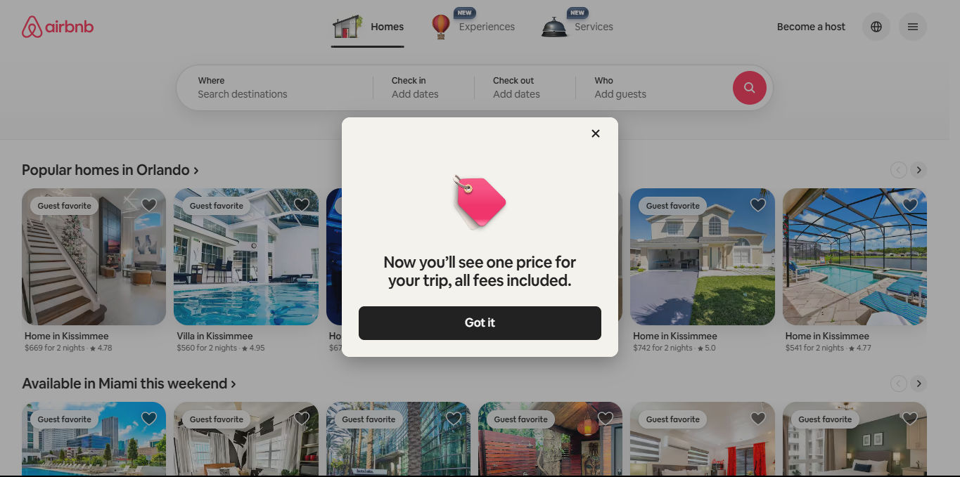
Consider how much trust users place in Airbnb. They intend to travel and stay in properties and depend on their expectations being met if not exceeded. If they’re to trust this can happen, they need a predictable, trustable digital experience that delivers every time.
© Airbnb, Fair use
Use Feedback Thoughtfully
The system should respond to user input in clear, immediate ways. For example:
A button pulses slightly when hovered over.
A loading bar animates as a file uploads.
A form field turns green after valid input.
A success message appears when a task is completed.
Clear feedback builds confidence, and trust depends on confidence.
Streamline User Flows
Design for efficiency. Remove unnecessary steps. Group related elements. Help users complete their goals quickly, especially for repetitive or high-frequency tasks. Remember your research findings and stay mindful of what users might be experiencing in their many user contexts; they want empathic design solutions that understand where they are, what’s going on around them, and what they need to do in the moment.
Explore how effective empathy plus dedicated design equals happier users, in this video.
Support Error Prevention and Recovery
Things can—and often will—go wrong; an imperfect world surrounds everyone. It could be connection issues, a bump in the road that makes a bus-riding user thumb the wrong button, or a variety of other causes. So, design interfaces that guide users away from mistakes, but also give them clear ways to fix errors when they happen. Error messages should explain what went wrong and how to fix it. Don’t leave them dangling, wondering what just happened or if something terrible will come of it; every split-second counts, and they need to believe your brand has got their back.
Not good: “Error 401.”
Better: “You must log in to continue. Please enter your username and password.”
Ensure Accessibility
It’s impossible to overstate the importance of accessible designs that all users can enjoy. Follow accessibility standards (such as WCAG). Use high-contrast colors, alt text for images, and labels for input fields. Enable keyboard navigation and screen reader compatibility, as many users will arrive on your site or app with assistive technology and expect it to let them do what they want. Inclusive and accessible designs aren’t nice-to-have options or something to tack on at the end of the UX design process as an afterthought. They also make clear statements about the caring and attentive brands that create them and expand the usability and convenience to levels that everyone can appreciate.
Use Microinteractions Mindfully
Microinteractions make interfaces feel intuitive and responsive when designers apply them wisely. They reduce ambiguity, prevent mistakes, and create emotional satisfaction, especially when users experience micro-moments such as wanting to order food, learn how to fix an item quickly, find directions, and buy items. Use microinteractions for feedback, but don’t overdo them—they should enhance clarity, not distract from the task.
Watch the Way Ahead
Stay current with design trends. It doesn’t mean following fashions fickly; it means that you remain aware of where the technology—along with modern users’ expectations—is heading. Timeless design principles should always come first, but when you understand a few modern directions that are shaping GUI design, you can make more informed decisions. For example:
Dark mode support: Many users prefer dark mode for comfort and aesthetics.
Neumorphism: A visual style blending flat and skeuomorphic elements (such as a search bar that appears gently raised from the background, with soft shadows that make it look like it’s molded into the screen. This approach is best used sparingly for clarity.
Voice-enabled interfaces: GUIs that integrate voice control still need fallback visual interfaces.
Component-based design systems: Some UX tools let teams reuse UI components for consistency and speed.
Gesture-based navigation: Especially relevant on mobile and touch devices, requiring visual cues and fallbacks. Gesture-based UIs may well become more prominent as a fundamental staple in the future of design.
Get more guidance on what successful mobile UIs look like in this video with Frank Spillers:
Special Considerations for GUI Design
Even experienced designers can run into pitfalls or battle with ideas about which design elements would be best to include. Here’s some further advice to help you stay aware of your users’ needs as you create the best graphical user interface designs for your target audience.
1. The Interface = Limited Space
Don’t overload the screen; trying to show everything at once clutters it and turns users off. Group related elements. Use progressive disclosure to reveal complexity only when users need it.
Proceed to a place where you can design with confidence about what to show users and when, as this video discusses.
2. Mobile Needs
Desktop-first design can create issues on small screens—hence why mobile-first design makes sense. Most users access digital products on smartphones and tablets. Design responsively and test on real devices.
3. Icons
Icons alone can confuse users, so always label them unless they’re universally understood, like a trash can for delete. When you signify what icons mean, you empower users to do what they need to—quickly.
Grab a greater grasp of how to direct users’ attention so they can successfully get things done on your digital product, as this video discusses.
4. Aesthetics
Design should serve function but beware of over-relying on aesthetics. For example, fancy animations or ultra-minimal layouts might look modern—but they can create usability problems if they hide controls or confuse users.
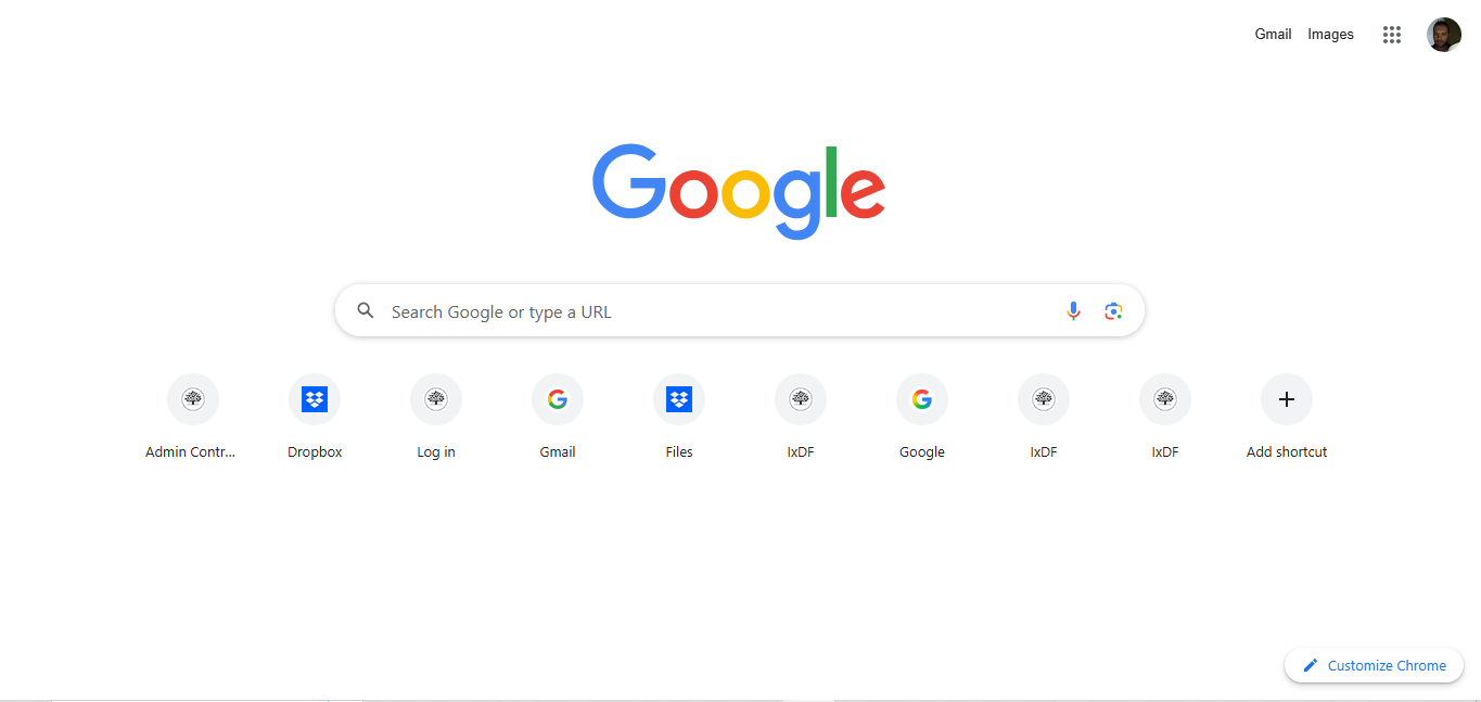
With its generous white space and pure simplicity that gives “iconic” new meaning, Google offers minimalist design. However, this brand does it with careful consideration for user behavior and user needs—one reason for Google’s massive success.
© Google, Fair use
5. Error Guidance
Users need clear instructions whenever something goes wrong, so use a proactive, non-judgmental tone. Never blame the user—even in a joking way. They might have clicked a button prematurely before filling out a form: not a time for “How dare you!”; help them recover, quickly.
Discover why designs that cater to users’ contexts reach users best, in this video with Alan Dix.
Above all, graphical user interfaces define how users experience digital products and will continue to for years to come. Design has come a long way since the days when users had to type “Load” and other commands to get anywhere with computers. For UX and UI designers to create successful GUIs, it takes more than arranging pixels. It means understanding users, solving problems, and crafting paths that feel natural and empowering. It’s about being fully in step with what users want, why they engage with an interface, where they want to proceed to each step of the way, and how to speed them comfortably on their user journey.
A well-designed GUI invites action. It lets people focus on their goals, not the tool; “seamless” means they’re interacting directly with the brand that offers them what they want. It also means they never have to hesitate, at least not because of something the designer has done wrong. By applying usability and design principles with care, testing with real users, and designing with empathy, designers can create GUIs that are both beautiful and functional—interfaces that feel like second nature and succeed in the “magic” of putting the user at the center of the experience while carrying them to a better place in terms of what they want or need to do.
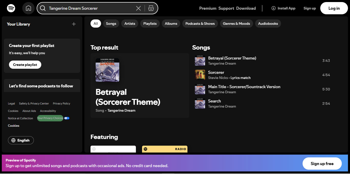
Spotify also presents mastery of the GUI and won’t disappoint users who want to pick from a vast array of desired songs, albums, and much more.
© Spotify, Fair use


