Your constantly-updated definition of Spatial Cognition and collection of videos and articles. Be a conversation starter: Share this page and inspire others!
99 Shares
What is Spatial Cognition?
Spatial cognition is our brain’s ability to understand our bodies in relation to the space around us. It lets us judge distances, know directions and navigate.
Copyright
Copyright holder: mobilenet.cz Appearance time: 0:31 - 0:35 Copyright license and terms: CC BY Link: https://www.youtube.com/watch?v=J85-o_1rt8k&t=56s&ab_channel=mobilenet.cz
Copyright holder: Taqtile Appearance time: 1:28 - 1:42 Copyright license and terms: CC BY Link: https://www.youtube.com/watch?v=_EfKA2RdSbY&t=1s&ab_channel=Taqtile
Transcript
Transcript loading ...
This ability allows us to intuit physics and geometry and gives us a sense of direction. Without it, we would be unable to navigate, catch thrown objects, or generally function. Spatial cognition strongly activates memory. Activating spatial cognition can significantly improve a person's memory.
Spatial cognition "hacks" are tools that memory athletes use to perform incredible acts of recollection. It is an essential brain function and of particular interest in spatial UIs, such as augmented and virtual reality.
Elements of Spatial Cognition
Spatial Perception: Spatial perception is the ability to perceive and interpret spatial relationships between objects, locations, and ourselves. It allows us to recognize objects in space, understand distances, and perceive depth and perspective.
Spatial Memory: Spatial memory encodes, stores, and retrieves spatial information. It's how we remember the locations of objects, landmarks, and routes. Spatial memory plays a crucial role in navigation and wayfinding.
Spatial Reasoning: Spatial reasoning lets us make logical predictions of objects in space. This ability enables us to understand geometric properties and transformations. We use spatial reasoning to predict a ball's trajectory and catch it. We can also visualize what a bowl might look like if it were twice as large or upside down.
Spatial Problem-Solving: Spatial problem-solving uses spatial information and reasoning to complete tasks. This process can include finding the shortest route between two points, assembling objects, or interpreting maps and diagrams.
Spatial Cognition and Memory
Our brains evolved to understand the physical world before we learned to remember abstract thoughts. This is why some people have learned to trick the brain into activating spatial memory.
The ancient Greeks developed a method called "the method of loci." Essentially, the person creates an imaginary space called a "memory palace," where they store their memories as imaginary physical objects.
Spatial Cognition in UX
Maps and other navigation interfaces are typical examples of how interfaces activate the brain processes associated with spatial cognition. However, most two-dimensional interfaces utilize it less.
Three-dimensional interfaces, like video games, augmented reality (AR) and virtual reality (VR), activate this brain process.
The tradeoff is that unrealistic physics, perspective and proportions can be particularly disorienting in AR and VR. More realistic environments will activate spatial cognition more powerfully.
Questions About Spatial Cognition? We've Got Answers!
Why should UX designers care about spatial cognition?
UX (user experience) designers should care about spatial cognition because it determines how users perceive and navigate visual interfaces. Spatial cognition involves how the brain interprets layouts, relationships, and movement within a space. Users create mental maps of products, which guide their expectations and actions. If an app respects these maps, navigation feels effortless. If not, users become disoriented and frustrated.
Familiar patterns, like persistent navigation bars, support these mental maps. By leveraging spatial cognition, designers can reduce friction, increase engagement, and deliver seamless, intuitive digital experiences that feel “right” from the moment someone interacts with them.
Make more of your designs by appealing to user mental models.
How does the brain process space and layout when using visual interfaces?
The brain processes space and layout by forming internal maps that depend on spatial cues. Regions like the hippocampus and parietal lobe help users understand where they are and where they can go. When users see familiar markers—like a logo or consistent menu placement—they subconsciously “anchor” themselves.
If layouts change unpredictably, these maps break, resulting in confusion. Designers ease this cognitive work by maintaining stable layouts, clear hierarchies, and recognizable patterns. This allows the brain to process screens faster and with less effort, which helps users reach their goals without unnecessary frustration.
What are the main principles of spatial cognition that apply to interface design?
Several spatial cognition principles guide good interface design. Landmarks, like logos or fixed navigation, anchor users. Grouping and proximity follow Gestalt psychology and show relationships by placing items together. Well-structured navigation creates predictable flows, like a checkout process. Consistency strengthens mental maps by keeping layouts stable across screens. Last, but not least, hierarchy uses size, contrast, and white space to signal importance.
Designers who apply these principles create experiences that “just make sense” to users.
Discover how to gear designs around the Gestalt Principles to help make experiences that make sense to users.
How does spatial cognition help users build mental maps of a product?
Spatial cognition allows users to build mental maps—internal layouts of a product structure. These maps help users remember where features “live” and predict navigation paths. For example, when the “Profile” button remains in the same place across screens, users quickly locate it.
Inconsistent placement, on the other hand, forces users to “remap” each time, increasing frustration.Good UX nurtures mental maps by using logical grouping, stable navigation, and recognizable design patterns. Over time, these maps make even complex apps feel familiar and easy to use, encouraging return visits and smoother engagement.
How can UX designers support the sense of direction of users in visual interfaces?
Designers can support the sense of direction of users by providing strong anchors and consistent navigation. Breadcrumb trails, fixed headers, and highlighted menu items help users understand their current location and next steps. Removing or shifting core navigation elements can disorient users, disrupting their mental maps.
Studies show users rely on “digital landmarks” like persistent icons to orient themselves. Products like Amazon maintain this sense of direction by keeping navigation constant across browsing and checkout. Designers who reinforce orientation keep users confident, reducing drop-offs and improving flow.
Find out how to create better designs through excellent navigation.
Why do some layouts feel more “intuitive” than others?
Layouts feel intuitive when they align with user expectations and existing mental models. People anticipate certain placements—search bars at the top, shopping carts in the upper right—because of repeated exposure. When designs follow these conventions, users process them quickly and easily.
In contrast, unconventional layouts force relearning, slowing interaction and eroding trust. Cognitive fluency studies show familiar layouts not only feel easier but seem more reliable too. Designers can innovate, all right, but aligning with known patterns ensures users instantly “get” the interface without conscious effort.
What are some best practices for aligning elements to match the spatial expectations of users?
Designers align elements by following established conventions and consistent grids. Use top navigation for menus, sidebars for categories, and predictable placements for key actions like “Save” or “Checkout.”Group related items together, and align text, icons, and buttons to an invisible grid for harmony.
Eye-tracking research shows users scan in patterns like the F-pattern, so place core elements in these zones to boost discoverability. These practices reduce orientation time and keep users focused on completing tasks, instead of struggling to interpret the interface.
How does spatial cognition change in AR, VR, and 3D interfaces?
Spatial cognition shifts in augmented reality (AR), virtual reality (VR), and 3D because users navigate immersive environments instead of flat screens. In VR, people rely on depth cues, movement, and real-world orientation. Poorly placed or inconsistent virtual landmarks can disorient or even cause motion sickness. AR adds complexity by layering digital elements over physical spaces, forcing the brain to process both at once.
Designers can use clear anchors, stable menus, and familiar interaction zones to ease this.
How does white space affect user perception of spatial organization?
White space helps users process spatial organization by creating perceptual boundaries and visual clarity. Research shows that empty space signals relationships—what belongs together and what is separate—without extra explanation. Crowded designs force users to mentally untangle elements, raising cognitive load.
Strategic white space guides the eye naturally, improving readability and focus. The Apple website famously uses generous white space to spotlight products and simplify navigation. By thoughtfully applying white space, designers can make interfaces feel clean, trustworthy, and easy to use.
Wonder what white space might do for your designs? Check out how to help them breathe and more.
What mistakes overload the spatial processing abilities of users?
UX mistakes overwhelm user spatial processing when they clutter or destabilize layouts. Constantly shifting navigation, inconsistent iconography, and overcrowded screens all force users to relearn the interface repeatedly. Too many elements compete for attention, creating “spatial noise.” Deeply nested menus or disorienting animations add unnecessary complexity, too.
Studies on cognitive load show that excessive reorientation slows tasks and causes frustration. So, designers should simplify screens, maintain consistency, and use recognizable landmarks to protect user mental bandwidth and keep navigation effortless.
Consider the cognitive load of users to help design better for their needs.
How does culture affect spatial cognition and navigation habits?
Culture shapes how people perceive space, direction, and layout. Studies show some cultures navigate using cardinal directions (north, south) while others rely on egocentric cues like “left” and “right.”
Language plays a role: for instance, speakers of Guugu Yimithirr (an Aboriginal language) use compass points for everyday tasks, affecting how they interpret digital layouts. Western users expect left-to-right navigation, but that assumption fails in right-to-left reading cultures like Arabic. Designers who account for these differences, by mirroring layouts or using universal icons, can create products that feel intuitive across cultural boundaries. Research is key, as is using local researchers and testing with the target audience groups you will design for.
Find out vital points about how to design with culture in mind, in this video with Alan Dix: Author of the bestselling book “Human-Computer Interaction” and Director of the Computational Foundry at Swansea University.
Copyright
Copyright holder: Tommi Vainikainen _ Appearance time: 2:56 - 3:03 Copyright license and terms: Public domain, via Wikimedia Commons
Copyright holder: Maik Meid _ Appearance time: 2:56 - 3:03 Copyright license and terms: CC BY 2.0, via Wikimedia Commons _ Link: https://commons.wikimedia.org/wiki/File:Norge_93.jpg
Copyright holder: Paju _ Appearance time: 2:56 - 3:03 Copyright license and terms: CC BY-SA 3.0, via Wikimedia Commons _ Link: https://commons.wikimedia.org/wiki/File:Kaivokselan_kaivokset_kyltti.jpg
Copyright holder: Tiia Monto _ Appearance time: 2:56 - 3:03 Copyright license and terms: CC BY-SA 3.0, via Wikimedia Commons _ Link: https://commons.wikimedia.org/wiki/File:Turku_-_harbour_sign.jpg
Transcript
Transcript loading ...
What are some helpful resources relating to spatial cognition?
Laubheimer explains how spatial memory—the ability of the brain to recall where interface elements reside—affects UX performance. The article details how consistent placement of menus, icons, and navigation supports user mental maps, improving efficiency and reducing disorientation. It discusses how unexpected UI rearrangements can disrupt spatial memory, forcing users to reorient and slowing their workflow. Laubheimer offers practical advice, including using persistent landmarks like headers or icons, designing predictable layouts, and preserving element placement over time. With real-world examples and research grounding, this article stands as a trustworthy, actionable resource for UX practitioners.
Clifton, P. G., Chang, J. S.-K., Yeboah, G., Doucette, A., Chandrasekharan, S., Nitsche, M., Welsh, T., & Mazalek, A. (2016). Design of embodied interfaces for engaging spatial cognition. Cognitive Research: Principles and Implications, 1(1), 1–19. https://doi.org/10.1186/s41235-016-0030-5
This article examines how tangible and embodied interfaces (TEIs) can foster spatial cognition—an ability strongly linked to STEM success. Drawing from embodied cognition theory, the authors propose a design space that connects bodily interaction with spatial thinking, supported by physical movement and tangible feedback. The framework provides both an analytical tool for evaluating existing TEIs and practical guidance for creating new ones. For UX and interaction designers, it offers actionable insights into leveraging embodiment to create richer, more cognitively engaging digital experiences.
This column introduces spatial computing and its impact on UX for AR, VR, and mixed reality. Olewiler outlines four core principles—immerse intentionally, strategize spatially, naturalize interactions, and engage the senses—and connects them to how users think about and navigate digital space. This piece is critical for designers exploring immersive environments and aiming to reduce disorientation through thoughtful, spatially aware interfaces.
Norman explains how mental models shape the understanding of objects and interfaces which users have. He connects design decisions to spatial reasoning, showing why intuitive placement matters. UX designers use this book to understand how people interpret layouts, spot patterns, and form expectations. Its insights apply to both physical and digital products, making it an essential reference for anyone working on user-friendly, spatially coherent designs.
Earn a Gift! Answer a Short Quiz at the End of This Page
Earn a Gift, Answer a Short Quiz!
1
2
3
4
1
2
3
4
Question 1
Question 2
Question 3
Get Your Gift
2
3
4
2
3
4
Question 1
Question 2
Question 3
Get Your Gift
3
4
3
4
Question 1
Question 2
Question 3
Get Your Gift
4
4
Question 1
Question 2
Question 3
Get Your Gift
Try Again! IxDF Cheers for You!
0 out of 3 questions answered correctly
Remember, the more you learn about design, the more you make yourself valuable.
Improve your UX / UI Design skills and grow your career!
Join IxDF now!
Congratulations! You Did Amazing
3 out of 3 questions answered correctly
You earned your gift with a perfect score! Let us send it to you.
1
Check Your Inbox
We've emailed your gift to name@email.com.
Improve your UX / UI Design skills and grow your career! Join IxDF now!
Learn More About Spatial Cognition
Make learning as easy as watching Netflix: Learn more about Spatial Cognition by taking the
online IxDF Course UX Design for Augmented Reality.
Why? Because design skills make you valuable. In any job. Any industry.
In This Course, You'll
Get excited about immersive experiences that effortlessly blend the digital and physical worlds! Feeling stuck in a 2D job? The UX Design for Augmented Reality (AR) course will help you fulfill your potential by creating 3DAR experiences people love with intuitive interfaces and a seamless real-world connection. Use AR overlays for real-time training in industrial settings to improve retention by 80% or to help people visualize a product in their home before purchasing. You'll merge reality with imagination to reshape how people interact with the world around them. More love, more impact, greater salary potential.
Make yourself invaluable with sought-after skills in spatial mapping, gesture-based input, object manipulation, and 3D interaction. Brands that use AR in campaigns see up to a 200% increase in engagement! From AR-assisted surgeries in healthcare to virtual try-ons with your favorite retailer, AR isn't limited to one industry, it's everywhere! And you can easily learn to master it, no matter your background. With clear guidance, hands-on templates, and real-world examples, you'll apply your skills immediately.
Gain confidence and credibility as you discover the AR design process step-by-step, from research to heuristic evaluation. You’ll develop timeless human-centered design skills to create natural, intuitive interfaces that blend digital and physical worlds with genuine empathy and insight. These skills become even more powerful as AI accelerates how fast we build and iterate. They let you turn AI into your superpower as you guide emerging tools toward meaningful and authentic outcomes that only your unique human insight can deliver. You’ll learn how to create customer journey maps, prototype your AR design, and gather usability feedback. With optional hands-on exercises and downloadable templates like the 3D Persona Template and the AR Heuristic Scorecard, you'll walk away with an impressive portfolio featuring your own AR project that accelerates your career success.
It's Easy to Fast-Track Your Career with the World's Best Experts
Master complex skills effortlessly with proven best practices and toolkits directly from the world's top design experts. Meet your expert for this course:
Frank Spillers: Service Designer and Founder and CEO of Experience Dynamics.
Get an Industry-Recognized IxDF Course Certificate
Increase your credibility, salary potential and job opportunities by showing credible evidence of your skills.
IxDF Course Certificates set the industry gold standard. Add them to your LinkedIn profile, resumé, and job applications.
Be in distinguished company, alongside industry leaders who train their teams with the IxDF and trust IxDF Course Certificates.
UX design for Augmented Reality (AR) has some different guidelines than what is used for screen-based UX. Designers must consider the space and the physical limits of what is comfortable for the human body. Also, as AR overlays physical space, you must be very aware of the cognitive load because you
Social shares
623
Published
Read Article
Spatial UI Design: Tips and Best Practices
UX design for Augmented Reality (AR) has some different guidelines than what is used for screen-based UX. Designers must consider the space and the physical limits of what is comfortable for the human body. Also, as AR overlays physical space, you must be very aware of the cognitive load because you add to the existing distractions of the real world.
In this video, UX consultant Frank Spillers covers the main guidelines for AR design. These are invaluable tips that will make your designs much more user-friendly.
Copyright
Copyright holder: GENECSIS Informática Ltda Appearance time: 1:26 - 1:29 Copyright license and terms: CC BY Link: GENECSIS Informática Ltda
Copyright holder: KEE JOON HONG Appearance time: 0:33 - 0:38; 0:47 - 0:52 Copyright license and terms: CC BY Link: https://www.youtube.com/watch?v=dlZRGJx4g8A&ab_channel=KEEJOONHONG
Transcript
Transcript loading ...
General Guidelines for Spatial UI
Let's summarize Frank's guidelines for spatial design in AR:
Design for context intelligence: Have your program sense and respond to the environment. Use space to trigger new content automatically when the user gets near.
Minimize abstract UIs: Affordances are the best tool to make UIs intuitive, especially 3D ones. Don't force users to interpret what things mean. If something looks interactable, make it interactable. Work with real physics and the environment. Use real physics and respect the boundaries of physical space; don't put an interactable object beyond a wall or window. Avoid "secret UIs" or hidden features that users need to use.
Use real physics: Have objects behave and interact in a way that mimics their real-world counterparts. A rubber ball should bounce, and the door handle should open a door.
Direct manipulation: Use natural interactions—for example, simple hand gestures like pressing a button, rotating, or grabbing an object. Use eye tracking or triggers based on the user's proximity. AR is not a suitable medium to flip through menus in, so make interactions as simple and intuitive as possible.
Expect interruptions: AR is highly interruptible. Don't make experiences with uninterruptible content like long videos or animations, especially if they cannot be paused. Allow the user to drop in and out of the experience quickly. It’s very similar to how mobile apps work.
Respect user spatial memory: Don’t overwhelm users with multiple interactions simultaneously. Instead, use contextual tutorials, which tell the user what they need to know in the moment.
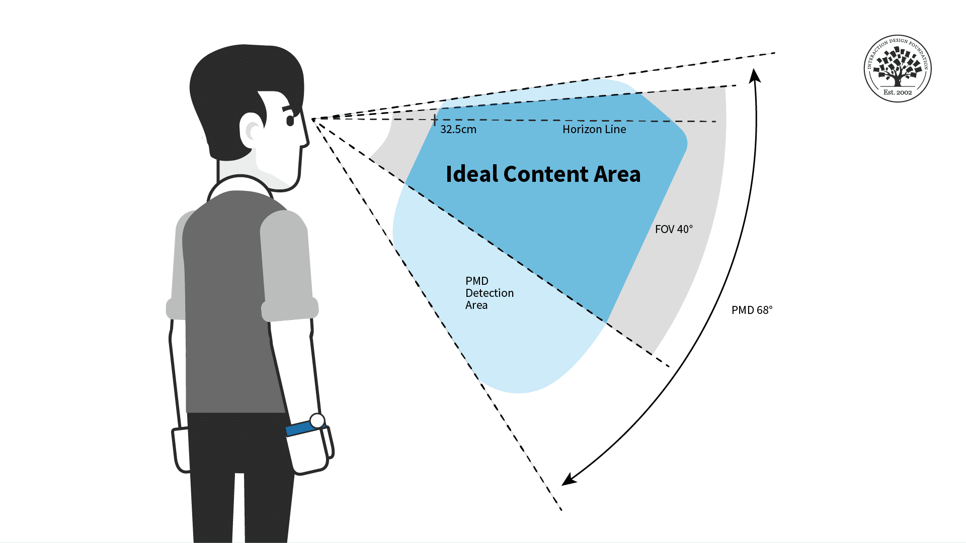
When you design for mobile and desktop, you are limited to the area of the screen. For AR, the area you can work with is limited only by the physical limitations of our vision—more specifically, our field of view and view distance.
How to Design Around Field of View
Transcript
Transcript loading ...
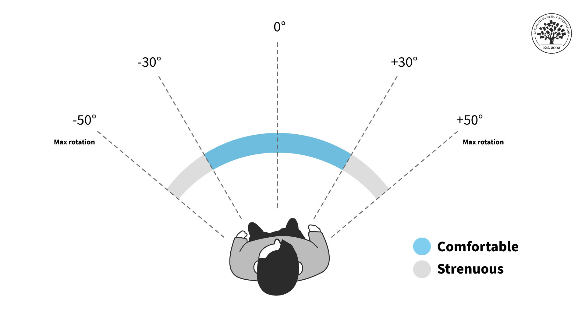
Users will be more comfortable if they aren't constantly forced to swivel their heads. This is true in all Extended Reality (XR) platforms. Place important content in front of them. The ideal horizontal placement for content is within 30 degrees off-center on either side. More than 30 degrees from the center is strenuous on the neck and shouldn't be used often. Content beyond 50 degrees is physically impossible for most people.
These rules apply primarily to content that moves with the user's gaze, like a heads-up display. If you have a scene in front of the user, ensure the main content doesn't exceed these areas. Otherwise, they might miss something when they turn their bodies. For example, you don't want two scenes playing simultaneously on either side of the user. Additionally, if the user uses a phone instead of a headset, the holograms might be cut off, breaking immersion.
AR content should stay within a certain field of view to reduce neck strain.
For the vertical field of view, the chance of neck strain is less of an issue but still present. You shouldn't have users look straight up or down for long periods, especially when they walk around. The ideal content placement for vertical rotation is the 40-degree area slightly above the center of vision or horizon line.
For prolonged interactions, put AR content in the ideal horizontal area displayed above for the most comfort.
Place your AR experiences in the most comfortable viewing angles to make users more relaxed and less tired. Remember that other factors might adjust the viewing angles and ideal distance.
While you design, consider whether the user is sitting, reclining, standing, or walking. While walking, you generally want users to face the direction they are walking in. While seated, the user may be more comfortable but unable to turn their whole body unless they adjust their seat. If possible, have your content automatically adjust for these different scenarios, and adjust once the user is in motion.
Remember that every human body is different, so give the user tools to adjust their field of view if they have neck pain or other conditions. Above all, you want to ensure the user has everything they need to be comfortable with your product.
FOV Design Tips and Best Practices
The user should always control the camera movement. Let them drive. Don't shake the camera, purposely lock rotation, or turn the user's camera for them.
Be sensitive to issues around dizziness or vertigo. You shouldn't need users to spin constantly to see everything.
Avoid abrupt movements and be mindful of people's reflexive reactions. For example, users will react to objects that fly toward their faces. If you need to bring content to or from the user, move it slowly and smoothly toward them for the most comfort.
Use shorter animations than you would in a desktop or VR experience. Remember that AR is for short bursts of activity and design around distractions.
Avoid timed challenges, like limited window rewards that are only available for a few seconds. This is primarily a safety issue, but it is also a good idea because these can be easy to miss if the user is looking elsewhere.
Allow the user to see the world in the background. AR users don't expect to be fully immersed without warning. It may be unsettling or dangerous to obscure their whole environment with content.
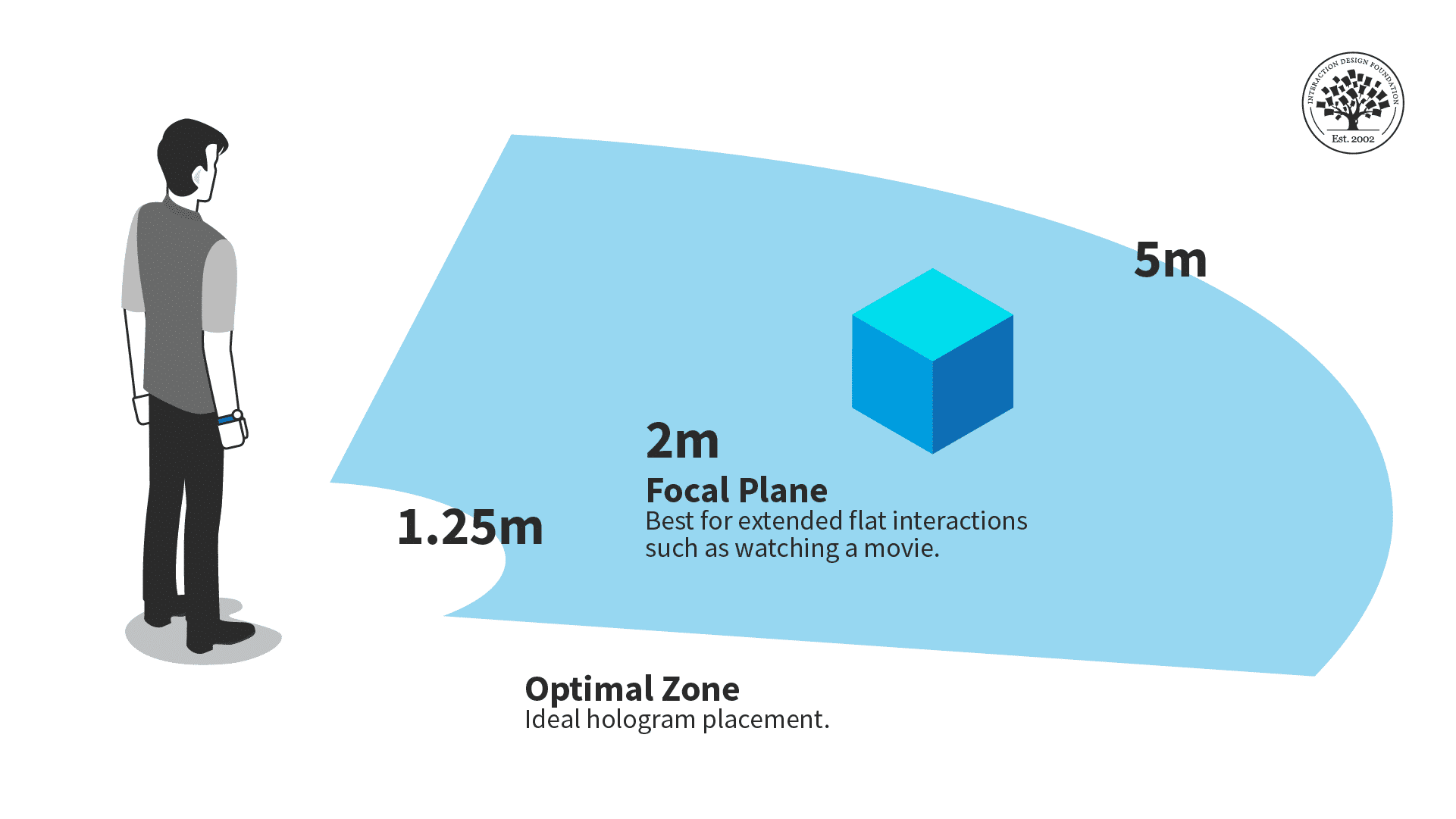
Lastly, you will want to place content at a comfortable distance away from the user, especially for prolonged interactions.
The optimal zone for AR content is between one and a quarter meters and five meters.
Ideally, you should place objects within five meters of the users and beyond one and a quarter meters. Users might overlook your content, want more personal space, or collide with the holograms if things are too close. Too far, and it might be hard for the user to see.
Consider situations where a user can move closer or farther from your content. While seated, the optimal distance is critical, as the user can't adjust the distance themselves. A walkable experience can be more flexible with distance, but ensure your content works best in the optimal view distance.
For example, audio or animations should trigger once the user reaches the right distance.
The Take Away
Because of how it interacts with physical space, AR needs to follow specific guidelines to make an experience that isn't unpleasant for viewers.
Object placement should fall within a central area in the user's field of vision, and objects shouldn't be too close or far away from the user.
AI is replacing jobs everywhere, yet design jobs are booming with a projected 45% job growth.
With design skills, you can create products and services people love. More love means more impact and greater salary potential.
At IxDF, we help you from your first course to your next job, all in one place.