Titled sections form a design pattern that helps the user skim contents and identify interesting or useful information. They are sections of content in which each section has a title that clearly indicates the subject of that section. Users will be able to navigate a page quickly and effortlessly. Titled sections thereby help users to complete tasks.
Titled Sections
Your constantly-updated definition of Titled Sections and collection of videos and articles.
Be a conversation starter: Share this page and inspire others!
Get 1 Powerful Email Each Week
Join 313,907 subscribers.
What are Titled Sections?
Learn More About Titled Sections
Make learning as easy as watching Netflix: Learn more about Titled Sections by taking the online IxDF Course UI Design Patterns for Successful Software.
Why? Because design skills make you valuable. In any job. Any industry.
Earn Industry-Recognized Certificates
Industry giants trust our courses to train their teams, and prestigious universities integrate our content into their curricula. Add your certificates to your LinkedIn profile, résumé, and job applications.

All Free IxDF Articles on Titled Sections


Help Users Skim Contents with Titled Sections
Text-heavy websites, such as those of all the major newspapers that have embraced the web as an essential medium for the future, know the importance of using titled sections to reel the readers in. There’s a perfect art to the craft, and it stems from an exact science concerning how human beings pro
- Social shares
- 563
- Published
Read Article
Help Users Skim Contents with Titled Sections

Text-heavy websites, such as those of all the major newspapers that have embraced the web as an essential medium for the future, know the importance of using titled sections to reel the readers in. There’s a perfect art to the craft, and it stems from an exact science concerning how human beings process information. So, learn from The New York Times and The Wall Street Journal, and find out how to translate their experiences to any website or application that conveys a lot of information to users. This can help you not only make visitors to your design more comfortable and stay with it; it also might just prompt them to make a good decision that much faster, and do something to get what they want, while giving you what you want.
The Design Problem
When you are dealing with a page, window, or panel that contains a large amount of information and everything must be displayed at once, users can get overwhelmed. They will need to spend a lot of effort on scanning the content, in hopes of isolating information of current interest from all the other content on there, so as to reduce the amount of scanning they need to do.

Author/Copyright holder: Unsplash. Copyright terms and license: CC0.
When reading a novel or report, a reader will tend to have few problems with working through larger sections of text without titles. After all, one of the pleasures of reading is the very act of reading, savoring plot lines and the like, getting excited about what’s coming next. However, let’s leave our idyllic novel and think about looking for information. Titles are always needed to support scanning in search of relevant information for the task at hand. The screen shown in this image does not provide any clues about the topic of the information; instead, it’s designed to be read from start to finish.
The Design Solution
Titled sections help the user skim a page’s contents and identify interesting or useful information. Simply put, they are sections of content that have a title which clearly indicates the subject of that section. Although the solution appears straightforward enough, when implemented with care, its benefits are far-stretching.
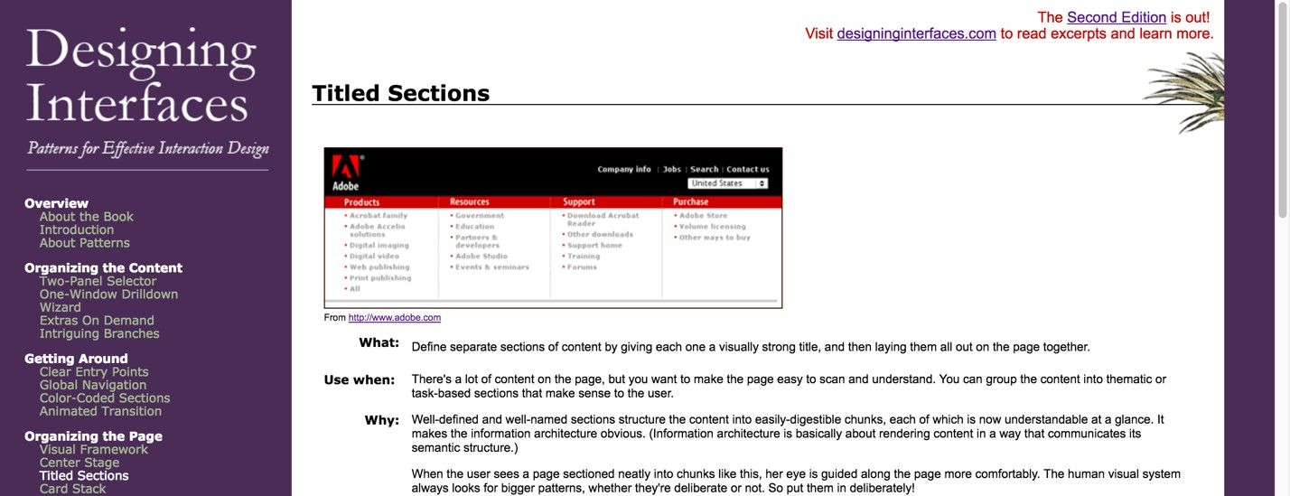
Author/Copyright holder: Jenifer Tidwell. Copyright terms and license: Fair Use.
Jennifer Tidwell, renowned author of the book ‘Designing Interfaces’, uses titled sections on the webpage showing all sorts of design patterns. On the left-hand side, you can see how she grouped patterns into categories, allowing users to get an overview of where to find the desired information very quickly.
Why Choose a Titled Section Design Pattern?
When the user scans the user interface, the titled sections provide strong visual cues to direct attention to relevant information. These save users from having to read through the contents themselves. At a glance, you know what each section is about. If you already know one or more of the points being made, you can zero in on what you do want to read, as opposed to taking the grand tour, which would take much more time.
The titles also serve to break the contents into more manageable chunks, which is especially useful when there are large bodies of text on a page. Human vision is naturally attuned to detecting differences, so the titles—usually in bold and larger font than the rest of the contents—instantly draw the user's attention, helping to lead the user through the user interface.
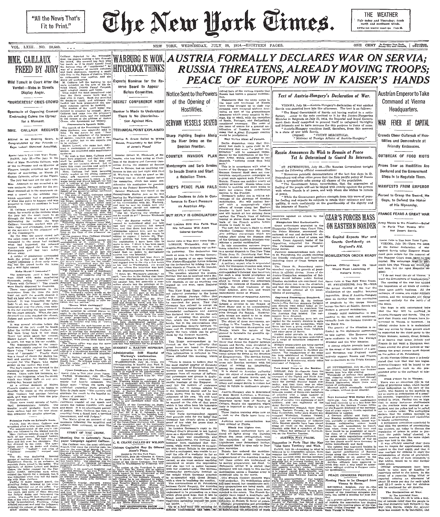
Author/Copyright holder: The New York Times Company. Copyright terms and license: Public Domain.
Here we have an example of what newspapers used to look like, before implementing titled sections became a common practice to help readers find their way to relevant information. While you can, of course, follow the columns, you might wonder just how comfortably you could keep that up if you had no other choice of format.
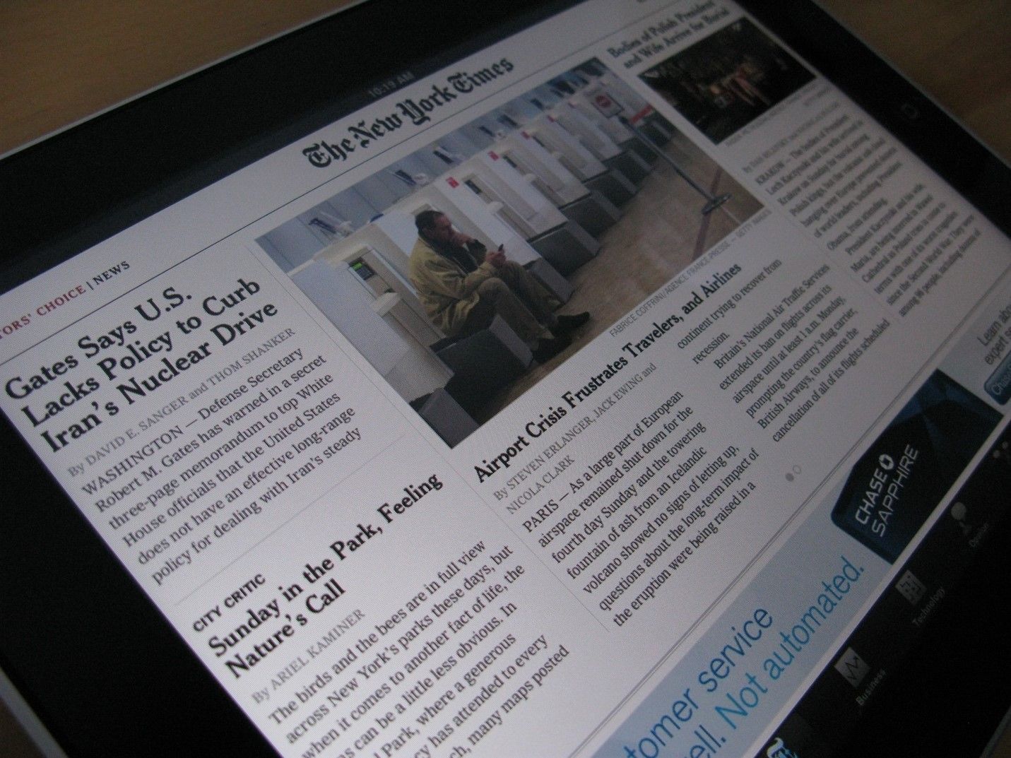
Author/Copyright holder: Jon Fingas. Copyright terms and license: CC BY-ND 2.0.
Nowadays, the same newspapers use titled sections in every page they create, whether online or offline. The difference in page layout between this New York Times app and its historical counterpart, in the previous example, is as clear as a bell.
Best Practice: How to Implement Titled Sections
Divide the contents into logical and meaningful chunks.
Assign short titles to these pockets of information; typically, two words should be enough for categories you use in a top-navigation bar. For other types of titles, you can use more words, but no more than a concise sentence.
Now choose the superficial aspects of the design, such as font, font size, color, and width. Test these superficial aspects in combination with the rest of the display. For example, you must make sure the title color does not conflict with the background color and they are perceptible by those who have any degree of color blindness.
Make sure you place the titles in close proximity to the corresponding contents, while using white space to separate the different sections.
Sometimes, designers use borders in combination with titles to divide contents, but they are not always necessary and they can draw the user's eye needlessly. However, a pale (e.g., light grey) border can increase the sense that a body of information is independent from all other contents, so this might be useful when you do not want users who are viewing chunks of information to think these are connected in any way.
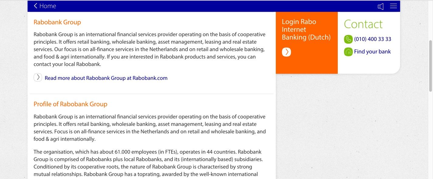
Author/Copyright holder: Rabobank. Copyright terms and license: Fair Use.
Sometimes, a designer can use light grey borders to separate one section of information from another. In the example shown here, a Dutch bank is using grey borders for exactly that reason, to emphasize the titled sections.
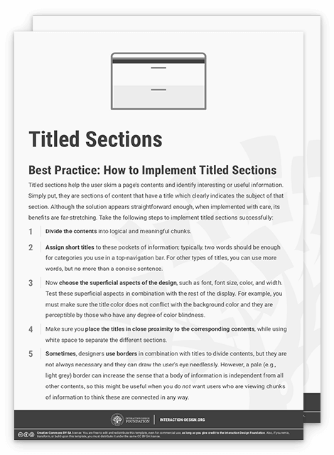
To help you get started implementing titled sections, you can download and print our “Titled Sections” template:
Advance Your Career With This Free Template
for “Titled Sections”
Potential Problems with Titled Sections
“Make your subheads intriguing as well as informative. Web readers have well-honed BS meters, so don’t exaggerate or you’ll lose credibility. ‘Compelling’ is not the same as ‘hypey.’ "
—Pamela Wilson, Author of Master Content Marketing: A Simple Strategy to Cure the Blank Page Blues and Attract a Profitable Audience
Indeed, we should never lose sight of the point that we’ll have to hold our reader’s interest with the substance of our material. However, let’s stick with the form for now. When there is lots of information on a page, titled sections might not be enough on their own to order contents. On these occasions, you might want to consider using other design patterns such as a tabbed document interface, a two-panel selector, or even an accordion menu. Users do not want to wade through large areas of text, so you should arrange contents in a way that saves their time and limits the amount of scrolling required.
There may be times when you are struggling to come up with logical and concise titles for your sections; on these occasions, the chunks of information might be best placed in another user interface design pattern, or you may want to reconsider your current arrangement. One thing is for sure; a title must give off clear cues that a user will reach his or her goal when pursuing that particular path. This is called ‘information scent’, and it assists users as they seek specific contents and move from one section to another. If the titles have a weak information scent, the user will have to scan more of the contents to decide whether this is what he or she is looking for, which defeats the objective of using titled sections in your design.
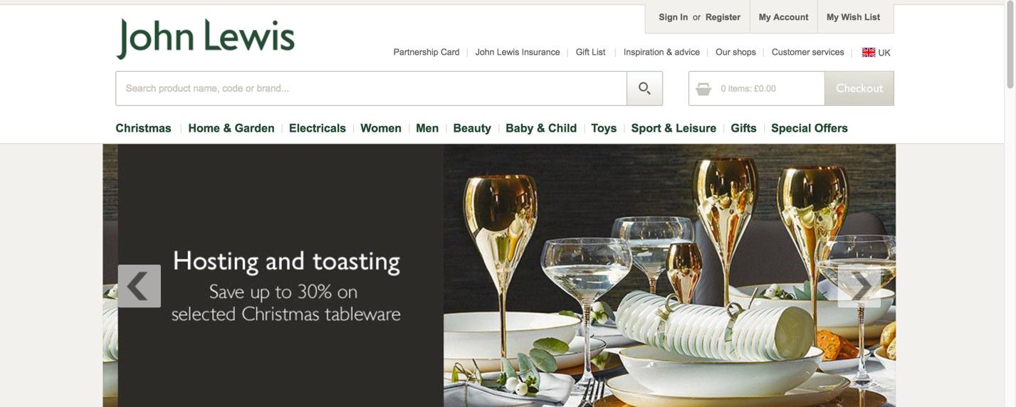
Author/Copyright holder: John Lewis. Copyright terms and license: Fair Use.
This website for the John Lewis department store in the UK shows how difficult creating titles that have a strong information scent can be. At first glance, the product categories seem clear enough. However, when users would be looking for a hairdryer, they could start looking for it either in the beauty category or in the electricals.
The Take Away
When users need to find their way through large amounts of information, you as a designer can help them along by using titled sections: sections of content that are signified by representative titles. Building on the experience of large newspapers, titled sections will help your users to skim content in search of relevant information. Implementing titled sections involves dividing the content into logical and meaningful chunks, assigning short titles to these pockets of information, and visualizing them in a way that supports usability of the interface. Finding the right words to describe categories of information is essential when implementing this user interface design pattern, as a weak information scent will keep users guessing where they need to go to reach their goals.
References & Where to Learn More
Hero Image: Author/Copyright holder: Kaboompics. Copyright terms and license: CC0.
Jenifer Tidwell, Designing Interfaces: Patterns for Effective Interaction Design, 2010
Martijn van Welie, Pattern Library, 2008