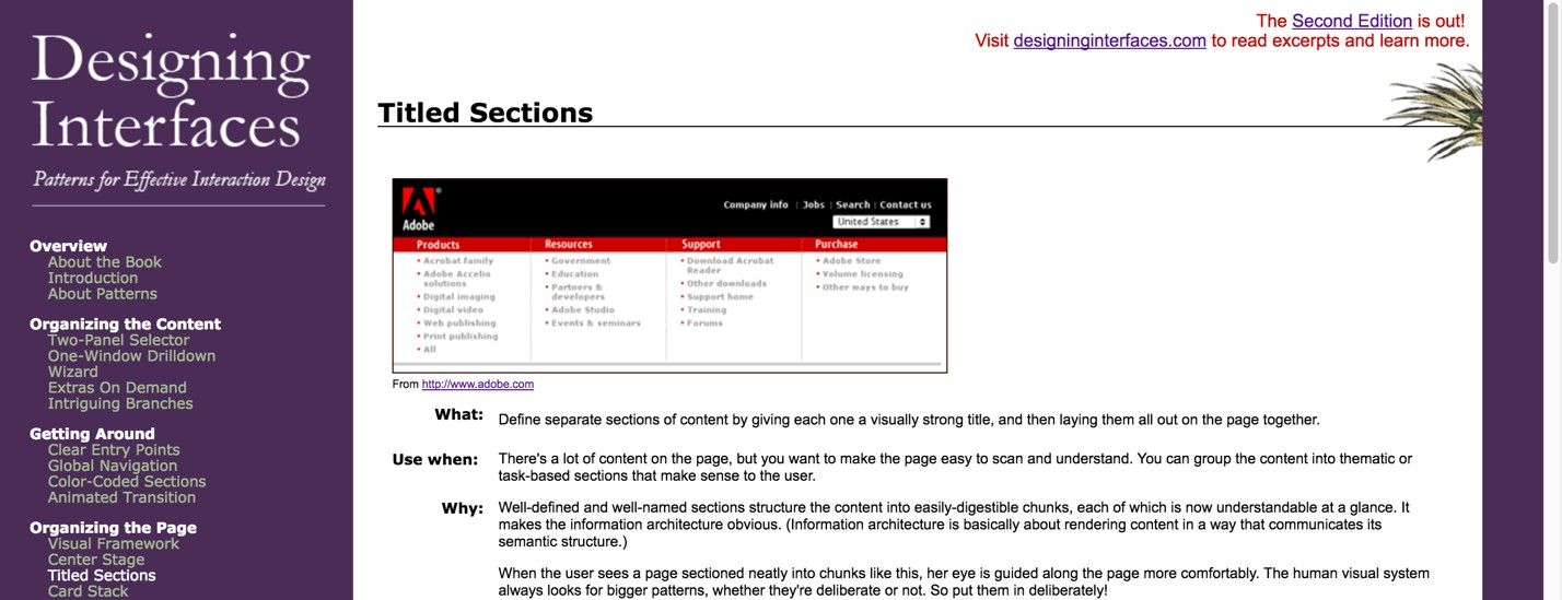
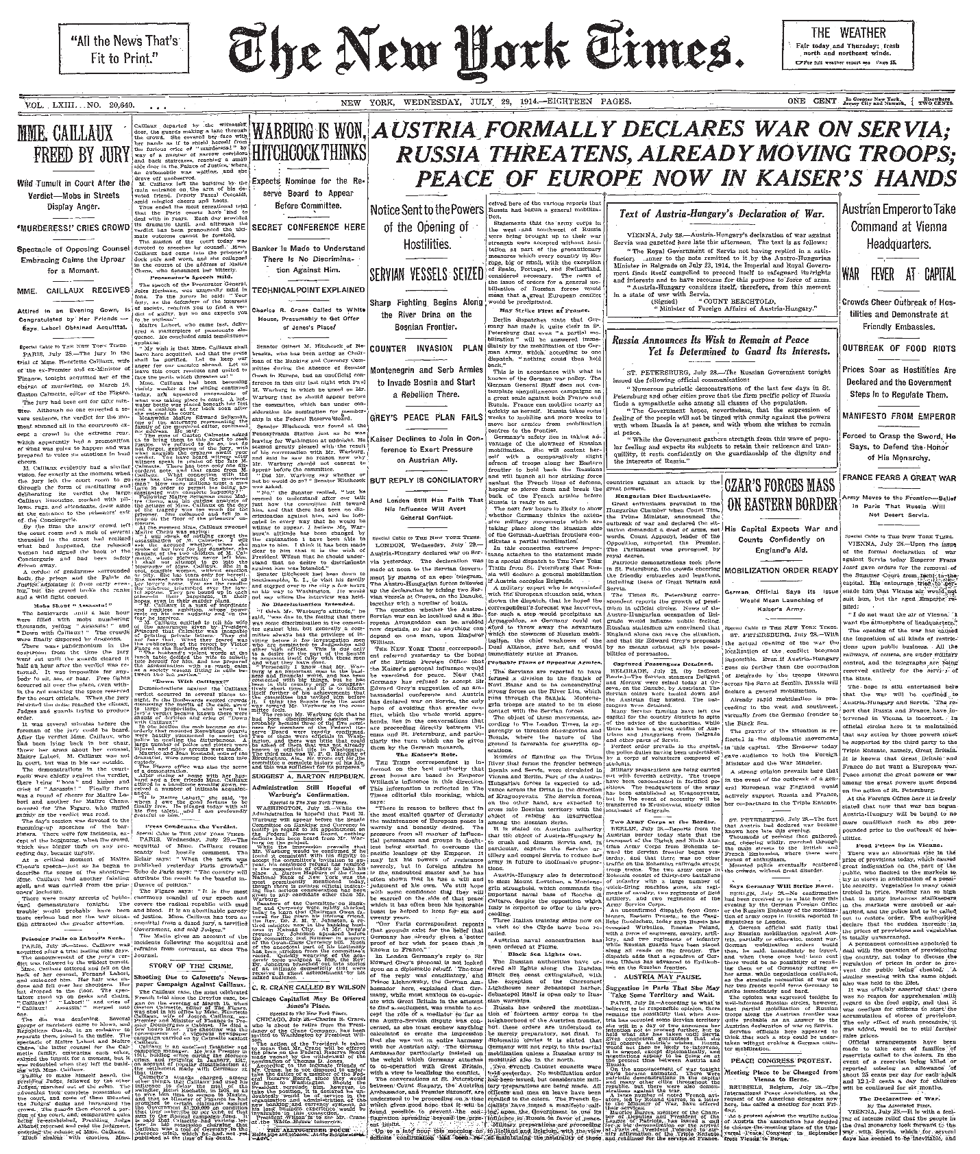
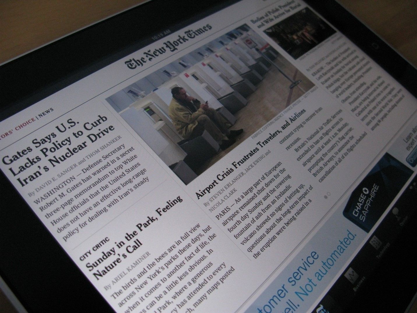
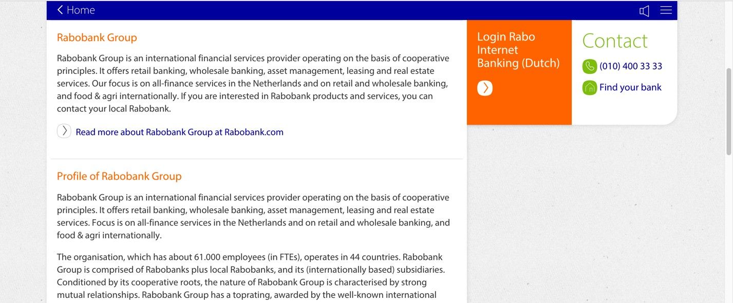
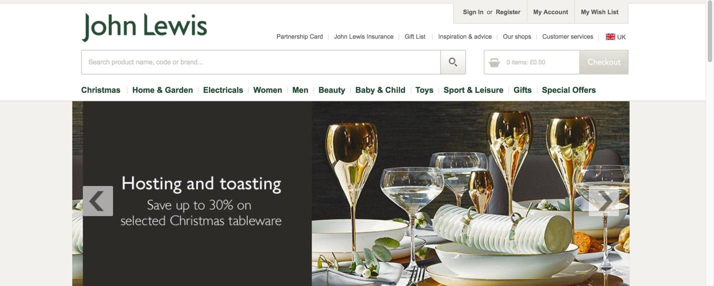
Page structure refers to the organization and layout of elements within a website and determines how pages and information relate to one another—encompassing visual hierarchy, navigation and internal linking. UX designers (user experience designers) aim to create well-structured pages to help users find what they need with ease and achieve desired goals quickly.
Watch our video on visual hierarchy to understand more about how it relates to more effective page structures in user interfaces:
Why Is Page Structure Important in UX Design?
Page structure forms the backbone of effective web design. It's how designers organize content and guide users through a digital solution like a website. A well-crafted page structure helps make for the best user experience and improves navigation. When users can find relevant content quickly, they can have a longer and more fruitful engagement with the site. It’s helpful to think of good page structure like a city with clear road signs or a building with a logical layout, and no clutter getting in the way—it makes navigation intuitive and effortless. Plus, it helps users trust the brand whose site or app they’re on.
UX designers—and especially user interface (UI) designers—work to create layouts that aren’t just visually appealing but functional and user-friendly, too. The appeal has to be there, not least since a web page is often where a user gets their first impression of a brand and a product or service it offers. Behind the scenes, though, designers also have to consider factors like scrolling patterns, consistency and accessibility. When designers anticipate user interactions on landing pages, product pages or some other piece of content, they can craft interfaces that users will find intuitive and easy to navigate. Plus, well-thought-out internal links mean that relevant pages and even more valuable content are just a few clicks away for users and potential customers.
See why accessibility is such a vital part of design:
Designers also need to place elements such as call-to-action buttons, typography and white space strategically. What’s more, they’ve got to fine tune these elements—such as get the right font size showing in microcopy that can speak best to a wide range of users. That goes a long way to optimizing conversion rates in the real world. Designers use tools like grids and UI patterns to help create such balanced layouts that work across different devices—particularly for mobile users, who form the majority of users, but larger screens count, too. To make the most of app and web page structure design, designers also pay close attention to information architecture, to make sure they organize content logically.
UX Strategist and Consultant, William Hudson explains important points about information architecture:
When designers master these aspects, they can create digital solution pages that don’t just look great as visual designs but perform well, too—the key that leads to heightened user satisfaction and achieving business goals. Designers can help streamline the user journey because a solid structure guides people through an engaging, logical path—and leads them from their entry point to their ultimate decision point.
Page structure plays a crucial role in search engine optimization (SEO) as well. It has an impact on how search engines crawl it—since an optimized structure serves as a detailed map for search engine crawlers, helping them understand and index the site more effectively. Another point is that a clear and logical structure—such as what the best design patterns offer—allows seamless updates and expansions from designers and web development teams, and it can adapt to the evolving needs of both the website and its users.
Beware that visual structure alone is not enough. A page can look well-organized to a sighted user while being completely opaque to a screen reader or a search engine crawler. The reason is that visual layout lives in CSS, but meaning lives in HTML. When designers and developers choose the right HTML elements for each part of a page, they give that structure a layer of meaning that machines can read and act on.
Semantic HTML
Semantic HTML provides that meaning: using elements that describe the role of their content, not just how it should look. Compare these two approaches:
A div with a large bold font looks like a heading to a human user.
An h1 element is a heading — for humans, for screen readers, and for search engines alike.
The distinction matters because assistive technologies and crawlers both depend on this structural information to do their job. A screen reader user navigating by headings, or a search engine trying to understand the main topic of a page, is relying on the same underlying signals.
Key Semantic Elements and What They Communicate
The following elements are the most important for page structure. Designers do not write HTML directly, but understanding these elements helps you make better decisions about layout, communicate more precisely with developers, and evaluate whether a design is structurally sound.
h1 through h6 — Heading levels that establish the document outline. There should be one h1 per page (the primary topic), with h2 and below used to create a logical hierarchy. Skipping levels (for example, jumping from h2 to h4 for visual effect) breaks both accessibility and SEO.
main — Identifies the primary content of the page, distinct from navigation, headers, and footers. There should be only one main element per page.
nav — Marks a block of navigation links. Screen readers can identify and announce navigation regions, allowing users to skip to or past them.
header and footer — Define the top and bottom regions of a page or section. A header typically contains the site logo, primary navigation, and page title. A footer typically contains secondary navigation, contact information, and legal notices.
article — Marks a self-contained piece of content that could stand alone, such as a blog post, a news story, or a product card. An article element signals to search engines that its content is the primary subject of the page.
section — Groups related content under a common theme. Unlike a div, a section implies a meaningful grouping and should generally include a heading.
aside — Marks content that is related to the main content but supplementary to it: a sidebar, a pull quote, or related links.
Why This Is a Design Concern, Not Just a Development Concern
Semantic structure is decided at the design stage. When a designer creates a wireframe or a high-fidelity mockup, they are implicitly defining the heading hierarchy, the primary content region, and the navigational structure of the page. If those decisions are not communicated clearly to developers, or if the design itself is structurally inconsistent, the HTML that gets built will reflect those inconsistencies.
Common structural problems that originate in design include:
Using visual size to imply heading level without specifying the actual level, leading developers to guess.
Creating multiple “hero” sections that compete for the h1 role.
Designing navigation patterns that have no clear HTML equivalent, resulting in div-based navigation that screen readers cannot identify.
Separating content that belongs together into disconnected visual blocks, making the document outline fragmented.
A good practice is to annotate wireframes and prototypes with the intended HTML element for key structural components. This takes very little additional time and significantly reduces the risk of structural problems in the final build.
Tip for designers: Ask your developer to run the finished page through a free heading structure checker, such as the HeadingsMap browser extension, or the WAVE accessibility tool. A clean, logical heading outline is one of the fastest indicators of whether the design's structural intent has been correctly implemented. |
ARIA Landmarks — When Semantic HTML Needs Support
ARIA stands for Accessible Rich Internet Applications. It is a technical specification, maintained by the World Wide Web Consortium (W3C), that provides a set of attributes developers can add to HTML elements to communicate their role and behavior to assistive technologies.
ARIA landmarks are a specific part of the ARIA specification. They define named regions of a page — such as the main content area, navigation, search, and complementary content — and expose those regions to screen readers. When a page has correctly implemented landmarks, a screen reader user can bring up a list of all regions on the page and jump directly to the one they want, without having to navigate through every element in sequence.
This is equivalent to the way a sighted user scans a page visually before deciding where to focus. Landmarks give non-sighted users the same ability to orient themselves and navigate efficiently.
The First Rule of ARIA: Use Native HTML First
Before reaching for ARIA, it is important to understand when it is and is not needed. The ARIA specification itself states that native HTML elements should always be preferred over ARIA equivalents when a native element exists. This is sometimes called the first rule of ARIA.
In practice, this means:
• A nav element already communicates the navigation landmark role. Adding role="navigation" to a nav element is redundant.
• A main element already communicates the main landmark role. You do not need to add role="main" to a main element.
• A header element at the page level already communicates the banner landmark role.
ARIA is most valuable in two situations: first, when a design uses non-semantic elements such as div or span for structural regions because the codebase requires it; and second, when building interactive components that have no native HTML equivalent, such as tab panels, modal dialogs, or carousels.
Key principle: ARIA does not add functionality — it adds description. An ARIA role tells assistive technology what an element is, but does not change how it behaves. A div with role="button" looks like a button to a screen reader, but it will not respond to keyboard activation unless that behavior is also coded in JavaScript. Semantic HTML elements, by contrast, bring their behavior built in. |
Common Landmark Roles and Their HTML Equivalents
The table below shows the most commonly used ARIA landmark roles, their native HTML equivalents when available, and when to use each.
ARIA role | HTML equivalent | When to use |
banner | header (page-level) | The page header: logo, site name, primary navigation. |
navigation | nav | Any block of navigation links. Multiple nav/navigation regions should be differentiated using aria-labels. |
main | main | The primary content of the page. Use once per page only. |
complementary | aside | Supporting content related to but not part of the main content: sidebars, related links. |
contentinfo | footer (page-level) | Page-level footer: copyright, secondary navigation, contact details. |
search | No direct equivalent | A search form or search region. Add to any container that holds a search function. |
region | section (with a heading) | A significant section of the page that does not fit another landmark role. Requires an accessible name via aria-labelledby or aria-label to be useful. |
What This Means for Designers
Landmark regions map directly onto the structural regions that designers define in page layout. The decision to include a sidebar, a secondary navigation block, or a search panel in a design is also a decision to introduce an ARIA landmark into the page. When designers are aware of this, they can:
Label ambiguous regions clearly in design specifications so that developers can apply the correct landmark role and an appropriate accessible name.
Avoid creating multiple regions of the same type (for example, two nav elements) without distinguishing them by label.
Recognize that a page with too many landmark regions is as unhelpful to a screen reader user as a page with none — the goal is a clear, predictable structure, not exhaustive tagging.
Page Structure, Search Engines, and Screen Readers — Two Audiences, One Architecture
Search engine crawlers and screen readers approach a web page in a remarkably similar way. Neither has eyes. Both must derive meaning solely from the HTML document's structure and content. Both navigate sequentially through the page. Both rely on headings, landmark regions, link text, and image alternative text to understand what a page is about and how it is organized.
This convergence is not a coincidence — it reflects a deeper principle: well-structured content is easier to process for any agent that cannot perceive it visually. Designing for one audience makes it easier to reach the other.
What Crawlers and Screen Readers Have in Common
The following page structure decisions affect both SEO and accessibility simultaneously:
Heading hierarchy. A logical heading structure (one h1, followed by h2 and h3 sections in correct order) helps a search engine understand the topic and subtopics of a page. It also allows screen reader users to navigate by heading and build a mental model of the content. A flat or scrambled heading structure harms both.
Descriptive link text. Links that read “learn more” or “click here” give neither a crawler nor a screen reader user any information about the destination. Descriptive link text — “Read our guide to accessible forms” — serves both audiences.
Image alternative text. Alt text allows crawlers to index image content and allows screen readers to describe images to users who cannot see them. Decorative images should have an empty alt attribute (alt="") so that both crawlers and screen readers know to skip them.
Landmark structure. A page with clearly defined header, nav, main, and footer regions is easier for a crawler to parse — it can identify the primary content area and weight it accordingly. The same structure gives screen reader users an orientation map of the page.
Unique, descriptive page titles. The HTML title element is both a primary SEO signal and the first thing a screen reader announces when a page loads. A vague or duplicate title is a problem for both.
Where the Audiences Diverge
The parallel is close but not perfect. Some accessibility requirements have no direct SEO equivalent, and vice versa. Designers should be aware of the boundaries:
Focus management, keyboard navigation, and ARIA attributes for interactive components are accessibility requirements with no direct SEO benefit. They matter because people need to use the interface, not because crawlers evaluate them.
Metadata such as canonical URLs, structured data (schema.org), and XML sitemaps are SEO tools that have no direct impact on accessibility. They help crawlers find, understand, and rank content, but do not affect the user experience for people with disabilities.
Page load speed and Core Web Vitals (the performance metrics used by Google as ranking signals) have a dual impact: slow pages are penalized in search rankings and create barriers for users on low-powered devices or slow connections, disproportionately affecting users in lower-income contexts and developing markets.
The Practical Takeaway
For designers, the most actionable insight from this parallel is that structural decisions made early in the design process, heading levels, region labeling, link text, image descriptions, have consequences that run through the entire product, from discoverability in search results to usability for people with disabilities.
A design that is structurally clear, consistently organized, and properly annotated for development is not doing extra work for accessibility or SEO. It is doing the same work once and doing it well.
For further reading, the Web Content Accessibility Guidelines (WCAG) 2.2, published by the W3C, provide the international standard for web accessibility. The Google Search Central documentation covers how Google crawls and indexes page structure. Both are publicly available and free to access. |
What Are Examples of UX Page Structure and UI Layouts?
Here are some common page structure and layout patterns:
1. Single Column Layout
In this simple and straightforward approach, designers arrange content in a single vertical column. It’s ideal for mobile devices and responsive designs. Blog posts, articles or simple landing pages are some examples of digital products designed this way.
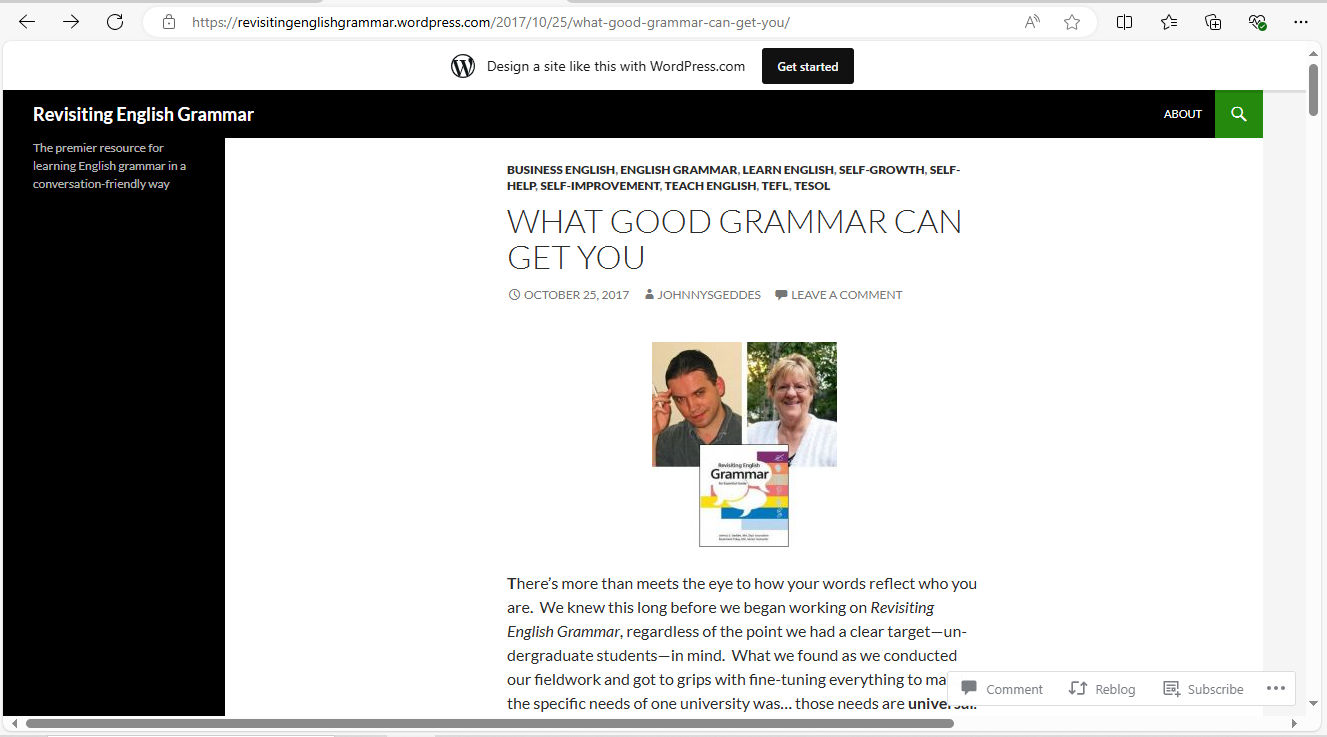
© Revisiting English Grammar, Fair Use
2. Two-Column Layout
Designers split the page into two vertical sections, and it’s often helpful for content-sidebar arrangements. It frequently sees use in navigation menus or additional information sections, and news websites and blogs with sidebars are some examples.
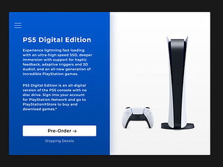
© Yiannis Kalaitzis, Fair Use
3. Three-Column Layout
Designers split the page into three vertical sections, and this way can provide more options for content organization. While it can be challenging to maintain on smaller screens, it can nonetheless be impressive and help with UIs such as complex web applications and dashboards.
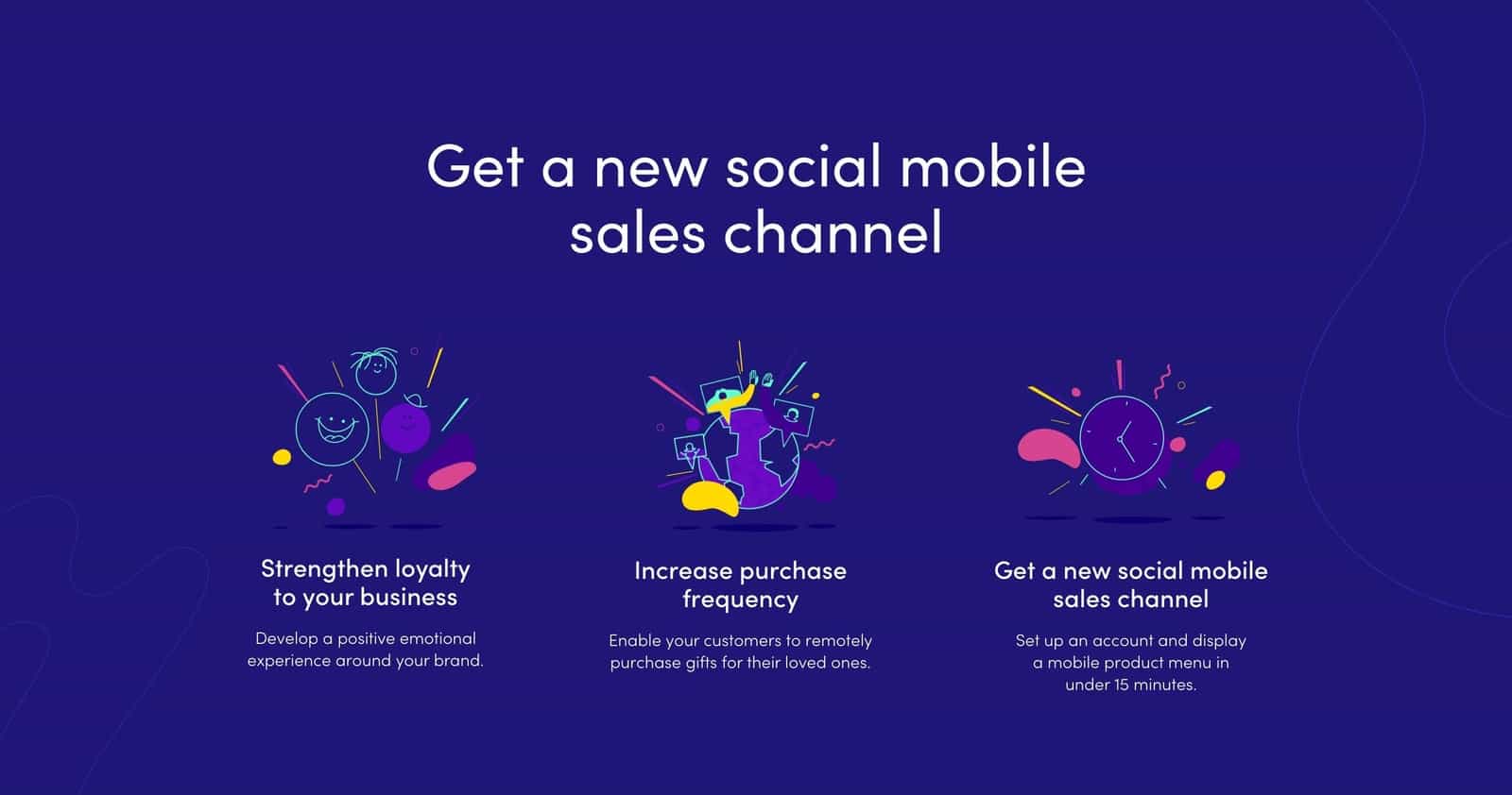
© Altrüus, Fair Use
4. F-Pattern
This pattern mimics the natural eye movement of many users—from left to right, top to bottom. Designers use it best for text-heavy pages, as they can put important elements along the top and left side of the page—and so conform with how users will encounter it, typically with news websites and search engine results pages as main examples.
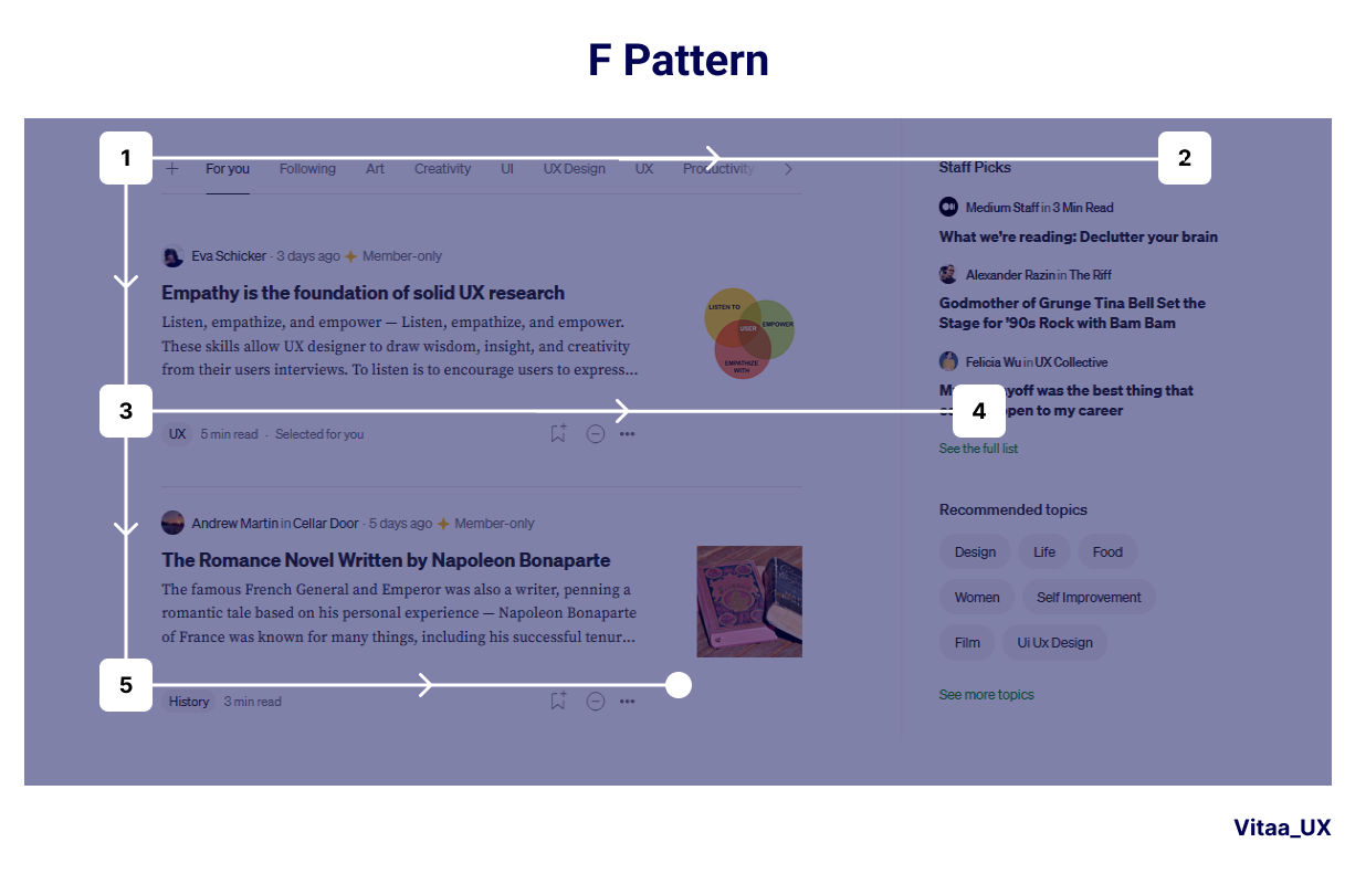
© Bootcamp UX, Fair Use
5. Z-Pattern
Designers tailor content to follow human natural eye movement in a Z-shape. This is ideal for pages with less content or more visual elements. Designers put key information at the top-left, middle and bottom-right. The Z-pattern works well for landing pages and advertisements.
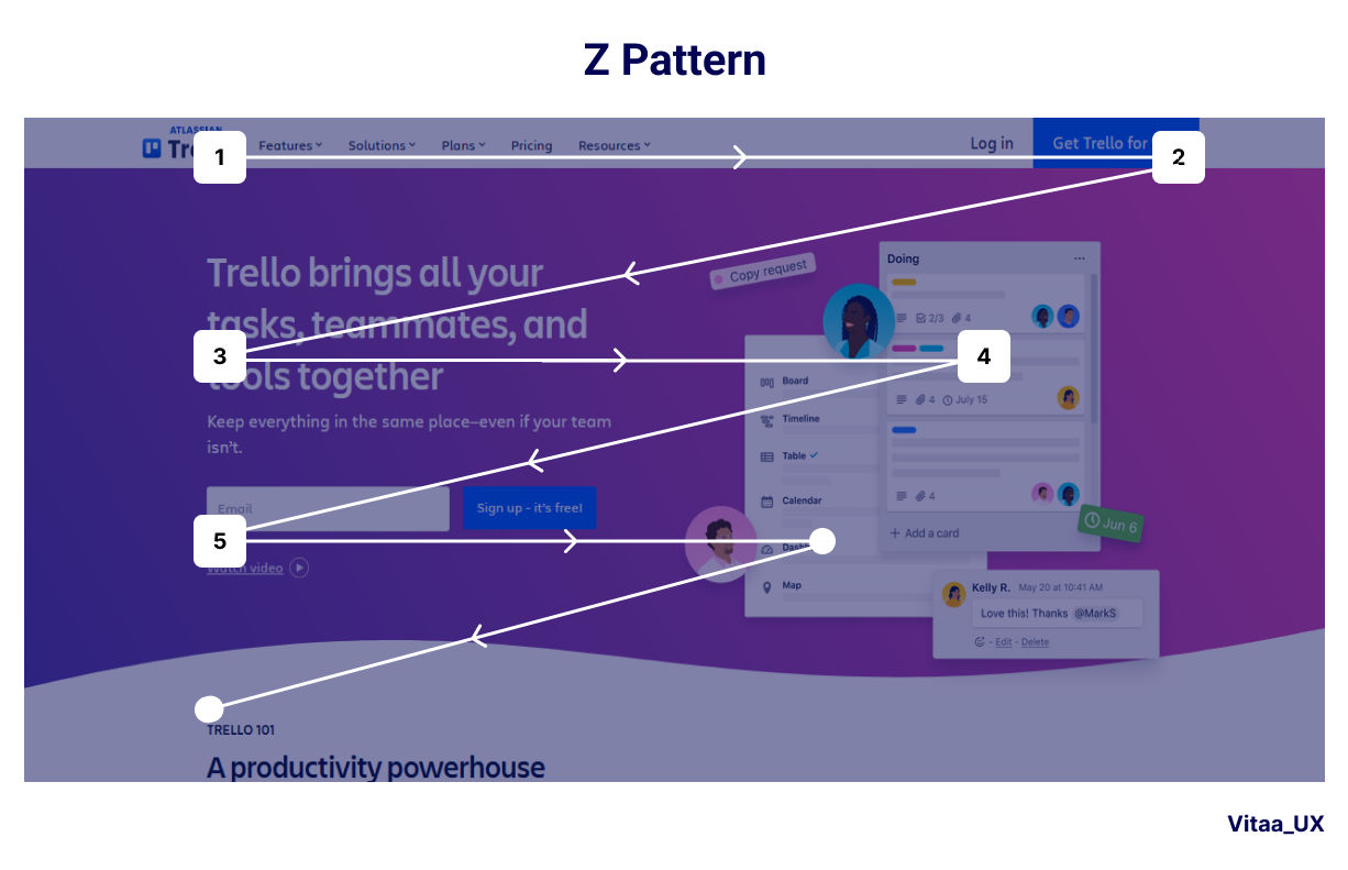
© Bootcamp UX, Fair Use
6. Grid Layout
Designers organize content into a series of rows and columns. It’s an approach that provides flexibility and consistency in design. What’s more, it’s easily adaptable for responsive designs. Examples include image galleries, product listings and portfolio sites.
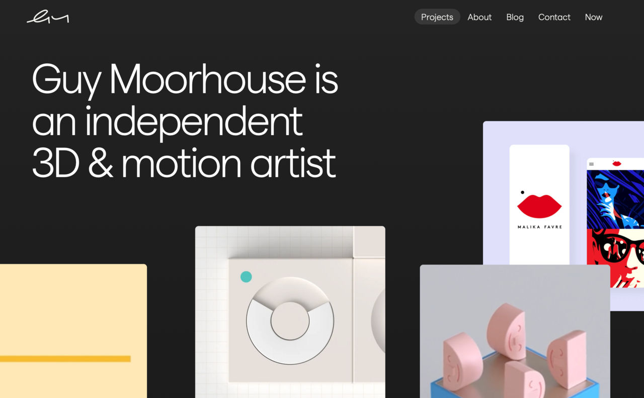
© Guy Moorhouse, Fair Use
7. Card Layout
Here, designers present information in individual, contained units (cards). This lets users easily scan and compare content, and it works well for both desktop and mobile interfaces. Designers use it for design work such as social media feeds and e-commerce product listings.
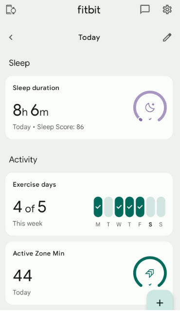
The Fitbit app exemplifies card design in action—a different piece of information on the dashboard takes the form of a card for categories like Activity and Active Zone Minutes. Users can click on a card and see another screen with more detailed data about it.
© Emily Stevens, Fair Use
8. Magazine Layout
Designers combine text and images in a visually appealing way for magazine UI layouts, and they often use a grid system for organization. This one’s suitable for content-rich websites with diverse media types—with online magazines and news portals as examples.
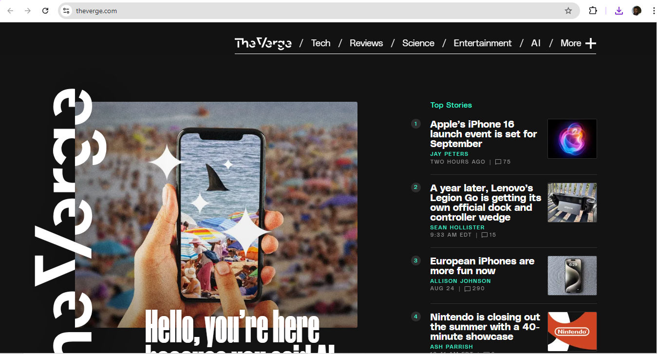
© The Verge, Fair Use
9. Asymmetrical Layout
Designers apply an uneven distribution of elements for visual interest—often helpful to create a dynamic and modern look, although it does call for careful balance to maintain usability. Examples include creative portfolios and artistic websites.
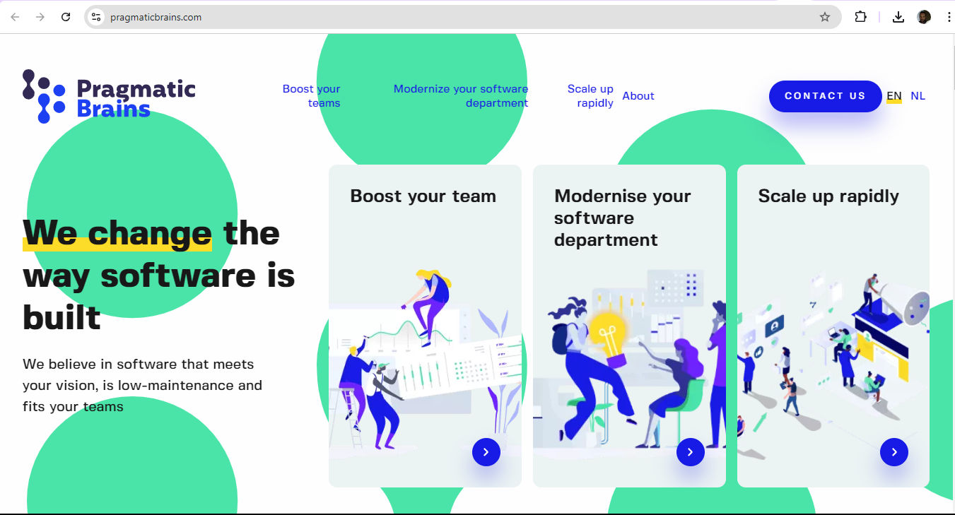
© Pragmatic Brains, Fair Use
It’s important to point out that the choice of layout is one that designers should base on factors such as the type of content, target audience, device compatibility and overall user experience goals. It's also important to consider responsive design principles for designers to make sure that their layout adapts well to different screen sizes and devices. For example, a table of contents should have optimum usability whether it appears on a desktop, tablet or mobile device screen.
CEO of Experience Dynamics, Frank Spillers explains important points about responsive design:
What Are Best Practices to Create Effective Page Structures?
Designers can follow some key nuggets of advice. The main point is to implement an effective visual hierarchy. Visual hierarchy determines how visitors engage with a page and the order in which they interact with its elements. It's a system that designers use to prioritize elements to make them easier for users to understand. Without a proper visual hierarchy in front of them, users can feel overwhelmed and likely won’t absorb the information the brand wants them to see. So, designers need to:
1. Use Size Effectively
Size and color play crucial roles as they establish visual hierarchy. Larger elements attract more attention than smaller ones can. For instance, newspaper headlines use large fonts to signal the importance of the text that follows. This principle applies to web design as well, where designers can use size to emphasize key elements.

The IxDF home page draws users’ eyes to important information relevant to what they want to do.
© Interaction Design Foundation, CC BY-SA 4.0
2. Use Color Effectively
Color is another powerful tool for designers to create visual hierarchy with. Bright colors tend to draw attention more effectively than dull shades—and are effective for call-to-action buttons, for example. However, it's important to use color sparingly and purposefully. To overuse vibrant colors can negate their impact and confuse the visual hierarchy. What’s more, there’s the users’ culture to consider.
Author and Human-Computer Interaction Expert, Professor Alan Dix explains important points about how to design with culture in mind:
3. Apply Negative Space Well
Negative space—also, white space or whitespace—is a critical, yet often overlooked, aspect of visual hierarchy. It’s blank space, or sometimes an image—a piece of “nothing” that acts as something to calm down an otherwise busy design and help separate and organize design elements. Users can then get a sense of order and balance coming from the design. When designers use negative space well, they make information easier to digest and improve readability for users.
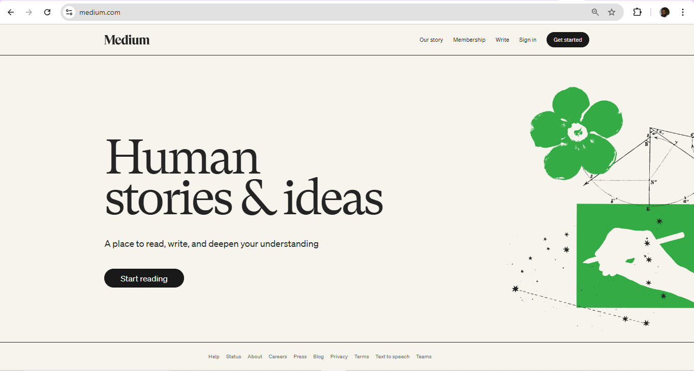
Medium makes maximum use of effective page structure tactics like negative space and information architecture.
© Medium, Fair Use
4. Apply Grouping Logically
Logical grouping is another essential technique. Designers should organize information into categories that make great sense to the user. For example, designers need to group product images with their corresponding names and descriptions, not separate them into different sections.
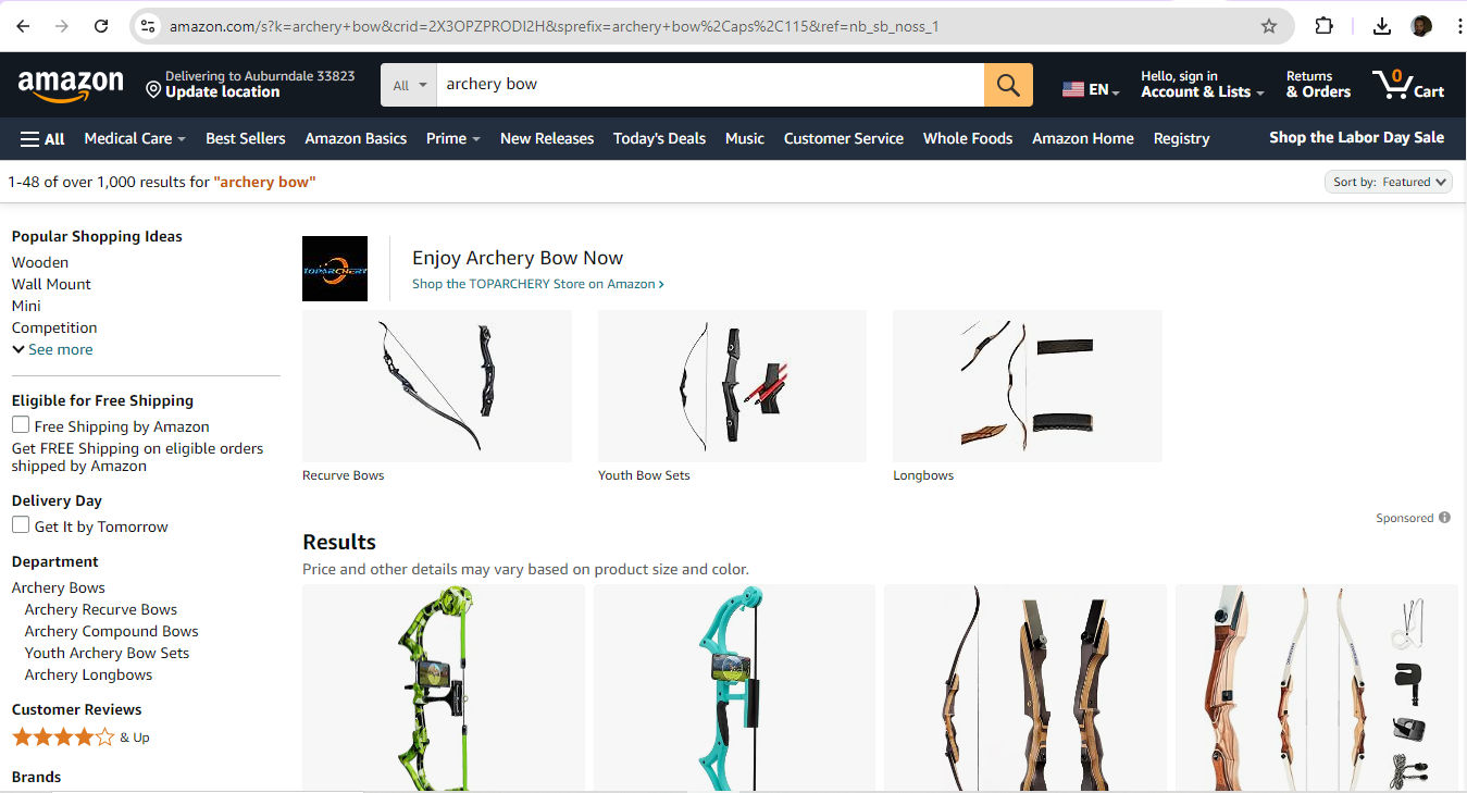
Amazon is on target with effective grouping so users can land on the items they’re aiming for.
© Amazon, Fair Use
5. Apply F-pattern and Z-pattern Layouts Carefully
These are the two common scanning patterns—particularly among Western users.
Here’s how to implement an F-pattern effectively—it’s more useful for text-heavy content:
Put critical information like logos and navigation menus at the top.
Use clear headlines and sub-headings to break up long sections of text.
Align important content to the left, as users’ eyes will tend to gravitate there.
The Z-pattern, on the other hand, is ideal for pages with less text and more visual content—such as landing pages or home pages.
Here’s how to implement a Z-pattern effectively:
Start with crucial elements like the logo and navigation at the top.
Use compelling images or graphics across the top and middle to guide eyes from left to right.
Place a strong call-to-action (CTA) at the final point of the Z, usually at the bottom right.
In addition to a page’s visual hierarchy in itself, it’s important to consider additional points regarding bigger-picture concerns; here are some:
6. Home Page
The home page—or landing page—is the top page in the website hierarchy, and it serves as the central hub for navigation. It also functions as a kind of brand ambassador in that it’s frequently the first port of call for users to access a brand. So, designers should provide an overview of the brand and website while they insert elements to guide users to key conversion areas and important pages.
7. Navigation Menus
These define the site's structure and guide users through the website. They can take the form of header menus, footer menus and sidebar menus—and the main navigation should represent all the main category pages.
8. Categories and Tags
Use these to group similar content, and so make it easy for users to access related information. For example, group blog posts into categories like "marketing" and further subdivide these into subcategories as needed.
9. Calls-To-Action (CTAs)
These prompts are the vital triggers to direct user actions—and so influence the overall user journey since they help visitors navigate the site and funnel them to conversion.
10. Follow The Brand’s Style Guide
After designers design their wireframes for a digital solution and are ready to proceed, it’s vital to remember to follow the brand style guide. This style guide should contain all the information about branding guidelines—matters such as color and font use, hero images and more. It’s vital to apply these guidelines—and consistently so. For example, one brand might prefer a card layout, while another might request a grid. Also, the target audience will determine the tone in which they want to hear their brand “speak.” Designers therefore need to be mindful about how they apply visual weight to elements they want to emphasize—such as to use bold text in appropriate places.
UX Strategist and Consultant, William Hudson explains important aspects of wireframing:
Why Are UX Portfolios Vital to Show Good Page Structure?
Nowhere is it more important for designers to show effective page structure to prospective clients, design agencies or their potential employers than in the form of their own portfolios.
Design Director at Societe Generale CIB, Morgane Peng explains important points about UX portfolios:
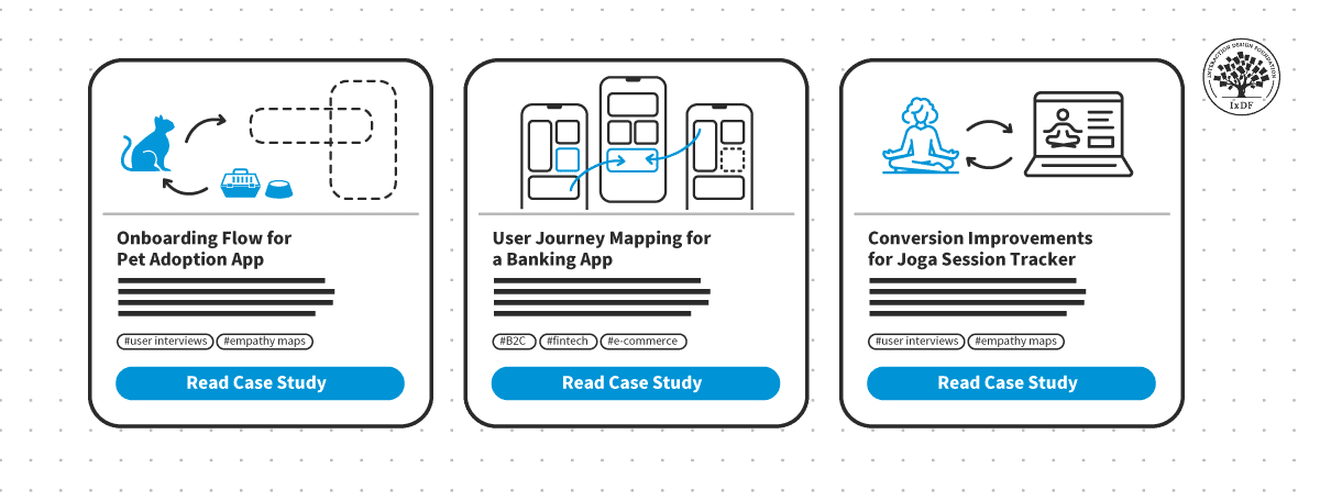
Designers need to remember in particular that the case studies they include should also include examples of finished products with effective visual hierarchies, responsive design, attention to detail regarding white space, accessibility, loading time and more. However, it’s vital to approach the structure of the portfolio itself as a design.
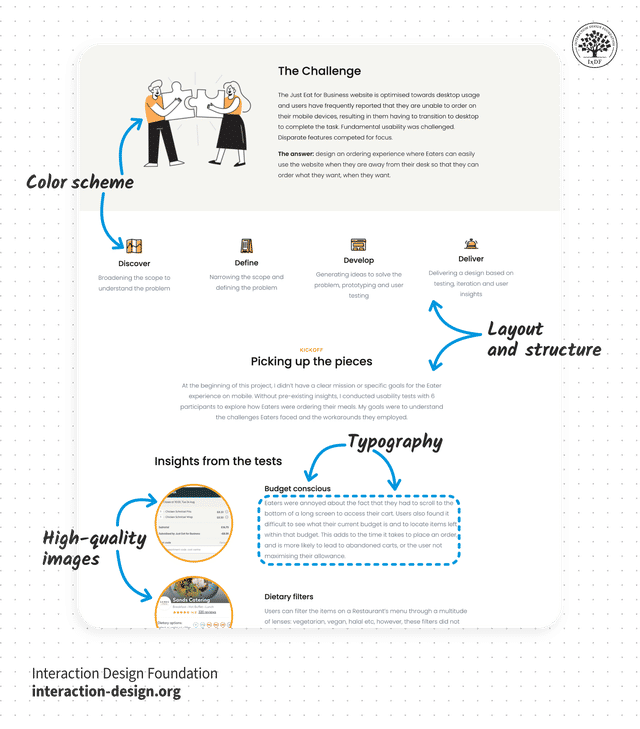
These are vital ingredients for designers to watch how they present in portfolios.
© Interaction Design Foundation, CC BY-SA 4.0
Designers also need to remember that—much like the user interfaces they design to boost users’ trust in brands—their portfolios travel ahead of them and act as brand ambassadors. So, if a designer has several superb case studies—all documented with a story arc angle—it’s extremely important to mirror the attention to detail in the portfolio that presents these.
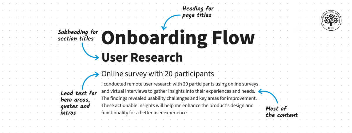
An example of effective structure at work.
© Interaction Design Foundation, CC BY-SA 4.0
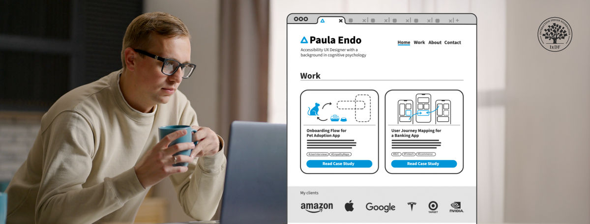
Most importantly of all, the “call-to-action" in a UX portfolio has to manifest through the experience a designer provides the target audience—in this case, potential hirers. That’s why a compelling introduction, effective documentation of the thought process throughout the design journey in the case studies, as well as all the other components need to work together as a design solution in itself: complete with ample white space and other elements to prove a designer is proficient in the trade—and enough to stand out.
The parts of a portfolio should reflect exceptional page structure and attention to design detail.
© Interaction Design Foundation, CC BY-SA 4.0
Last—but not least—designers need to remember to make their brand presence consistent across the portfolio. So, wherever the viewer navigates to, they can build trust in work that impresses them as they proceed. The functionality must be perfect, while the aesthetics complement the usability to make for a truly seamless experience.
Morgane Peng explains additional important points about UX portfolios:
What are Potential Risks that Designers Should Consider with Page Structure?
This is an important aspect of user interface design—and one that can significantly impact user experience and the overall success of a digital product. Key risks include:
Cognitive overload: One of the primary risks is to overwhelm users with too much information or too many options at once. This can lead to decision paralysis and frustration. That’s why it’s essential to apply progressive disclosure, and reveal information gradually as the user needs it or requests it. Plus, it’s helpful to guide users through a process step-by-step.
UX Strategist and Consultant, William Hudson explains important points about progressive disclosure:
Poor information hierarchy: To fail to properly organize and prioritize content can make it difficult for users to find what they're looking for—and frustrate them as well as make them miss important cues and calls-to-action.
Lack of consistency: Inconsistent layouts, navigation or design elements across different pages can confuse users and make the interface harder to learn and use. Worse, it can destroy the trust they might have built up in the brand.
That’s why it’s vital to use good design practices through knowledge of design principles and understand where users expect to find items like menus, how they expect to see links and other consistency-related points—including the subtle, but ultra-important, one about how the brand’s logo colors and finer points appear across the solution for users and customers in their touchpoints with the brand.
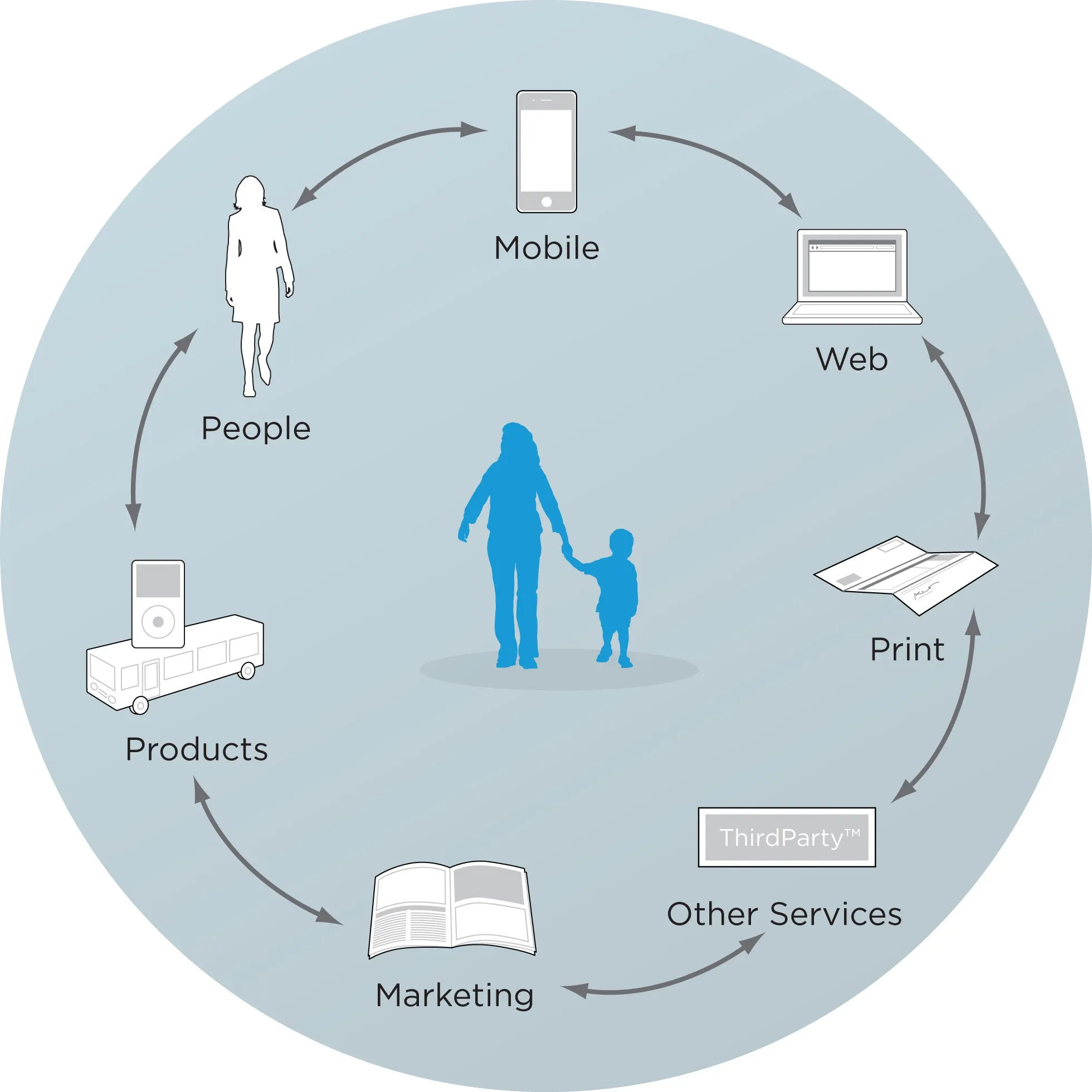
Here are some customer touchpoints.
© Rosenfeld Media, Fair Use
Inadequate responsive design: Remember the variety of devices and screen sizes available; to fail to create a responsive design that adapts well to different screen sizes can result in a poor experience for many users.
Accessibility issues: Don’t exclude users with disabilities. This includes issues like poor color contrast, lack of keyboard navigation or incompatibility with screen readers. Accessibility is a legal requirement in many jurisdictions, too; however, it’s best to apply it, anyway, since it will help all users.
Typographical misfires: Choices about typography are important—and should appear in the style guide. Designers need to be mindful about how they set out text according to considerations such as Gestalt principles, and what can go wrong if they don’t.
Associate Professor of Art Studio and Digital Design, University of Kentucky, Mia Cinelli explains how the Gestalt principle of continuation works in typography:
Cultural insensitivity: Designs that don't take into account cultural differences in color meanings, symbols or layout preferences can alienate certain user groups.
Slow loading times: Complex page structures with heavy elements can lead to slow loading times—every second counts, and frustrated users may well abandon a site or app.
Over-reliance on trends: To follow design trends and not consider their appropriateness for the specific project can lead to form over function—something that might work against the digital solution’s usability.
To ignore user feedback and analytics: Always test and incorporate user feedback and analytics into the design process. It’s the product this target audience will use, so it’s vital to test it out with the users and let data-driven design help shape things positively.
William Hudson explains important points about user testing:
Inadequate white space: Remember to provide enough breathing room in the design—without it, the interface can feel cluttered and overwhelming. Are there too many elements or text on a page? Are they even necessary? Or, can they appear elsewhere, on a relevant page and not overpopulate a page that looks a little busy? Remember, users will encounter websites and apps in their many contexts, and they may not have the mental bandwidth—or desire—for busy designs that can’t “breathe.” Even in the quietest moments on their desktops and with time to spare, users need white space.
Overall, effective page structure forms the backbone of successful app and web design, as it guides users through a seamless journey and enhances the overall user experience. When designers implement clear visual hierarchies, intuitive navigation systems and well-organized content, they can create products that don’t just look appealing but perform exceptionally well, too. These elements work together to improve user satisfaction, boost engagement and ultimately achieve business goals. That includes the business goals involved when a designer seeks work and mirrors the results they can deliver time and again for the brands that hire them.
© Interaction Design Foundation, CC BY-SA 4.0