Visual mapping is an important part of information visualization. It requires the definition of a spatial substrate, graphical elements and graphic properties to properly explain how data relates to other data. Visual mapping can be based on real spatial relationships or it can create a virtual spatial relationship when no such relationship exists in the data set.
Visual Mapping
Your constantly-updated definition of Visual Mapping and collection of videos and articles.
Be a conversation starter: Share this page and inspire others!
Get 1 Powerful Email Each Week
Join 313,907 subscribers.
What is Visual Mapping?
Learn More About Visual Mapping
Make learning as easy as watching Netflix: Learn more about Visual Mapping by taking the online IxDF Course Information Visualization.
Why? Because design skills make you valuable. In any job. Any industry.
Earn Industry-Recognized Certificates
Industry giants trust our courses to train their teams, and prestigious universities integrate our content into their curricula. Add your certificates to your LinkedIn profile, résumé, and job applications.



All Free IxDF Articles on Visual Mapping


Visual Mapping – The Elements of Information Visualization
Information visualization requires mapping data in a visual or occasionally auditory format for the user of the visualization. This can be challenging because while some data has a spatial relationship built in (for example, temperatures in cities around a country) many data sets don’t have a tradit
- Social shares
- 916
- Published
Read Article
Top Service Blueprint Templates
Service blueprint tools are vital for effective customer experience design—and for designers to make experiences that are exceptional. Here, we’ll discuss why these tools are so important. What’s more, we’ll explore templates and practical resources to create high-quality, efficient service blueprin
- Social shares
- 685
- Published
Read Article
The Power of Mapping
The map is one of the earliest and most important human inventions. It helps us to navigate our complex world. Maps simplify complex spaces, create shared understanding, reveal hidden insights and help us coordinate action. Around 25,000 B.C. a person carved the earliest known map into a mammoth tus
- Social shares
- 586
- Published
Read Article
Visual Mapping – The Elements of Information Visualization

Information visualization requires mapping data in a visual or occasionally auditory format for the user of the visualization. This can be challenging because while some data has a spatial relationship built in (for example, temperatures in cities around a country) many data sets don’t have a traditional spatial relationship (for example, salaries within an organization).
Henry D Hubbard, who was a member of the US Bureau of Standards in the 1920s, said; “There is a magic in graphs. The profile of a curve reveals in a flash a whole situation — the life history of an epidemic, a panic, or an era of prosperity. The curve informs the mind, awakens the imagination, convinces.”
That means the information visualization designer needs to think carefully about the way they intend to represent their data and create structures that support that representation in order to bring out the magic Henry Hubbard spoke of.
There are three elements to define for an information visualization according to Card, Mackinlay and Sheniederman in their text “Readings in Information Visualization: Using Vision to Think”:
The Spatial Substrate
The Graphical Elements
The Graphical Properties
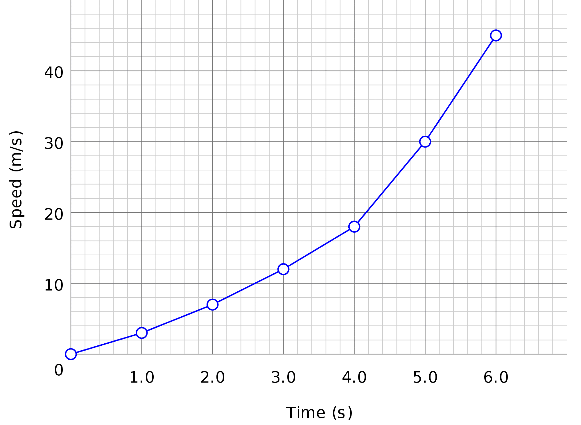
Author/Copyright holder: Urocyon. Copyright terms and licence: Public Domain.
Here the spatial substrate is two dimensional, the graphical elements are points and lines and the properties are the size of points, length of lines, the orientation of the lines and the blue color.
The Three Elements of Visual Mapping for Information Visualization
Defining the three elements we will use within a visual map provides a strong structure for the overall information visualization. It can also help us, as information visualization designers, to gain a better understanding of the data we are trying to portray and how it might be used to deliver value to our users.
The Spatial Substrate
The spatial substrate is the space in which we’re going to create our visualization. The vast majority of information visualization takes place in 2-dimension space – along x and y axes. However, it is possible to create 3-dimensional and even hyper-dimensional (more than 3-dimensions) representations too.
It’s important to consider which axes you will use and what kind of data will map to each individual axis. Data may be:
Quantitative. E.g. it has a numerical measurement of some quality of the data set.
Ordinal e.g. is not associated with a number but still offers some form of order – for example months in a calendar year.
Nominal e.g. the data is a collection of non-numerical and non-ordered data (the names of the members of parliament for example)
The Graphical Elements
Graphical elements are the visual elements that will appear in the spatial substrate. There are four kinds of visual elements:
Points
Lines
Surfaces
Volumes
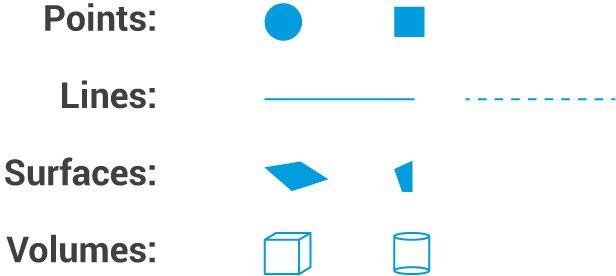
Graphical elements should be chosen for their clarity when conveying data. Unless, of course, the intention is to deliberately confuse the user to persuade them of something that the data does not represent. This is unethical but it would be naïve to pretend it doesn’t happen. Both corporations and politicians can be especially guilty of this behavior.
The Graphical Properties
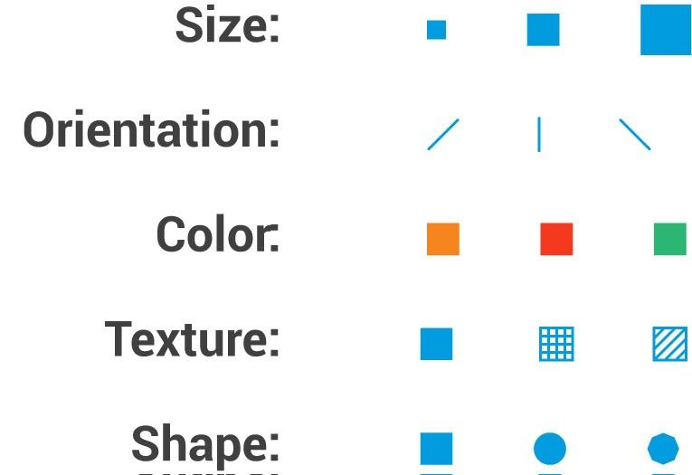
Graphical properties are properties that can be applied to the graphical elements which make them more (or indeed less) noticeable to the eye and/or valuable to the user of the representation. There are many possible graphical properties that can be applied to graphical elements but the most commonly used are:
Size – the size of a point, surface or volume can convey information about significance or weight
Orientation – the orientation of a line or volume in space can help clarify the purpose of the line or volume
Color – color coding can be used to provide a visual key to data or to provide a “call to attention” to the eye
Textures – textures can be used to provide visual keys to data
Shapes – hexagons, circles, triangles, etc. can be used to provide a visual key to data
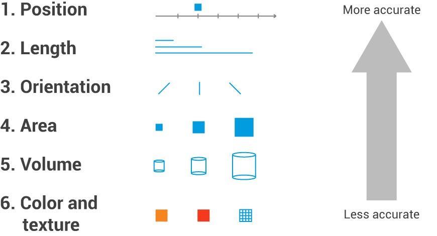
Cleveland and McGill, in their paper, “Graphical perception: Theory, experimentation, and application to the development of graphical methods.” showed that some graphical properties are more effective than others when it comes to conveying information.
They offered (in order of 1 being most accurate and 6 least accurate) the following list in terms of properties and their accuracy:
Position on the axis
Length of line
Orientation of line or object
Area of shape
Volume of shape
Color and textural indicators
Color in particular is a tricky thing to use in information visualization. Firstly, there are cultural and linguistic factors that often come into play with certain colors in certain societies having specific meanings or interpretations already built into their use. (For a cultural example, in China red is considered to be a “lucky” color whereas in many Western societies it is considered to be a “warning” color. For a linguistic example, in the highlands of New Guinea there are only two terms for color “light” and “dark” and in the Piraha language of the Amazon – there are no words for color at all, colors are identified by linguistic comparison to another object such as “this looks like blood” whereas English offers a rich and varied set of terms for many colors).
Then there is the problem of color blindness which affects up to 12% of men and 1 in 200 women. Red-green color blindness is the most common form of color blindness but there are others.
All of which suggests that color should only be used to convey information when all other options have been exhausted.
The Take Away
To conduct visual mapping in order to create an information visualization we must first define the spacial substrate, we can then consider the graphical elements we will use within that substrate and finally which properties we will use to assist these elements in conveying as much meaning as possible to the user.
References & Where to Learn More:
Course: Information Visualization
K. Stuart Card, Jock D. Mackinlay, and Ben Shneiderman. Readings in Information Visualization: Using Vision to Think. Morgan Kaufmann, San Francisco, 1999.
W. S. Cleveland and R. McGill. Graphical perception: Theory, experimentation, and application to the development of graphical methods. Journal of the American Statistical Association, Colours in Culture, Information is Beautiful, 79(387):531–554, 1984.
Hero Image: Author/Copyright holder: marco antonio torres. Copyright terms and licence: CC BY-NC-ND 2.0