Dark mode is a feature that changes the color scheme of an application or website from light to dark. It's a popular option for those who prefer a less bright and more subdued interface.
With dark mode, the background is typically black or dark gray, and the text and icons are white or light. This can reduce eye strain, especially in low-light environments. Additionally, some people find it more aesthetically pleasing and easier to read.
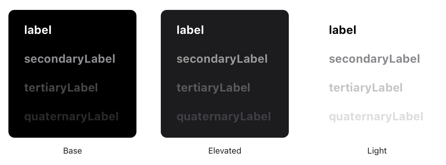
© Apple, Fair Use.
Benefits of Dark Mode on Different Devices and Platforms
Dark mode is available on various devices and platforms, including smartphones, laptops, desktops, and web browsers. Here are some benefits of using dark mode on different devices:
On smartphones, dark mode can help save battery life as the display consumes less power to produce black pixels.
On laptops, dark mode can help reduce eye strain when using your computer in low-light conditions or at night. This is because it reduces the amount of blue light emitted from the screen, which can also be particularly beneficial if you work long hours on your computer.
For users with OLED screens, dark mode can extend the lifespan of their displays by reducing the amount of power used to light up individual pixels.
Accessibility Benefits of Dark Mode
In addition to reducing eye strain and improving the aesthetics of an interface, dark mode can also have significant accessibility benefits, for example:
Reduced Glare: Bright white backgrounds can cause glare, making it difficult for some users to read text or view images. On the other hand, dark mode reduces glare and makes it easier for these users to interact with an application or website.
Improved Contrast: For users with low vision or color blindness, high contrast between text and background is essential for readability. Dark mode often provides better contrast than light mode due to lighter text on a darker background.
Better Visibility in Low-Light Environments: Users with sensitivity to bright light may find it uncomfortable or even painful to view a bright white screen in low-light environments. Dark mode reduces the amount of light emitted from the screen and can make it more comfortable for these users to use an application or website.
When Not to Use Dark Mode
While dark mode has many benefits, there are also some potential drawbacks. For example, dark colors can evoke negative emotions associated with mourning or depression. Moreover, using dark mode in brightly-lit conditions may increase eye strain. Individuals with myopia or astigmatism may also experience halation, making text less readable. Dark mode may also lower reading comprehension and focus for some users. Finally, it's worth noting that dark mode does not necessarily improve battery life on older devices without OLED screens.
How to Design User Interfaces That Support Dark Mode
Keep in mind the increasing popularity of dark mode and ensure that your design is compatible with this feature. Here are some best practices for designing UIs that work well in both light and dark modes:
Use high-contrast colors: UI elements, such as buttons or text, need to have high-contrast colors that are easily distinguishable from each other. This is especially important in dark mode, where the color palette is limited, and low contrast can make it difficult to read or navigate. Remember that images and icons will appear on a darker background in dark mode. So, ensure they remain visible and don't blend into the background by using colors that provide enough contrast.
Avoid pure black backgrounds: While pure black backgrounds may seem like a good fit for dark mode, they can be too harsh on the eyes. Instead, consider using a very dark gray or navy blue background, which provides enough contrast but is easier on the eyes.
Test your design in both light and dark modes: Test your design thoroughly to ensure it works well in both light and dark modes. This will give you an idea of how your design looks and feels in different lighting conditions.
Provide an option to switch between modes: Not all users prefer one mode over the other, so make sure to provide an option to switch between light and dark modes. You can achieve this through a simple toggle switch or syncing with the device's system settings.
Avoid High Saturation: Colors with high saturation can appear too bright or overpowering in dark mode. To avoid this issue, consider using less saturated colors or adjusting the saturation levels of your existing colors.
Test Your Designs in Both Modes: As with any aspect of UI design, it's essential to test your icons and images in light and dark modes to ensure they look great in all lighting conditions. This will help you identify any issues with visibility or contrast before releasing your product.


