Cognitive science is the discipline that explains how people perceive, remember, decide, and act. In UX (user experience) design, it turns guesswork into evidence when designers and researchers use insights about attention, memory, perception, and emotion to reduce effort for users, guide user decisions, and prevent errors. Teams craft interfaces that fit how minds work when they link research with practice.
Discover how cognition plays a vital role in everyday human lives and what it means for people as users, in this video with Alan Dix: Author of the bestselling book “Human-Computer Interaction” and Director of the Computational Foundry at Swansea University.
Why Cognitive Science Is Important to UX Designers
Cognitive science offers designers a toolkit of proven insights about how people think, remember, perceive, and act, which translate into concrete benefits for both users and product teams. Cognitive science UX design is where designers ground their efforts in the realities of how users think and act, instead of their own assumptions. More specifically, cognitive science principles help designers through key benefits and design practices as they:
1. Manage Working Memory Limitations
Users can only hold about four “chunks” of information in their working memory at once. This is the part of short-term memory that handles immediate conscious linguistic and perceptual processing, and designers make sure UIs (user interfaces) don’t overload this limited capacity. For example, a well-designed airline booking form keeps all entered passenger details visible on the payment page so users don’t have to remember them while they’re completing payment.
2. Apply Recognition Over Recall
UIs that show users their available options reduce the cognitive burden on users compared to making them remember possibilities from memory. For example, a navigation menu that displays all main sections instead of hiding them behind a generic “Menu” label lets users recognize rather than recall their options.
3. Reduce Overall Cognitive Load
Cognitive load theory warns that too much complexity at once can overwhelm the mind and prevent users from completing tasks. Users might even abandon what they are trying to do altogether and then go to a competitor’s website, for instance. For an example of how designers address this, a multi-step checkout process reveals only relevant fields at each stage rather than showing everything at once—a tactic known as staged disclosure.
4. Help Users Make Decisions More Effectively
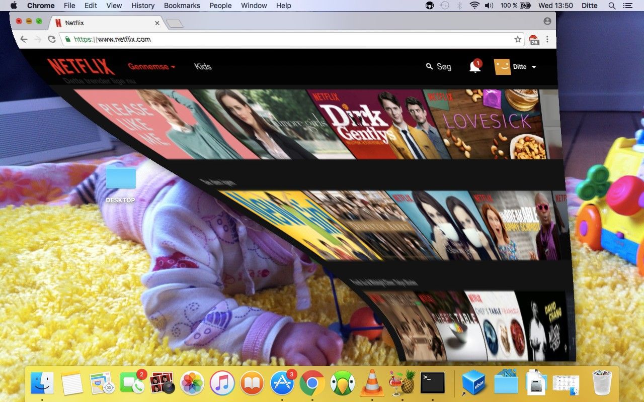
The Hick-Hyman law shows that the more choices people have, the longer it takes them to pick one. In UX design, as with any situation where individuals face a great number of options, they can become spoiled for choice—and, faced with “selection overload,” many of them may not even pick anything and leave instead. Designers therefore apply thoughtful constraints to help users progress faster. For example, a streaming service might show only a handful of movie categories on the home page, with a “See More” link for deeper exploration.

Amazon Prime Video’s approach offers viewers interested in action-adventure motion pictures a prime selection of entertainment, starting with top results, then “Based on your search” shows some personalization, and more (further down) to help users in their search of what to watch.
© Amazon, Fair use
5. Optimize Physical Interaction
The science of the brain relates to the hand as well. Fitts’ law explains why target size and distance matter for quick, accurate interaction—and larger targets that are closer to users’ focus points help them enjoy better performance. The alternative—smaller targets farther from these focal points can frustrate users and slow them down. For an example of Fitts’ law applied well, a mobile email app places its “Compose” button in the bottom-right corner, where most right-handed users’ thumbs naturally rest, and where users are used to finding this familiar design pattern.
6. Leverage Visual Perception
This sphere of brain science also lends itself to the area of design principles and visual design—namely in how users respond to design factors such as shapes, sizes, and colors. It particularly accounts for certain phenomena, such as what the Gestalt principles—or Gestalt laws—address. The Gestalt School of Psychology dates to the 1920s, and its findings reveal how people instinctively group and interpret visual information through such laws as proximity, similarity, and closure.
For example, a banking dashboard groups account balances together and transaction history separately, a convenience that makes information scanning effortless for users.
Explore how to tap into the power of Gestalt principles to serve users more effective, pleasant-looking, and highly helpful designs, in our video.
7. Align with Mental Models
Users expect systems to behave in familiar ways based on their previous experiences, and often this carries over from their understanding of how the physical world operates. For example, e-commerce sites use carts and baskets, mirroring “tools” from the “real” bricks-and-mortar store experience. Designs should match these expectations to reduce learning curves. For example, an e-commerce site places the shopping cart icon in the top-right corner, where users expect to find it, and marks it as a “cart.”
8. Provide Clear Affordances and Signifiers
Users need to see what actions are possible (affordances) through clear visual indicators (signifiers)—which, like mental models, borrows from the physical world, such as a door with “PUSH” engraved on the push-plate. For a digital example, a button’s raised appearance and hover effects signal that users can click it.
See how to apply signifiers as vital guideposts in better designs which users can take to faster and in seamless experiences, in our video.
9. Establish Feedback Loops
Users need confirmation that their actions have succeeded to maintain confidence and control. Feedback is vital for users to keep enjoying a seamless experience—any pause where they wonder what’s going on can break that. This is why designers design for feedback and micro-interactions—those valuable signatures of interaction design where, for example, a button changes color when a user hovers over it. From a password manager that shows immediate visual confirmation and a success message when a user saves credentials, to a triumphant vibration from a smartphone to notify a user of a successful action, feedback is fundamental to the user experience.
10. Balance Aesthetics with Usability
Great looks are no substitute for usability. A design can be beautifully useless and go nowhere. The aesthetic-usability effect shows that attractive designs can feel easier to use, but designers must balance this phenomenon with actual functionality. It can depend significantly on the brand or industry—for example, a meditation app might combine calming visuals with clear, accessible controls that don’t interfere with the peaceful experience.
When designers thoughtfully apply these cognitive science principles, they can create experiences that align with how humans naturally process information, make decisions, and learn new systems.
A Brief History of Cognitive Science in UX Design
Cognitive science as a discipline has its most directly visible roots in the following areas.
Human Factors and Early Engineering
In the 1940s, wartime aviation research revealed that poor control layouts and unclear labeling caused dangerous errors, a problem that led to “human factors” engineering—designing equipment to match human abilities. Psychologist Paul Fitts’s 1954 work quantified how quickly people can move to and select targets. His law influencing interface design rules is still in use today.
The Memory Revolution
Psychologist George Miller’s 1956 paper “The Magical Number Seven, Plus or Minus Two” suggested people could hold about seven items in working memory, but working memory specialist Nelson Cowan’s later work refined this to closer to four chunks in many cases. This finding strongly supports chunking content—such as remembering a phone number in two or three blocks of digits as opposed to the whole number as a string—and using staged disclosure.
Human-Computer Interaction and Formalized Evaluation
By the 1980s and ’90s, cognitive psychology had underpinned the emerging field of human–computer interaction (HCI). Researchers developed structured models like GOMS (Goals, Operators, Methods, and Selection rules) and introduced the cognitive walkthrough, a step-by-step inspection method to predict how easily a new user could learn a new task.
Norman’s Influence
The “Godfather of UX design,” Don Norman’s book The Design of Everyday Things (1988, revised 2013) translated these concepts into everyday design language—such as mental models, mappings, feedback, and constraints—and added the modern emphasis on signifiers for digital environments. Norman had noticed the need for improved usability on even simple designs such as doors which didn’t indicate whether a user should push or pull them to open.
Modern Integration
Today, cognitive science principles shape everything from mobile app onboarding to the layout of complex dashboards, and designers who leverage them mindfully can ensure that the interfaces they create fit human mental processes. From that, they can prove a solid understanding of their user behavior and meet—and, ideally, exceed—their users’ needs.
Discover how to develop a true designer’s mindset from Don Norman, as he discusses what design should do and how costly bad design can get, in this video.
How to Apply Cognitive Science in Design, Best Practices and Step-by-Step
The following suggested process blends core cognitive principles, Don Norman’s design philosophy, and a practical evaluation method to help uncover learnability issues early in the UX design process.
1. Understand the User’s Mindset
Get right into user research to learn about your brand’s target users and:
Identify the most important tasks for a first-time or occasional user through a cognitive task analysis, to uncover hidden challenges and more.
Consider what they likely know at the start and their environment—such as their device type, distractions, and time pressures.
Apply mental models: match interface logic to what the user already understands.
For example, for a food delivery app, a first-time user’s main goal is to order a meal quickly—so, don’t overwhelm them with loyalty offers before they’ve even placed their first order.
Discover how to use task analysis to learn what’s important to users in the moments when they need to take actions, in this video with Frank Spillers: Service Designer, Founder and CEO of Experience Dynamics.
2. Shape Decisions with Cognitive Principles
Now that you’re building up a clearer picture of the users and what they go through in their contexts, you can inform your design decisions better. One “tool” that’s especially helpful is personas—synthesized representations of real users—so you can keep your target users top of mind.
Discover how personas are more than helpful—to design without them falls short, in this video with William Hudson: User Experience Strategist and Founder of Syntagm Ltd.
From your earliest design prototypes, consider how to help your product’s users help themselves:
Use the Hick–Hyman law and stage and group options to speed decisions and prevent analysis paralysis.
Apply Gestalt grouping using such laws as proximity and similarity, for example, and hierarchy to make scanning easy.
Reduce cognitive load: break tasks into manageable steps so users don’t feel they’re having to do “work” to use the digital product.
For example, consider an online tax form that shows only three income categories on the first page and then expands the chosen category into specific forms on the next page. This measured approach to what users see keeps them from becoming overwhelmed (which, for actions like calculating taxes, can feel daunting to start with).

Airbnb neatly applies proximity in a clear and user-friendly interface—elements lined up precisely with consistent spacing in a grid-like layout. They cluster elements that relate to the user's search, too, and their use of color and typography highlights important information and actions.
© Airbnb, Fair use
3. Make Actions Easy to Perform
Apply Fitts’ law and make important targets large enough and positioned for easy access so users don’t have to reach far or look for elements.
Use affordances and signifiers to ensure interactive elements clearly look interactive and users are not left wondering. For example, “Buy Now” on a button shows in no uncertain terms what that large, well-placed button does.
Maintain logical mappings and place controls near the content they affect. For example, in a photo-editing app, crop controls appear directly around the image area and not in a distant toolbar.
4. Prototype for Clarity and Learnability
Prototypes guide the way to better designs because you don’t invest too much in them—compared to finalized design solutions—and changes are far cheaper the earlier you catch flaws in usability testing. Therefore:
Keep early designs focused on essentials.
Use progressive disclosure to limit initial complexity.
Provide feedback loops: visible, immediate confirmation after actions.
For example, a budgeting tool prototype shows only the current month’s data by default, with a toggle to reveal historical charts—so test users won’t feel overwhelmed with information and can hopefully intuit their way around.
Find out how to get the most out of prototyping and pave the way to better designs with early discoveries from user testing, in this video with Alan Dix.
5. Evaluate with a Cognitive Walkthrough
Speaking of “intuit,” cognitive walkthroughs provide an essential lens through which to evaluate a design, simulating a newcomer’s perspective so designers and design teams can spot learnability issues. To conduct a cognitive walkthrough:
Select a representative first-time task.
Write the ideal action sequence.
For each step, ask:
Will the user know they should take this step? (Mental model alignment)
Will they see the correct control? (Signifiers)
Will they connect that control to their goal? (Mapping and recognition)
Will they see progress afterward? (Feedback loop)
Flag any step where the answer is “no” or it’s uncertain.
Propose fixes and prioritize them.
For example, a fitness tracker’s setup flow walkthrough might reveal that the “Pair Device” button is buried in a settings menu instead of being visible on the welcome screen where users need it.
6. Validate with Real Users
As much as cognitive walkthroughs can show you, the only way to learn if your design works—and how well it does—is to conduct usability testing with real users.
Test with your intended target audience.
Measure task success, errors, and time to complete.
Watch for aesthetic–usability effect bias—ensure users aren’t just forgiving a beautiful but flawed design.
Ask users to think aloud as they encounter and use the prototype, noting that their sighs and pauses can tell you much about frustration levels (which they might not verbalize for fear of offending you).
For example, five first-time users test a bank’s account-opening process; completion time drops from ten minutes (on the first design) to seven after designers have simplified the document upload step.
7. Refine for Emotional Experience
Design to appeal to users in ways that draw them to your product and brand. Balance Norman’s three levels of design:
Visceral: first impressions (style, tone).
Behavioral: ease and flow of interaction.
Reflective: how it feels afterward.
For example, users find a journaling app delightful because it uses calming colors and a clean font (visceral), offers frictionless daily entry logging (behavioral), and celebrates streaks with summaries (reflective).
Explore how to bring out the best feelings from users towards your design solutions, in this video with Alan Dix.
8. Ensure Accessibility and Inclusivity
Accessible designs are non-negotiable, especially since they’re legal requirements in many jurisdictions. However, it’s good UX practice in any case because accessible features such as captions and high contrast help all users, such as (respectively) those in loud environments and those in bright sunlight. Some key accessible design practices include:
Reduce clutter to lower cognitive load for all users.
Use plain language, high contrast, and adjustable text sizes.
Arrange to test with assistive technologies—specialist agencies can handle this for you.
For example, a shopping site offers good accessibility via an optional “simplified view” with larger text, fewer elements per page, and no autoplay banners.
Get a greater grounding in how to make your digital products work well for users with disabilities as well as those without, in our video.
Special Considerations and Risks
Given the nature and complexity of the human brain, the appliance of cognitive science carries some important considerations, and these are areas to watch for in particular:
Misusing the Hick-Hyman Law: Users may need essential options on show right away, so be careful what you decide to “hide” in the next screen or so. Long menus can still be quick if users find them well-organized and familiar.
Aesthetics masking flaws: Test functional clarity, not just emotional appeal—a uselessly beautiful design is just as bad as a beautifully useless design, so don’t let users down.
Neglecting signifiers: In digital contexts, make interactive elements unmistakably actionable. Even if it seems “redundant” or “users should know what this does,” microcopy on a button can make the difference between a quick conversion (and an enjoyable experience) and a hasty abandonment.
Walkthrough limits: Remember, walkthroughs help predict first-use problems but don’t replace live user testing—that’s testing with real users, not just members of a team “down the hallway.”
Accessibility: The dimensions of accessible design extend to many areas. Dense layouts can overwhelm; so, keep spacing generous—with negative space—and simplify what users encounter.
Ethics: Last, but certainly not least, use cognitive principles to assist, not manipulate. Good design involves helping users make decisions that benefit them via a digital solution—never trickery. In particular, beware of dark patterns—UI design patterns that “guide” users by automatically opting them in for subscriptions and the like through pre-checked boxes. Remember, good user experiences are ones where the user is in control.
Overall, cognitive science has provided designers and brands with a reliable way to align interfaces with how people think, act, and learn in the real world. Time-tested principles and understandings of “what works” help give valuable co-direction on how to create experiences that feel natural and intuitive.
Note the word “co-direction,” however. Indeed, a designer’s application of essentials such as conceptual models, mappings, and feedback ensures that interfaces can explain themselves. Still, designers must combine these principles with real-world testing and thoughtful iteration, and build products that work with the mind—not against it. When they succeed in delivering clarity, confidence, and lasting satisfaction from the very first interaction, it’s a healthy indicator that they’ve empathized with the user’s pain and designed well and truly for their brain.


 Author/Copyright holder: lavaki. Copyright terms and licence: CC0.
 Author/Copyright holder: Steven Worster. Copyright terms and licence: CC BY-ND 2.0
 Author/Copyright holder: Google Incorporated. Copyright terms and licence: Fair Use.