Multivariate analysis is required when there are 4 or more dependent variables to be examined against an independent variable or variables. The challenge for an information visualization designer is to help someone make sense of these complex relationships. While a univariate analysis (with only a single dependent variable) is very simple to carry out – the more dependent variables added to a data set, the more difficult it becomes to represent these relationships in a meaningful way to the user.
Multivariate Analysis
Your constantly-updated definition of Multivariate Analysis and collection of videos and articles.
Be a conversation starter: Share this page and inspire others!
Get 1 Powerful Email Each Week
Join 313,901 subscribers.
What is Multivariate Analysis?
Learn More About Multivariate Analysis
Make learning as easy as watching Netflix: Learn more about Multivariate Analysis by taking the online IxDF Course Information Visualization.
Why? Because design skills make you valuable. In any job. Any industry.
Earn Industry-Recognized Certificates
Industry giants trust our courses to train their teams, and prestigious universities integrate our content into their curricula. Add your certificates to your LinkedIn profile, résumé, and job applications.




All Free IxDF Articles on Multivariate Analysis
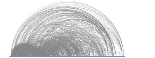

Information Visualization – An Introduction to Multivariate Analysis
Albert Einstein said; “If you can’t explain it simply, you don’t understand it well enough.” He could easily have been talking about the challenges of creating information visualizations for multivariate analysis.Multivariate analysis takes place when you have a data set with 4 or more dependent var
- Social shares
- 824
- Published
Read Article
Information Visualization – An Introduction to Multivariate Analysis
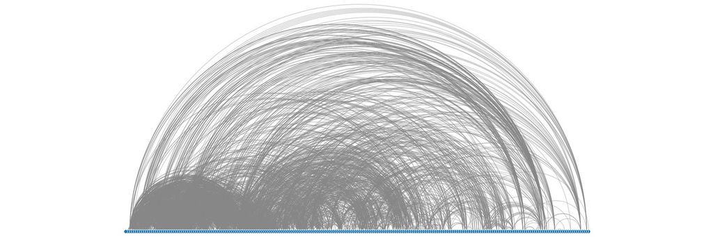
Albert Einstein said; “If you can’t explain it simply, you don’t understand it well enough.” He could easily have been talking about the challenges of creating information visualizations for multivariate analysis.
Multivariate analysis takes place when you have a data set with 4 or more dependent variables which are to be examined against an independent variable or variables. Traditionally, each variable in an analysis -with 3 or fewer dependent variables – is given a dimension (or axis). So that univariate analysis is conducted in a line, bivariate analysis in 2 dimensions and trivariate analysis in 3 dimensions. This is fairly straightforward as human beings are quite capable of perceiving 3 dimensions. In multivariate analysis a 4th (and indeed 5th, 6th,… and so on) dimension is not available to the information visualization designer. This presents a challenge which must be overcome if the designer wishes to represent such data to their users.
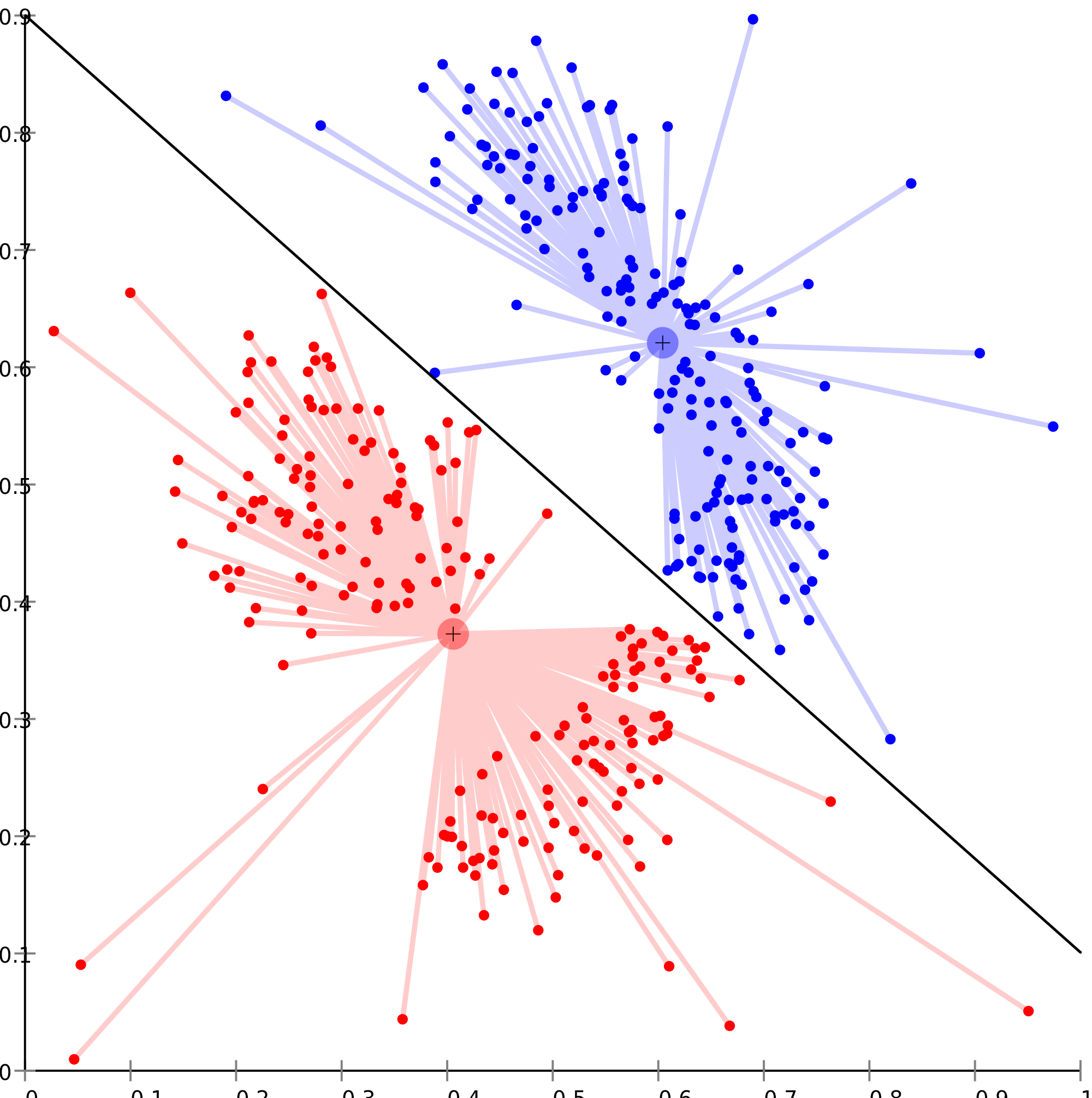
Author/Copyright holder: Chire. Copyright terms and licence: CC BY-SA 3.0
As you can see from the graph above, multivariate analysis can be quite complex to render visually.
There are some common techniques employed to render multivariate analysis through information visualization include:
Geometric Representations
Icon Representations
Pixel-Oriented Representations
Why Do We Conduct Multivariate Analysis?
Before we examine the techniques for multivariate analysis it might be useful to ask why do we need to conduct multivariate analysis?
Imagine that you are shopping for a new laptop (something that most people will do at some point in their lives). You go out to compare different models of laptop and you find that they all have slightly different specifications – processors, hard drives, screen sizes, memory, graphics cards, etc.
In order to make the best purchase; you will conduct a form of multivariate analysis (all the specifications are dependent variables – the independent variable in this case would be the model of each laptop).
Multivariate analysis is very common even if at first glance, it’s hard to see examples of it. The same is true when shopping for cars or mobile phones too.
Visual Representations of Multivariate Analysis
Now let’s take a closer look at the types of information visualization available to us for multivariate analysis:
Geometric Representations
A geometric representation requires that the information visualization be rendered in such a way that the data is mapped to a geometric space.
Parallel Coordinates
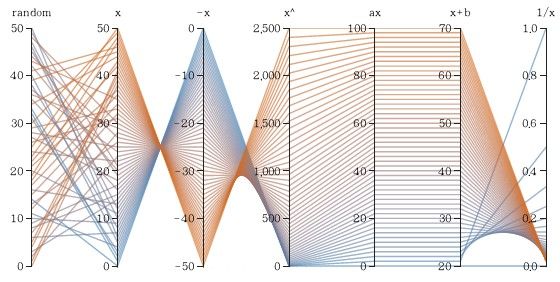
Author/Copyright holder: Yug. Copyright terms and licence: CC BY-SA 4.0
Parallel coordinates uses the idea that each attribute corresponds to an axis and that the axes will be arranged in parallel and with equal spacing between them. Each record is represented as a chain which connects each of its attributes across the axes of the graph.
This approach is best used with smaller data sets as with large data sets – the spacing between chains becomes increasingly difficult to determine.
Parallel coordinates may be rendered using software tools which allow the user to reorder the axes – this can help users study the relationships between two attributes more easily.
Scatter Plot Matrix
Author/Copyright holder: Sigbert. Copyright terms and licence: CC BY-SA 3.0
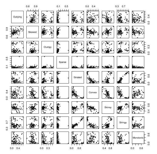
A scatterplot matrix is an attempt to extend the traditional 2D scatterplot to additional dimensions. It works by representing pairs of variables in traditional scatterplots in a matrix with all possible scatterplots created from pairs of variables in the data set.
It’s a very good tool for allowing quick comparison of similar data sets (as they are each arranged next to each other in vertical and horizontal directions). This is easier to use for analysis in some cases than the parallel coordinates method but there are drawbacks to this method too, namely: it is difficult if not impossible to label the individual axes of the smaller scatterplots (due to space constraints and legibility requirements) and there is no “global” view of the data.
TableLens
The TableLens approach was designed by John Lamping and Ramana Rao. It is similar to tabulating data in a spreadsheet but instead of using numeric values – each value is represented with a horizontal bar (proportionate to the numeric value). Bars are colored based on the attribute they represent.
They can then be manipulated, like a spreadsheet, to change column orders, hide/show columns, sort data by the values of any given column or columns, etc.
TableLens representations are normally created using specialist software such as Business Objects’ TableLens software.
Icon Representations
An alternative to geometric representations for multivariate data is the use of icon representations. These use the concept of an icon or a glyph to represent each independent variable with a number of attributes that can vary to represent the dependent variables. (Think color, shape, size, spatial orientation, markings, etc.)
There are two common icon representation techniques star plots and Chernoff faces.
Star Plots
Author/Copyright holder: NASA Primary START. Copyright terms and licence: All rights reserved. Public Domain
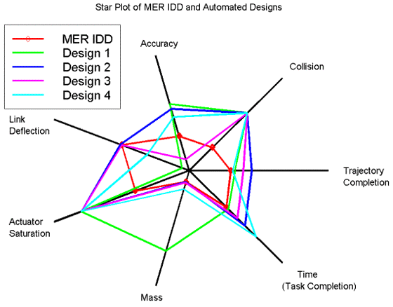
A star plot takes a single instance of a data set and then transcribes all the dependent variables on a series of axes radiating from a central origin. The points on each axis are then joined to form a polygon. These are most useful for comparing single instances in data sets and more than one star plot may be required to conduct analysis. In the diagram above all 5 instances are mapped to a single star plot – for more complex data sets – it may be necessary to generate multiple star plots.
Chernoff Faces
Author/Copyright holder: Avenue. Copyright terms and licence: Public Domain.
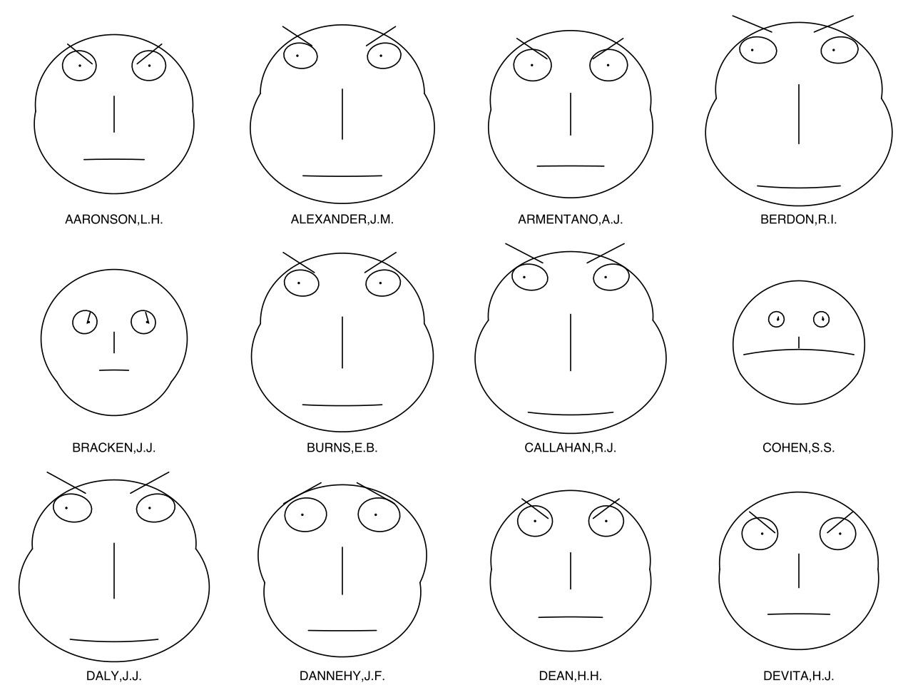
Chernoff faces involve mapping data points to attributes of the face such as eyes, eyebrows, mouths, noses, ears, etc.
The diagram above shows a Chernoff analysis of US judges and their records on certain issues.
It is worth noting that many information visualization experts see a Chernoff analysis as a flawed tool – they argue that it is too easy for people to perceive two datasets as similar based on only a single reference point (say shape of mouth) rather than on the dataset as a whole. This can lead to poor comparisons made between data items.
Pixel-Oriented Representations
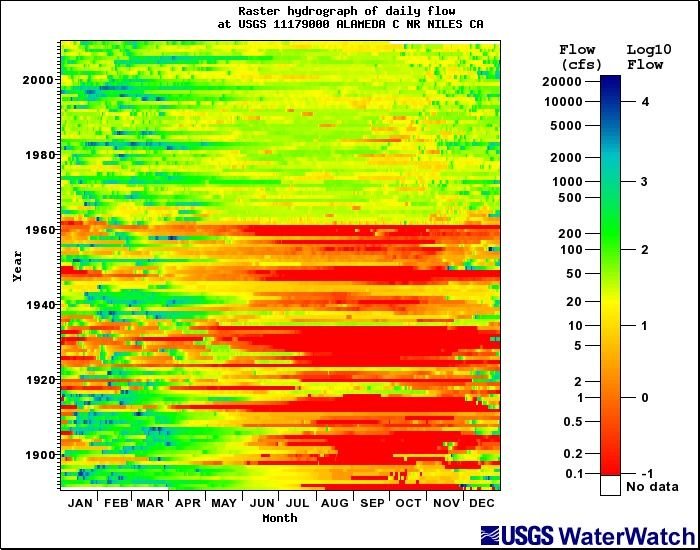
This form of representation uses the idea that the pixel is the smallest unit available on a screen and thus represents each data unit in pixels.
Author/Copyright holder: Richard Koehler. Copyright terms and licence: All rights reserved. Public Domain.
Daniel Keim, the German computer scientist and chair of Information Processing at the University of Konstanz, defined a series of considerations to be undertaken before using pixel-oriented representations of data:
What will the shape of the window in which the pixels are displayed be? Normally, this is a rectangle which mimics the shape of a screen.
What will each pixel represent in the visual mapping?
How will the pixels be arranged within the window?
What color mapping will be applied to the pixels?
What order will different windows on the screen be arranged in?
Pixel mapping is always carried out using software tools.
The Take Away
Multivariate analysis through information visualization is challenging when compared to simpler forms of analysis. However, there are three main toolsets which can be used to tackle the problem successfully – geometric representations, icon representations and pixel-oriented representations.
References & Where to Learn More:
More about Chernoff faces.
Daniel Keim. Designing pixel-oriented visualization techniques: Theory and applications. IEEE Transactions of Visualization and Computer Graphics, 6(1), 2000.
Riccardo Mazza, Introduction to Information Visualization, Springer, ISBN 878-1-84800-219-7
Hero Image: Author/Copyright holder: ep_jhu. Copyright terms and licence: CC BY-NC 2.0