There are four basic visual properties (color, form, movement and spatial position) that can be defined as preattentive (e.g., they are processed in our sensory memory without our conscious thought). Information visualization designers can use these properties in their designs to help users better understand the information they are being presented with.
Preattentive Visual Properties
Your constantly-updated definition of Preattentive Visual Properties and collection of videos and articles.
Be a conversation starter: Share this page and inspire others!
Get 1 Powerful Email Each Week
Join 313,907 subscribers.
What are Preattentive Visual Properties?
Learn More About Preattentive Visual Properties
Make learning as easy as watching Netflix: Learn more about Preattentive Visual Properties by taking the online IxDF Course Information Visualization.
Why? Because design skills make you valuable. In any job. Any industry.
Earn Industry-Recognized Certificates
Industry giants trust our courses to train their teams, and prestigious universities integrate our content into their curricula. Add your certificates to your LinkedIn profile, résumé, and job applications.


All Free IxDF Articles on Preattentive Visual Properties


Preattentive Visual Properties and How to Use Them in Information Visualization
A preattentive visual property is one which is processed in spatial memory without our conscious action. In essence it takes less than 500 milliseconds for the eye and the brain to process a preattentive property of any image. This is good news for information visualization designers and graphic des
- Social shares
- 993
- Published
Read Article
Preattentive Visual Properties and How to Use Them in Information Visualization
A preattentive visual property is one which is processed in spatial memory without our conscious action. In essence it takes less than 500 milliseconds for the eye and the brain to process a preattentive property of any image. This is good news for information visualization designers and graphic designers in more general terms too – it means that these properties can be harnessed to make it easier for a user to understand what is presented through the design and save them from consciously processing all the data presented in short-term memory which requires more effort.
John Tukey, the American mathematician and statistician, said; “The greatest value of a picture is when it forces us to notice what we never expected to see.” By tapping into preattentive properties of visualizations you can help users find what they never expected to see.
Colin Ware, in his book “Information Visualization: Perception for Design” defines the four preattentive visual properties as follows:
Form
Movement
Spatial Positioning
The Four Preattentive Visual Properties
1. Color
Color can be expressed in many different ways. From the RGB (Red, Green, Blue) scale to the CMYK (Cyan, Magenta, Yellow and Key) scale to the HSL (Hue, Saturation and Lightness) scale.
The HSL scale is useful to us when we examine color in terms of preattentiveness. Hue is a measure of the color that we normally give a name to such as “Red” or “Violet”. Saturation and lightness are a measure of the intensity of colors.
Hues and intensities are preattentively processed and can be used to separate visual elements from their surroundings. This saves the user from having to perform a visual search through data.
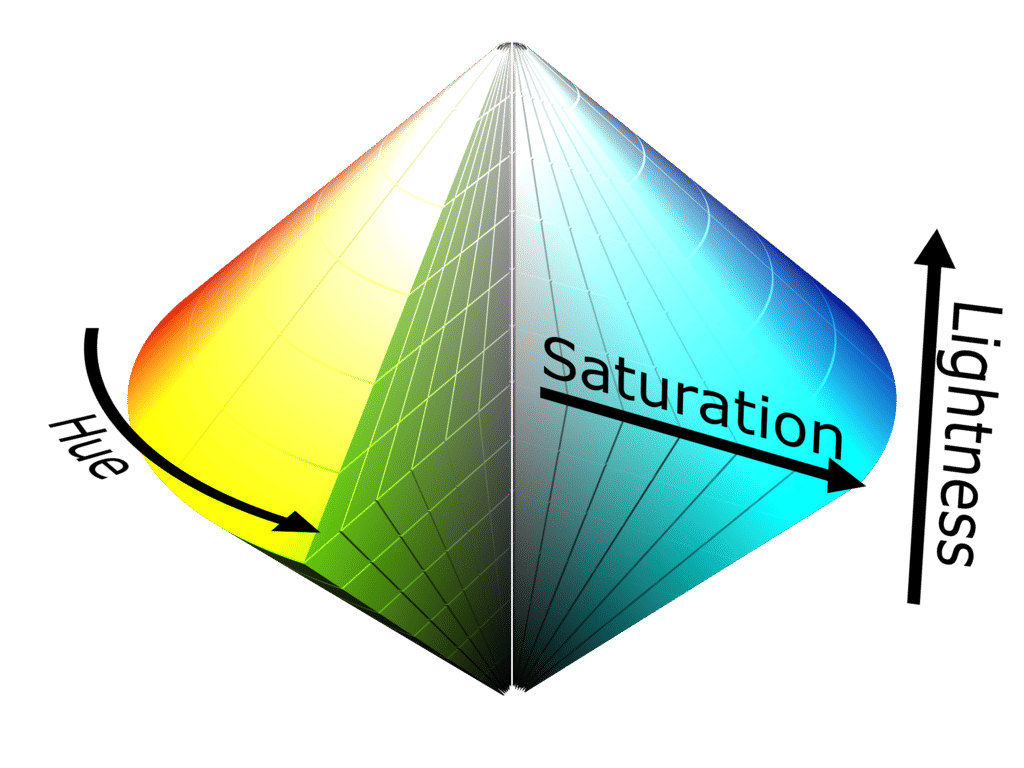
Author/Copyright holder: SharkD. Copyright terms and licence: CC BY-SA 3.0
The HSL scale can be visually represented itself in 3-dimensions – the idea is to try and demonstrate how saturation and lightness relate to intensity for each hue.
2. Form
Form applies to a set of attributes (listed below) and form can be manipulated to either call attention to a member of the data set or to reduce our attention on it. For example, if you were to manipulate the size of an object you could use that size to indicate its importance in a data set by making it larger. Conversely you could make it smaller and reduce its importance.
Form attributes include:
Collinearity
Curvature
Length, breadth and width
Marks added to objects
Numerosity
Shape
Size
Spatial grouping
Spatial orientation
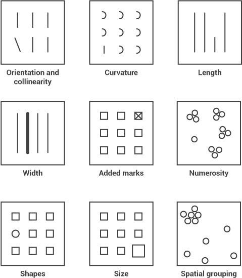
In the image above you can see how each form property can be used to call attention to a part of a visualization; you might not realize it but you didn’t even have to think to see these differences – it was all done in your sensory memory without conscious effort.
3. Movement
Movement has two sub-attributes flicker and motion. They can be used very effectively to call someone’s attention. However, care should always be taken when employing motion in information visualizations and other designs. This is because the motion can rapidly become annoying or distracting from the rest of the information that is being presented. It’s also a technique which has been over-employed in banner adverts and other forms of web advertising over the years and may be a primary reason for the rise of ad-blocking software.
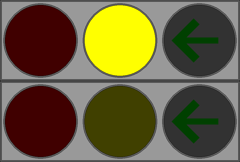
Author/Copyright holder: P.Ctnt. Copyright terms and licence: Public Domain.
The central traffic light in this GIF flickers to call the user’s attention to the yellow light rather than the red light or green arrow.
4. Spatial Positioning
There are several considerations for spatial positioning including:
2D positioning – this is often the best way to deliver data that can be easily recognized and processed visually. It is particularly effective for quantitative data representations.
Stereoscopic depth - we perceive depth by combining the images generated by the left and right eyes in the brain. This depth is preattentively processed. It is possible to recreate stereoscopic depth using two separate cameras set at different angles to a subject and imposing the images over each other.
Concave and convex positioning – this can be created through the use of shading.
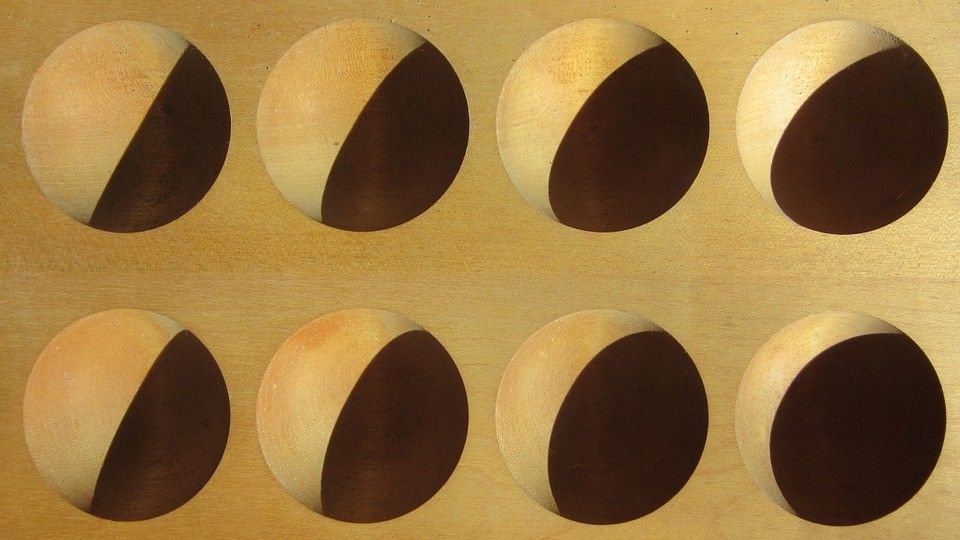
Author/Copyright holder: Pixabay. Copyright terms and licence: Free to Use
In this image we can see the use of shading to suggest convex/concave properties. These are then preattentively processed in the brain.
Using Preattentive Properties in Information Visualization Design
When you develop an information visualization you must decide which properties will be used to deliver each attribute of the data set. This process is known as visual mapping.
Colin Ware indicates that the choice of these four preattentive attributes is the most significant thing that can be done to utilize the science of vision to improve information visualization.
However, there is no universal agreement on which attributes in which combination will be most effective for any given user group. This means that if you intend to use preattentive properties in your designs – you will need to test them with your user group to see if they deliver the appropriate impact.
The Take Away
Preattentive processing takes place in sensory memory; it requires no conscious effort from the user (or viewer) to do this processing – it’s automated and takes less than 500 milliseconds to complete. This can be very useful in design and in particular in information visualization design because it allows the designer to grab the attention of the user without their input or effort. This in turn allows for increased complexity of data that must be processed in short-term memory.
References & Where to Learn More:
Course: “Information Visualization”
Colin Ware. Information Visualization: Perception for Design. Morgan Kaufmann, San Francisco, CA, 2nd edition, 2004.
Find out more about the RGB scale on Wikipedia here.
Find out more about the CMYK model on Wikipedia here.
Find out more about the HSL scale here.
Hero Image: Author/Copyright holder: Marcin Ignac. Copyright terms and licence: CC BY-NC-ND 2.0