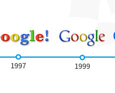
Flat Design

Your constantly-updated definition of Flat Design and collection of videos and articles.
Be a conversation starter: Share this page and inspire others!

314 Shares
Save

Get 1 Powerful Email Each Week

Join 315,237 subscribers.

What is Flat Design?

Flat design is a user interface design style that uses simple, two-dimensional elements and bright colors. It is often contrasted to the skeuomorphic style that gives the illusion of three dimensions through copying real-life properties. Its popularity became prominent with the release of Windows 8, Apple’s iOS 7, and Google’s Material Design, all of which utilize flat design.

Flat design was originally developed for responsive design, where a website’s content scales smoothly depending on the device’s screen size. With the use of simple shapes and minimal textures, flat design ensures that responsive designs work well and load fast (especially important since mobile devices have slower internet speeds). By reducing the amount of visual noise (in the form of textures and shadows), flat design provides users with a streamlined and more optimal user experience.

However, despite its popularity, flat design also has drawbacks regarding the user experience. The absence of three-dimensional effects (e.g., drop shadows) takes away the cues that indicate how a user can interact with a design. For example, buttons in the flat design style do not appear distinct from other visual elements on a webpage, and therefore do not appear clickable. Because of this danger, flat design is increasingly applied in a more balanced way, often referred to as “flat design 2.0” or “almost flat design.” This trend takes the clean and simple visuals from flat design and adds some subtle skeuomorphic qualities such as color variations and shadows. With this increased depth and dimension, visual variety increases and usability improves. For instance, Google’s Material Design and Apple’s iOS interfaces heavily use shadows and/or blurring effects to make their interfaces more intuitive to use.

Questions About Flat Design?
We've Got Answers!

What is a flat design style?

A flat design style is a clean and minimalist graphic style that uses 2D elements with bright colors. It focuses on minimalism, functionality, and usability and uses no shading or extra details to make visuals look 3D. It prioritizes a clean and organized layout to minimize distractions and improve clarity. 

A flat design style aims to keep things straightforward without any fancy extras. It is about simplicity, with a modern look that is practical and user-friendly in digital apps.

What is a flat design image?

A flat design image is a simple picture made in the flat design style. It uses basic shapes, bright colors, and simple typography. You might see these images on websites, apps, or printed materials. Flat design images keep things neat, focusing on how easy it is to use them. They help share information in a clear and user-friendly way. So, it is a clean and straightforward picture that makes things easy to understand, whether on a website or using an app.

This video discusses various examples of different visual frameworks. Jump ahead to 9.20 to catch an example of a flat design. 

Transcript

What is the benefit of flat design?

The flat design comes with a range of benefits:

  • It ensures consistent application across platforms for a unified brand image.

  • User-friendly icons aid in better understanding and interaction.

  • Flat design reduces cognitive load by avoiding complex textures and shadows.

  • It offers a contemporary aesthetic aligned with modern design trends.

  • Easier maintenance and updates due to design simplicity.

  • Simplifies visual elements for a clean interface.

  • It contributes to faster loading times with simple shapes and details.

What is the theory of flat design?

Flat design theory uses clean, white space, crisp edges, bright colors, and two-dimensional illustrations. The goal is to create a modern and straightforward experience for users on computers or phones. 

Flat design became famous as a cleaner alternative to skeuomorphism. The article discusses the evolution, decline, and return of skeuomorphism in design. It also highlights the rise of flat design as a response to the issues with skeuomorphism, emphasizing visual clarity and simplicity. 

What is modern flat design?

Modern flat design, or "flat design 2.0," is an evolution of traditional principles. Modern flat retains the simple, two-dimensional elements, and bright color palettes characteristic of flat design. However, it has subtle additions to address its drawbacks regarding the user experience.

Some notable features of modern flat design are:

  • Incorporates subtle shadows or gradients. 

  • Prioritizes responsiveness, ensuring adaptability to various screen sizes and devices.

  • Employs layering techniques to establish a sense of hierarchy and improve user interaction.

Who uses flat design?

Flat design is widely used across various industries and platforms, seeking clean and modern aesthetics. Major tech players like Microsoft, Apple, and Google have incorporated flat design principles into their operating systems.

Social media platforms, professional networking sites, and web development tools also leverage flat design for its visually appealing qualities. The design trend is not limited to specific industries. Diverse organizations striving for a streamlined and contemporary visual experience in their products and interfaces are embracing it.

Yes, the flat design remains a prevalent and influential trend. It gained widespread recognition as a design style in 2012 and 2013, notably with the releases of Windows 8 and iOS 7. Since then, flat design has remained a prominent and recognizable trend.

"Flat design 2.0" or "almost flat design" are more balanced ways to use flat design. Major tech companies and web and app designers highly utilize these. 

What is flat design on a website?

A flat design on a website is a modern and clean style. Bright colors, simple shapes, and easy-to-read fonts characterize it. Here are six signs to recognize flat design:

  • Bright Contrasts: It uses vivid colors to guide users visually.

  • Simple Shapes: No fancy, realistic images—just basic shapes.

  • Easy Fonts: It prefers simple, fast-loading fonts, like sans-serif.

  • White Spaces: Blank areas help focus and make websites easier to read.

  • Grid Layouts: It often follows a symmetrical grid for organization.

  • Plain and Simple: Symbolic icons, basic shapes, no textures, and no fancy color blends.

How do you make a flat design?

Here are some simple steps to make a flat design:

  • Utilize basic iconography and design simple and recognizable icons.

  • Opt for a bright and contrasting color palette. Limit the number of colors for simplicity.

  • Limit your typography choices and opt for simple, legible fonts.

  • Establish a visual hierarchy through size, color, and placement.

  • Eliminate gradients, realistic textures, and shadows.

  • Maintain consistency in design elements and employ a consistent grid system for alignment.

  • Ensure the design adapts well to different screen sizes and test on various devices for responsiveness.

Where can you learn more about flat design?

The course "Visual Design: The Ultimate Guide" comprehensively explores flat design and visual principles. It will enhance your understanding of visual principles, color theory, typography, and grid systems. The course comprises four lessons and provides practical applications:

  • Learn to differentiate between visual design elements and principles. Apply this knowledge by deconstructing well-known designs.

  • Explore color theory, schemes, and systems. Gain a cultural understanding of color symbolism and its context of use.

  • Understand the anatomy of type, classifications, styles, and typographic terms. Learn some practical tips for selecting and combining typefaces.

  • Recognize the significance of grid systems in providing a structure within the design. Unveil different types and practical applications to enhance design work.

Earn a Gift, Answer a Short Quiz!

1
2
3
4
1
2
3
4
Question 1
Question 2
Question 3
Get Your Gift

Question 1

Which feature is characteristic of flat design?

1 point towards your gift

  • Realistic textures and three-dimensional (3-D) elements
  • Shadows and gradients that improve the depth of elements
  • Simplified, two-dimensional (2-D) visuals with minimal distractions

Question 2

Why do designers often prefer flat design for user interfaces?

1 point towards your gift

  • It offers faster load times and simplifies responsive design.
  • It uses realistic details to simulate real-world objects.
  • It is visually complex and grabs attention with intricate graphics.

Question 3

How can flat design impact usability in user interfaces?

1 point towards your gift

  • It increases visual distractions which makes navigation more difficult.
  • It makes it challenging for users to identify interactive components.
  • It simplifies visual elements which lowers cognitive load for users.

Learn More About Flat Design

Make learning as easy as watching Netflix: Learn more about Flat Design by taking the online IxDF Course Visual Design: The Ultimate Guide.

Why? Because design skills make you valuable. In any job. Any industry.

In This Course, You'll

  • Get excited to master the timeless principles behind great visual design and move from "This looks nice" to "I know why this design works and how I can bring that to my own work". Research from the University of Basel and Google has shown that people judge a design's visual appeal in as little as 17 to 50 milliseconds, long before they've read a single word. That split-second reaction is formed through our perception of visual elements like composition, contrast, and color, and it's something you can influence. In this course, you'll build a stronger eye for visual design and learn from legends like Ellen Lupton, author of the bestselling book "Thinking with Type". You'll start with the fundamental elements every strong composition relies on: line, shape, negative space, volume, value, color, and texture. From Bauhaus-era paintings to the Beethoven poster (1955) and the live MTA New York subway map (2020), you'll trace the impact of more than 100 years of iconic design, see how it continues to shape the visual world, and learn to apply that thinking to your own work. Whether you want to break into visual design or are a senior designer who wants to strengthen your fundamentals, this course gives you timeless, human-centered design skills you'll use for the rest of your career.

  • Make yourself invaluable when you can identify the invisible structure behind great design: how layouts guide the eye, typography creates tone, color carries meaning, and composition shapes what people notice first. These visual choices shape users' trust, emotion, and actions, which means they influence engagement, conversion, and revenue. AI has made it easier to produce visuals, but also easier to produce bad ones. With a strong foundation in visual design, you'll know the difference between what looks finished and what actually works. In this course, you'll learn practical skills you can apply immediately, like how to pair typefaces, use alignment to direct visual flow, choose color with cultural context and psychology in mind, and use grid systems to organize information across different media. By analyzing real-world designs, you'll break down what works, what doesn't, and why, so you build the habit of seeing and creating structure in everything. Whether it's websites, decks, apps, physical interfaces, or posters, you'll bring that trained eye to whatever lands on your desk next.

  • Gain confidence and credibility as you learn to articulate your design decisions without second-guessing yourself. You'll discover how type works, from its anatomy to kerning, leading, tracking, and hierarchy, and know how to talk about it precisely. You'll also be able to describe color choices in terms of theory, schemes, symbolism, and cultural context. When a client asks why you chose that typeface, color palette, or composition, you'll have a confident and clear answer that connects design choices to user behavior and business outcomes. Instead of saying "I like it" or "something feels off," you'll name the root problem and know how to fix it.

  • Craft a personal portfolio with optional hands-on activities and downloadable templates. You'll use grid systems, responsive layouts, typographic systems, sketching, journey mapping, and paper prototyping to explore ideas, organize information, and create stronger work across digital and print. By the end, you'll have portfolio pieces that show employers, clients, and collaborators your design expertise and be able to explain every choice with confidence.

Learn From Industry Leaders

Master complex skills with proven best practices and toolkits directly from industry leaders. Meet your experts for this course:

  • Mia Cinelli: Associate Professor of Art Studio and Digital Design at the University of Kentucky.

  • Joann Eckstut: Color Consultant, Founder of The Roomworks, and one of the 12 designers chosen by the Color Association of the USA to create the yearly forecast used by industries to keep up with color trends.

  • Arielle Eckstut: Author, Agent-at-large at the Levine Greenberg Rostan Literary Agency, and Co-Founder of The Book Doctors and LittleMissMatched.

Earn Industry-Recognized Certificates

Industry giants trust our courses to train their teams, and prestigious universities integrate our content into their curricula. Add your certificates to your LinkedIn profile, résumé, and job applications.

Our clients: IBM, Harvard University, University of Cambridge, NASA, Adobe, Stanford, Massachusetts Institute of Technology, LinkedIn
Course Certificate

All Free IxDF Articles on Flat Design

Read full article
Skeuomorphism is dead, long live skeuomorphism - Article hero image

Skeuomorphism is dead, long live skeuomorphism

Skeuomorphism has been a very useful concept in design, then it became the most hated concept in design, and then it came back from the dead. Understanding skeuomorphism lets designers help users through learning curves and make decisions as to whether skeuomorphism still serves a purpose today.Skeu

Social shares
1.1k
Published
Read Article
Read full article
Top 10 UI Trends Every Designer Should Know - Article hero image

Top 10 UI Trends Every Designer Should Know

People get easily bored with trends, and every few years, the pendulum swings from one way to another. We have all seen the rise and fall of iconic fashion pieces or art movements. The same thing happens in User Interface (UI) design. UI trends go from interfaces that mimic real-world objects to sup

Social shares
1k
Published
Read Article
Read full article
Flat Design – An Introduction - Article hero image

Flat Design – An Introduction

With the dawn of personal computing skeuomorphic design became important to introduce users, unfamiliar with technology, to new concepts. Skeuomorphism takes a simple approach – it creates lifelike affordances in user interfaces (UI) that the user can relate to from their real lives. Thus when you d

Social shares
886
Published
Read Article

Flat Design – An Introduction

Flat Design – An Introduction

With the dawn of personal computing skeuomorphic design became important to introduce users, unfamiliar with technology, to new concepts. Skeuomorphism takes a simple approach – it creates lifelike affordances in user interfaces (UI) that the user can relate to from their real lives. Thus when you delete a file – it goes in the trash can on screen. The act of throwing something away is something that everyone can relate to.

As time progressed skeuomorphic design became ever more realistic with concepts lovingly rendered in 3-dimensions. Many designers felt that this approach was becoming increasingly redundant. Users were more familiar with IT than ever before and in addition there was nothing about a 3D trash can that added any particular value over a 2D rendering of the same trash can.

Flat design is a style of interface design that rejects the 3D elements of skeuomorphism. It does not, contrary to popular opinion, abandon skeuomorphism in its entirety but rather focuses on rendering objects in flat minimalist form. It avoids the excessive use of gradients, textures, and drop shadows designed to deliver 3D effects for simpler elements focusing on simple flat elements, typography and flat color schemes.
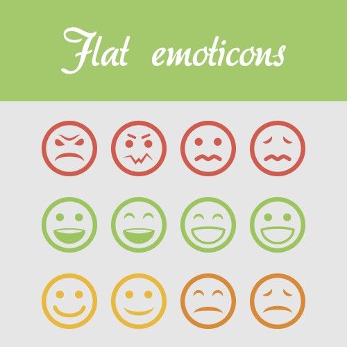

Author/Copyright holder: crassuscz. Copyright terms and licence: CC BY 3.0

Flat design is all encompassing in its approach and can be found everywhere in certain designs if you look hard enough. For example; these flat emoticons.

There is an added benefit of this design approach – it is not just for aesthetics – 2 dimensional objects are far easier to scale within responsive designs that adapt to different screen or browser sizes. This has become far more important with the advent of the mobile web.

A Brief History of Flat Design

Flat design is not entirely new and has been inspired from 3 existing forms of art: The Swiss Style (or International Typographic Style), Bauhaus and Modernism. Of the three, it is probably Swiss Style which has had the largest impact on flat design. Flat design in the real world became popularized in the 1950s and 1960s but the digital world would be rather slower to catch up.

There is a good example of early digital flat design to be found in Microsoft’s ill-fated Zune MP3 player which was launched back in 2006. The interface was both clean and simple and used lower-case typography in a large font size, silhouette styled logo design and plain monochromatic fonts.

The Zune may no longer be with us but the UI styling continued first into Windows Phone and later into the much derided (though not for its flat design) Windows 8 operating system.
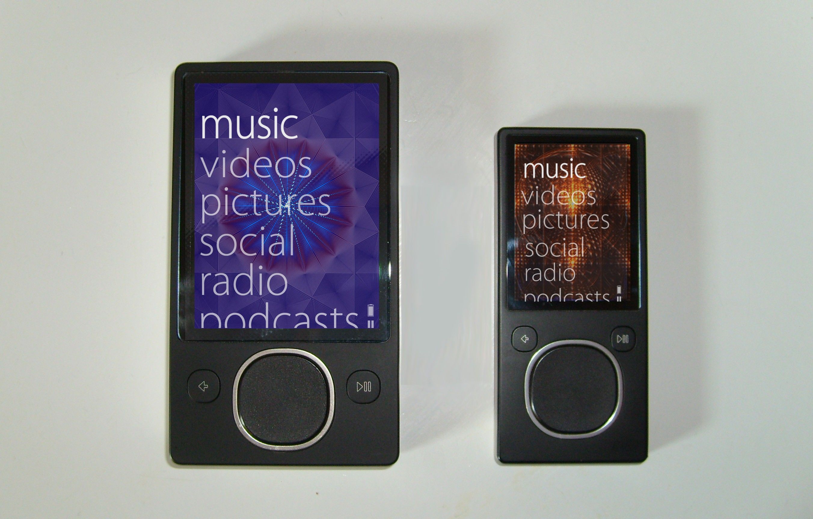

Author/Copyright holder: Bkwparadox. Copyright terms and licence: CC BY-SA 3.0

The Zune may never really have captured the MP3 player market’s imagination but its legacy lives on in flat design.

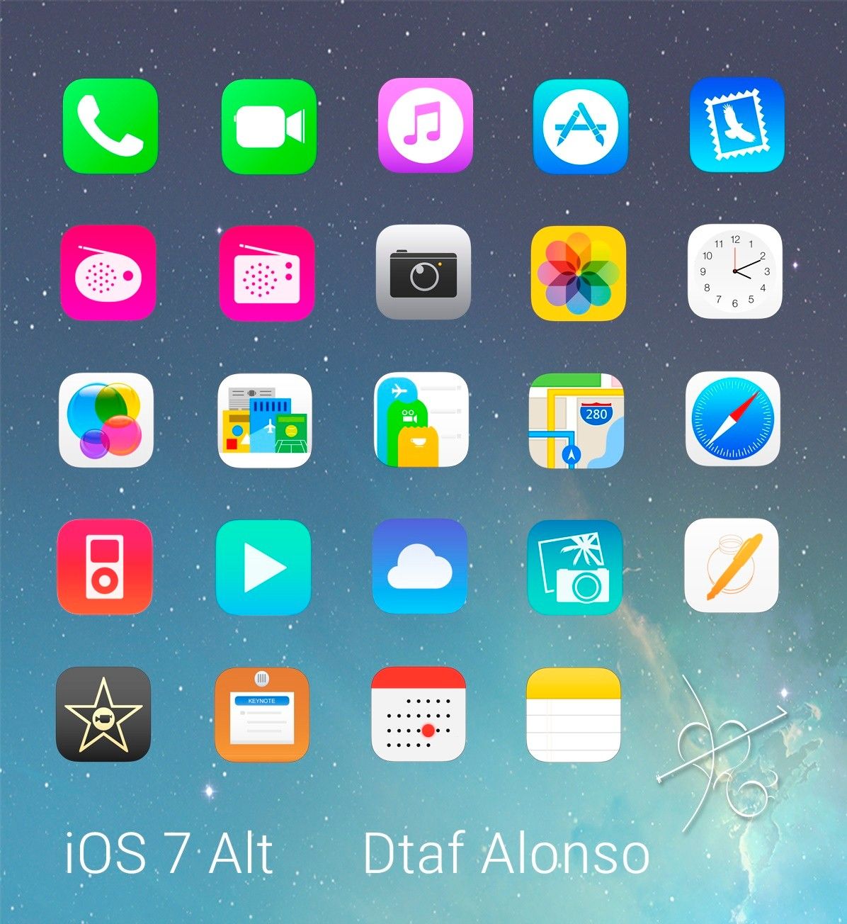
In 2013 Apple joined the flat design party with the release of iOS7 deliberately rejecting previous skeuomorphic designs.

Jony Ive (Head of Design for Apple) said; “When we sat down last November (to work on iOS 7), we understood that people had already become comfortable with touching glass, they didn’t need physical buttons, they understood the benefits,” says Ive. “So there was an incredible liberty in not having to reference the physical world so literally. We were trying to create an environment that was less specific. It got design out of the way.”

Isn’t Flat Design Boring?

Well, Microsoft and Apple don’t think so but yes, some people think that flat design is boring design. However, the truth is that minimalistic design styles are popular and eliminating unnecessary clutter from a design can improve its usability. If a component of a design serves no utility it may hinder the user experience and thus it should be eliminated from the design itself.

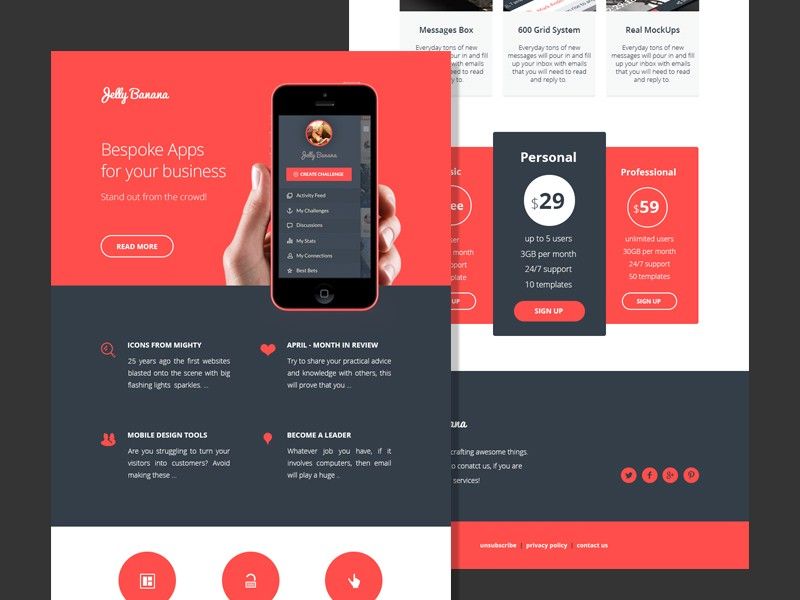
Much of the appeal of flat design is found in the implementation. The use of attention grabbing bright (and highly contrasting) color, for example, can help make icons, images, etc. really stand out from backgrounds. Clever use of flat design can also help guide the user’s eyes to where the designer wants them to be in their design.

Author/Copyright holder: alexlasek. Copyright terms and licence: CC BY 3.0

Flat design definitely doesn’t have to be boring, though it can be. User testing can help you determine whether your flat designs wow users or turn them off.

It’s also easy to argue that the simplicity of flat design is what makes it so effective. The simpler the image that conveys a message – the easier the message is to understand.

What Does Flat Design Mean to UI Designers?

Flat design enables the UI designer to think of their designs as a functional tool. Their work will be measured based on the value that the design brings to the user rather than simply on aesthetic appeal. Many UI designers feel that this focus enables them to concentrate on user experience more than graphic design to the benefit of their businesses and customers alike.

What Goes Into a Flat Design?

The good news is that flat designs are pretty easy to create. The designer needs to focus on simple experiences and can then use:

  • Strong, contrasting colors to add emphasis on details within icons, illustrations, etc.

  • Sans serif typography in large and easy to read fonts that offer straightforward indications of what an icon or illustration is for

  • Crisp, clean UI elements that are easy to see and easy to comprehend

This should bring together a visually consistent and functional design for the UI.

Author/Copyright holder: dtafalonso. Copyright terms and licence: CC BY 3.0

iOS7 showed how much could be achieved through flat design in the hands of skilled designers.

The Take Away

Flat design is a minimalist approach to UI design. It is intended to reduce complexity in the design and thus enhance the user experience. It is not the only approach to UI design and material design and skeuomorphism (in the form of rich design) are also possible considerations when putting together a UI. It is important to carry out research to discover what it is that your users want and not rely on any standard approach for UI design without getting their input first.

References

Read Jony Ive’s take on Flat Design at Cult of Mac here.

An interesting examination of Flat Design vs Skeuomorphism can be found here.

Hero Image: Author/Copyright holder: Pixel Fantasy. Copyright terms and licence: CC BY-NC-ND 2.0

39% of Today's Skills Will Change by 2030

The World Economic Forum expects 39% of today's skills to be transformed or become outdated by 2030.

The good news is that jobs in UX / UI design and AI are among the fastest-growing professions globally.

Build Skills That Keep You Relevant

Privacy Settings

By using this site, you accept our Cookie Policy and Terms of Use.
Customize
Accept all

Be the One Who Inspires

People remember who shares great ideas.

Share on:

Academic Credibility — On Autopilot

Don't waste time googling citation formats. Just copy, paste and look legit in seconds.