Material Design is a user interface design system developed by Google. UX (user experience) designers use it to create visually consistent, intuitive, and responsive digital experiences. With built-in motion, layering, and dynamic theming, Material Design helps teams deliver accessible, high-quality UIs (user interfaces) across devices and platforms.
Get a greater grounding of where Material Design came from and why so you can examine where to take it in exciting ways, in this video with Frank Spillers: Service Designer, Founder and CEO of Experience Dynamics.
Why Designers Use Material Design
UX designers use Material Design because it offers a complete, flexible system that balances usability with visual richness that can deliver excellent results in digital products such as apps and websites. At its core, Material Design is a design system that provides a common language of components, motion, and interaction patterns that help teams create cohesive, cross-platform experiences.
One major advantage is its scalability. Whether you’re designing for a single mobile app or a broad ecosystem of products, Material Design offers a modular structure that supports reuse, consistency, and fast iteration. You can customize visual elements—like colors, typography, and layout—while keeping a strong structural backbone.

Material Design is ready to serve up in exciting digital products you can customize to match how your brand wants to meet its users.
© Google, Fair use
It supports accessible design through built-in contrast guidelines, legibility recommendations, and motion controls that respect user preferences. These features help you create inclusive experiences, although real accessibility still depends on validating against WCAG standards and testing with users to ensure no users are unintentionally excluded.
Explore how to leverage accessible design to reach more users in more ways and help all users in the process, in our video.
Another key benefit is the availability of high-quality tools. Google provides resources such as the Material Theme Builder, icon libraries, and responsive layout systems, enabling designers to prototype and scale quickly without making the mistake of reinventing the wheel.
Last, but not least, Material Design is research-driven. It evolves through user feedback and deep usability studies, a neat point which means that designers can trust that foundational decisions have been well and truly tested. More recent updates to Material Design continue to expand customization, motion, and personalization, making it a flexible and forward-looking choice for modern UX needs.
Discover how to harness the power of user research to take your own design solutions in the right direction, faster, in our video.
Material Design Evolution: Four Generations
Or, to be more exact, four generations and counting, Material Design continues to evolve to respond to UX and UI (user interface) designers’ needs as they deliver inclusive and seamless experiences to countless users in various industries. The saga so far:
Material Design (2014)
Google launched Material Design in 2014 as a design language grounded in real-world metaphors—light, motion, and material surfaces. Known internally as “Quantum Paper,” it introduced elements like cards, elevation, and shadows to give digital content tactile properties.
Material Design emphasized clarity, consistency, and predictability—a refreshing way for designers to mimic the physics of real-world interaction. Surfaces moved naturally, responded to touch, and transitioned fluidly, which gave users a sense of control in a way they had not known previously.
Material Design 2 (2018)
In 2018, Google released a revised version commonly referred to as Material Design 2. This update neatly responded to growing criticism that apps using Material looked too similar. The “sequel” to “Material Design 1” nicely addressed that cookie-cutter concern. Designers wanted more freedom to express brand identity and fine-tune things to put their unique stamp on what users would come to know—and, more importantly, how they would feel—about their product and brand.
Material Design 2 delivered by introducing greater flexibility in color, typography, and shape. The new Material Theme Builder permitted deep customization, letting brands stay recognizable without straying from core usability principles. It also updated component guidelines and icon sets for better readability and adaptability.
Material You / Material Design 3 (2021)
Material You, introduced in May 2021 with Android 12, marked a philosophical shift that took things in an even more customizable direction. Instead of enforcing visual consistency across platforms, Material You prioritized user personalization.
At its heart is the Dynamic Color System, a generator that builds a color palette based on the user’s wallpaper. This affects app themes, system UI, typography, and even icon styles such that no two experiences look exactly alike—and that’s intentional. True to its name, Material You embraces individual expression while preserving functionality.
Otherwise known as Material Design 3, this update conveniently also brought better accessibility defaults, responsive layout patterns, and motion principles that adapt across devices. It opened new paths for designers to personalize without compromising clarity or cohesion, just what designers had been seeking to fine-tune even more expressive and personalized digital solutions to bridge their brands to users.
Material 3 Expressive (2025)
After Material You or (plain) Material 3 came what may be the natural progression in the “series.” Announced in May 2025 at Google I/O, Material 3 Expressive represents the most significant update since Material You. Google termed it, “one of our biggest updates in years,” and for good reason.
It introduces spring-like motion—animations that bounce, stretch, and respond to touch more organically. These interactions feel more alive while remaining subtle. When paired with advanced haptic feedback, the result is an emotionally rich and intuitive experience.
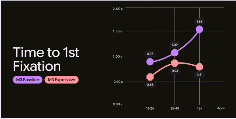
There’s more; Material 3 Expressive improves designer control over theme and motion behaviors, offering enhanced tools for branding and customization. These improvements didn’t come from an arbitrary push to provide more expressive freedom to designers; they’re changes which are backed by research: Google conducted 46 user studies with over 18,000 participants to ensure motion and color contribute to clarity and satisfaction—not confusion. Participants were able to recognize key UI elements up to four times faster.
Expressive design also helped older users spot key elements just as fast as young users across 10 apps tested.
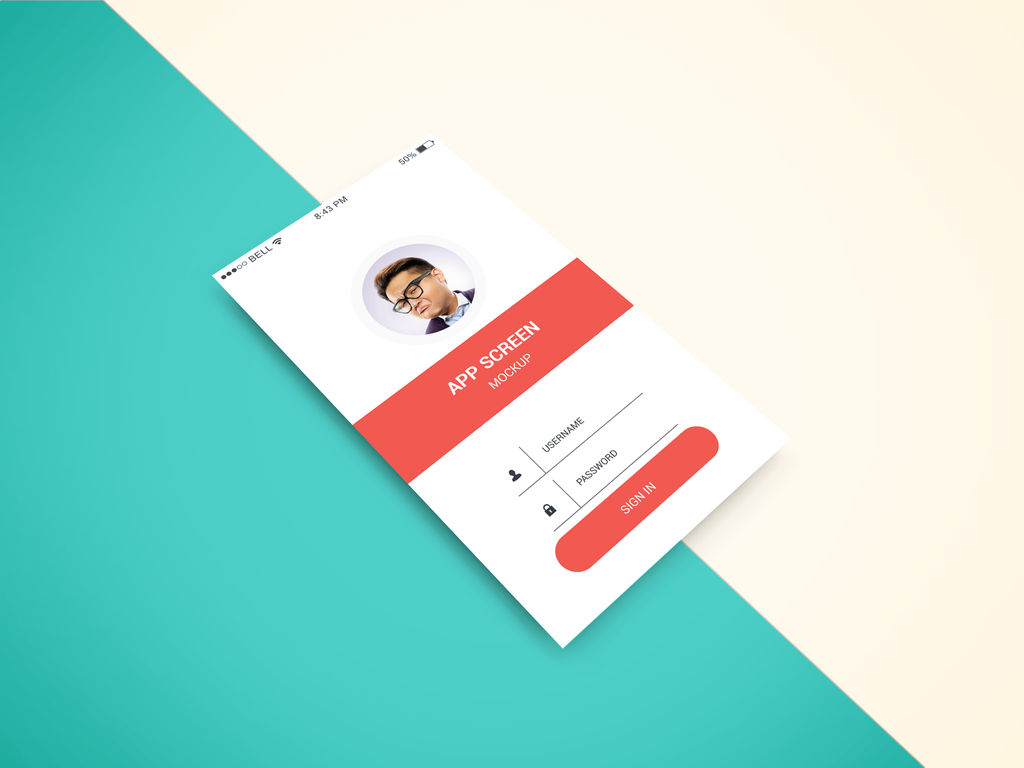
Design your way with a powerful lift from a tried-and-tested system.
© Google, Fair Use
Material Design’s Core Concepts and Principles
Physical Metaphors and Predictable Behavior
From its earliest days, Material Design leaned on real-world principles: elevation, lighting, texture, and motion. Cards behave like physical paper; shadows create hierarchy; and objects don’t vanish, but transform smoothly. This predictability builds trust with users and reduces cognitive load on them.
Grab a greater grasp of what an effective visual hierarchy does for design, in our video.
Users don’t need to guess what a button does or where a menu will appear; behavior follows familiar rules. This intuitive foundation makes Material Design especially effective for complex interfaces, where creating seamless experiences is all the more important given how any confusion and resulting hesitation can break that seamlessness.
Dynamic Color System
One of Material You’s most innovative features is the Dynamic Color System. It automatically extracts a cohesive color palette from a user’s wallpaper, applying it across the UI for them to enjoy.
A big advantage for designers is how they can leverage this to create highly personalized experiences without manual theming. It’s designed to maintain adequate contrast and can be constrained to align with brand guidelines, but designers should always validate against WCAG and brand requirements. It can be adapted to support brand coherence, although dynamic color may require constraints.
Personalization and Expression
Material Design 3 marked a strategic pivot, taking things away from a more universal style to individual user expression. This is a key part of bringing more relevant experiences home, as it empowers users to shape their digital environments through color, motion, and interaction preferences.
Another point is how this aligns with broader UX trends toward co-created experiences. Designers now think beyond “one-size-fits-all” and offer flexible defaults that adapt to user needs, behaviors, and contexts. Material Design gives users greater scope for personalization while designers should balance this with their brand identity.
Consider users’ contexts when you create designs that resonate with more users in more situations, in this video with Alan Dix: Author of the bestselling book “Human-Computer Interaction” and Director of the Computational Foundry at Swansea University.
Enhanced Motion and Haptic Feedback
Material 3 Expressive deepens the role of motion so that animations mimic spring physics, easing in and out with elasticity. These subtle cues help users track changes and understand spatial relationships between elements—making for more intuitive user experiences while reflecting real-world dynamics in fresh and engaging ways.
Pairing these movements with sophisticated haptic feedback (vibrations or tactile cues) adds another sensory layer. Feedback feels precise, contextual, and supportive—enhancing both delight and usability to help shift up a few gears for designers to provide experiences that go beyond user expectations while keeping them on board every step of the way.
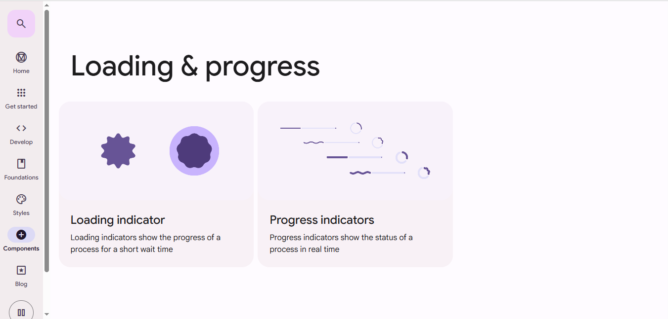
Fine-tune feedback such as through loading and progress indicators to keep users informed and content in seamless user experiences.
© Google, Fair use
Why Users Trust “Realer” Interfaces
Material Design’s core strength is realism—maybe not so much in look, but in feel. By simulating how real objects respond to touch, motion, and light, it helps designers build interfaces that behave the way users expect them to. This predictability lowers the barrier to interaction, as it paves the way to help users perform tasks and achieve goals. Be it swiping a card, tapping a button, or watching content animate into place, users instinctively know what to do and what will happen; trust follows naturally.
The Paradox of “Magical” and “Predictable”
Great interfaces surprise and satisfy—without confusing, and that’s a key part of a user experience. If you consider the vast array of contexts users can find themselves in when they encounter and (attempt to) use a digital solution like an application, the element of “surprise” can be especially challenging to get right.
Material Design balances these opposing forces, enabling designers to deliver successful solutions to users who won’t become frustrated whenever they use the product:
Predictable: Buttons depress, sheets slide from the right, and shadows imply depth; nothing behaves unexpectedly—just what users need when, for example, they’re quickly thumbing at a screen in a busy situation and need to get something done quickly.
Magical: Transitions feel fluid, objects animate gracefully, and changes happen with polish. That level of slickness keeps the communication channel between brand and user fresh and exciting, so even during the most mundane tasks users can feel the brand knows them that much more.
Designers must craft experiences that reveal complexity gradually, through elegant motion and meaningful structure—not abrupt shifts or gimmicks. This skill is what makes progressive disclosure, the art of revealing complexity as and when it’s needed, work so well. Material’s system supports this and more, to help maintain that delicate balance.
Peer into the power of progressive disclosure to learn how to ease users into digital solutions more successfully, in our video.
Material Design Delivers in a Contemporary UX Context
Accessibility and Inclusion
Modern UX demands interfaces that serve everyone, a reality which Material Design addresses through:
Auto-generated high-contrast themes
Scalable typography
Keyboard and screen reader support
Reduced motion options for sensitive users
These features come built-in, fast-tracking things to help teams design inclusively from day one. Accessible and inclusive UX design goes beyond compliance; indeed, accessibility is enforced by law in many jurisdictions, but the “spirit” of designing to accommodate all users runs deeper than that. It involves designing for a range of human abilities, devices, and situations—making the best design solutions to serve users in any situation, whoever they are.
Material Design provides guidelines for responsive layouts, semantic labels, and color systems that adapt to the needs of users with visual disabilities—for example, color blindness. It encourages designers to create systems that flex with the user—across languages, devices, and abilities—while maintaining functional clarity.
Consider how to accommodate color blind users in more thoughtful designs, in our video.
Special Considerations for “Material Designers”
While Material Design is powerful and offers exceptional design “lift,” designers must approach it thoughtfully. Here are key considerations:
Don’t Overuse Motion
Material encourages animation, but too much movement—or unnecessary flourish—can distract or confuse and work against the benefits you’re trying to provide users with. Use motion to support interaction, not decorate it.
Don’t Ignore Accessibility
Material Design has done much to aid users with disabilities. Still, it’s tempting to rely on auto-generated themes without checking contrast ratios or font legibility. However, always validate against WCAG (Web Content Accessibility Guidelines) standards and test with real users whenever possible.
Resist Uniformity
Material Design provides structure, not sameness—and it’s advanced to a level where it’s fair to say there’s no “excuse” for not fine-tuning your unique brand expression. So, customize shapes, typography, and color palettes to reflect your brand identity. Don't default to the generic Material look—use the tools to stand out, not blend in.
Consider Performance
Animations and haptics are engaging, sure, but they can slow down low-end or older devices. So, optimize interactions and offer fallback states for slower connections or older hardware.
Stay Updated
Material Design reflects the UX “continuum” it’s in and evolves, in step with users rather than trends. So, make sure you follow the latest guidelines, as older practices may be outdated. Material 3 Expressive changes how you might think about motion and theming—so adapt your design workflows accordingly to help users know where they are, what to do, and how to make the most of your digital product.
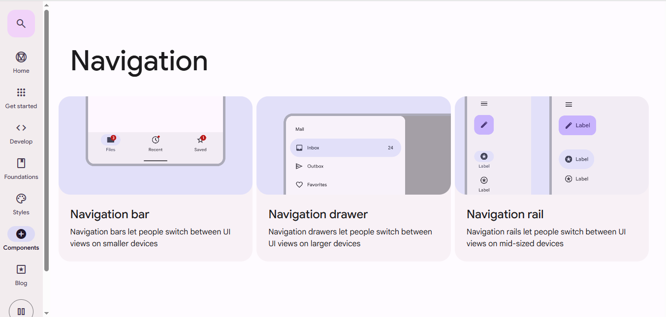
Speaking of users’ knowing where they are, remember to leverage effective navigation to help them enjoy excellent user experiences free from frustration or confusion.
© Google, Fair use
Overall, Material Design has grown from a bold visual language into a deeply personalized, adaptive system built on UX research and user expression in just over a decade. With Material 3 Expressive, designers have more control over motion, theming, and interaction than ever before. At the same time, the system ensures these freedoms support clarity, accessibility, and usability—a true “best of both worlds” deal.
Remember, Material Design is far more than a visual style; it’s a strategic framework for building digital experiences that feel intuitive, inclusive, and beautifully responsive to the human touch. And that human touch is more than just a little instrumental in building the bridge between user and brand, as the former connects with the latter in ways that transcend the “material” sense of a design being just the sum of its parts. It’s so much more. Material Design gives you a springboard to hit the high altitudes where you can spot how to make the “magic” to bridge that divide so users can enjoy seamless experiences every time.


