Heuristics in UX (user experience) design are general principles that guide designers as they create user-friendly interfaces. Designers apply heuristics such as error prevention, recognition rather than recall, and others to help optimize digital products, identify usability issues, and improve user experiences efficiently.
Watch as William Hudson, User Experience Strategist and Founder of Syntagm Ltd, explains important points about heuristics at work in design:
The Origins of Heuristics in UX Design
Heuristics are a set of rules for solving problems in quick, practical ways. The concept of heuristics in UX design traces back to the late 1980s and early 1990s. It was an era when computing and interaction design looked more than a little different to today. In 1990, usability experts Jakob Nielsen and Rolf Molich introduced the idea of heuristic evaluation as a method to identify usability problems in UIs (user interfaces).
In 1994, Nielsen refined the “10 Usability Heuristics for User Interface Design”—a set of principles that have become foundational for UX designers to create pleasant and seamless user experiences. The purpose of these heuristics was to provide a framework for evaluating user interfaces without the need for extensive user testing.
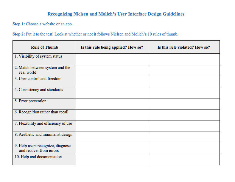
Jakob Nielsen’s 10 usability heuristics are:
Visibility of system status: The system should always keep users informed about what is going on, through appropriate feedback within reasonable time.
Match between system and the real world: The system should speak the users’ language, with words, phrases, and concepts familiar to the user, rather than system-oriented terms.
User control and freedom: Users often choose system functions by mistake and will need a clearly marked “emergency exit” to leave the unwanted state without having to go through an extended dialogue.
Consistency and standards: Users shouldn’t have to wonder whether different words, situations, or actions mean the same thing, hence why designers should follow platform conventions and maintain consistency throughout.
Error prevention: Even better than good error messages is a careful design which prevents a problem from occurring in the first place.
“An ounce of prevention is worth a pound of cure.”
— Benjamin Franklin, American Polymath
Recognition rather than recall: When people must remember what to do in a situation, they find it more taxing than when they have a cue or suggestion on screen. Minimize the user’s memory load by making objects, actions, and options visible.
Flexibility and efficiency of use: Accelerators—which novice users likely won’t notice—may often speed up the interaction for the expert user such that the system can cater to both inexperienced and experienced users.
Aesthetic and minimalist design: Dialogues should not contain information which is irrelevant or rarely needed.
Help users recognize, diagnose, and recover from errors: Error messages should inform users in plain language, precisely indicate the problem, and constructively suggest a solution.
Help and documentation: Even though it’s better if users can use a system without documentation—like how-to information and guidelines—it may be necessary to provide help and documentation.
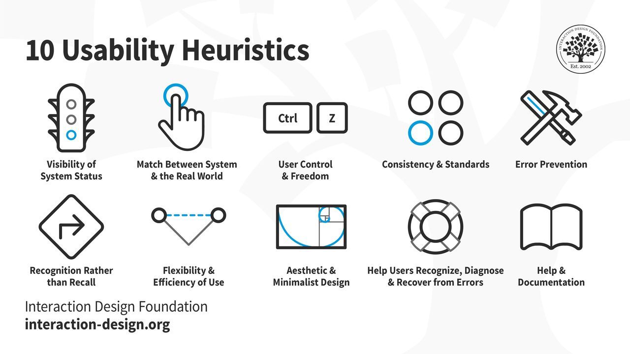
Nielsen’s heuristics have stood the test of time. When Nielsen revisited them in 2020 to slightly refine the definitions’ language, the 10 heuristics remained unchanged.
© Interaction Design Foundation, CC BY-SA 4.0
These heuristics act like an early-warning system for designers to shape their UIs with before they commit to testing on expensive final design solutions. Indeed, when designers—and heuristic evaluators—apply these principles, they often can systematically identify potential usability issues early in the UX design process. That translates to more efficient and cost-effective improvements and less problematic designs for user testing.
How Heuristics Help UX Designers and Brands
The best way to illustrate the true value of heuristics is to imagine a world without them. For example, designers can create great-looking websites according to what they know about design principles and what a great-looking website looks like. However, a great-looking digital product is no guarantee that it’s highly usable—and usability is just one of the seven factors that influence UX. That approach can detach the designer from the user and get in the way of an empathic connection with their user needs, behaviors, and the rich details of context in their user journey.
Watch this video to understand why successful designs reflect empathy with users:
UX professionals continue to use heuristics such as Nielsen’s widely to evaluate and improve user interfaces across various digital products. For example, you can apply them early to prototypes you create to stay mindful of what users need every step of the way.
When you apply UX heuristics, you can flip perspectives with the user and understand how to answer questions like “Did that go into my shopping cart?” and “How do I see what I’ve sent?” quickly.
At the same time, you can see how to keep users from becoming confused and asking questions like: “They said, ‘Log in’ on the other screen; why is it ‘Sign in’ here?” and “How do I get back to where I was?”
Watch as Alan Dix, Author of the bestselling book “Human-Computer Interaction” and Director of the Computational Foundry at Swansea University, explains why good designs need prototyping:
If your product is a website, application, or other digital product—such as augmented reality (AR) or virtual reality (VR)—you can use heuristics to help ensure that the interface aligns with user expectations and behaviors. Heuristics are a tool that empowers you to stay two steps ahead of users and help prevent the ultimate problem: user distrust.
Consistent and predictable interactions mean greater user satisfaction and efficiency; users get what they want or need to do done, fast. You can enjoy great efficiency with a heuristic evaluation of your design, too. It’s a cost-effective method to assess usability, and saves you from finding numerous problems later in usability testing.
How To Create More Intuitive and User-Friendly Interfaces with Heuristics
Understand and apply each of Nielsen’s 10 usability heuristics—along with an 11th one—to get on the fast track and create effective user interfaces. Here’s a breakdown of each heuristic with some practical advice:
Visibility of system status: Keep users informed about what’s happening on the interface and in the system—provide timely and appropriate feedback. Empathize with them; many users access apps and sites in potentially stressful situations and can become frustrated quickly, or even fearful if they don’t know what’s going on.
For example, show progress indicators during loading times or confirmation messages once users complete actions.
Match between system and the real world: Use language and concepts familiar to users. Don’t give them technical jargon. Instead, use terms that align with users’ real-world experiences. Even if your brand has a quirky personality, it’s a good idea to keep things simple and familiar for users.
For example, use “Shopping Cart” instead of “Item Inventory.”
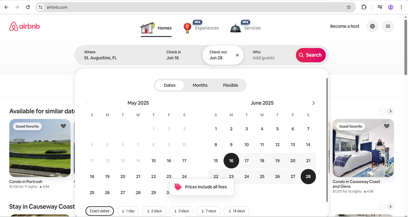
Airbnb uses plain language and calendar icons, and mirrors real-world booking experiences.
© Airbnb, Fair Use
User control and freedom: Mistakes happen in an imperfect world; you can count on it. So, provide users with the ability to undo and redo actions. Include clearly marked “exit” options to allow users to leave unwanted states without difficulty. Users might access solutions like banking apps while they’re on a bumpy bus ride. What if they need to make a payment, accidentally add a zero or two, and accidentally click “Pay”?
For example, offer a “Cancel” button during multi-step processes.
Consistency and standards: Maintain consistency in design elements and follow platform conventions. Users look for items they’ve come to understand as “industry standards,” so use standard icons and terminology consistently to prevent confusion. Again, they may access your digital product in a hurry; don’t delay them as they wonder where buttons are or what words mean. Even small pauses cost them time and, in even just a few seconds, can cost your brand credibility in their eyes.
For example, use a magnifying glass icon for search functionality.
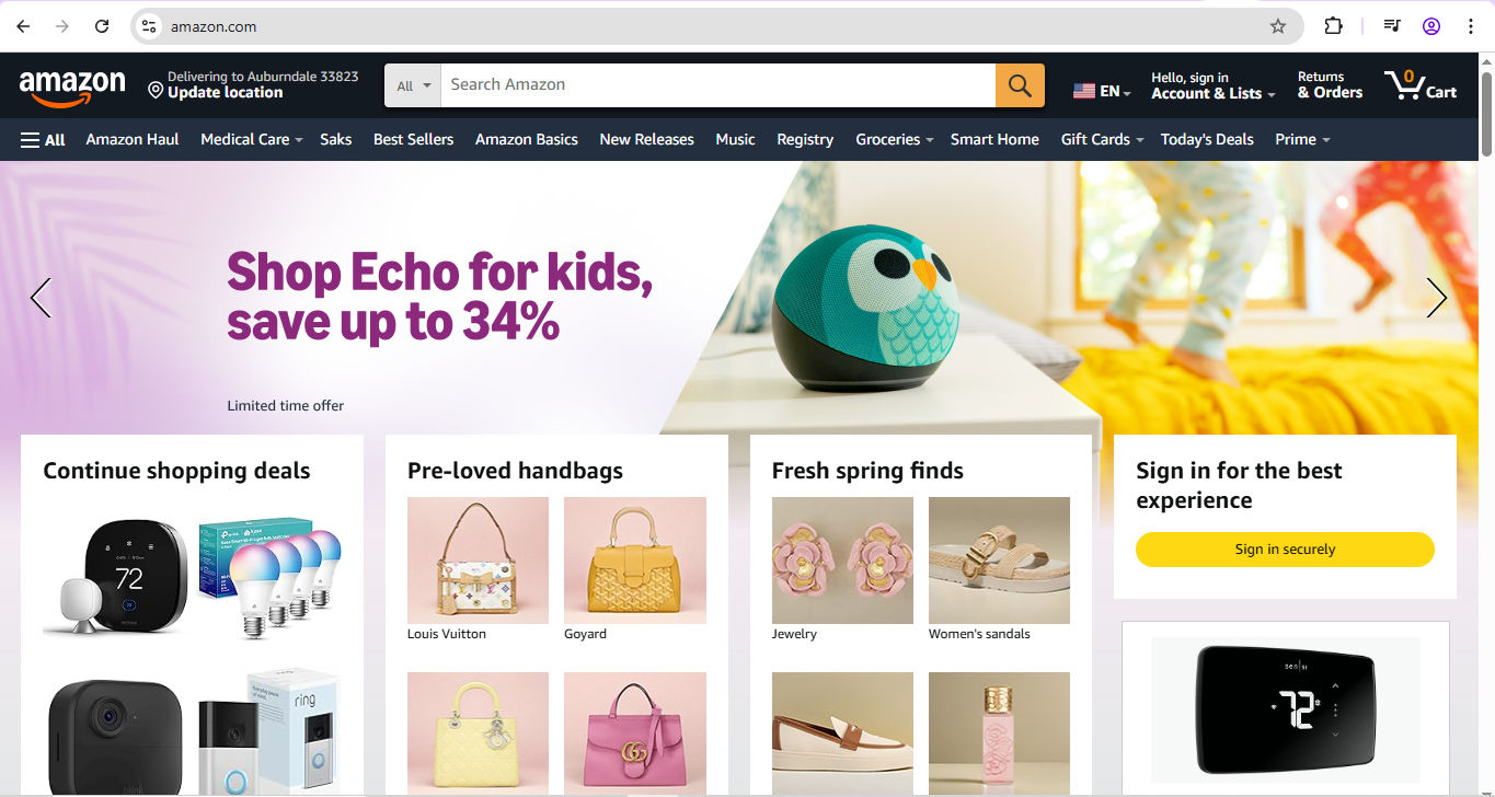
Amazon’s highly findable magnifying glass helps users identify the search bar and get the products they want, fast.
© Amazon, Fair Use
Error prevention: Assume it’s an imperfect world and users need safety nets; it is, and users will be glad of the consideration (or will become irritated or angry if they’re allowed to “fall”). So, design interfaces that prevent errors in the first place. Use confirmation dialogs for critical actions and provide constraints to guide user input.
For example, disable the “Submit” button until all required fields are completed, or guard-rail the banking app user who may have made a mistake with a “Confirm payment” screen. Show them the amount they’re about to pay—if it’s wrong, let them edit the amount or cancel (which goes back to Heuristic 3).
Recognition rather than recall: Minimize users’ memory load by making options and information visible. So, use menus, icons, and tooltips to help users recognize actions and options without having to remember them. Users in their many contexts expect to find choices and achieve goals fast without having to remember which screen they saw something on—hesitation breaks seamless experiences.
For example, if users need to contact customer support, have an easily recognizable icon for it throughout a site.
Flexibility and efficiency of use: Power users know their way around; newcomers won’t—although they should still find the digital solution intuitive and user-friendly. So, cater to both and provide shortcuts and customization options for experienced users while maintaining simplicity for novices.
For example, offer keyboard shortcuts for frequent actions and allow users to customize their dashboard layout.
Aesthetic and minimalist design: Cluttered, busy designs keep users back, so design interfaces with simplicity in mind. Remove unnecessary elements that don’t support user tasks—don’t have anything in there that gets in the way of what users want to do.
For example, use whitespace effectively to create a clean and focused layout.
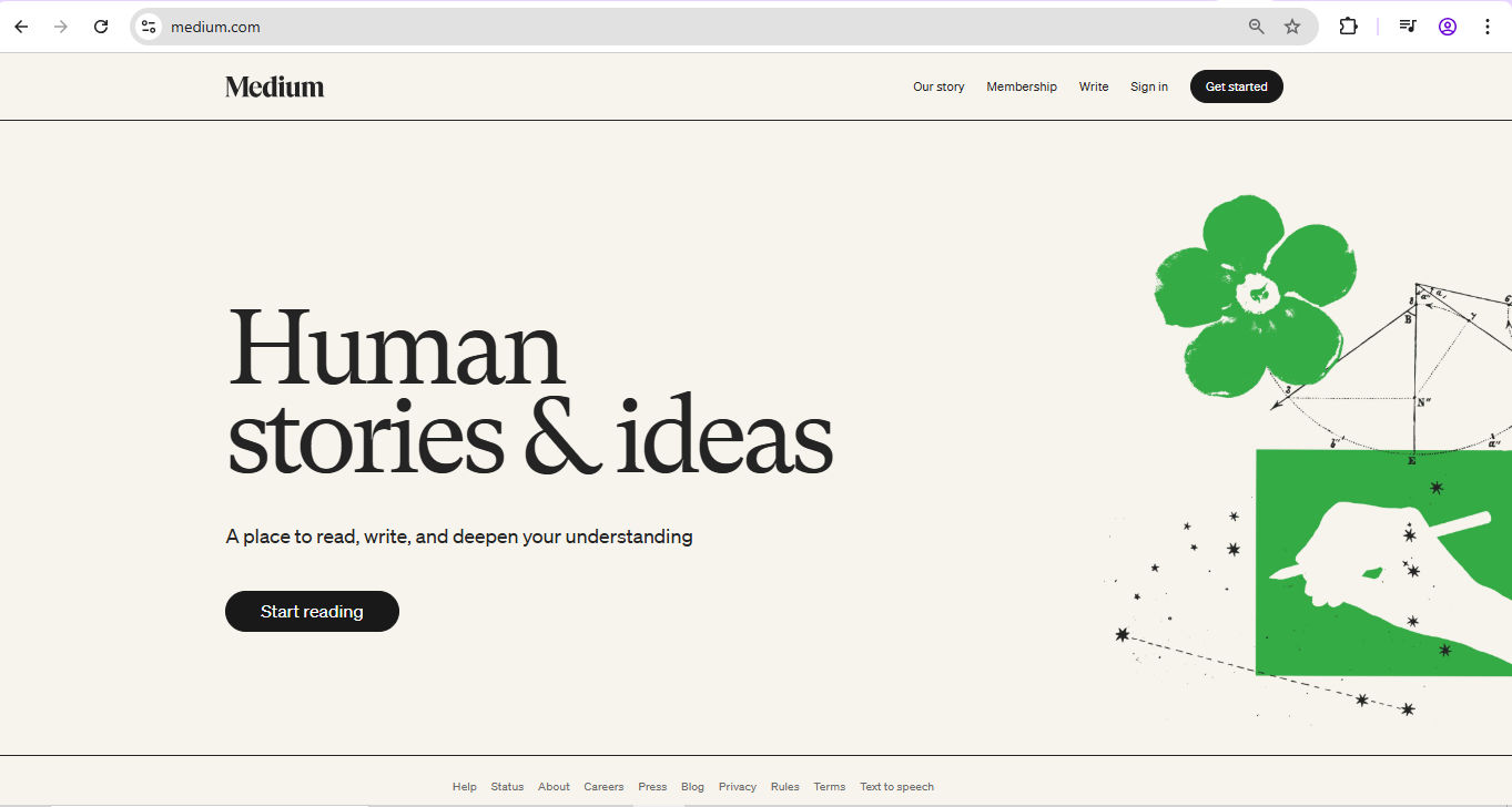
Medium’s clean layout features generous whitespace (which can be grey, too)—lots of breathing space to help deliver a great experience whether you’re a reader or writer.
© Medium, Fair Use
Help users recognize, diagnose, and recover from errors: Errors will happen, even with guardrails in place. So, provide clear and concise error messages that indicate the problem and suggest solutions. Avoid technical language and error codes.
For example, display "Please enter a valid email address" instead of "Error 400."
Help and documentation: Fast, empathic aid helps users when they need to pause on more intricate sites or consider what a product or service includes. So, offer easily accessible help and documentation that focuses on users’ tasks and their needs in context. Include search functionality and organize content logically.
For instance, provide a searchable FAQ section and contextual help links.
Accessibility and inclusion: In a world where accessible design is a legal requirement in many jurisdictions, create interfaces that are perceivable, operable, understandable, and robust for all users. This aligns with the Web Content Accessibility Guidelines (WCAG), and you can use it to help your brand reach not just users with disabilities but all users too (such as subtitles for users in loud places).
Key aspects of this heuristic include:
Perceivability: Ensure that users can perceive the information a digital product presents, regardless of their sensory abilities.
Operability: Design interfaces that users with various physical abilities can operate.
Understandability: Create content that users with different cognitive abilities can understand.
Robustness: Develop content that a wide range of user agents, including assistive technologies, can interpret reliably.
Watch our video about accessibility to understand why it’s vital in design:
Some Considerations and Cautions about Heuristics
While heuristics are valuable tools in UX design, they’re not a guarantee of perfect designs. They are principles to guide you as you develop user-friendly and accessible designs; so, recognize their limitations and use them appropriately.
Subjectivity: Heuristic evaluations rely on the expertise of the evaluator, which can introduce bias. Different evaluators may identify different issues based on their perspectives and experiences.
Not a substitute for user testing: Heuristics should complement—not replace—user testing. While they can help you empathize better with users’ needs and identify potential usability issues, they don’t capture actual user behavior and preferences.
Context matters: Heuristics are general guidelines and may not apply equally to all contexts. For great designs that resonate with users, you’ll want to consider the specific needs and expectations of their target users when applying these principles.
Over-reliance: If you rely just on heuristics, you might overlook unique usability challenges. So, combine heuristic evaluations with other methods, such as user testing and analytics. It will help you gain a comprehensive understanding of usability issues and can prevent expensive design missteps.
Overall, include heuristics effectively as part of your broader UX strategy. Jakob Nielsen’s 10 usability heuristics give you a solid foundation to set your digital creations on, and the accessibility and inclusion heuristic offers an important additional lens to examine the user-friendless of your product.
Heuristic Evaluation: An Essential and Enduring Tool
The timelessness of heuristics is a reassuring indicator that mirrors the enduring relationship between technology and users. Technological advancements will continue to produce system changes and pave the way for exciting new products. However, human users will still need to find things and do things as easily as possible on the apps and sites they choose to try, trial, and subscribe to. They won’t just appreciate brands that guardrail them, forgive their mistakes, and keep them on board; they’ll be secure in the knowledge that they are safe and valued. They will expect brands to do that, too. Use heuristics mindfully and help deliver seamless experiences to users of all types—and have winning products to show for your thoughtful design work.


