Object-oriented UIs (User Interfaces) are structured around the objects (nouns) users care about and their relationships. Objects are things, for example files, messages, and tasks, and actions are operations on those objects, rather than being the focal point of the interface. This matches how people naturally think about their work.
Instead of forcing users to rely on File, Edit, and View menus and memorizing where commands live, you present the things they want to work with directly on screen. A message object shows sender, subject, and preview text. Select it, and reply, forward, and archive options appear. The interface adapts to users, not the other way around.
This approach works because it mirrors how you already think. When you walk into your kitchen, you don't mentally scroll through possible actions. You spot the glass you want, and reaching for the cabinet follows naturally. Show people what they want to work with, and they'll instantly know what to do with it.
In this video, William Hudson, User Experience Strategist and Founder of Syntagm Ltd, explains how popular apps like Instagram, Notion, and Airbnb demonstrate object-oriented patterns that make interfaces feel intuitive from the first interaction.
Real-World Object-Oriented User Interfaces You Use Every Day
You already use object-oriented interfaces daily, probably without realizing it. While these products may or may not have been created using formal object-oriented user interface approaches, examining them with these principles reveals why they work so well. Here's how:
Email Applications
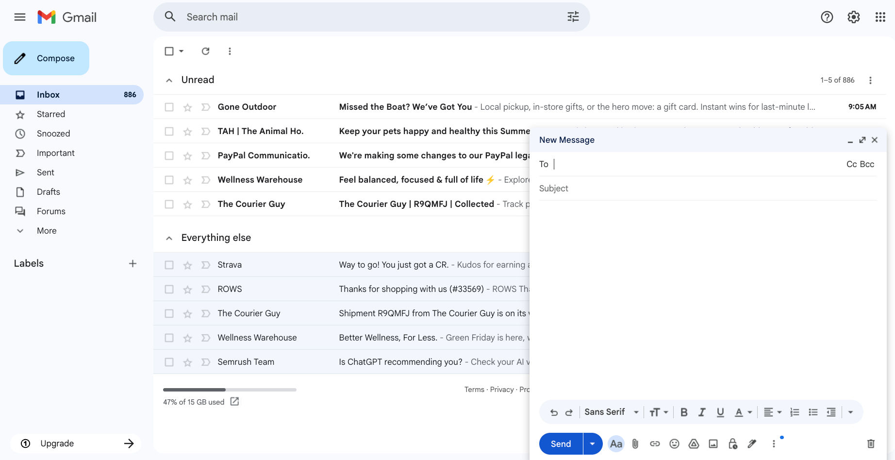
Gmail displays message objects with key attributes (sender, subject, and preview) visible at a glance. Selecting a message or opening the compose window reveals only the contextual actions relevant to that object, which keeps the interface clean and focused.
© Google, Fair use. Modified by Interaction Design Foundation.
Gmail and Outlook demonstrate object-oriented patterns. When you open your inbox, you see message objects with visible attributes: sender name, subject line, preview text, and timestamp. You select a message, and contextual actions appear:
Reply
Forward
Archive
Delete
Mark as spam
Conversation threads illustrate object relationships. Related messages group together as a single conversation object. You expand the conversation to see individual message objects within it. This structure mirrors how you think about email: Conversations contain messages, and messages have senders, subjects, and content.
Travel Booking Platforms
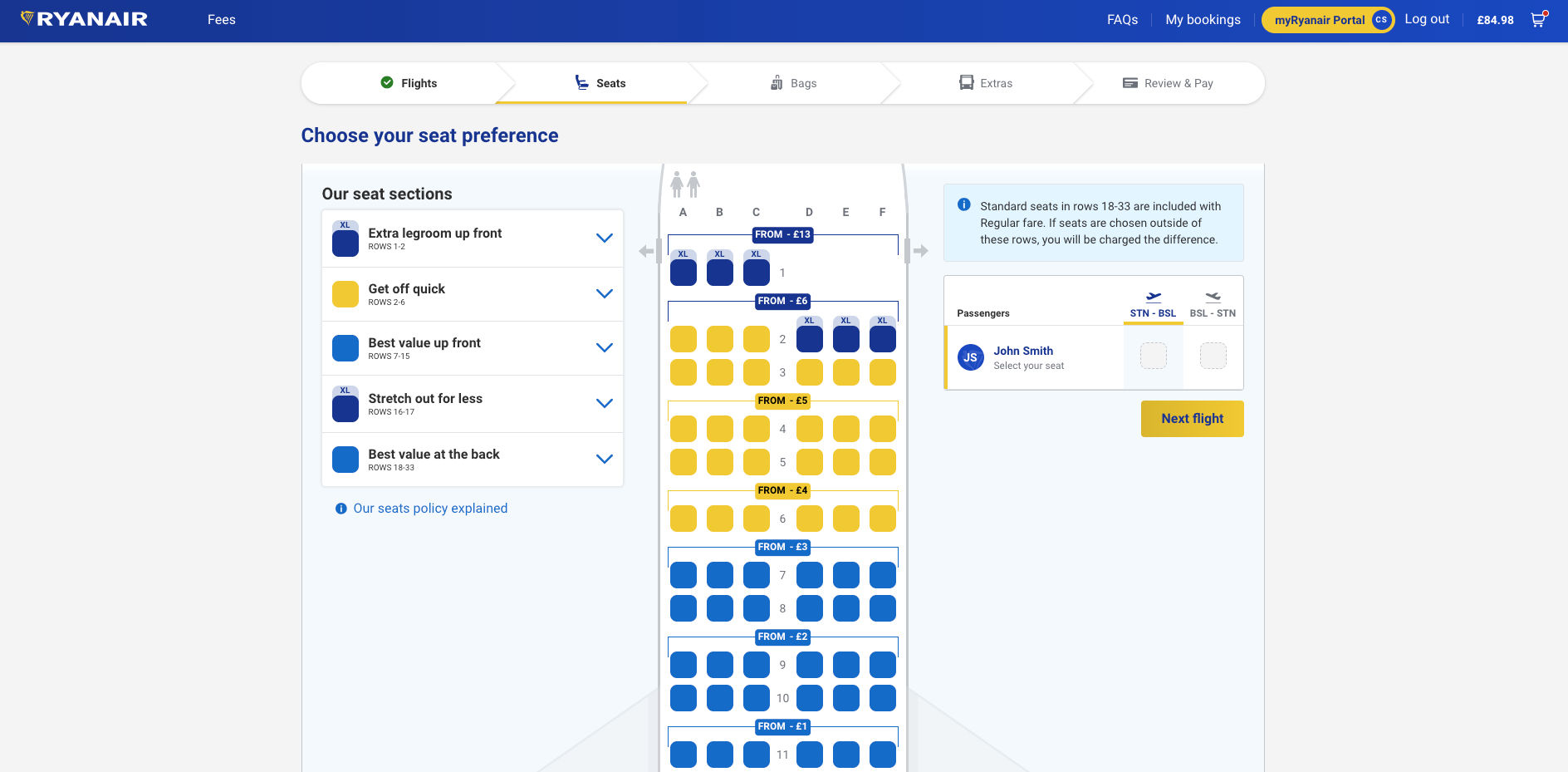
Ryanair's booking interface demonstrates object-oriented design: The reservation object organizes flights, passengers, and seats, while contextual operations like "modify booking" and "select seats" keep interactions intuitive despite the platform's underlying complexity.
© Ryanair, Fair use. Modified by Interaction Design Foundation.
Airline booking systems like Ryanair illustrate object-oriented interface principles. The reservation is the central object that contains flight objects, passenger objects, and seat objects. You see your reservation with visible attributes: Flight numbers, departure times, passenger names, and booking reference.
You interact with the reservation object through contextual operations: Modify booking, select seats, add baggage, and check in. Each operation makes sense in the context of the reservation object. The interface manages complexity by organizing everything around objects you understand.
Social Media Platforms
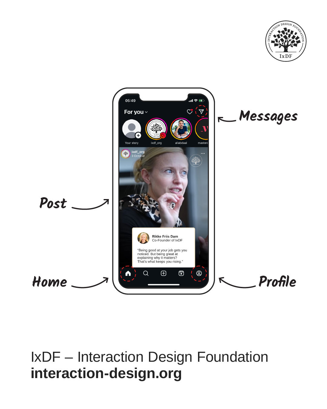
Instagram organizes its interface around distinct object types (posts, profiles, and messages) each with their own visible attributes and contextual actions. Interacting with a post surfaces options like like, comment, and share, while switching to a profile reveals follow and message actions instead.
© Instagram, Fair use. Modified by Interaction Design Foundation.
Platforms like Instagram demonstrate object-oriented interface design clearly. Posts, profiles, stories, and messages are distinct object types with different attributes and operations. When you view your feed, you see post objects with visible attributes: Images, captions, like counts, and timestamps.
You interact with post objects through contextual operations: Like, comment, save, and share. You interact with profile objects differently: Follow, message, view posts. Each object type has operations that make sense for that object.
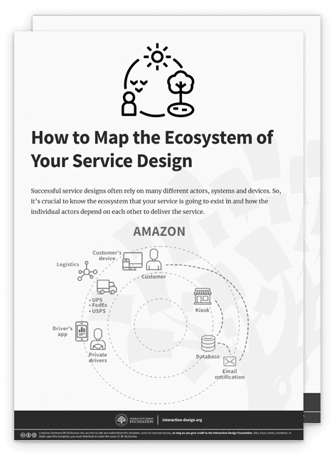
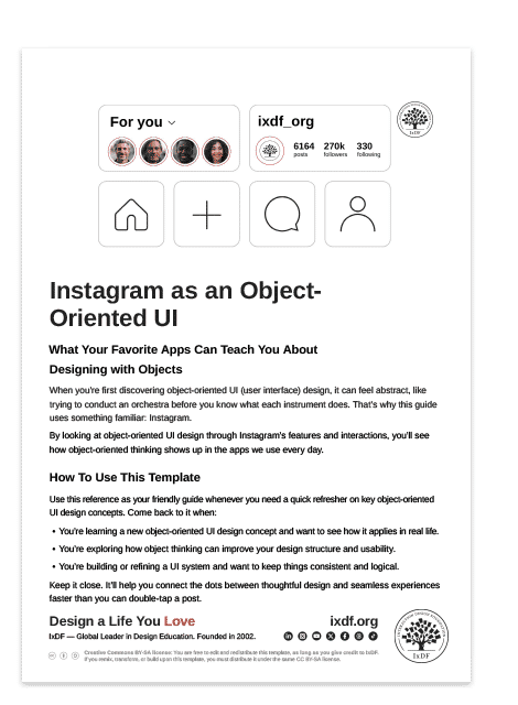
To make object-oriented user interfaces less abstract, we've created a case study of Instagram as an object-oriented interface. Download this free template to quickly see how those core concepts translate into a real-life interface.
How Object-Oriented User Interfaces Improve User Experience and Satisfaction
Object-oriented user interfaces create experiences that feel effortless from the first click. Here's why they work:
Users Learn Instantly and Make Fewer Mistakes
Object-oriented user interfaces feel instantly familiar because they show users things they already recognize: Messages, tasks, files, and products. They select one and discover what they can do with it. No training is needed because the interface mirrors concepts they already know from the real world.
Gmail works this way. Users see messages with senders, subjects, and previews. They click one and find they can reply, forward, or archive. The message makes sense and the operations make sense. This immediate recognition reduces learning time from hours to minutes, or even seconds.
Users can't accidentally delete something when nothing is selected. They can't perform operations that don't apply to what they're working with. The interface only shows them valid choices based on their selection. Better yet, objects behave consistently everywhere. Messages work the same way in inbox, sent mail, and drafts. Users learn it once and apply it everywhere.
Users Feel in Control
Every action gives users immediate, visible feedback. They drag a file and watch it move. They swipe a message and watch it disappear. They resize a window and see it respond instantly. They're manipulating objects directly, not issuing commands and hoping something happens. This builds confidence and creates a sense of mastery.
Products Grow Without Overwhelming Users
When you want to add new features or capabilities to your product, you attach or relate them to the objects users already understand. Adding scheduling to email? "Send later" appears as an option on messages. Adding collaboration to tasks? "Assign to" appears on tasks.
Users don't face entirely new interface patterns when the product grows. Someone who learned the interface with 10 features can still navigate it comfortably when it has 10 more because the organizing principle remains consistent.
Complex Systems Feel Simple
Object-oriented user interfaces make complex products with many features easy to navigate by organizing everything around familiar objects. Products that offer dozens or even hundreds of capabilities remain straightforward when you structure them around what users want to work with.
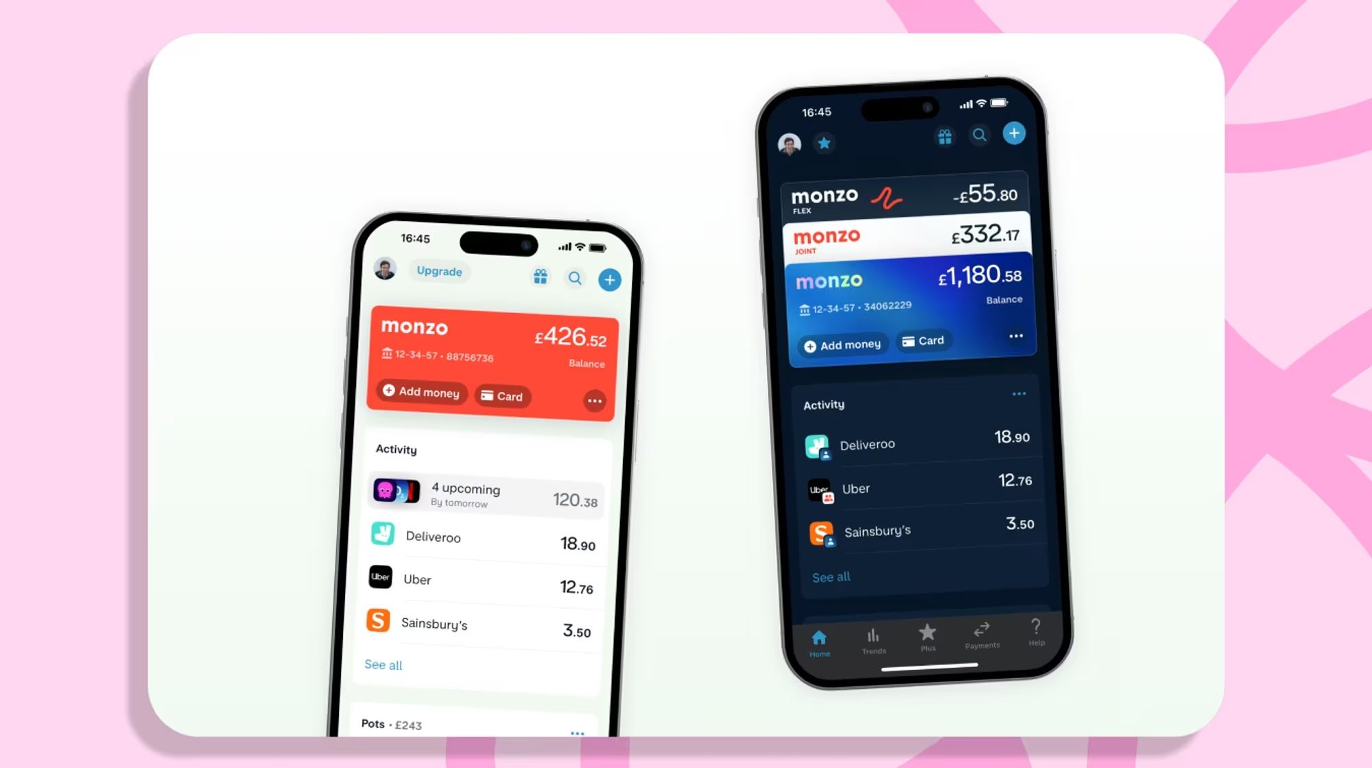
Monzo organizes banking complexity around familiar objects like accounts, transactions, and cards.
© Monzo, Fair use. Modified by Interaction Design Foundation.
Consider banking apps like Monzo. Banking involves countless features: transfers, payments, budgets, savings, cards, statements, direct debits, standing orders, and more. An object-oriented approach organizes this complexity around core objects users understand: accounts, transactions, and cards.
Users select an account object and see relevant operations: transfer money, view transactions, set budgets.
Users select a transaction and see contextual actions: split with friends, add notes, request receipt.
Each object groups related features, so users never face an overwhelming menu of every possible banking operation.
This approach hides the underlying technical complexity. Behind each transaction object are database queries, security protocols, and payment networks, but users simply see a transaction they can split or categorize. The object-oriented interface encapsulates complexity, so users focus on their goals rather than system mechanics.
What Makes Object-Oriented User Interfaces Work?
Object-oriented user interfaces are effective because of these core principles.
Before exploring these principles in detail, William Hudson explains how conceptual models form the foundation of object-oriented design. Using Amazon's website evolution from 2002 to present, he demonstrates how core objects remain consistent even as visual design changes.
Show Objects, Not Actions
When you open an object-oriented user interface, you immediately see the things you want to work with, not menus of actions you can perform. In a file manager, you see files and folders. In a task app, you see tasks. In a shopping app, you see products. These objects occupy the primary visual space using clear representations like cards, list items, or thumbnails.
The interface makes objects discoverable through visual design. Cards show photos with captions and like counts. List items show tasks with due dates and assignees. Product tiles show images with prices and ratings. You scan objects and identify what matters without opening menus or settings.
Objects display their essential properties directly on screen. A reservation shows flight number, departure time, and passenger names. A message shows sender, subject, and date. A product shows image, price, and availability. You see what defines each object without additional interaction, which enables quick decision-making.
Show Actions Only When Users Need Them
Instead of presenting menus full of commands, object-oriented user interfaces show you what you can do based on what you've selected. When you select a photo, editing and sharing options appear. When you select an email, reply and forward options become available. When you select a file, open, rename, move, and delete options appear.
This approach is called progressive disclosure, and object-oriented user interfaces make excellent use of it. The two approaches work hand in hand: objects provide the structure, and progressive disclosure reveals relevant operations at the right moment.
Contextual actions keep interfaces clean and focused. Instead of showing every possible operation at once, the interface reveals operations relevant to your current selection. This reduces visual clutter and cognitive load significantly. You see only what matters for your current task.
The pattern works consistently: select an object, see relevant operations. This predictable interaction model means you quickly learn to select first, then choose an action.
Make Objects Behave Consistently
All objects of the same type work the same way throughout the interface. Every email message responds to the same operations: reply, forward, archive, delete. Every task offers the same core actions: mark complete, change priority, reassign. Every file supports the same contextual menu: Open, rename, move, and delete.
You see a message in your inbox and learn you can reply to it. That knowledge applies to messages in sent mail, drafts, spam, and all other folders. The message object works consistently regardless of location or context. You don't need to learn different operations for the same object type in different places.
This behavioral consistency extends to how objects display their attributes. All messages show sender, subject, and date in the same visual pattern. All tasks show title, due date, and assignee in the same layout. Visual consistency reinforces behavioral consistency.
Let Users Touch and Move Objects
Object-oriented user interfaces let users interact directly with meaningful objects, often in ways that resemble how they handle real-world items. You can drag files between folders, swipe messages to delete them, or reorder tasks by priority. These interactions feel natural because these actions are tied to visible objects, not abstract commands.
Direct manipulation requires objects to be first-class interface elements, not hidden data. When files appear as visual objects on screen, you can grab and drag them. When messages appear as swipeable cards, you can swipe them away.
When you drag a file, it moves visually as you drag. When you delete a message by swiping, it slides off screen. When you resize a window, it changes in real time under your pointer. This immediate response builds confidence and helps you understand what actions do through direct visual feedback.
Connect Objects the Way Users Think About Them
Objects connect to other objects in ways that reflect real-world relationships. An email message belongs to a conversation thread. A task belongs to a project. A photo belongs to an album. A reservation has flights and passengers.
The interface shows these relationships visually through grouping, hierarchy, and containment. Conversation threads group related messages together. Project views display all related tasks grouped by project. Albums contain related photos shown as a collection.
You navigate by following object relationships rather than searching through flat lists. You open a conversation to see its messages. You open a project to see its tasks. You open an album to see its photos. This navigation pattern matches how you think about finding related items.
Create Your Own Object-Oriented Interface in 5 Steps
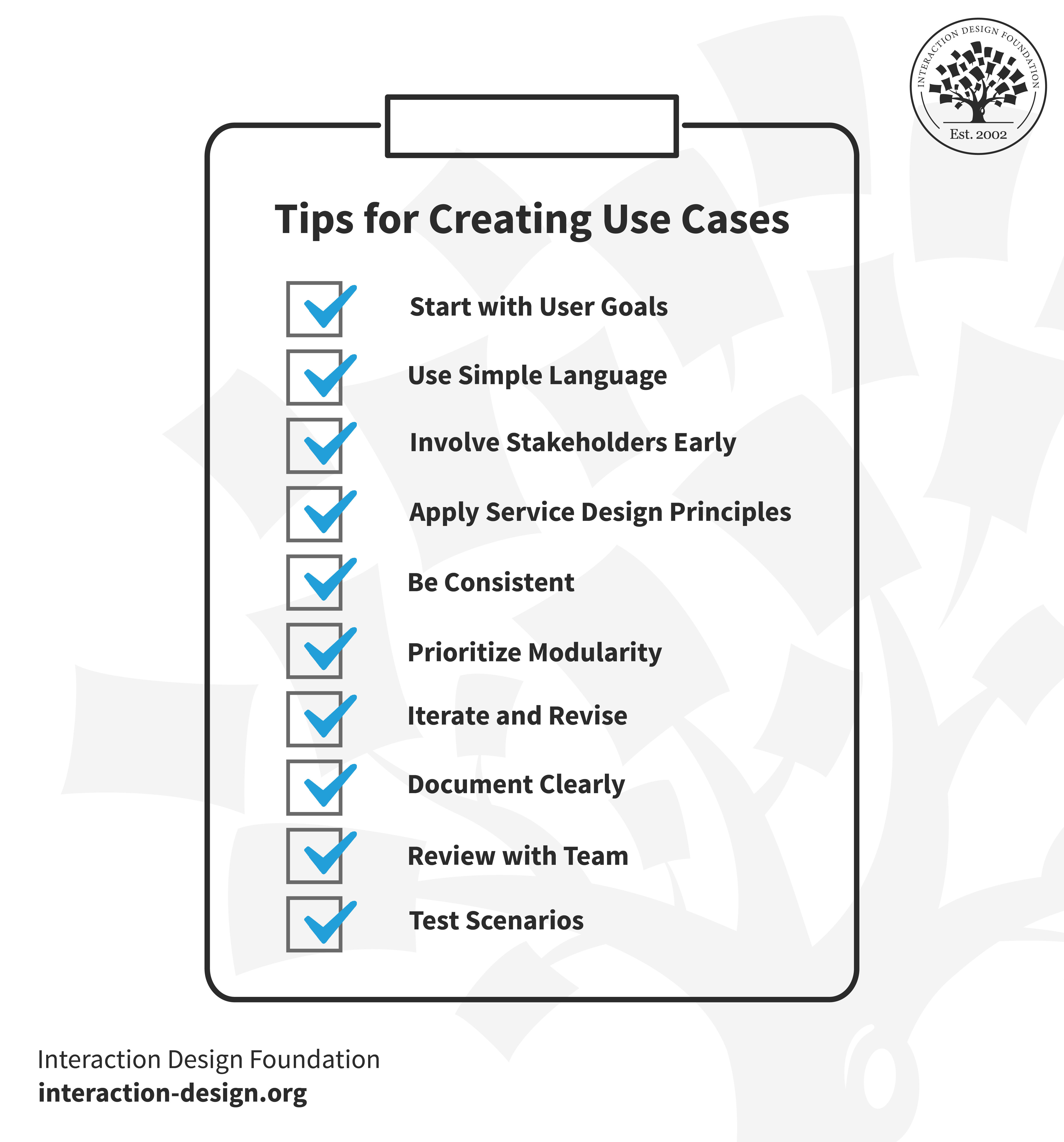
Building an object-oriented user interface requires careful attention to user needs and systematic application of core principles.
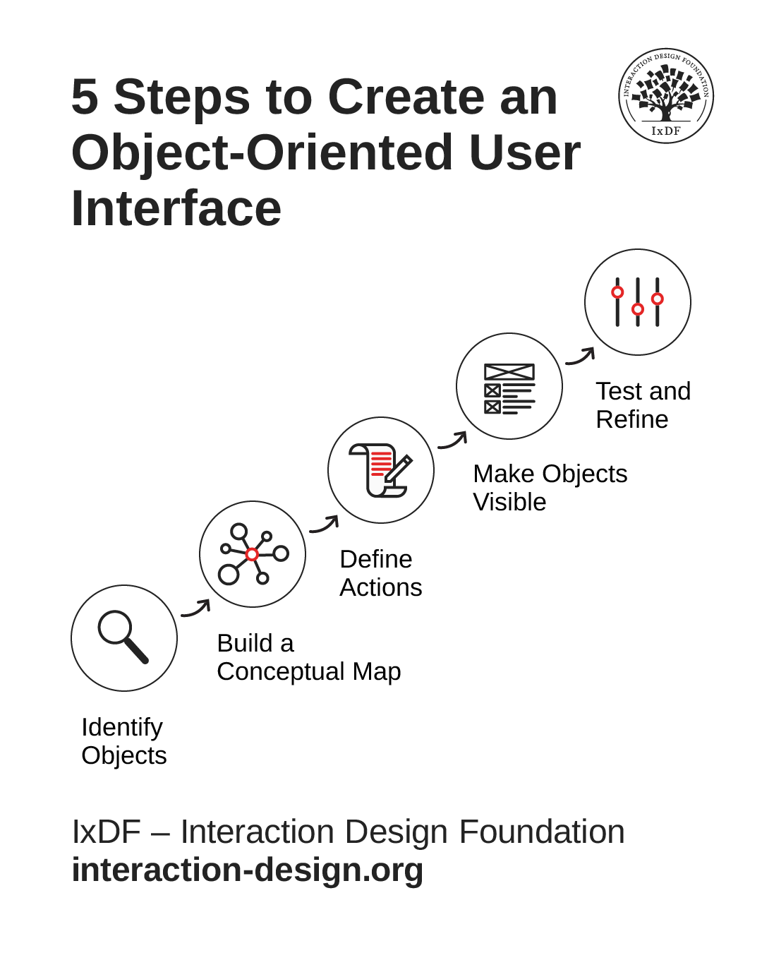
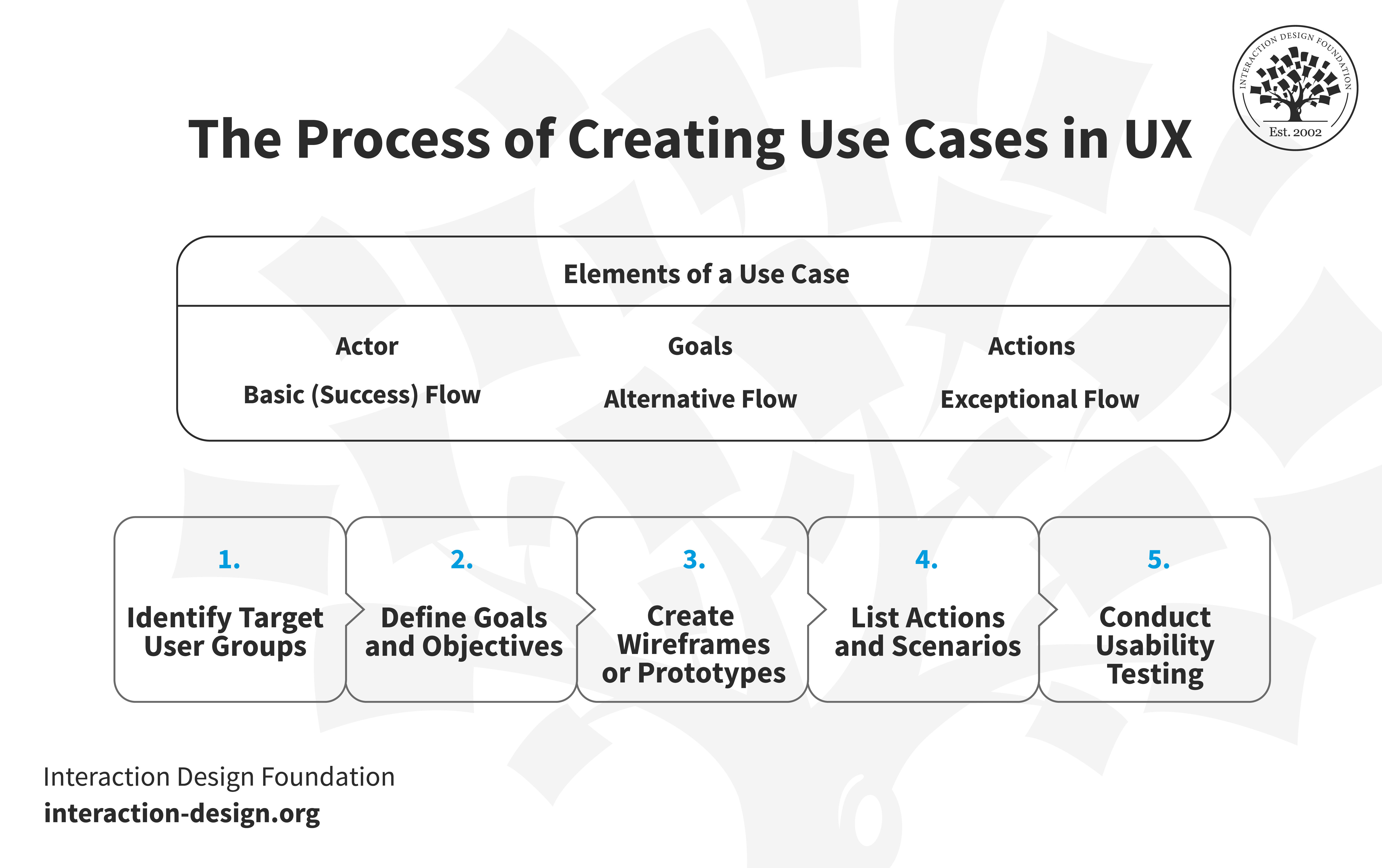
This five-step process provides a systematic method for creating object-oriented user interfaces that match user mental models and scale gracefully as your product grows.
© Interaction Design Foundation, CC BY-SA 4.0
1. Identify Your Primary Objects

Start by understanding what users want to work with. What nouns do they use when describing their work? In a project management tool, primary objects might be projects, tasks, and team members. In a healthcare app, they might be patients, appointments, and medical records.
In this video, William Hudson explains how use cases from object-oriented software design help identify the objects users interact with, bridging the gap between requirements and implementation.
Conduct user research through interviews and observation. Listen for the nouns users mention most frequently. Watch which items they interact with repeatedly.
2. Build a Conceptual Map
Design your interface to display these objects prominently. Use clear visual representations: cards, list items, thumbnails, or icons. Add meaningful labels and show essential properties for each object.
Map these relationships to create the underlying structure of your interface. A project might contain multiple tasks, and each task might be assigned to one team member. An appointment connects to a patient and generates medical records. These relationships determine how users navigate between objects and how information flows through your system.
This conceptual map becomes the foundation for your entire interface. It shows which objects contain other objects, which objects link to each other, and how users move between related items.
3. Define Contextual Actions
Determine what actions make sense for each object type. What can users do with a project? View details, edit, share, archive, delete. What can they do with a task? Mark complete, change priority, reassign, ad add comments.
Map these actions to specific object types. Not all actions apply to all objects, so create action menus specific to each object type.
4. Make These Objects Visible
Design your interface to display these objects prominently using clear visual representations: Cards, list items, thumbnails, or icons. Add meaningful labels and show essential properties for each object.
Decide which UI elements and screens you’ll use to communicate your objects:
A dashboard might show all projects as cards, each displaying project name, progress, and team members.
A detail view might show a single project with all its tasks listed below.
Choose visual patterns that make objects immediately recognizable and their relationships clear.
5. Test and Refine
Watch real users interact with your object-focused interface. Do they immediately understand what they can work with? Can they discover actions easily? Do similar objects behave consistently?
Measure the impact on user behavior. Track time to first successful action, error rates on common tasks, and support tickets related to navigation confusion. Object-oriented user interfaces should show measurable improvements: faster task completion, fewer errors, reduced support volume. If metrics don't improve, revisit your object definitions. You might have chosen objects that don't match user mental models.
Why Object-Oriented User Interfaces Matters More Than Ever
Most designers don't know object-oriented user interface design exists, which means you can apply principles that directly address common design challenges while many of your peers work without this framework. When you design with objects, users get intuitive experiences from the start. They see objects they recognize, select them, and discover what's possible, with no training manuals or lengthy onboarding required. This reduces frustration, support tickets, and abandonment.
This approach positions you as the bridge between user needs and technical implementation. While other designers focus only on visual design and user flows, you bring systematic thought that helps teams build confidently and users learn intuitively.
When you apply object-oriented principles, you can build a coherent product rather than a collection of features. Master this approach, and you create interfaces that users love and developers appreciate.
References
Want to design interfaces that feel intuitive from the first click? Take our course, Object-Oriented UI Design: Build Interfaces Users Love. You'll master how to turn complex requirements into coherent interfaces, create systems that scale effortlessly as your product grows, and become the designer who delivers clarity and consistency on every project.
Struggling to identify which objects belong in your interface? Use Cases: The Ideal Bridge Between Requirements and Design? shows you how to extract primary objects from user requirements, ensuring your interface matches how people think about their work.
Our article, Conceptual Models: The Hidden Structure Behind Your Next Great Interface reveals the invisible framework that makes complex products feel simple. You'll discover why consistent conceptual models let users navigate sophisticated features without confusion.