Visual hierarchy is the principle of arranging elements so that people instantly recognize their order of importance on a screen or page. When you use visual hierarchy well, you guide attention, reduce confusion, and make your message easy to follow, and build trust.
Explore the power you can wield on the screen and page when you use effective visual hierarchy, in this video.
How Visual Hierarchy Makes People Listen to You
In UX (user experience) design and UI (user interface) design, the principle of good visual hierarchy determines whether users can scan a page, find what they need, and take action without friction. On a web page, for example, a bold headline will almost certainly capture attention first, a contrasting button may signal the next step, and clean spacing helps users understand how information is grouped.
The same applies to presentations. If your slides look cluttered, or if every element shouts for attention, your audience won’t know where to look. However, if you structure your visuals carefully, you’ll control the flow of attention and keep people engaged from beginning to end.
“Visual hierarchy controls the delivery of the experience. If you have a hard time figuring out where to look on a page, it’s more than likely that its layout is missing a clear visual hierarchy.”
—Kelley Gordon, writing for The Nielsen Norman Group
Beyond design work, this is about leadership. When you guide people’s attention clearly, they listen, trust you, and remember your ideas. That’s how you succeed in meetings, pitches, or interviews.
How to Guide Attention with Visual Hierarchy
On a web page, app screen, presentation slide, or other design you show to an audience, you can shape an effective hierarchy with several visual cues. Here are the most important ones:
Size
Larger elements command more attention than smaller ones can. For example, viewers will notice a headline in 44-point text pretty much right away, and before they find a footnote in 12-point. Use size to highlight your key points so nobody misses them.
Color
Bright or saturated colors draw the eye more than muted ones will, which is why they can help users and viewers notice outstanding elements that are that way for a strategic reason (such as a call-to-action button). Use color carefully to help users notice important elements and such.
Contrast
Strong light–dark differences or bold versus thin weights make elements stand out. This is why contrast is particularly important for viewers with vision disabilities and so forms a part of accessible design. Use contrast mindfully to help users be able to more easily notice important elements and enjoy an accessible design.
Discover why accessibility helps all users, in this video.
Alignment
When you align elements and layout well, you shape the flow and help users and viewers to enjoy seamless experiences in digital products and presentations. When you make most items neatly aligned, a single off-axis element stands out.
Explore how to empower screens and pages of all types with effective visual alignment that users and viewers notice, in this video with Alan Dix: Author of the bestselling book “Human-Computer Interaction” and Director of the Computational Foundry at Swansea University.
Repetition
Repeated shapes, colors, or styles suggest that content is related. Viewers make these associations quickly, too, which is why it’s important to use repetition purposefully.
Proximity
Items that are close together appear grouped, and it’s a major reason the law of proximity works as one of the principles rooted in Gestalt psychology, which explains how humans perceive patterns and groupings. Use it to group similar items strategically to help users.
Get a greater grasp of how to use Gestalt principles to get noticed with your content, in this video with Mia Cinelli, Associate Professor of Art Studio and Digital Design, University of Kentucky.
White Space
Empty space is powerful; the right amount of “nothing” can frame and emphasize what matters on clean screens, and so works better than “something” such as more elements that might make a screen cluttered. Use it to calm the screen as well as draw attention to the elements that are on there.
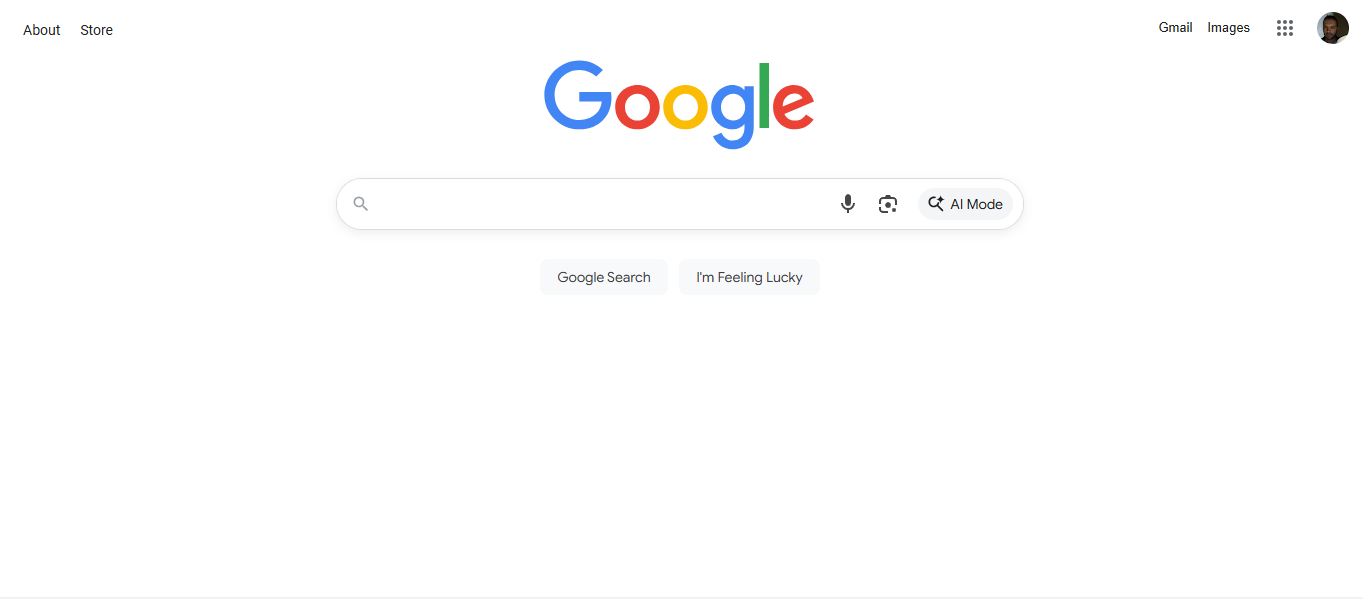
Google’s generous use of white space is a signature of their iconic and easy-to-use interface. White space (sometimes called “whitespace” or “negative space”) also helps other sites and applications set a strong visual hierarchy, and it needn’t always be white.
© Google, Fair use
Texture and Style
A rich illustration may draw more attention than a flat icon might do, lifting it and other styled elements off the screen and more “alive” to the eye. Use texture and style carefully to draw users’ eyes and help them enjoy a better experience for it.
How to Create a Strong Visual Hierarchy: Step-by-Step
A strong hierarchy leads your audience’s eyes to look exactly where you want them. Whether they’re navigating a product interface or looking at your slides, the same rules apply:
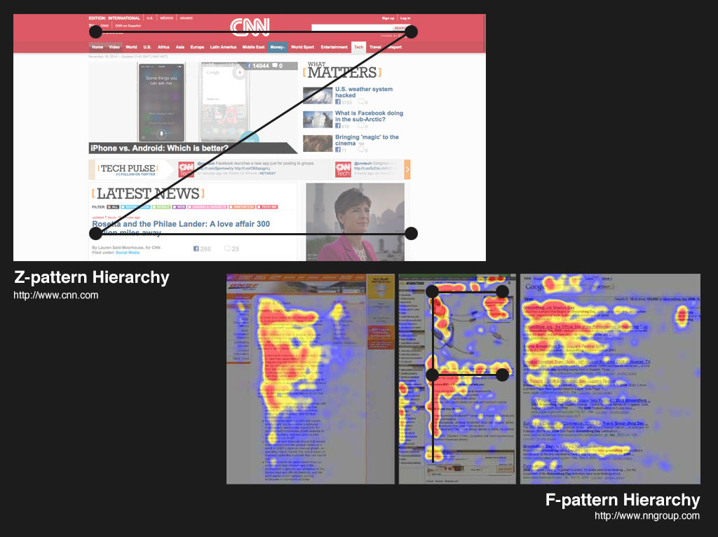
1. Respect Natural Scanning Patterns
People in Western cultures tend to scan in an F-pattern (top to bottom, left to right) or a Z-pattern (top left → top right → bottom left → bottom right). Use these patterns to place key information where viewers and users will most likely see it.
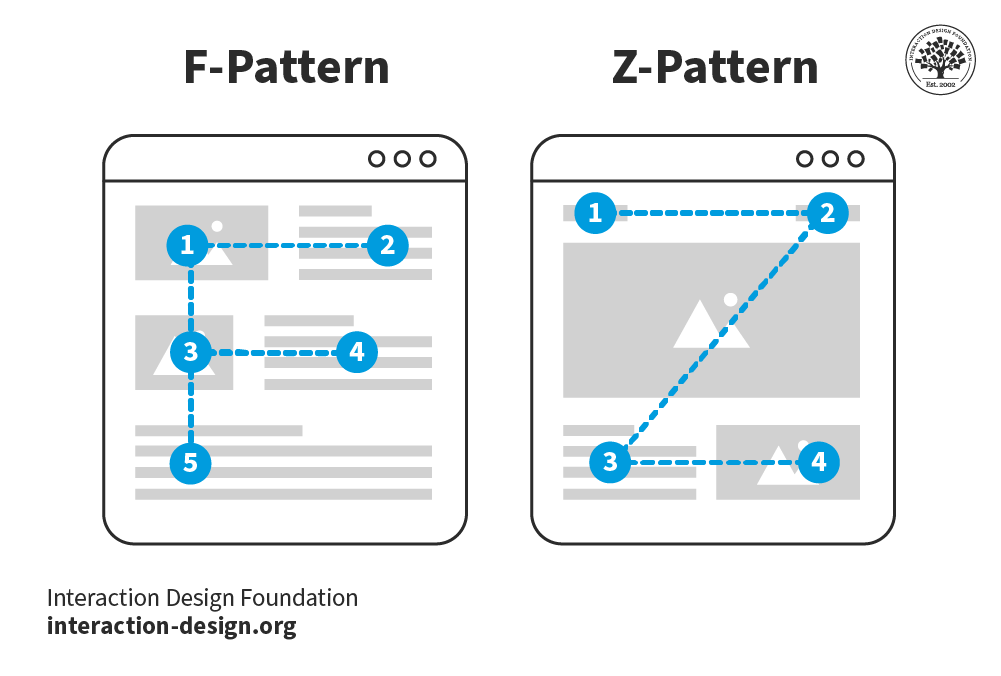
© Interaction Design Foundation, CC BY-SA 4.0
2. Guide Attention with Deliberate Focal Points
Want to highlight one critical data point? Then break the pattern. For example, a centered statistic in bold text with generous white space can redirect attention right away.
3. Use Recognition over Recall
Make your content scannable. Well-made headers, bullets, and bold highlights let your audience recognize information quickly instead of struggling to remember it later.
4. Create a Sense of Ranked Importance
Not everything deserves the same emphasis, so decide what’s most important and then scale down the rest. You want users and viewers to find signals fast, but equal weight across all elements equals visual noise that tidal-waves senselessly into people’s eyeballs.
5. Leverage Typography
Present content in levels: use a large header for the core idea, a medium sub-header for context, and body text for details. Design guidelines often suggest, for example, a 3:1 ratio between headers and body text for clarity.
6. Be Consistent
Consistent icons, colors, and heading styles make your slides or products easier to follow. Inconsistency creates friction (questions like “Where has it gone?” and “Why is it over there?” arise in audience members’ minds) and breaks trust.
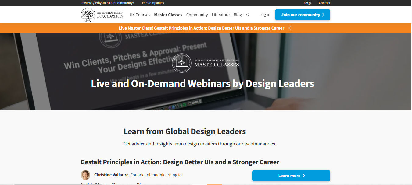
Color, contrast, typography; the list goes on to help users of all types find what they need fast on the Master Classes page.
© Interaction Design Foundation, CC BY-SA 4.0
Why Clear Slides Can Make You a Successful Presenter
In a similar way to how users who land on websites and applications want to find things quickly, in presentations, your audience has limited time and attention. A cluttered or chaotic slide forces them to read, interpret, and decide all at once, which means they’ll quickly disengage. Unlike what they can do, for example, on a website they don’t like (i.e., leave), they’ll feel “trapped” in a presentation and might not even let you know things are wrong.
Good visual hierarchy helps you engage your target audience in how it helps:
Keep attention on you. If your slides support instead of overwhelm or take over from your speech, your audience will be able to listen to your words and flow with them.
Highlight your key points. You decide what people remember by making those points visually dominant and supporting them in how you announce them, such as varying your tone or using silence around them to build emphasis or let key points sink in.
Signal professionalism. Clean, consistent visuals make you look credible and prepared, and that you haven’t cobbled together a quick and haphazard presentation just to “pass” yourself and get it out of the way.
Your slides are like your partner in a winning presentation, not your competitor that steals the show; so, use them to complement and amplify your voice.
How to Design Slides That Make People Trust You Instantly
Try some practical guidelines you can apply right away:
1. Keep Slides Simple
Simple can be so elegant and powerful, so limit each slide to one core idea. You can speak the supporting details and pace your presentation in a way that flows naturally.
2. Use Progressive Disclosure
If appropriate, reveal content step by step with animations, so your audience doesn’t feel overwhelmed with everything at once.
Explore how to keep audiences on board with progressive disclosure so they can take in everything you have to show them more successfully, in our video.
3. Make the Headline Count
Think of the power of transmitting insights. For example, if you write “Key Findings,” that’s nowhere near as “newsworthy” as if you write: “58% of users drop out during checkout.” Headlines that state the insight directly help people remember it.
4. Prioritize White Space
Avoid the temptation to fill every corner; cramming doesn’t work and, aside from confusing people with cognitive overload, a busy slide can sometimes look amateurish. White space calms the eye and sets off what matters most with beautifully simple emphasis.
5. Use Visuals, Not Paragraphs
Replace text walls with icons, charts, or photos that reinforce your point. If you need to go into detail, keep it in your speaker notes or a written version of your slide deck you can refer to. Viewers can read ahead of your speaking, anyway, so keep things interesting and in sync for them.
6. Apply Consistent Styles
Choose two fonts (one for headings, one for body text) and stick to them. Because consistency doesn’t just help on the surface but also boosts trust, keep to an effective style and, if applicable, use your brand colors consistently to signal organization and credibility.
7. Think Accessibility
Check your contrast ratios so text is legible on screen. Avoid color combinations that exclude people with color vision disabilities.
Find a firmer foundation to build more accessible designs upon with a better understanding of color blindness, in this video.
Examples of Visual Hierarchy in Slides
Example 1: A Slide to Present Research Findings
Not-so-good slide:
Title: “Usability Testing Results”
A dense paragraph describing all the findings.
Ten bullet points, all the same size, all clamoring for attention.
Better slide with good hierarchy:
Title: “3 Key Insights from Feedback Sessions”
Large, bold numbers (1, 2, 3) with short headlines:
“58% drop at checkout”
“Users skip product filters”
“Confusion around shipping costs”
Small supporting notes under each.
The improved slide tells your audience instantly what matters most.
Example 2: A Slide to Pitch a New Feature
Not-so-good slide:
Feature name in small font.
Screenshot of the whole interface.
Multiple paragraphs describing the functionality of it.
Better slide with good hierarchy:
Title: “New Onboarding Flow = 40% Faster Sign-Up”
One large annotated screenshot with highlighted area.
Three short callouts explaining the benefits.
You lead with the outcome, then support it visually.
Example 3: A Slide to Share Data
Not-so-good slide:
Title: “Survey Results”
A table of raw numbers.
Better slide with good hierarchy:
Title: “82% Want Mobile Alerts”
One large, bold percentage in the center.
A simple bar chart comparing responses.
The number jumps out first, and then the chart gives context.
How to Win Attention in Any Room
Presentations come in many forms: one-way, two-way, online, in-person, and even email updates. Make the best use of visual hierarchy for each context:
One-way updates: Keep slides simple. Your hierarchy should spotlight the most critical take-away since you won’t have much interaction.
Two-way workshops: Use visuals that encourage participation, such as sticky note layouts, numbered steps, or frameworks where you’ve clearly grouped input.
Online presentations: Use progressive disclosure and limit distractions on your screen. Hierarchy here isn’t only on slides; it’s also about your digital environment.
In-person talks: Emphasize big, bold visuals people can read from the back of the room. Your physical presence adds another layer of hierarchy: where you stand, where you point, and how you direct attention.
Explore how to cast your presence in presentations, in this video with Morgane Peng, Managing Director, Global Head of Product Design and AI Transformation.
Email presentations: Since people read at their own pace, create strong written hierarchy with bold headlines, sub-headers, and scannable formatting.
© Interaction Design Foundation, CC BY-SA 4.0
Tap a Bonus Benefit: Bring Emotional Intelligence into Visual Hierarchy
Hierarchy isn’t just about visuals; it’s also about connection. In live presentations, your body language and tone become part of the visual experience, and you can mirror the visual hierarchy of your content by punctuating it with your delivery. One of the bonuses of having well-made slides is, as you rehearse your presentation, a good visual hierarchy can help you notice points easily and use them as naturally flowing “triggers” to expand on in your public speaking. As you become more confident with your material and delivery of it, you’ll have more bandwidth to be able to read the room and adapt strategically.
Explore how to read the room and shine with delivery approaches like the SOLER framework (Sit squarely, Open posture, Lean forward, Eye contact, and Relax), in this video with Morgane Peng.
Overall, you can consider visual hierarchy a presentation partner, coaching a more confident delivery from you as it helps you pace your speech delivery and pace your audience’s attention so they can consume eagerly. Your points and the silence you place around them can land with more impact when you’re on point with how to show your material best.
In UX design, visual hierarchy ensures that users can find their way through a digital product. In presentations, it’s part of a reliable “formula” to help ensure your audience can follow your message, appreciate that you respect their time (especially important with business stakeholders), and remember your points. Visual hierarchy therefore plays an important role in how your viewers and users (of products and services who enjoy the experiences you provide them with) see you as a confident, credible professional they can agree with and support.


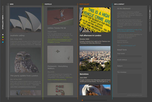
 Author/Copyright holder: Supermariolxpt. Copyright terms and licence: CC BY-NC-ND 2.0