Early-design testing is the practice where designers or researchers evaluate design concepts, prototypes, or user flows at the beginning of the UX (user experience) design process. UX designers use it to uncover usability issues, validate assumptions, and gather user feedback before committing to develop products more concretely.
Enter the zone of early-design testing and come away with insights that will put your product, service, or experience on the right track as soon as possible, in this video with William Hudson: User Experience Strategist and Founder of Syntagm Ltd.
Why Designers Start Testing Early
It might sound counterintuitive to test a proposed design so early in the UX design process—almost as if to suggest a design team hasn’t had time to build anything that’s truly testable—but it’s vital to do.
Designers typically test low-fidelity prototypes such as paper prototypes, wireframes, or clickable mockups with real users to determine how functional, clear, and usable the core parts and concepts of their design idea are. The goal is to gather actionable feedback before they plow significant time and resources into development.
Unlike later-stage usability testing, which often assesses polished interfaces or working software, this testing focuses on identifying potential friction points long before they can grow into true design faults. It helps answer key questions like:
Do users understand the layout?
Can they accomplish tasks intuitively?
Are design assumptions valid?
Since design teams can make—and quickly act on—assumptions from the moment they think about user behavior, user needs, and even a potential solution, they can run into the danger of getting carried away with unfounded ideas. They might assume users will see things their way and that the road ahead is all straight and smooth. If they proceed thinking that way, they can set themselves up for a shock later when usability tests expose a faulty high-fidelity prototype or even a flawed “finalized” solution.
The Benefits of Early-Design Testing
1. Catches Problems Early—When They’re Easier to Fix
One of the most compelling reasons to test early is cost. It costs far, far less to fix usability problems during the earlier stages of the design phase than to address such problems later, when teams have sunk time, effort, and money into higher-fidelity prototypes, or (worse) the product after launch, when users can rate—and berate—it.
The 1-10-100 rule mirrors this fact. A $1 problem that a team finds at the initial stage can cost $10 to fix if they don’t catch it until later, and it can skyrocket to cost $100 to address if they only discover the issue late in development or even post-release. This ratio set can scale painfully for brands that go too far with assumptions.
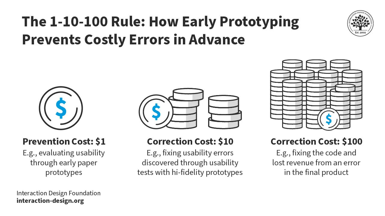
Early testing helps teams weed out such problems before they become cemented in code, and so they can remove them long before they can frustrate more users, hurt the product, and tarnish the brand’s reputation by “escaping” into the marketplace.
© Interaction Design Foundation, CC BY-SA 4.0
2. Validates Key Assumptions
As vital as user research is, designers often work from a set of assumptions—about what users need, how they behave, or which features will be most valuable. When they early-design test those assumptions in real-world conditions, they can challenge or confirm such notions about how users will respond to a design and its features. For instance, a team may assume users will recognize an icon’s meaning, but testing may show users find it confusing. If the team catches this early, they can easily course-correct.
Discover how user research helps lay the foundations on which to build successful design solutions, in this video with William Hudson.
3. Aligns Teams Around User Needs
Early testing builds a shared understanding of what users need and how they interact with a product. It grounds design conversations in hard evidence rather than fly them high into the cloudy realms of opinion. This is particularly valuable in cross-functional teams, where product managers, developers, and stakeholders may have differing views on what users need.
Discover how user needs fit into product design, in this video.
4. Improves Product-Market Fit
When teams validate design decisions early, they can slash the risk of launching a product that misses the mark. Early testing helps teams prioritize features users actually want. Teams can find out not only what doesn’t work but also insights about important features they had either not thought important or overlooked completely.
When designers and teams shift their focus to fixing faults and fine-tuning desired features, they can keep testing to work out the best way forward. This approach results in a final product that truly delights the target audience. From out of a scanty-looking wireframe can come insights from which designers can make essential adjustments to a proposed product before they set anything in “concrete” for users in the marketplace.
Get a clearer view of how wireframing helps set foundations on which to cement designs that can engage users in seamless experiences and deliver on what they want, and more, in this video.
How to Conduct Early-Design Testing: A Step-by-Step Guide
Step 1: Define Your Goals
Decide what you need to find out. Write clear, testable questions. For example:
Can users find the signup form from the homepage?
Do users understand the purpose of the dashboard?
Is the navigation intuitive for first-time users?
Step 2: Choose the Right Prototype
Match the fidelity of the prototype—and it should be a lower-fidelity one—to your goals. Use:
Paper sketches for basic flows or layout concepts.
Wireframes for navigation or content testing.
Clickable mockups for task-based scenarios.
Explore how to draw and cut your way to a paper prototype of a novel solution you can test early, in this video with William Hudson.
Step 3: Recruit Participants
Find participants who reflect your intended user base so you can get the best insights from your target audience. Use recruitment tools, social media, or your (intended) customer base. Offer individuals incentives, if necessary, to encourage participation.
Step 4: Prepare a Test Script
Outline tasks for users to perform during the test session. Keep instructions neutral and don’t use jargon or leading language. For example:
“Show me how you’d add a new contact.”
“Where would you click if you wanted to book a meeting?”
Step 5: Run the Test
Conduct tests one-on-one, either in person or via remote tools. Use the think-aloud method, and resist the urge to correct or guide users. Remember, it should be early enough in the design process for you to make corrections relatively easily; that’s why you’re doing a test at this stage.
Step 6: Capture and Analyze Results
Take notes, capture quotes, and identify usability issues. Particularly watch what users do and their body language; frowns can tell you more than words. Speaking of words, some users might downplay their frustration so that they don’t offend you. In any case, look for patterns across sessions—do multiple users struggle with the same element?
Prioritize problems by severity and frequency; when users uncover significant issues, especially ones that arise often, your test will save you a great deal of time, effort, and money.
Explore how to get data working well for you, in this video with helpful tips about collecting data, with Ann Blandford: Professor of Human-Computer Interaction at University College London.
Step 7: Iterate and Test Again
Now you’ve gathered some feedback, analyze it so you can make design changes based on feedback. If issues persist on the next test, consider alternative solutions. Continue testing until users can complete key tasks with ease and confidence—the hallmarks of an intuitive experience. Early-design testing helps pave the runway so a design solution can launch into clearer “skies.”
Reach into statistics, briefly, for a clear view of how to determine if the results of tests are significant, in this video with William Hudson.
Two Specialized Methods of Early-Design Testing
Designers and teams have two helpful “allies” they can rely on to test specific areas: first-click testing and tree testing.
First-Click Testing
First-click testing is a method that evaluates where users click first when trying to complete a specific task on a UI (user interface). This initial click is crucial; research indicates that users who click correctly on their first attempt are far more likely to complete the task successfully.
Find out how this form of testing can help you spot vital points about where your design stands, and where you can take it to enjoy more success, in this video with William Hudson.
To run a first-click test, you present users with a static image or prototype of a webpage or app and give them a task, such as “Find the contact information.” So, they click—hopefully correctly—and you record and analyze their first click to see if your design, like a prototype, guides users intuitively.
This method is particularly effective in early stages, as teams can conduct it with low-fidelity prototypes. It could be to test how to “book an appointment” or “add a product to the cart”—you want to see what users do first and if they can do it without hesitation.
How to Do First-Click Testing: Step by Step
Create a Prototype or Static Image
Use an interactive prototype, wireframe, mockup, or even a sketch that you’ve rendered into a digital format. It should show the interface users need to begin a specific task. Sketches help bring form to ideas, while wireframes work as blueprints for a digital solution’s structure. Mock-ups showcase the visual appearance—how things will look on the proposed solution—while prototypes offer simulations of interaction and functionality at the higher end.
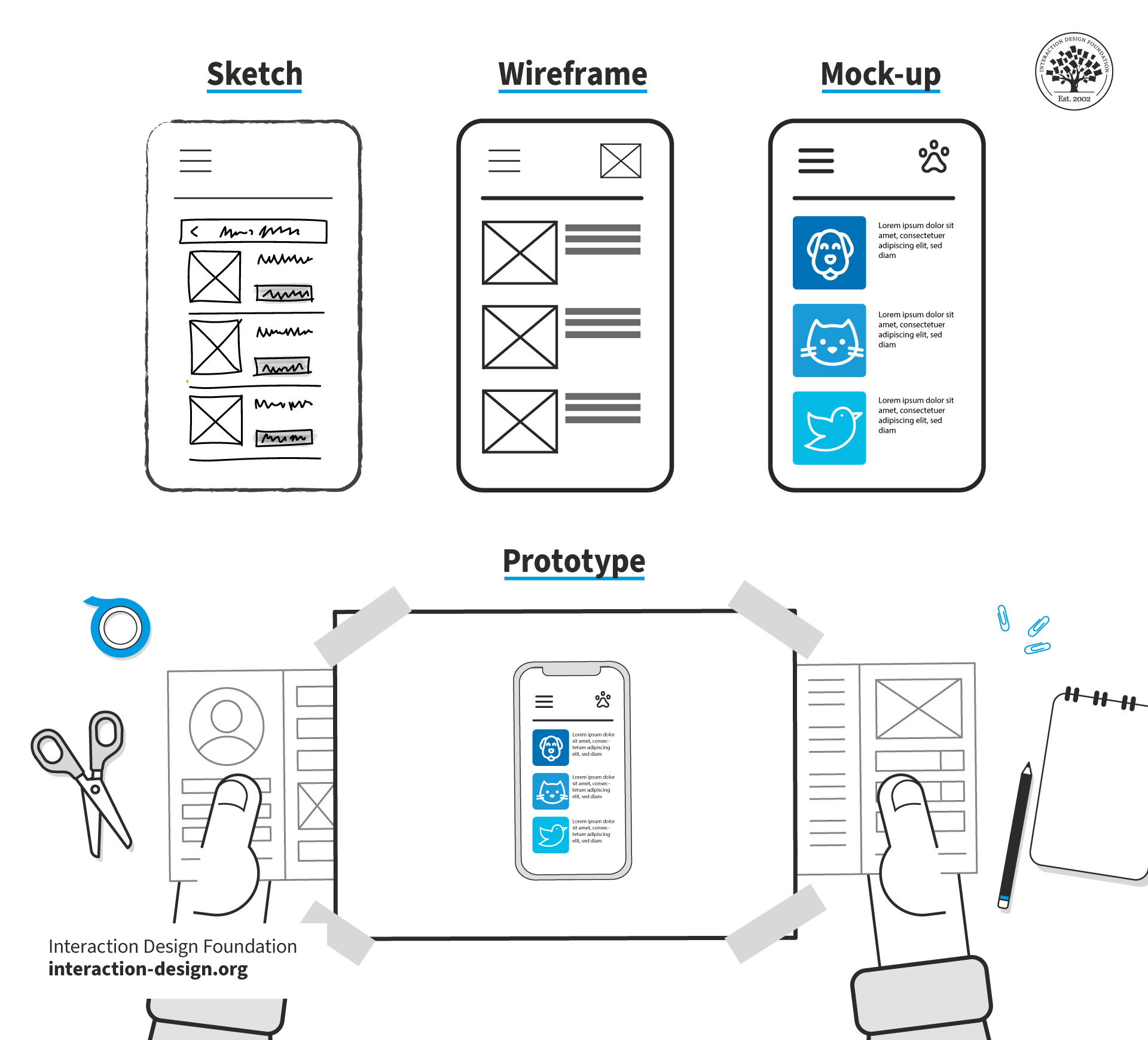
© Interaction Design Foundation, CC BY-SA 4.0
Write a Task Prompt
Clearly instruct the user on what they need to do—for example, “Where would you click to change your password?”
Ask for the First Click Only
Don’t let users complete the full flow. You want to see where they believe the task should begin.
Record and Analyze Results
Use heatmaps or click maps to visualize the click distribution and have the results for easy reference. Analyze how many users clicked the correct area and how far off incorrect clicks were.
Iterate and Re-test
If a significant number of users fail, it’s a sure sign you’ll need to adjust the layout or labels and test again to validate improvements.
Best Practices for First-Click Testing
Use neutral, task-focused prompts.
Test five to eight users per iteration.
Don’t give hints or feedback during the test (not even subtle sighs).
Visualize data using heatmaps to identify click patterns.
Prioritize revising elements that consistently mislead users.
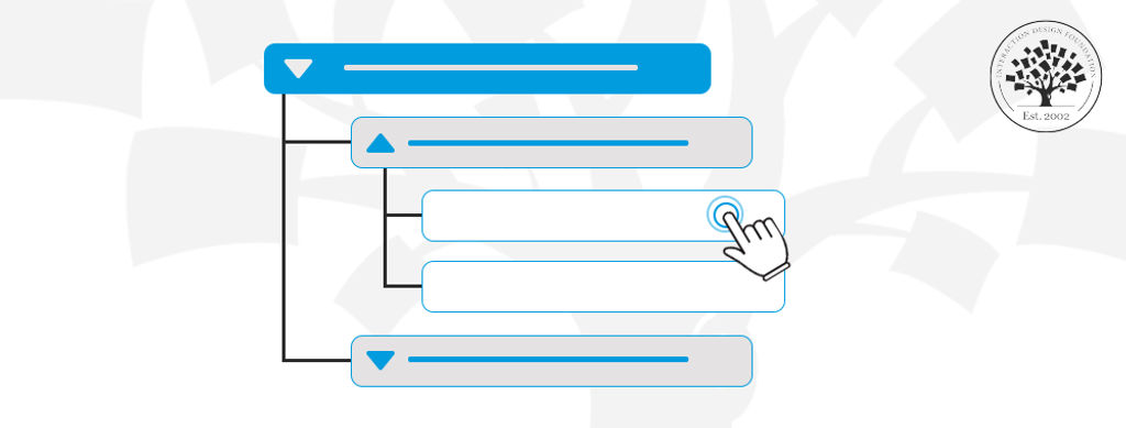
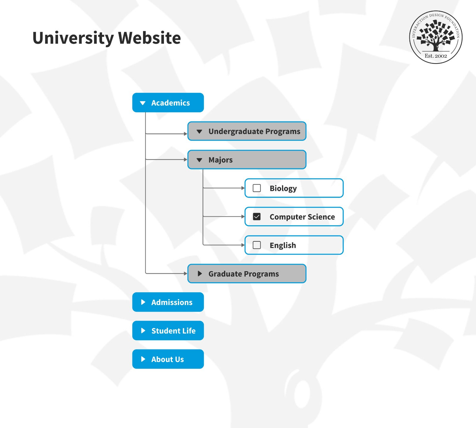
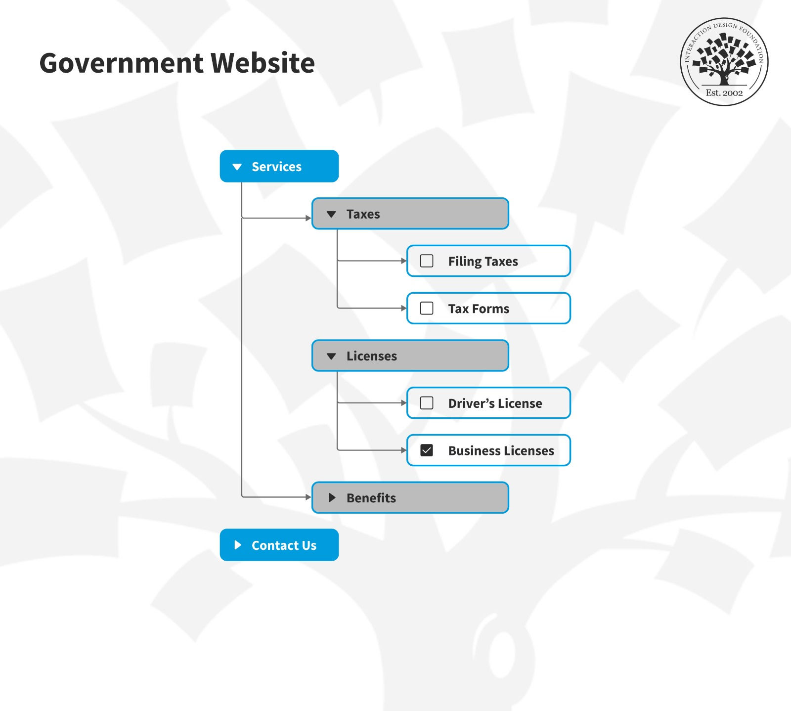
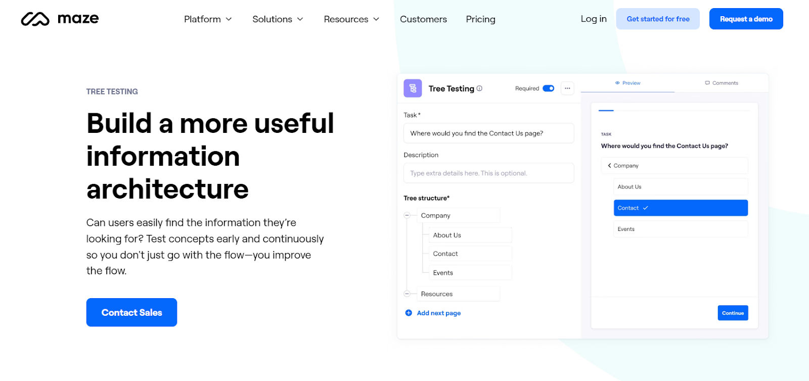
Tree Testing
Tree testing assesses how clear and effective a website or application’s information architecture is to your test users. Where first-click testing revolves around visual design, tree testing strips away visual design elements; designers focus just on the site’s structure here.
Grab a hold of this helpful branch of testing to get a better view of your digital product’s information architecture—and learn what to tweak so your design can reach more successful heights—in this video with William Hudson.
To run a tree test, you give users tasks that require them to navigate through a simplified text version of the site’s hierarchy so they can find specific information. For example, you might ask them, “Where would you find information about shipping policies?” and then they would navigate through the text-based menu to locate it. You want to discover whether users can find information easily and if the site’s organization aligns with their expectations.
How to Do Tree Testing: Step by Step
Build a Text-Only Site Structure
Use an online tool or sketch out your navigation paths; don’t include visual elements that might distract users from the structure.
Develop Realistic Tasks
Ask users to find content they would normally look for—for example, “Where would you look to track the delivery of your item?”
Run the Test Remotely or In-Person
Ask users to click through the hierarchy to find answers. Measure the success rate and time it takes them to do so.
Analyze Results
Look for patterns: Are users getting lost? Are they choosing incorrect categories? Use metrics like task success rate, directness, and time on task.
Refine and Re-test
Based on what you find out, restructure confusing categories, rename items, or reorganize paths. Then, re-test until you’re sure you’ve “hammered out” these kinks and have an information architecture (IA) that users understand well.
Investigate how a strong information architecture helps brands reach users better, in this video.
Best Practices for Tree Testing
Test at least 10 tasks with 5–15 users.
Use actual user terminology in your navigation.
Include distractor categories to mimic real-world complexity—for example, “Returns and Refunds” to distract from where to go for information about shipping policies.
Treat failed paths as learning opportunities—not user errors.
Combine findings with insights from open and closed card sorting if available.
Check out how card sorting can help get design ideas on track, in this video with Donna Spencer, Author, Speaker and Design Consultant.
Special Considerations for Effective Early-Design Testing
1. Set Clear Testing Objectives
Before you start, always decide what you want to learn. Your goal might be to validate a concept, test a navigation pattern, or explore user reactions to a new layout. When you have a clear objective, you can design the right test scenarios and analyze results more effectively.
2. Use Low-Fidelity Prototypes
Remember, “early” is in the name for a reason; don’t wait for polished visuals or complete flows. Early testing works best with rough concepts—paper sketches, wireframes, or clickable mockups. These lightweight prototypes are quick to create and easy to change based on user input.
3. Recruit Real Users (or as Close as You Can Get)
Ideally, test with people who closely resemble your target audience. For example, if your product is for new parents, don’t test with college students. In early stages, even a handful of users—usually five to eight—can uncover critical usability issues.
This is where your research will help point the way. Better still, if you pinpoint your users and distill them into user personas—fictitious representations of your real target users—you can gear your future design decisions around more substantial focal points.
Prioritize personas as a powerful aid to fine-tune design solutions that can match and exceed the real-world expectations and desires of target users, and learn why design without them falls short, in this video with William Hudson.
4. Use the “Think Aloud” Protocol
Encourage users to verbalize their thoughts while they’re interacting with the prototype. This reveals confusion, assumptions, and expectations in real time—and it means users typically won’t have time to be politely dishonest out of fear of offending you. For example, a user might say, “I’m not sure what this button does”—a clear signal that you’ll need to include clearer labels or buttons.
5. Watch, Don’t Lead
Resist the urge to explain or help during the test. As much as a user may seem to “agonize” about how to achieve a goal, don’t give the game away; your job is to observe how they naturally interact with the design. Take detailed notes and record sessions, if possible, but focus on what users do, not just what they say.
6. Iterate Quickly
Act on insights right away. Fix glaring issues, refine the prototype, and test again—still nice and early in the design process. Rapid iteration is the heart of early testing—it lets you improve designs before costly rework becomes necessary.
Overall, early-design testing empowers UX teams to create user-centered solutions from the very beginning. It’s like a safety-net that can save designers and teams from falling into an abyss from the earliest steps they take. “Abyss” is no exaggeration; a few steps in the wrong direction early on can lead to stumbling into massive problems if a team doesn’t course-correct before they release a flawed digital product.
Just a few precautions like early-design tests can prevent brands from losing out to competitors who did invest in early validation. It can also spare users from feeling overwhelmed by features they didn’t ask for or ignored by a design that fails to address their pain points. Indeed, also, it can save designers the pain of meeting with frustrated business stakeholders who might lose faith in UX design after their shiny new solution flops as a “dud” in the marketplace.
Whether you're launching a startup’s MVP (minimum viable product) or redesigning a legacy platform, early-design testing gives you the confidence to move forward with clarity. It helps you make sure you’re building the right product—before you get to building the product right.