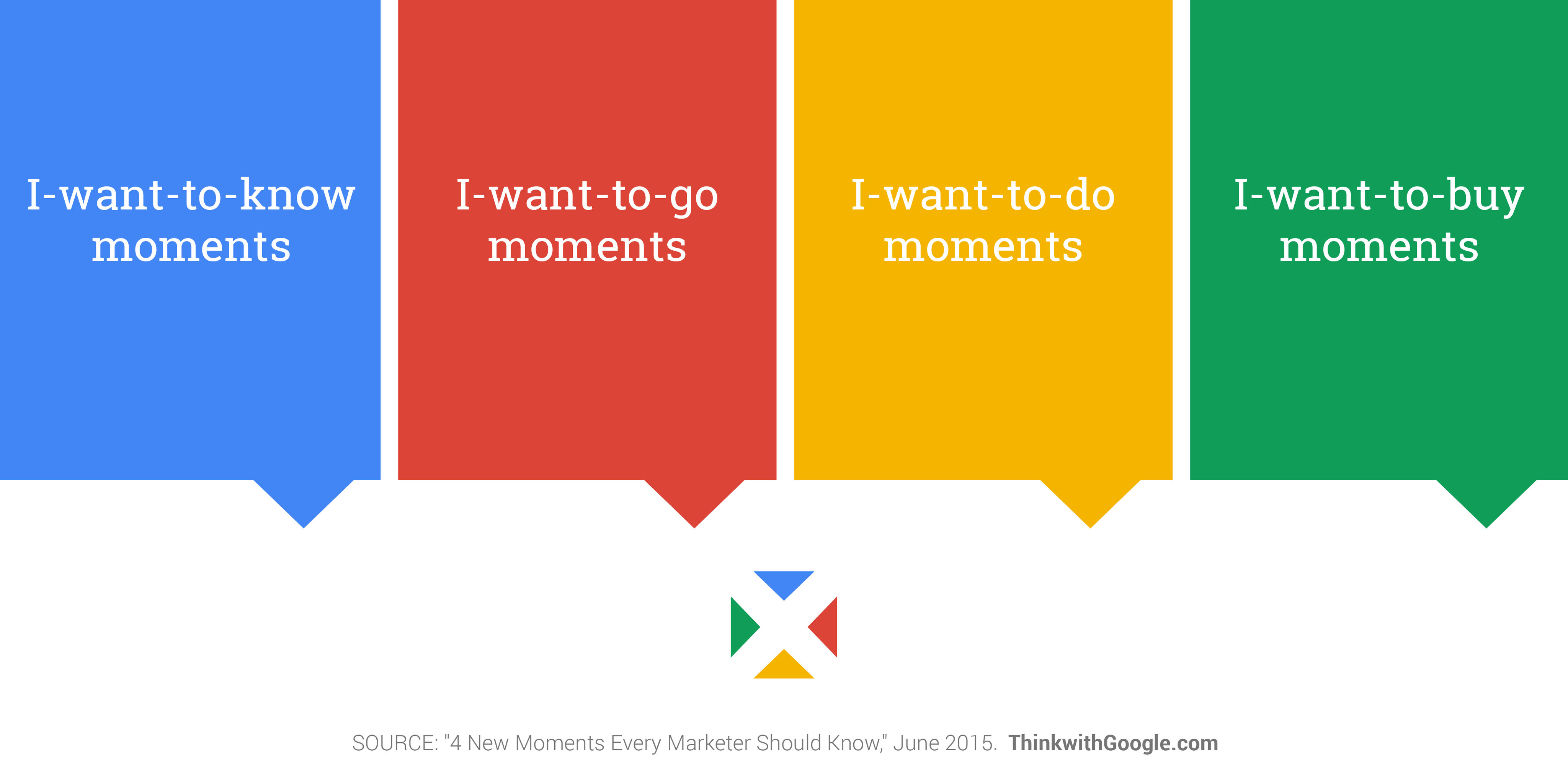
Micro-moments (also micro moments and micromoments) are short, intent-rich interactions when users instinctively consult devices for quick answers or actions relating to four principal desires: to know, to go, to do, and to buy. UX (user experience) designers shape these moments to be fast, seamless, and helpful, allowing users to get what they want without friction.
Discover how the contexts users are in, including micro-moments, significantly determine how designers need to cater to them in well-suited design solutions, in this video with Alan Dix: Author of the bestselling book “Human-Computer Interaction” and Director of the Computational Foundry at Swansea University.
Why Micro-Moments Matter to UX Designers
Successful designs reflect a deep understanding of time—users’ time in the many contexts they find themselves in. Google first defined micro-moments in 2015 as times when people reflexively reach for their smartphones (or other devices) with a purpose: to learn something, go somewhere, discover how to do something, or buy something—immediately. These moments occur quickly, happen for specific reasons, and deeply revolve around the user’s perception of what’s important at that moment.
The Four Core Types of Micro-Moments
Designers who understand the types of micro-moments find it easier to design experiences that meet users where they are, with exactly what these users need in the moment (or, more precisely, in the micro-moment). Here are the four micro-moments with examples:
I-want-to-know micro-moment: A user at a dinner party tries to explain a four-dimensional object they learned about in a science documentary but can’t remember the name of the exotic shape. So, out comes their smartphone and they ask, “Hey Google, what’s a four-dimensional object called?” They and everyone else close by suddenly learn it’s a tesseract or a hypercube (a three-dimensional representation of a four-dimensional cube).
I-want-to-go micro-moment: A user fancies having a caramel Frappuccino and opens the Starbucks app, which directs coffee-lovers with its location-based service to their nearest Starbucks store.
I-want-to-do micro-moment: A user wants some quick exercise and looks for a 10-minute workout or a specific exercise. The app provides a video demonstration and instructions in a concise format so the user can start right away.
I-want-to-buy micro-moment: A user who’s a cat-lover wants to buy a new phone case for an iPhone. They open Amazon, pick out the case they like best, and click Buy Now.
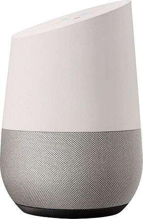
A Google Home Smart Speaker with Google Assistant – a key help for many a micro-moment around the home.
© Google, Fair use
Why Micro-Moments Exist
To look at the definition of “moment”—an extremely brief period—the first thing that might come to mind is: “Isn’t a moment short enough to design for?” However, the point of micro-moments is that they’re all about “now,” characterized by high user intent and a desire for immediate, relevant information or action. Designers must address this need for speed by staying two steps ahead of their users; the two “steps” are that they must know what these users want and why.
Haste, one “by-product” of 21st-century living, defines many user behaviors, but it’s not a degenerate choice. The phenomenon of smartphone adoption ushered in a new era of design; most users access digital products and services on mobile phones and tablets. User needs, expectations, and desires revolve around a speed of life which mobile phones facilitate. Unlike their “counterparts”—or, sometimes, younger selves—from the previous century, modern users expect accurate, relevant results delivered with minimal effort and zero delay. Their mental models of how to find information, for example, have moved on from the “old way” of using a physical telephone book or library. A user who wished to know about a four-dimensional object in 1980 would have had to go to a library if their home encyclopedia didn’t have an entry for “hypercube.” Patience, then, wasn’t just a virtue; it was a necessity, too.
As humans’ dependence on mobile devices grows, micro-moments increasingly define the digital user experience. Users are “keen for the screen” partly because the availability of handheld devices has reached a level where many people feel naked without a phone.
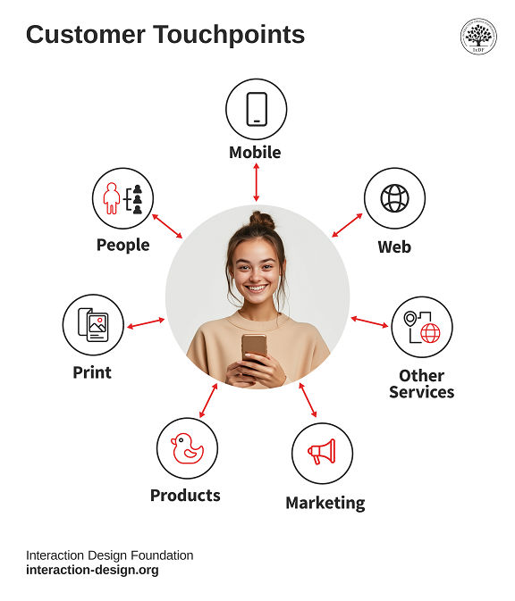
Mobile UX design serves millions of people who use products and services every day. People connect with these products and services at many different points—these are called touchpoints. Companies need designers who understand users deeply and know exactly what they need at each step of their journey.
© Interaction Design Foundation, CC BY-SA 4.0
What Role UX Designers Play in Micro-Moments
UX designers don’t control when micro-moments happen, but they can design how a product responds to them; so, they:
Research real behaviors: Designers use approaches such as analytics, surveys, and field studies to find out what users want in the moment.
Explore the fundamental area of user research in this video to learn how it provides the best foundations for any design:
Map intent to interface: From their research, designers find which actions users take during specific micro-moments, and match those to UI (user interface) elements like buttons and shopping-cart icons.
Design for speed and clarity: Designers reduce steps and distractions so users get what they need without pausing to think twice.
Ensure responsiveness and accessibility: Moments fail if they exclude users or lag in performance, so designers factor in vital considerations such as the needs of users with disabilities.
Discover why designers create accessible designs and how they can help users of all ability levels when they do so:
Micro-Moments vs. Microinteractions
Think of design for micro-moments as involving two sides of a UX “coin.” Designers who create truly frictionless micro-moment experiences must also understand how to design excellent microinteractions (or micro-interactions)—the tiny design details that provide feedback, control, and delight.
Users Initiate Micro-Moments
Micro-moments start with the user’s intent. They’re externally motivated and context-sensitive; whatever the user is doing or wants. A user grabs their phone to look something up, go somewhere, or make a decision.
User Interfaces Initiate Microinteractions
Microinteractions are the digital product’s response to user input—turning a switch, receiving a confirmation, reacting to hover states, for example. What the user gives as a request or command, the app must reply to. Microinteractons shape the feel of the interaction and make interfaces human.
Together, these two layers form a complete experience. Micro-moments define the “what”; microinteractions define the “how.” Designers who understand their users, including the relevant user behaviors and user needs, also prove they understand the “who,” “when,” and “why” in successful designs like applications with well-designed microinteractions that are ready for users’ in-the-moment desires.
For example, in an “I-want-to-buy” moment, a user taps “Add to Cart.” Instantly, the cart icon briefly pulses, and a number badge increments by one. This microinteraction provides feedback, confirms the action, and reassures the user. Another example could be a pizza delivery app. The user selects “pepperoni,” and red dots instantly appear on the pizza illustration. Then they tap barbeque sauce, and the background turns a smoky brown. Finally they choose thick crust which thickens the border around the pizza base. Each subtle animation or graphic change is a microinteraction that keeps users confident their selections are correctly registered.
What Designers Do for Each Micro-Moment and Micro-Interaction
Designers can create extremely successful digital apps and other products when they understand that micro-moments aren’t just fleeting interactions but high-stakes opportunities to meet user needs and shape perceptions of a brand or product within the user journey. For example:
1. “I Want to Know” Moments
They’re research-focused moments where the user isn’t necessarily ready to act; they want to understand, explore, or gather facts.
Example:
A user waiting in line at a café Googles, “Is dark chocolate healthier than milk chocolate?” They’re in learning mode, not buying mode yet.
UX Consideration:
Designers create content that answers questions quickly. They use headlines, bullet points, and strong SEO (search engine optimization). They don’t ask users to log in or download anything for the basic answers these users want.
Supporting Microinteraction:
Designers use subtle animation or color shifts to highlight the most relevant section of the answer when the page loads.
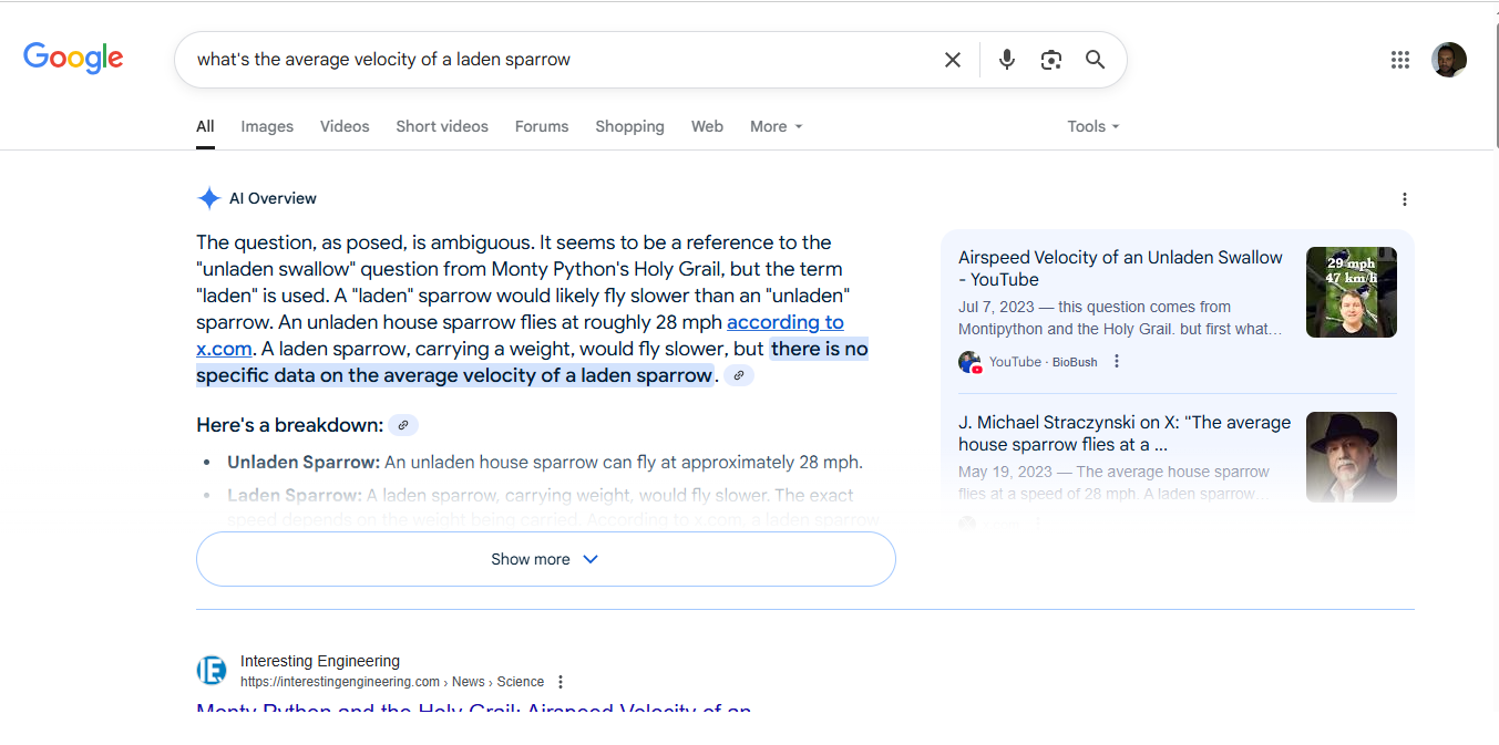
Ask a silly question, get a clear answer; note the highlighted text that helps satisfy this whimsical I-want-to-know moment—instantly.
© Google, Fair use
2. “I Want to Go” Moments
These are location-driven moments when users want to find something near them—like a store, event, or service.
Example:
A tourist who’s just arrived at their hotel after a long flight types “best ramen near me” at 8 PM on a Friday night; they're hungry, mobile, and impatient.
UX Consideration:
Designers offer a map-based interface, use real-time data (e.g., restaurant opening hours), and integrate with navigation apps. They don’t bury the “Get Directions” button; this kind of user is likely tired and hungry—two high-stakes adjectives in user experience design.
Supporting Microinteraction:
Designers provide a responsive hover or tap effect on map pins. They show real-time wait times or review snippets in a tooltip when users tap a location.
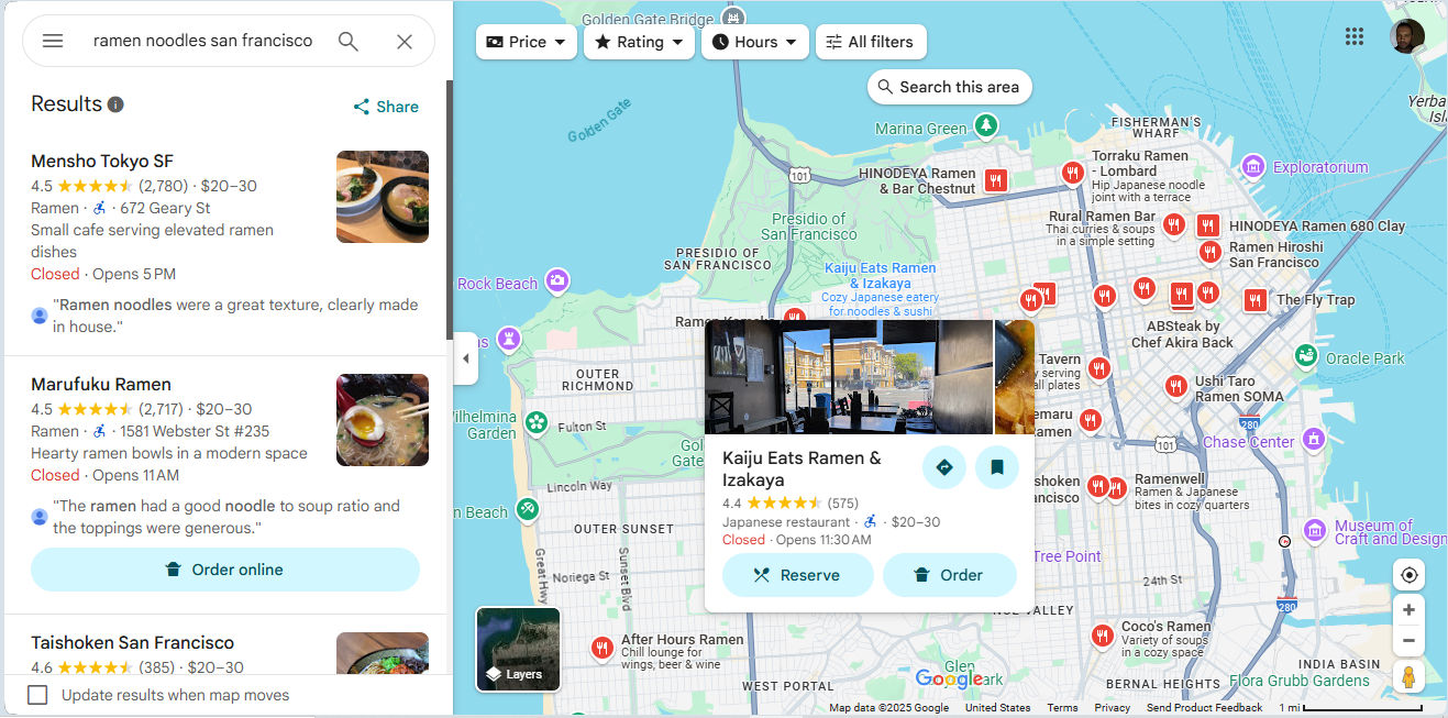
A hungry user in this section of San Francisco can find their way via Google Maps to enjoy a fair few options for ramen noodles—maybe they’ll fancy reserving a table or ordering to go; the choices are abundant, anyway.
Google, Fair use
3. “I Want to Do” Moments
These moments involve hands-on action. The user wants to complete a task, solve a problem, or try something new.
Example:
Someone searches “how to reset iPhone 13” after their device freezes. They need a fix—now.
UX Consideration:
Designers break instructions into steps. They use images or short videos, and enable search or voice commands within their help content.
Supporting Microinteraction:
Designers show a visual confirmation (like a checkmark or brief success animation) after a user completes each step. This reassures users and drives progress. It takes empathic design; think of a user who’s trying to remove their car battery and has both hands occupied. They need clear instructions at a slow pace as they might have trouble finding the battery and be worried about safety.
Get a greater grasp of what users really want and why, in this video about empathy in design:
4. “I Want to Buy” Moments
Here, the user is ready to purchase something but may need a little help—it could be comparison info, reviews, specs, or reassurance that they’re about to make the best choice.
Example:
A commuter looks up “best noise cancelling headphones under $150” on the way home from work on a noisy train.
UX Consideration:
Designers feature comparison tables, review summaries, and direct buying options. Again, they know the user’s goal and it’s vital to reduce friction—no forced signups or hidden fees.
Supporting Microinteraction:
Designers use dynamic content updates as the user applies filters. They let product cards animate slightly when the user adds the item to the cart to confirm the action—instantly.
How to Design for Micro-Moments, Step-by-Step
Identify Key Intents
Know your users—all the relevant aspects; use analytics, search logs, and user interviews to uncover your target audience’s most common moment-driven needs. Create personas—fictitious representations of real users—to help guide where you take your design efforts.
Understand why personas aren’t just helpful in design; they’re essential, in this video with William Hudson: User Experience Strategist and Founder of Syntagm Ltd.
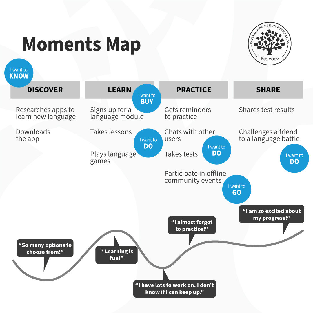
Map the Journey
Chart the user’s journey to find answers to: Where and when do these moments happen? Are they tied to location, time of day, device use? When you understand how users experience moments in their many user contexts, you can cater to their needs with greater precision.
Discover how to design for user journeys—in this case from a service design perspective, with Frank Spillers: Service Designer, Founder and CEO of Experience Dynamics.
Define the Ideal Outcome
Discover what success would look like for the user in that moment. Would it be a booking? A fact learned? A product found? A malfunctioning dishwasher (safely) fixed before it overflows soap suds all over their kitchen? Get the definition of success in concrete and use it as your focus.
Create Lean Interfaces
Strip away distractions and remember the user’s context demands simple, easy-to-find guidance. Design single-purpose screens with one dominant action.
Integrate Helpful Microinteractions
Use animations, sound, or haptics to guide users and confirm actions without interrupting flow. Remember the pizza app? Now consider a hungry user with even hungrier house guests having a lively conversation. They’ve just agreed on what kind of pizzas they want but are too interested in the subject they’re discussing to have to think more about the pizzas (they just want them to arrive—soon).
Test in Real Conditions
Validate your design under the conditions where micro-moments actually occur—mobile, on-the-go, low attention.
Iterate Based on Behavior
Refine the experience using real engagement data. Are users dropping off? Are they reaching their goals? Gear the improvements to your design around what you find users do in their contexts. What people actually do is more important than what they say they do.
Best Practices for Micro-Moment Design
To create user experiences that thrive in these split-second moments and that can delight users while they drive business for brands, apply the following principles:
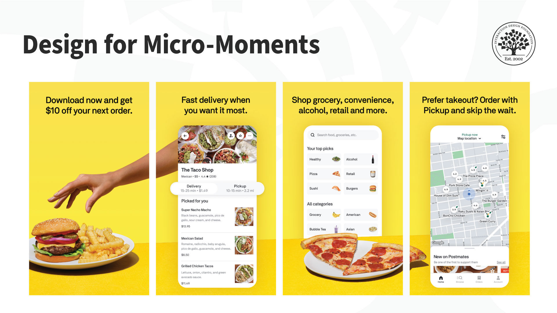
1. Design for Mobile First
Most micro-moments happen on mobile; twenty-first-century users reach for mobile devices more than they sit down in front of desktops. Use adaptive layouts, fast-loading assets, and large touch targets.
2. Deliver Information Fast
Don’t bury key content—get it right out there for users. Show summaries first. Use accordions or links for deeper exploration.
Explore the vast potential mobile-first design offers in this demonstration from Frank Spillers about how to build a mobile app.
3. Match Design to Intent
Think contextually and consider what the user wants (or needs) in the moment—and how urgent it might be. For example, the users with the car battery and the dishwasher problems want direct how-to guides to lead them to a fast fix, not blog articles or upsells.
4. Keep Interactions Lightweight
Avoid complex flows or unnecessary features; one goal per screen is ideal. Part of the “magic” of a seamless experience is to take the “work” out of the task.
5. Use Smart Defaults
Autofill known info and suggest nearby locations. Let users act without typing if possible. Remember our house-party host who’s ordering the pizzas? They may be in deep conversation about an important matter while holding a drink. They want the right pizzas to arrive quickly, but they may not have the time or mental bandwidth to thumb-type fine details; they want low (or no) distractions.
6. Provide Instant Feedback
Microinteractions should reassure users—show that the app is listening and responding. When users see that the system acknowledges their input, they’re more likely to stay engaged, follow through, and return. Silence or lag, though, can make them doubt or frustrate them, especially during task-critical moments like payments or sign-ups. Speed is of the essence for users to enjoy a seamless experience.
For example, in Google Maps, when a user taps “Start” to launch navigation, the interface immediately animates the route line, activates voice guidance, and shifts the map orientation. These microinteractions confirm to the user that the system received the command, understood their intent, and is now actively guiding them. That feedback—instant and purposeful—eliminates hesitation and keeps the experience feeling fluid and reliable.
In the Amazon mobile app, when a user taps the “Buy Now” button, the button dims briefly and a loading spinner appears—followed quickly by a confirmation screen that shows the purchase details. This sequence of microinteractions serves multiple functions: it signals that the system registered the tap, reassures the user that the transaction is processing, and confirms the action’s success.
7. Maintain Accessibility
Ensure all users can participate in micro-moment experiences; many users may be accessing designs using assistive technology like screen readers or voice navigation. Considerateness helps all users enjoy what your brand has to offer.
Special Considerations in Design for Micro-Moments
Even with the best intentions, designs for micro-moments can go wrong. Avoid these pitfalls:
Time Sign-ups Mindfully
Don’t gate content or action behind registration—offer value first.
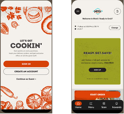
Moe’s Southwest Grill is a good example of how to do it. They let users continue as guests (left image above) and, after they enter their location for a pickup order, they show them how to enjoy great deals (right).
© Moe’s Southwest Grill, Fair use
Keep The Interface Content Appropriate
Micro-moments demand clarity—too many options can make users hesitate in analysis paralysis. Cater to what they need or want and in a way where, for example, they can still order pizzas with specific, personalized toppings without being flooded with so many options that they can’t find the best—and safest way—to handle their overflowing dishwasher. Speed is of the essence.
Keep Page Speeds High
A moment can be lost in three seconds or less—often along with a user’s trust in the brand. Compress, preload, and prioritize to keep up with users.
Design Effective Microinteractions
The system’s response must match the user’s need in the micro-moment. If a microinteration delays the experience or distracts from the goal, it can hurt more than help.
Localize for Users
If you serve global users, tailor micro-moment content to local time, language, and preferences. For example, users who want the best ramen noodles in town will want to receive the best guidance but may not know English.
Overall, micro-moments happen whether designers design for them or not—it’s a fact of modern life. The brands who design well for users are the ones who can enjoy success because users feel delighted with frictionless experiences. A few split-seconds can make all the difference, which makes micro-moments high-value points in a user’s journey, where intent meets opportunity. UX designers who master them can build interfaces that feel natural, fast, and trustworthy; they help people in real-world situations get things done fast.
The best designs not only deliver the right information or functionality; they reinforce confidence through polished, purposeful microinteractions, too. Together, micro-moments and microinteractions are behind the responsive, intuitive digital experiences modern users expect. Users may not always recognize how much they value an app when they use it. The experience may be so seamless that they don’t notice they’re using a device to engage with a brand. However, that’s a sign of successful micro-moment design—and as long as they loved the pizza, learnt how to keep their kitchen safe from a flood, or whatever they needed to know, do, or buy—or wherever they needed to go—they’ll likely return to the great sources of help the designers of their trusted brands have provided for them.