The Law of Proximity

Your constantly-updated definition of the Law of Proximity and collection of videos and articles
77 shares

What is the Law of Proximity?

The law of proximity is a principle in Gestalt psychology. It describes how humans perceive elements that are close together as more related than ones farther apart. This is so even if the elements differ in color, shape, size or otherwise. Designers use proximity to create clear, coherent layouts, guide users’ attention and reduce cognitive load.

Michal Malewicz, Co-founder of HYPE4 explains how proximity can help you make effective and intuitive user interfaces.

Show Hide video transcript
  1. Transcript loading…

Why is the Law of Proximity Vital in Design?

Proximity is a fundamental Gestalt principle, or law. The Gestalt laws describe how humans perceive visual elements and how our brains tend to group them into meaningful patterns. Moreover, these principles state how an image is more than the sum of its parts. The Gestalt school of psychology emerged in 1920s’ Germany. Psychologists Max Wertheimer, Kurt Koffka and Wolfgang Köhler developed theories—such as the laws of continuity, closed region and prägnanz—to account for various phenomena related to human visual perception, including how we perceive lines or curves, and focal points.

Image of arranged dots exemplifying law of proximity

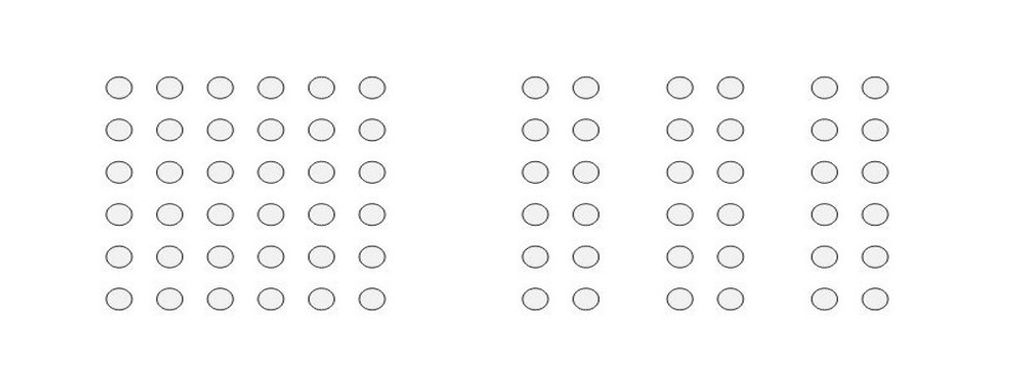
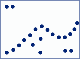
The essence of proximity: Objects that appear together form distinct groups from others.

© Steven Bradley, Fair use

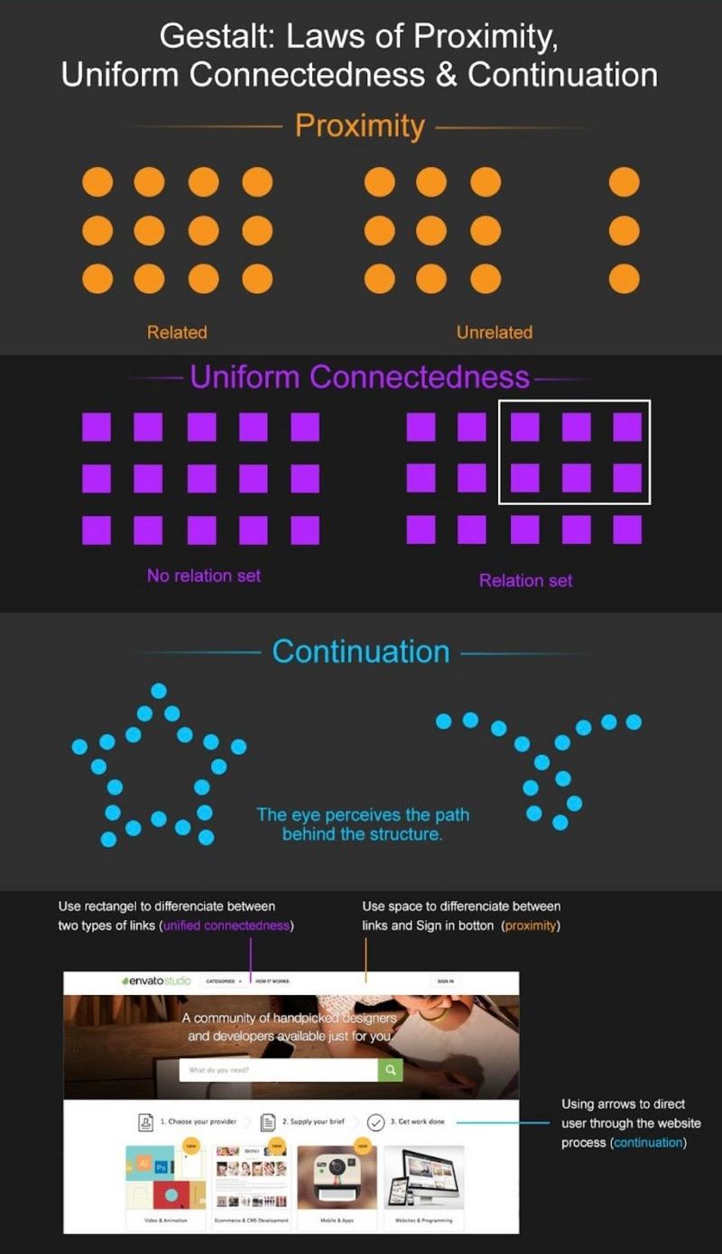
The principle of proximity is a grouping law, describing how humans perceive and simplify complex images in visual elements. According to the Gestalt psychologists, our minds innately tend to group items and perceive patterns using five main categories. Wertherimer, Köhler and Koffka developed the principle of proximity, principle of similarity, principle of continuity, principle of closure, and principle of connectedness (or uniform connectedness). As with the wide range of other principles, proximity quickly became a valuable part of graphic design. And it’s especially helpful for your design work to improve the user experience in digital products.

Like most Gestalt laws, it’s easy to define the law of proximity in simple terms and take the meaning literally from the name. The closer two or more objects are, the more likely a human viewer will perceive them as a group or unit. Close proximity means there’s a relationship between the elements or objects. For example, think of clusters of frequently asked questions on an FAQ page that relate to various issues brand customers may have.

Proximity casts a powerful effect on users’ eyes. For instance, it overrides color in the importance the eye gives it.

Picture of dots showing how proximity law and color work.

With Gestalt theory, you can apply the law of proximity to many aspects of web design, user interface design (UI), and product design.

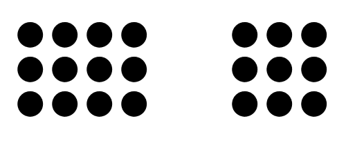
© Lukas Oppermann, Fair Use

What are the Benefits and Challenges of Using Proximity in UX Design?

When you use proximity well, you can improve the readability of your product (for example, a website), enhance your users’ comprehension and boost usability and engagement. Get the proximity right, and you can make the interface more user-friendly, intuitive, persuasive and compelling. 

But there are some challenges and pitfalls to be aware of, also. If you don’t apply the principle of proximity well, the elements can work against your design. So, the context and content of the interface are vital to bear in mind when using proximity. For example, as far-away elements will seem to be unrelated, it’s easy for users to miss them if they have the majority of the elements clustered together.

Responsive design can present another challenge when it comes to proximity, as the design will adjust to the screen real estate and some effects—like proximity—might diminish on smaller screens.

Website example screenshot of law of proximity.

On the desktop version of WCC’s website, extra whitespace at the left of the Search button shows it has different functionality from the other buttons.

© Aurora Harley, Fair use

Website example screenshot of law of proximity.

But on a tablet, this separation can’t hold, so “Search” appears to be part of the main navigation; it was raised and grouped with other utility-menu items.

© Aurora Harley, Fair use

How to Apply the Law of Proximity in UX Design

To apply the law of proximity in your user interface (UI) designs, it’s important to consider three things in particular: alignment, spacing, and grouping. Alignment is all about arranging elements along a common axis or edge. Meanwhile, spacing particularly refers to how much white space you include to separate elements and draw the users’ eyes to important features. To group items properly, you cluster elements that share a common function, feature, or category.

Here are some tips:

  1. Plan the Layout: Before starting your design process, plan the layout to determine how you’ll group and organize different elements. Consider the relationships between elements and the desired user flow.

  1. Use Consistent Design Elements: Use consistent design elements, such as color, shape or typography, to visually group related elements. This helps users quickly identify and understand the purpose and function of each element.

  2. Group Elements That Belong Together: Elements that belong together should be together. This will make it easier for users to understand the relationship between the elements and how they function. Grouping also helps to create clear boundaries or white space around them.

  3. Consistently Align Elements: Consistent alignment is essential to create a balanced and harmonious layout on your UI. When you align elements, it creates a sense of order and structure in the interface. This, in turn, makes the interface more user-friendly and intuitive.

Screenshot of Airbnb.com

Airbnb makes use of proximity in a clear and user-friendly interface – elements lined up precisely and the spacing consistent in a grid-like layout. Also, Airbnb clusters elements that relate to the user's search (e.g., filters, map, and listings) and the use of color and typography highlights important information and actions.

© Airbnb, Fair Use

  1. Leave Enough Spacing Between Elements: Make sure you leave the right amount of spacing between elements. This white space, or negative space, will create contrast and separation, and establish visual hierarchy. Too much or too little spacing can make your design look sparse or cramped. However adequate spacing will help to make the interface more readable and understandable—and make a more enjoyable UX.

  2. Use Visual Cues to Reinforce Grouping: Visual cues like color, shape, size, or typography can reinforce the grouping. For instance, if you use a consistent color scheme for related elements, you can create a sense of unity and coherence.

    Screenshot of an Amazon.com product detail page.

    On Amazon's product detail page, the product title, price, and "Add to Cart" button are grouped closely together, indicating their relationship and making it clear for users how to proceed with purchasing the product.

    © Amazon, Fair use

  3. Use Proximity to Create Logical and Intuitive Navigation: Proximity can be a tool to create logical and intuitive navigation. So, when you place elements that are frequently used or related near each other, you help users to enjoy easy access and interaction. This will help to reduce cognitive load and make the interface more user-friendly.

    Screenshot of Google search results as an example.

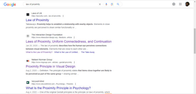
    Google's search results page demonstrates the use of proximity to group search results and related elements. Each search result is presented as a distinct unit, with the title, URL, and snippet closely grouped together for easy scanning and comprehension.

    © Google, Fair use

  4. Consider Responsive Design: Ensure that the proximity you applied in your design is maintained across different screen sizes and devices. Group and space the individual elements appropriately, regardless of the screen real estate available.

  5. Accessibility: Keep accessibility in mind. Ensure that your design elements are distinguishable for users with visual impairments such as color blindness or macular degeneration. So, use additional cues like text labels or alternative text. 

  6. Apply Proximity to Forms as well: If you present your users with forms to fill in, you can use proximity to make it easier for them. Cluster related sections together (e.g., personal details, credit card information). Not only will this make for a better user experience; it will also reduce the likelihood that they’ll make errors.

  7. Trust Your Gut: As proximity appeals to the human eye at such a deep and visceral level, go with your initial reactions. If you must force yourself to see those groups, for instance, then rethink your design.

  8. Test and Iterate: Conduct user testing to validate the effectiveness of proximity in your design. Iterate and refine the layout based on user feedback about usability and desirability, etc. to optimize the user experience. Does the proximity you’ve applied aid in problem-solving, for example?

    Remember, the law of proximity is a crucial principle in Gestalt psychology, and for good reason. It can help you create clear and coherent layouts, reduce cognitive load, and enhance usability greatly. It’s important to apply the principles of proximity mindfully, however, as you will need to consider your users’ needs throughout the user journey.

    Still, with consistent and effective use of proximity, you’ll infuse your interface with a sense of order, hierarchy, and structure. This will help to guide the user's attention, focus, and navigation, making the interface more user-friendly and engaging. From there, you can bring users closer to your brand.

    Learn More about the Law of Proximity in UX Design

    Take our course: Gestalt Psychology and Web Design: The Ultimate Guide

    See the various Gestalt principles described in our piece on them: What are the Gestalt Principles?

    Find in-depth insights in this Nielson Norman Group article: Proximity Principle in Visual Design.

    Find additional important points on how humans perceive objects in the article What Is the Law of Proximity & Why Does It Matter in UX Design? | Anna Fitzgerald.

Questions related to Law of Proximity

Can you provide examples of the law of proximity in web design?

Here are some examples of how to apply the law of proximity in web design:

- Navigation Menus: In web navigation menus, designers group related items together based on their proximity. This helps users easily identify and select the option they need without confusion.

- Form Fields: In forms, designers place related fields close to each other. For instance, a user's first and last name fields often appear together as a group, indicating their relatedness.

- Content Grouping: Articles or blog posts often use proximity to group paragraphs, headings, and images. This visual grouping helps users digest information in chunks, which makes the content more readable and engaging.

- Buttons and Call-to-Actions: Buttons or call-to-action elements related to a specific section of content appear close to it. This proximity signals to the user that these actions are directly related to the content they are viewing.

- Whitespace Usage: Effective use of whitespace can enhance how you apply the law of Proximity. When you space unrelated items farther apart, you can reinforce the grouping of closer elements.

Why do we use the principle of proximity?

The principle of proximity is crucial, to:

Group Similar Design Elements: Proximity plays a particularly important role as a Gestalt principle, especially when working with simple shapes. The principle of proximity dictates that human eyes see objects that are close to each other as being a group. This allows you to organize elements effectively as the building blocks of your web design, including the visual hierarchy. 

Show Hide video transcript
  1. Transcript loading…

This video is an in-depth analysis of how you as a designer can establish visual hierarchy on a web page using the Gestalt principle of proximity.

Establish Figure/Ground Relationships: Proximity aids in establishing figure-ground relationships, also known as positive and negative space. If you change the arrangement or create discontinuity, you draw attention in your design and guide users so they can identify important elements within a visual field.

Create Consistency: To maintain consistency, apply proximity consistently. Your elements are essential group members. So, distances between groups and elements within groups should follow a pattern based on the natural hierarchy. This lets users quickly process and understand the layout.

Enhance Grouping and Organization: The principle of proximity helps you organize information by creating groups within groups. Whether it's a larger group or a smaller group within a group, proximity helps you visually show relationships between elements on web pages and elsewhere.

Improve Scannability in Forms: In form design, keep an appropriate distance between labels and fields; it’s crucial. Adequate spacing between elements enhances scannability and prevents confusion, ensuring users can easily associate labels with corresponding fields.

In essence, the principle of proximity serves as a guiding rule for you to create visually cohesive and organized layouts. When you consistently apply proximity, it helps users naturally understand the hierarchy and relationships between different elements.

How does the law of proximity improve user experience (UX)?

The law of proximity, a key principle in Gestalt psychology, significantly enhances user experience (UX) since it influences how users perceive and process information. It states that objects that are near, or proximate to each other, are what users tend to view as a group. This principle is crucial in UX design for several reasons:

Improved Organization: When you group related items together, you can create a more organized and clean interface. This organization helps users easily understand which elements are related and which are separate, streamlining navigation and interaction.

Enhanced Usability: The law of proximity makes interfaces more intuitive. For instance, if you group related buttons or functions together in a software application or a website, it intuitively indicates their relatedness. That makes it easier for users to learn and remember how to use the product.

Efficient Information Processing: When you group information according to the law of proximity, it reduces the cognitive load on users. They can quickly process and interpret grouped information without having to evaluate each element individually.

Visual Hierarchy: This law helps to establish a visual hierarchy on a page or screen. When you adjust the proximity of elements, you as a designer can guide users' attention to where it's most needed. That will improve the effectiveness of the design.

Error Reduction: When you group related options or controls, you’ll reduce the likelihood of user errors. Users are less likely to make incorrect choices or feel confused when similar or related options are grouped together.

In practice, you can see the law of proximity in the layout of forms, menus, website navigation, and even in the spacing and grouping of content in a mobile app. So, use this law effectively to make your digital products more user-friendly and satisfying to interact with.

What is the basic principle of proximity?

The basic principle of proximity in design, based on Gestalt psychology, asserts that elements that designers place close to each other are what users perceive as a unified group. This principle guides how designers organize information, especially when it comes to creating a clear visual hierarchy. When you strategically group related elements, you as a designer can leverage the principle of proximity to enhance user understanding. This will make it easier for them to interpret and navigate visual content. This fundamental design concept plays a crucial role in shaping user experiences, and optimizes how users understand information and engage in problem solving.

How does the law of proximity relate to whitespace in design?

The law of proximity and the use of whitespace in design are closely interconnected, and each plays a critical role in how you as a designer present information and your users perceive it.

- Grouping and Separation: The law of proximity states that users perceive objects that are near each other as a group. Whitespace, or negative space, is the empty space between design elements. You use it to create or break proximity between elements. When elements are closer together, surrounded by whitespace, users perceive them as related or part of the same group. Conversely, more whitespace between elements suggests they are separate or belong to different groups.

- Focus and Attention: You can use whitespace to emphasize the law of proximity. When you strategically place whitespace around groups of elements, you can direct the viewer's focus to specific areas. This will enhance the effectiveness of the proximity principle. This technique is crucial to guide users through a design, and so they notice and process information in a desired order.

- Clarity and Readability: In typography and layout design, whitespace enhances readability and comprehension. For instance, the spacing between paragraphs (a form of whitespace) utilizes the law of proximity to indicate related content. That makes text easier to follow and understand.

- Aesthetic Balance: Whitespace contributes to the aesthetic and balance of a design. It's not merely empty space but an active element that, in conjunction with the law of proximity, creates a visually pleasing and effective layout. It helps to avoid clutter, and allows the design to breathe and communicate more effectively.

- User Experience (UX): In UX design, whitespace and the law of proximity work together to create a user-friendly interface. Adequate spacing between navigation elements, for example, makes them easier to identify and interact with, enhancing the overall user experience.

The relationship between the law of proximity and whitespace is fundamental to create harmonious, functional, and aesthetically pleasing designs. They work in tandem to organize content, direct attention, and improve the usability of a design.

What are the common mistakes when applying the law of proximity in design?

- Overcrowding Elements: A common mistake is to place too many elements close together. This defeats the purpose of the law of proximity, as it becomes difficult for users to distinguish between different groups of information. Overcrowding leads to a cluttered and confusing interface, hampering user experience.

- Inconsistent Grouping: Inconsistency in how you as a designer group elements can create confusion. If you don’t group similar elements consistently, or if you group dissimilar elements together, it breaks the visual flow and makes it hard for users to understand the relationships between different parts of the design.

- Neglecting Whitespace: If you don’t use enough whitespace, it can make a design feel cramped and overwhelming. Whitespace is essential for making the grouping of elements clear and distinct. It's not just empty space; it's a powerful design tool that enhances readability and focus.

- Lack of Hierarchical Structure: Another mistake is not to consider the hierarchical importance of different groups. All groups of elements should not be given equal visual weight. Use the law of proximity in tandem with other design principles like contrast and alignment to create a clear visual hierarchy.

- Ignoring User Expectations and Patterns: Designers sometimes group elements in ways that don't align with user expectations or common patterns. For instance, to place a 'submit' button far away from the form fields can be counterintuitive. It’s crucial to understand user behavior and common design patterns for effective grouping.

- Inadequate Testing: If you don’t test designs with real users, it can lead to ineffective use of the law of proximity. User testing can reveal how different groups perceive and interact with the grouped elements; that will allow you to make necessary adjustments.

What are some highly cited pieces of research about the Gestalt principle of proximity?

Here are some highly cited pieces of research about the Gestalt principle of proximity:

1. Wertheimer, M. (1923). Untersuchungen zur Lehre von der Gestalt, II. Psychologische Forschung, 4(1), 301-350. Available at: Psychologische Forschung

Wertheimer's seminal work is a foundational piece in Gestalt psychology, introducing the principle of proximity and its role in visual perception. This publication has been influential in shaping our understanding of how the human mind organizes visual elements based on their proximity, which has significant implications for user experience design, particularly in the creation of visually cohesive and meaningful designs.

2. Beck, J. (1966). Effect of orientation and of shape similarity on perceptual grouping. Perception & Psychophysics, 1, 300–302. Available at: SpringerLink

This influential article investigates the impact of orientation and shape similarity on perceptual grouping. The study utilized a method in which participants were asked to partition a pattern into two regions to examine the perceptual grouping produced by changes in the orientation and shape of two-line figures. The results revealed that the judged similarity of the figures failed to predict the degree to which the figures formed distinct perceptual groups. The study found that grouping was most strongly influenced by differences in the orientation of the lines composing the figures, with the crossing of lines also affecting grouping, albeit to a lesser extent than line orientation. This research provides valuable insights into the principles governing perceptual grouping, with implications for various fields, including psychology, visual perception, and user experience design.

What are some of the most popular books on the law of proximity?

“Gestalt Psychology: An Introduction to New Concepts in Modern Psychology" by Wolfgang Köhler (1947) 

Wolfgang Köhler's seminal work provides a foundational understanding of Gestalt psychology, exploring principles such as proximity. The book delves into how our perceptual system organizes stimuli based on their proximity, forming holistic perceptions. Köhler's insights laid the groundwork for the application of Gestalt principles in various fields, including user experience design. Understanding proximity is vital in designing interfaces that leverage the way our brains naturally.

Where to learn more about the law of proximity?

To learn about the law of Pragnanz, you can enroll in the online course Gestalt Psychology and Web Design: The Ultimate Guide offered by the Interaction Design Foundation. This comprehensive course will provide you with a deep understanding of Gestalt psychology principles and how to apply them in web design. By the end of the course, you'll be equipped to create more intuitive and user-friendly designs. Sign up for the course here: Gestalt Psychology and Web Design: The Ultimate Guide.

Literature on the Law of Proximity

Here’s the entire UX literature on the Law of Proximity by the Interaction Design Foundation, collated in one place:

Learn more about the Law of Proximity

Take a deep dive into Law of Proximity with our course Gestalt Psychology and Web Design: The Ultimate Guide .

One of the key ingredients to a successful product is the creation of effective, efficient and visually pleasing displays. In order to produce such high-quality displays, whether they are graphical (e.g., websites) or tangible (e.g., remote controls), an understanding of human vision is required, along with the knowledge of visual perception. By observing, researching, and identifying examples of our perceptual abilities, we can design products according to these unifying qualities. In order to spread such skills within the world of interaction design, we have developed “Gestalt Psychology and Web Design: The Ultimate Guide.”

Gestalt psychology is a theory of mind which has been applied to a number of different aspects of human thought, action, and perception. In particular, Gestalt theorists and researchers attempt to understand visual perception in terms of the way in which underlying processes are organized and how they help us make sense of the world. The organization of these cognitive processes is important to our understanding of how we interpret the constant stream of visual information entering our eyes and how it becomes a cohesive, meaningful and usable representation of the world. Over the last twenty years, the work of Gestalt psychologists has been adopted by interaction designers and other professionals involved in the development of products for human users.

Within this course, we have compiled and consolidated some of the best resources currently available on the subject of Gestalt psychology and visual perception. To help you appreciate how you can apply Gestalt psychology to web design, we have provided many different examples from existing designs. These draw attention to the exact qualities, quirks, and features of visual perception. Moreover, they discuss how these have been accommodated and, on a number of occasions, exploited so as to support either the user's intentions or those of the designer or client.

The application of Gestalt thinking to design provides us with insights and new ways of approaching problems and challenges. By cementing in our own minds the many ways we organize visual information, we can improve our designs for all users.

All open-source articles on the Law of Proximity

Please check the value and try again.

Open Access—Link to us!

We believe in Open Access and the democratization of knowledge. Unfortunately, world-class educational materials such as this page are normally hidden behind paywalls or in expensive textbooks.

If you want this to change, , link to us, or join us to help us democratize design knowledge!