The Persuasion Triad — Aristotle Still Teaches

- 953 shares
- 9 years ago
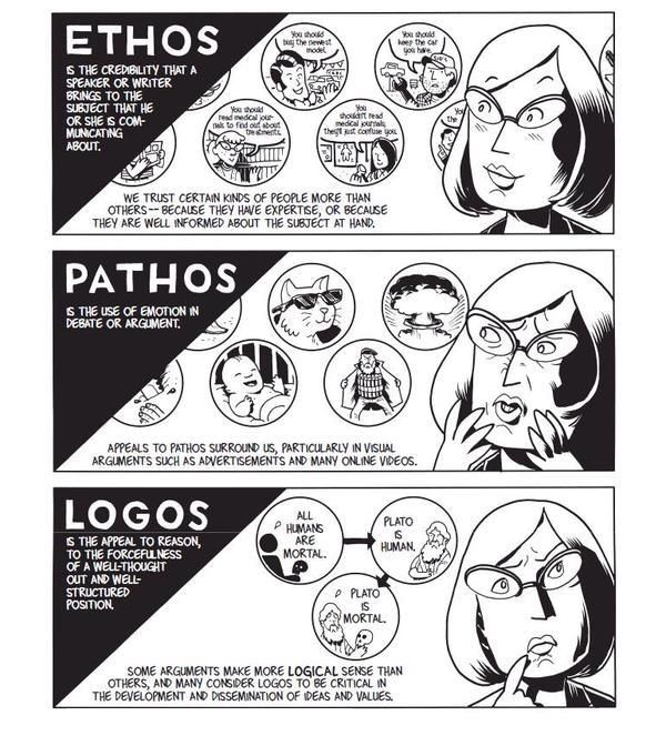
Presentation styles are the different strategic ways you can frame and deliver ideas to others, such as to tell a story, teach step-by-step, or spark collaboration. For any professional, your choice of style shapes how stakeholders see your ideas, how well they understand concepts and needs, and how quickly they buy into your solutions. The right selection helps you launch and land ideas best.
Explore how you can use presentation styles to frame more effective messages, win over audiences, and advance your career, in this video with Morgane Peng, Managing Director, Global Head of Product Design and AI Transformation.
Imagine you have a public speaking engagement, to present your UX design findings and solution ideas to stakeholders. You’ve got your points all listed out, each one important in its own right, but something’s missing. You notice that your slides are just a loose collection of facts and ideas; what about a thread or a channel to cast it to your audience?
In professions like UX design and product development, you spend much time presenting. Your work doesn’t exist in a vacuum, and so you’ll often find yourself “explaining” things like wireframes and prototypes, user research, insights, and design rationales. No matter what you may have to say, how you present it often determines if stakeholders adopt your ideas, fund your projects, or trust you with greater responsibility. Your presentation may contain a unique collection of essential points and have much potential to inspire action, but you need a “package” to launch it to the eyes, ears, and minds of your target audience. The right style is how you reach them best.
Presentation styles give you a set of options to craft your messages with. You might decide to tell a story, walk through a demo, explain concepts in detail, or invite collaboration from your audience members. Each style has its own strengths and suitability for the material and audience concerned. When you adapt, you can make the style fit your content like a glove and “shake hands” more profoundly with your audience, who’ll find you more credible, persuasive, and memorable because of how you’ve resonated with them and won their trust.
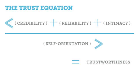
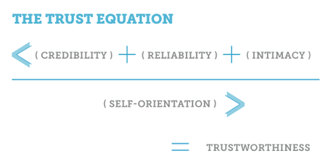
Explore how to win your audience’s trust and leverage trust frameworks so your presentation can resonate with them, in this video with Morgane Peng.
There’s no one-size-fits-all or one-way-wins-the-day approach. The right style helps you:
People can only absorb so much information at once, whoever they are and however much they might care or already know about what you’re aiming to get across to them. If you deliver your message in a way that doesn’t match their attention span, mood, or expectations (especially regarding why they’re in your meeting), you’ll risk losing them. Presentation styles are your toolkit to keep energy high and brains switched on.
Trust isn’t automatic; it’s something you earn through how you communicate. People judge you on two dimensions to see if you tick two boxes: your competence (Do you know what you’re doing?) and your warmth (Are you genuinely looking out for others?). Presentation styles give you levers to show both and win audience members over. Even if you’re presenting for the twentieth time to a roomful of people who know you and the quality of your professionalism, you’ll still want to reflect that you’re “on the ball” with the subject matter and have the confidence to see it through to becoming part of an excellent product.
Presentation style isn’t just about getting through today’s meeting in the best way; it’s about your reputation tomorrow. Over time, people remember not only what you presented but how you made them feel, too. Colleagues who consistently adapt their style to suit the moment are ones who get noticed as leaders, not just contributors.
Pick the right style and it shields you from classic presentation mishaps, too. You’ll want to prepare and rehearse your presentation anyway, but especially in the moment on the day, it can be easy to run into some common mistakes.
Discover what to avoid in your presentations and so win audiences over more easily, in this video with Morgane Peng.
You have four core presentation styles to pick from:
What makes storytelling powerful is how it taps into one of the oldest ways humans share knowledge. Instead of a dry list of features, you take your audience on a journey: you set the scene, introduce a challenge, and reveal the solution as the climax.
For example, say you’re pitching a redesign of an onboarding flow. Instead of starting with screens, you begin with: “Maya is a student who tried to open an account but gave up after 10 minutes.” You describe her frustration, how those ten minutes can sour anyone’s experience with, and memory of, a brand, and then show how your design clears obstacles and helps her succeed. The audience members connect with Maya and don’t just see why your design matters; they feel it, too.
The Storyteller can give you a great springboard for big pitches, portfolio reviews, or anytime you want to inspire action. However, don’t try it when you’re only up there for a five-minute stand-up where people just need quick updates.
This style is hands-on, where you show rather than tell. Instead of describing how a prototype works, you click through it live, and it’s a superb way to make your message concrete and transparent and fast-track things when the audience already knows something about what they’re seeing.
For example, in a sprint review, you screen-share a clickable prototype. Stakeholders see buttons animate, flows connect, and content adapt in real time, sampling the excellence of what’s on show. They don’t just hear about usability; they watch it happen right in front of them.
True to its name, the Demonstrator approach works well for demos, usability testing recaps, or design team meetings. However, for non-technical stakeholders who need a broader story before details, you’re better off with another approach to instruct them.
Speaking of “instruct,” consider this one your “professor” mode, where you break down complexity step by step to ensure no one feels lost.
For example, when you’re introducing usability testing to a team who’s never used it, you’ll want to patiently explain the purpose, the method, and why it matters. To bring it “home” to them and make it relatable, you use analogies like: “Think of it like a dress rehearsal for your product.” That will ease even the most unfamiliar listeners into your world; so, by the end, even non-designers will feel confident about the process.
The Instructor is your key presentation style for trainings, onboarding sessions, and cross-functional meetings. However, when audiences already know the basics, don’t use it; they may feel patronized.
This style makes the audience part of the story; instead of presenting to them, you present with them. It can neatly inspire co-ownership of the subject or subject matter and make for more effective outcomes because of it.
For example, in a workshop, you might sketch rough wireframes on a whiteboard and ask, “Okay, now what would you add?” You then guide the discussion so that everyone feels ownership over it. People leave not just with your ideas, but with your (i.e., the plural “your”) ideas as a group.
A Collaborator approach can work well in brainstorms, critiques, and co-creation sessions. However, when you need to land a decision quickly and not open new debates, it’s better to go for another style, one where you won’t “muddy the waters” with so many “oars” dipping in.
It’s so important to match the style to the occasion, that it can help you see some “night and day” differences between what can work well and what won’t. And if you’re wondering whether you can mix styles in the same presentation, yes you can.
It’s best to illustrate this with some examples. Imagine you’re sharing the results of a two-month user research project with executives who only have 20 minutes to spare. If you slip into “Instructor mode” and start detailing every testing method, participants’ demographics, and survey question, you’ll see eyes glaze over by slide five. They won’t have the time or mental bandwidth for “Instructor you.” However, if you use the Storyteller style, starting with one frustrated user’s journey and then connecting it to your data and effective fixes or ideas, you’ll be able to pull them in emotionally. Once they care, they’ll lean in for the numbers that support your case.
On the flip side, if you’re in a design critique with your peers, storytelling won’t be enough. You’ll need the Collaborator style to invite input, test assumptions, and build on each other’s ideas. Engagement and the chances of a “happy ending” here come not from telling a polished story, but from making others part of the process.
Now picture yourself presenting a new app feature to a cross-functional team. At first you might think a rigid Demonstrator style, where you “demo” it and quickly click through a prototype, will work. Sure, people might admire your skills, but they’ll also likely feel left out of the conversation if they’re don’t know much about what you’re showing them. They may walk away respecting your competence but doubting your warmth, as you didn’t bring it into their frame of reference. And because you didn’t make the effort to “translate” it for them, they didn’t feel heard.
However, what if you didn’t notice this pitfall in advance and you really did start your presentation in Demo mode? Don’t panic; you can shift midway into the Collaborator style and save the day:
You pause and ask, “How do you see this working in your department?”
You reframe concerns from one audience member with curiosity: “That’s interesting. Can you tell me more about how your team would use it?”
You add warmth with eye contact, dropped shoulders, and a relaxed tone.
Suddenly, your credibility grows since you’ve shown not only that you can design but that you care about their input, too. And people trust professionals who balance both competence and warmth, the reason why presenters who use trust frameworks in their approach to an audience can do better.
For another situation, imagine a job interview. If you lean only on the Demonstrator style in there and walk through every pixel of your portfolio, an interviewer may admire your work but not your ability to communicate. So, if you blend storytelling (“Here’s the problem our users faced”), instructing (“Here’s how I approached it step by step”), and collaborating (“I’d love to hear how your team might approach similar challenges”), you can catapult yourself out of the “laboratory.” Suddenly, you come across as the kind of professional who can get others to get why what you’re doing is essential; plus, you’ll be someone who can represent the company, not just contribute inside it.
Remember, you’re free to mix your styles; think of them as layers you can match the moment with, not strict boxes to tick. You might start a portfolio review in Storyteller mode, switch into Demonstrator mode for a prototype, and end with a Collaborator discussion; whatever the moment may call for.
Pick your style and feel free to adapt and change into another as the flow of your presentation and audience responses may require.
© Interaction Design Foundation, CC BY-SA 4.0
Beyond the core four, you’ve got some other styles to consider selecting. They’re ones that often shine in conferences or high-impact talks, but they can also give you extra tools for everyday work.
Freeform: No slides; it’s just you speaking from the heart. The Freeform style finds you communicating with the audience in a way that flows directly with them and the vibe you get from them, for example, or if you’re building on points from earlier speakers. Think of a TED Talk. It’s perfect for a fireside chat or Q&A (questions and answers) when authenticity matters more than polish.
Visual: Where you use slides with almost no text, just images or bold graphics. Again, this may resemble what you can find in TED Talks. These act like visual cues while keeping eyes on you.
Lessig Style: Use fast-paced slides every 15 seconds, synced with your words. This high-energy style keeps attention sharp and audience members engaged, but it requires tight rehearsal to get right.
Takahashi Style: Big, bold text slides, and sometimes just one word, to make your point impossible to miss and cueing your entry with some specific points. Great for rallying cries like “Simplicity!” or “Trust!” to get the audience engaged and really inspired.
Choose the “style of yourself” you bring to the podium, the Freeform, the Visual, the Lessig, or the Takahashi Style.
© Interaction Design Foundation, CC BY-SA 4.0
The right style depends on context, and you’ve got three guiding questions to clarify that with:
Are they executives with little time? Business stakeholders who care, all right, but at a higher level with “bottom line” concerns? How much time do you have to get things across in? Depending on these factors, choose Visual or Storyteller for clarity.
Or are they developers digging into details? Other design team members? Go Instructor (if they don’t know your subject matter) or Demonstrator.
Do you want to inspire and fire people up? Pick the Storyteller.
Or maybe it’s to teach so there’s no shadow of doubt about your topic? Go for the Instructor.
Or is it to get input and in-the-moment feedback? Then try the Collaborator.
Or maybe you need to show proof? Think about going into Demonstrator mode.
Are you online? If so, break up long talks with Collaborator-style questions in the chat.
Is it an in-person workshop? Then you’ll find the Collaborator style shines with sticky notes and group energy.
Or is it a job interview? You can blend Storyteller (personal journey) and Demonstrator (portfolio walk-through) to present the you you want them to see and value.
On top of these three questions, you’ll want to be receptive to how receptive they’re being to you. Welcome to the skill of active listening, where you know how to keep them engaged and keep them from zoning out on you.
Find out how to use active listening to make your presentation even more successful, in this video with Morgane Peng.
Presenting is iterative, so here’s how to grow:
Experiment in safe spaces. Try storytelling in a team meeting or freeform speaking at a small event.
Rehearse. Even one run-through can transform delivery and confidence; if you can ask a colleague to sit in and observe closely and objectively, you can learn a great deal as to how you came across. Manage any performance anxiety or stress safely with the 4-7-8 breathing method (4 seconds to inhale, 7 seconds to hold, 8 seconds to exhale for a minute). Try a power pose, where you open your posture in your chest and ground your stance with your abdomen.
Seek feedback. Ask not just “Did that make sense?” but “What stuck with you?” or “Where did I lose you?”. Find out what they thought about the pitch of your voice, how well you articulated words, how you paced your presentation, how well you made eye contact: all the little factors that make up a successful presentation.
Mix and match. Don’t lock into one “persona” but blend styles to fit each moment. Apart from suiting the occasion better, it’ll make you look more natural.
Reflect and iterate. After each presentation, jot down what worked and what you’d tweak next time. For example, were you turning your back on the audience? Did you say “so,” “like,” “you know,” or some other “signature” expression you never notice you utter when your mind is occupied with presenting?
Remember the trust factor. Trust is what makes the UX world turn, and in design terms when it’s lacking, your users can turn on your brand. Similarly, when it comes to presentations, you’ll want to secure it to the maximum. Without earning an audience’s trust, your message won’t land, however powerful it may seem to you. So, read the room and be sure to come across confidently, competently, and with the relatability and conviction you would want to see if you were sitting in the audience.
Make messages sit better in audience’s minds when you sit or stand well. For example, use the SOLER framework: Sit squarely, Open posture, Lean forward, Eye contact, Relax, a helpful mix of confidence and openness that can make audiences so much more receptive to you (but note that sustained eye contact can put people off or even offend them, so tailor your approach to the audience).
Secure a greater grasp of how to position yourself for success in a presentation, in this video with Morgane Peng.
Overall, presentation styles aren’t about performing but about connecting. Every style signals something, and brings it home to the audience with essential criteria like “clarity” and “humility” for them to remember you. When you master multiple styles, you stop being boxed in and overwritten by a signature style that might take over from the real you.
It’s a (learnable) skill to be able to adapt presentation styles, but when you do you’ll influence decisions, build stronger relationships, and position yourself as someone worth listening to. Use styles consciously, experiment boldly, and refine constantly and soon, you’ll discover the real magic and so will the people who come to listen to you. You won’t just present; you’ll cast a more powerful presence and be able to persuade, inspire, and lead.
Discover how to unleash your presentation skills potential and much more in our course Present Like a Pro: Communication Skills to Fast-track Your Career with Morgane Peng, Managing Director, Global Head of Product Design and AI Transformation.
Reach back into the past for some powerful points about how to manage present presentations and future instances when you stand in front of others speaking, in our article The Persuasion Triad — Aristotle Still Teaches.
Peer into presentation tips and insights in this Seven Peaks article, Creating Impactful UX Design Presentations: 11 Essential Tactics.
Explore additional helpful dimensions of how to present well in this UX Collective article, Presenting work with confidence and clarity.
Get more out of your UX presenting with additional tips from the Justinmind article 6 tips to ace your next UX design presentation.
Yes, you can (and often should) mix presentation styles in a single talk. Audiences respond well to variety because it keeps them engaged and prevents monotony. For instance, you might start with the Storyteller style to hook attention, switch to the Demonstrator style to show a prototype, and then use the Collaborator style to invite input.
Mixing styles lets you adapt to the room’s energy, time limits, and stakeholder needs and shows you’re aware, considerate, and professional. The key is smooth transitions: don’t jump abruptly from storytelling to data-heavy slides. Rather, frame each shift with a clear purpose like, “Let me show you how this works.” Do it well, and you’ll find blending styles creates balance: emotional connection, practical clarity, and collaborative engagement.
Explore how to come across better in UX presentations, design team meetings, and more, in our article What Soft Skills Does a UX Designer Need?.
The best presentation style is the one that aligns with both your natural strengths and your audience’s needs in the moment. Begin by reflecting on your personality. Do you thrive on stories and big-picture thinking? You may lean toward the Storyteller style. Or do you prefer showing tangible results? Try the Demonstrator style. If teaching comes naturally, the Instructor style fits. Enjoy discussion and co-creation? The Collaborator style may suit you best.
Context matters, too: a client pitch may demand storytelling, while a design critique benefits from collaboration. Test different approaches in safe settings like team meetings and ask for feedback. Over time, you’ll discover your comfort zone and learn how to stretch it and go beyond. Overall, the best style is flexible and you adapt your approach while staying authentic and confident, the best version of yourself to deliver the presentation.
Discover more about what matters for UX designers to cast better impressions, in our article Key Soft Skills to Succeed as a UX Designer.
Yes, some beginners find some presentation styles easier. The Instructor style is often the most comfortable starting point as it focuses on clarity and step-by-step explanation. Beginners can prepare structured content, anticipate questions, and calm their nerves by following a clear roadmap to cover much “territory.” The Demonstrator style works well, too, when you want to “show, not tell” using prototypes or visuals, and it puts less pressure on memorization.
Note that the Storyteller style, while powerful, can feel harder at first because it requires timing, flow, and emotional pacing. The Collaborator style may overwhelm beginners if audience feedback goes off track. So, start simple: choose a structured style, rehearse it, and gradually blend storytelling or collaboration as your confidence grows. With practice, even new presenters can master more advanced styles that build strong audience connection and trust, vital ingredients.
Find out how to come across better as a more trustable presenter, in this video with Morgane Peng, Managing Director, Global Head of Product Design and AI Transformation.
If you’re presenting online, the Visual style works especially well. As audiences get distracted quickly on video platforms, clean, image-driven slides paired with strong narration keep attention focused. The Storyteller style also shines online because a relatable story cuts through screen fatigue. Don’t go for overly text-heavy or monotone Instructor-style talks; remote listeners tune out fast.
If you need collaboration, adapt the Collaborator style using polls, chat, or breakout rooms. The keyword online is interaction, so encourage reactions early to set the tone. Keep slides simple, reveal content gradually, and use vocal variety to replace physical presence. Don’t forget to test your tech; glitches kill flow faster online than in person. The best online presentations mix visual storytelling with interactive moments, helping people stay engaged and remember your message.
Discover how to make the best use of visual representation to support any presentation you give.
For in-person presentations, pick a style that fits both the room and the audience size. The Storyteller style connects well in small to medium groups, where eye contact and body language amplify your story. The Demonstrator style works in workshops or product demos where people want hands-on clarity. The Instructor style suits classrooms or training sessions that need structured explanations. For larger groups or brainstorming sessions, the Collaborator style encourages participation but demands strong facilitation to stay on track.
In person, you’ve got advantages such as physical presence, gesture, and movement to emphasize points, so use them. Before you choose, ask: “What’s my goal? Inspire, explain, teach, or collaborate?” Match your intent with the right style and it’ll help you land your message and build credibility and that all-important ingredient of trust.
Explore how to harness one of the most powerful forces in design, in our article Trust: Building the Bridge to Our Users.
When you’re using the Storyteller style, don’t drift into long, unrelated stories or go off on tangents. Relevance is everything: your story must connect clearly to the audience’s context and the presentation goal. Keep details concise; too much backstory confuses listeners and dilutes your point.
Avoid over-dramatization, too. Authenticity matters more than theatrics; audiences quickly sense when a story feels forced or verges on sentimentality. And don’t rely on stories alone; support them with data, visuals, or next steps so your presentation balances emotion and evidence.
Last, but not least, be mindful of time. Stories are engaging, but going long can derail your presentation and frustrate decision-makers. You want to spark attention, build empathy, or illustrate a challenge, but always tie it back to action in a bridge between your idea and audience buy-in.
Enjoy our Master Class Storytelling That Sells UX Design: Define Requirements and Engage Leadership with Rafael Hernandez, Lead Product Designer, T. Rowe Price.
The Demonstrator style is effective but does carry risks if you don’t manage it carefully. A major one is technical failure; a live demo can freeze, crash, or lag, leaving you scrambling, so always have a backup plan like screenshots or a short video.
Another risk is overwhelming the audience with detail; showing every feature or screen distracts from your main message and dilutes what should be a powerful presentation. So, keep the demo focused and purposeful.
A third risk is assuming your audience shares your context; without background, people may not understand what they’re seeing. They’ll need to get the background information (and just the right amount of it) to be able to respond. That’s where a stakeholder map, which helps you understand what audience members really want and need, comes in handy.
Lastly, moving too quickly between views or layers can cause confusion or even motion sickness online. So, don’t wing it; the key is preparation. Rehearse your demo, anticipate glitches, and keep the focus on solving the audience’s problem, not on showing off tools.
Use a stakeholder map to power your way to better views of how to deliver points properly, in this video with Morgane Peng.
To keep the Instructor style engaging, break complex ideas into digestible steps and use visuals instead of long text blocks. Vary your voice pace, tone, and volume to avoid sounding monotonous. Insert stories or examples to illustrate concepts and keep attention high. Ask occasional questions, even rhetorical ones, to re-engage listeners. Use analogies or metaphors so that abstract ideas feel tangible.
If you’re presenting online, lean on polls or chat to add interactivity. In person, eye contact and small group exercises can keep energy up. Above all, highlight the “why” before you dive into the “how.” Audiences stay engaged when they know the purpose of the lesson, and a well-delivered Instructor style feels less like a lecture and more like guided discovery, clear, structured, and still dynamic, and capable of making people go “wow.”
Get more from your presentations, and more from more interested attendees, with a wealth of helpful points to appreciate your value as a designer, in our article How to Communicate Clearly and Gain People’s Interest.
In the Collaborator style, too much input can quickly derail your talk, so set ground rules at the start to manage it: time limits, turn-taking, or a “parking lot” for off-topic ideas. Use visual aids like sticky notes, whiteboards, or digital boards to capture feedback without letting discussion spiral.
Summarize and reflect back (“OK, so far I’m hearing three main points…”) to show respect while steering conversation. Prioritize voices strategically: encourage quieter participants and gently redirect dominant ones. Remember, time management is crucial, so announce how much time you’ll dedicate to collaboration before moving on. If debate stalls progress, suggest next steps like “let’s test both ideas.” Balance openness with structure and you’ll keep collaboration productive, ensure inclusivity, and still deliver your presentation’s core message.
Get a greater grasp of what collaborating can achieve in our article Collaborating with Your Team for Research.
The Freeform style is a presentation approach where you use no, or very few, slides and rely instead on adaptability and direct connection with the audience. Think TED Talks where the presenter walks on stage and speaks freely, tailoring their opening based on the crowd’s energy or previous speakers.
This style works best in informal settings, panels, or inspirational talks where authenticity matters more than polished visuals. It’s highly flexible and makes you seem confident, but it requires strong preparation beneath the spontaneity. Note that without structure, you risk rambling or losing your thread. It can be powerful when you’re pitching a vision or personal story, but less effective for detailed data or process-heavy explanations that require visual anchors.
The Visual style is, true to its name, a presentation approach where you use clean, image-driven slides with minimal text to reinforce your words. Instead of bullet-heavy decks, you focus on striking visuals like photos, diagrams, or icons that complement the story.
This style works especially well for online talks, keynote speeches, or inspirational sessions where attention spans are short. Reduce text and you’ll prevent the audience from reading ahead and keep focus on you. Still, the risk is over-reliance on imagery without clear explanation, so balance visuals with strong narration. Use it to highlight design work, user journeys, or prototypes in a memorable way, and make your message easier to grasp, more engaging, and far more likely to stick.
Understand user journeys better to leverage key insights so you can make better design decisions, in our article Top Tips to Create Effective Journey Maps.
The Lessig style, named after law professor Lawrence Lessig, is a fast-paced presentation method where you change slides every 15 seconds or so to match speech rhythm. Each slide typically has just a few words, a phrase, or a simple image.
The rapid transitions keep audiences alert and prevent drifting attention, and it’s a style that’s engaging and energetic, perfect for summarizing ideas, motivating teams, or making bold points quickly. The challenge lies in preparation; synchronizing speech and slides takes practice, and missing your timing can throw things off. It’s not ideal for explaining complex material that requires deep thinking, but can work well in short pitches, conference talks, or design showcases where you want to energize and inspire.
The Takahashi style, created by Japanese designer Masayoshi Takahashi, uses slides with only large, bold text, often just one word or phrase per slide. Your goal here is impact: the audience sees the word, listens to your explanation, and remembers the key point. You don’t have fancy graphics, just clarity and emphasis. This style is highly effective for technical talks or big-picture themes where distractions must be at a minimum. It forces you to explain concepts in your own words instead of reading slides, which builds connection and trust.
The risk is oversimplification; without detail or imagery, some topics may feel too abstract. Still, the Takahashi style is great for driving home critical insights, like “USABILITY,” “ACCESSIBILITY,” or “TRUST,” making sure the message sticks long after.
Speaking of accessibility, discover why it’s a vital ingredient in any design, in our video.
Duarte, N. (2010). Resonate: Present Visual Stories that Transform Audiences. Wiley.
Resonate teaches presentation as narrative. Duarte shows readers how to build a message arc, use contrast to maintain interest, and connect emotionally. For UX designers, these storytelling strategies translate directly into crafting persuasive product pitches and compelling user journeys.
DiResta, D. (2018). Knockout Presentations: How to Deliver Your Message with Power, Punch, and Pizzazz. Morgan James Publishing.
This book focuses on performance: how to stand, speak, and connect with an audience. For UX professionals who pitch or present frequently, DiResta’s strategies ensure their message isn’t lost in delivery. She emphasizes presence, confidence, and charisma: essential soft skills in UX leadership and client interaction.
Reynolds, G. (2008). Presentation Zen: Simple Ideas on Presentation Design and Delivery. New Riders.
Presentation Zen by Garr Reynolds is a foundational book on modern presentation design and delivery. Rejecting cluttered slides and text-heavy formats, Reynolds advocates for simplicity, clarity, and storytelling to engage audiences more effectively. The book draws from design principles, Zen aesthetics, and communication theory to help presenters craft visually compelling and emotionally resonant presentations.
Anderson, C. (2013, June). How to give a killer presentation. Harvard Business Review. https://hbr.org/2013/06/how-to-give-a-killer-presentation
In this Harvard Business Review article, Chris Anderson, curator of TED, shares lessons learned from coaching hundreds of TED speakers. He explains why some presentations inspire while others fall flat, arguing that clarity, storytelling, and authenticity matter far more than flashy visuals or rote memorization. Anderson stresses the importance of building ideas step by step so that audiences can easily follow and stay engaged.
Forbes Coaches Council. (2024, April 29). Public speaking for introverts. Forbes. https://www.forbes.com/councils/forbescoachescouncil/2024/04/29/public-speaking-for-introverts/
This Forbes Coaches Council article addresses the challenges introverts face in public speaking and reframes them as strengths. It emphasizes preparation, deep listening, thoughtfulness, and authenticity as qualities that can make introverts highly effective communicators. The piece dispels the myth that charisma and extroversion are required for successful presentations, offering instead practical strategies to build confidence and deliver with impact.
Remember, the more you learn about design, the more you make yourself valuable.
Improve your UX / UI Design skills and grow your career! Join IxDF now!
You earned your gift with a perfect score! Let us send it to you.
We've emailed your gift to name@email.com.
Improve your UX / UI Design skills and grow your career! Join IxDF now!
Here's the entire UX literature on Presentation Styles by the Interaction Design Foundation, collated in one place:
Take a deep dive into Presentation Styles with our course Present Like a Pro: Communication Skills to Fast-Track Your Career .
Make yourself invaluable when you master the art of delivery and craft messages that resonate. You'll inspire action and guide the conversation. You become the person people listen to, trust, and follow. Research shows that people trained in presentation skills are 12% more likely to move into leadership roles. This is the skill that gets your name on the next big project, a salary increase, and the shortlist for promotion. Deliver presentations where each word works for you and gets you the results you want.
Gain confidence and credibility as you learn how to overcome nervousness and impostor syndrome, use your voice and body language to engage any audience, and own every room you enter. Never again leave a meeting thinking, "I should have said that better." Master the overlooked skill of turning feedback into fuel: handle criticism with confidence, navigate difficult conversations, and make Q&A sessions your strongest moments. If you can't communicate your ideas, someone else will, and they'll get the credit.
Craft your personal portfolio with step-by-step guidance. Through hands-on activities, you'll create a professional presentation video—an impactful asset that showcases your skills and helps you stand out to employers, clients, and collaborators. It'll speak for you long after the course ends.
Master complex skills effortlessly with proven best practices and toolkits directly from the world's top design experts. Meet your expert for this course:
Morgane Peng: Head of Product Design & AI Transformation at Societe Generale CIB. Morgane is a design leader who climbed from trainee to Managing Director, and knows exactly how to use strategic communication and presentation skills to fast-track career growth and open doors to leadership.
We believe in Open Access and the democratization of knowledge. Unfortunately, world-class educational materials such as this page are normally hidden behind paywalls or in expensive textbooks.
If you want this to change, , link to us, or join us to help us democratize design knowledge!