Cognitive task analysis (CTA) is a research approach that explores users’ mental processes—including decision-making, memory, and attention—while they perform tasks. UX (user experience) designers use CTA to uncover hidden challenges, refine workflows, and align designs with users’ mental models, making interfaces intuitive and efficient from the user’s perspective.
Explore how task analysis helps pinpoint what users need from designers’ solutions, in this video with Frank Spillers, CEO at Experience Dynamics.
Why Cognitive Task Analysis Matters to UX Designers
First, it’s important to “disambiguate” the term, since “CTA” also stands for “Call To Action”—and so UX and UI (user interface) designers know the abbreviation well for either case.
For a designer to think about any digital solution, it’s important to consider the bridge between the user’s problem and the achievement of their goal: the task. Designers and user researchers need to understand how users make sense of and approach the tasks they must perform to achieve their goals with a digital product like an app or website.
When UX professionals conduct cognitive task analyses, they dig into how users think while they’re completing tasks in digital systems. Unlike hierarchical task analysis, which outlines observable steps, the analysis of cognitive tasks focuses on the mental processes—including the decisions, judgments, and strategies—that underlie each step.
The CTA methods designers and researchers apply in UX design emerged from cognitive psychology and human factors engineering—dating back to the 1980s, when computing was becoming “mainstream.” In complex system design such as aviation systems, nuclear power control systems, and other expert systems, users can face demanding situations and inadvertently bring on potentially disastrous consequences if they don’t act or respond optimally and fast enough. The effective design of such systems is therefore imperative to simplify their tasks and environment as far as possible so that good decision-making and results can result.
Perhaps no reason for the “need” for CTA was more pressing than the Three Mile Island nuclear power station disaster in 1979, where the control room design was so poor that even competent operators couldn’t prevent the accident. Confusion and potential consequences at such high-stakes levels as plane disasters and nuclear power plant meltdowns can cost millions of dollars and, in catastrophic cases, many lives.
Explore how good design can prevent calamities, in this video with Don Norman: Father of User Experience design, author of the legendary book “The Design of Everyday Things”, and co-founder of the Nielsen Norman Group.
Benefits of Cognitive Task Analysis in UX Design
Designers leverage CTA to create interfaces that enhance efficiency and reduce friction because CTA helps:
1. Uncover Deep Cognitive Challenges
CTA shows researchers where users hesitate, guess, or feel uncertain and provides essential insights to help designers simplify interfaces and support better decision-making. Empathy for the user is a critical factor here, especially to expose hidden cognitive demands. Assumptions can get in the way of empathy, however. And, since designers may have assumptions about what users “should” be able to do or understand without prompts, assumptions can cloud what should be a clear and intuitive user interface and even fail to match a user’s mental model of how something should work.
For example, while designers are engaged in redesigning a travel booking platform, CTA can show that users tend to hesitate when picking baggage options. Although the UI looks simple, the evidence shows people just aren’t sure what is included or how the system calculates extra costs. They find that users are left to mentally weigh incomplete information, a problem that leads to confusion and abandoned bookings—not to mention hurt trust in the brand. After identifying that flaw, designers can restructure the flow to show clear price breakdowns and defaults—helping users move forward with confidence.
Explore why empathy is the key to the users’ point of view for designers to unlock better design solutions, in this video.
2. Bridge Novice-Expert Performance Gaps
CTA techniques compare insights from novices and experts, and reveal expert strategies and mental shortcuts—great ingredients to inform learning aids and onboarding flows. The gulf between power users and “first-timers” can be wide, leaving much room for designers to cater to both types—and provide fast-track options for the former while guard-railing and respectfully hand-holding the latter with insight.
For a simple example, consider an older user buying something online for the first time—they might hesitate when asked to enter their credit card details, particularly unsure what “CVV” means. Experienced shoppers breeze through this step, but for new users, it can be a moment of uncertainty that can make them stop in their tracks entirely and mar an otherwise seamless experience. CTA helps designers identify these knowledge gaps so they can add tooltips, explanations, or simplified flows—and nicely bridge the gap between novice confusion and expert ease.
3. Lighten Mental Load and Reduce Errors
As it helps researchers map cognitive bottlenecks, CTA supports error reduction and mental effort optimization—two vital factors to get right for usability and safety in complex systems. Not all systems may involve potential threats as grave as nuclear plant meltdowns, but users of intricate systems can easily run into difficulties that can ruin their experience with both system and brand. In an era of fast feedback and long consumer memories, that can spell disaster in a commercial sense.
For example, for a complex insurance claims system, CTA might reveal that insurance loss adjusters have to remember policy rules across multiple screens while they’re evaluating each claim. This mental juggling leads to frequent mistakes and slow processing—potentially a massive problem for customers who need insurance payments promptly. After analyzing where the cognitive load peaked, designers might introduce context-sensitive prompts and inline policy summaries. Fewer errors, faster decisions, and lower stress for the insurance company workers result from this because the interface can now support their thinking instead of overwhelming it.
Explore how to design to users’ contexts in this video with Alan Dix: Author of the bestselling book “Human-Computer Interaction” and Director of the Computational Foundry at Swansea University.
4. Align Design with Mental Models
CTA helps clarify which mental frameworks or mental models users use when they encounter a situation—for example, a magnifying glass icon means “search” and the Waze app presents real-time traffic on the road. Designers can use that knowledge to structure UI content and navigation that feels intuitive—and users don’t have to relearn how to approach solutions or what to do in their user contexts when they’re looking for mental models to follow intuitively.
For example, in their redesign of a patient portal, designers might use CTA to find that users search for “My Lab Results” even though the system labels them under “Health Records.” Users mentally group test outcomes as being something distinct and urgent—not buried in general documentation about them. From restructuring the menu and renaming sections to reflect users’ mental categories, the design team find they can improve navigation, take pressure off the help desk (by reducing calls), and make the portal feel more intuitive.
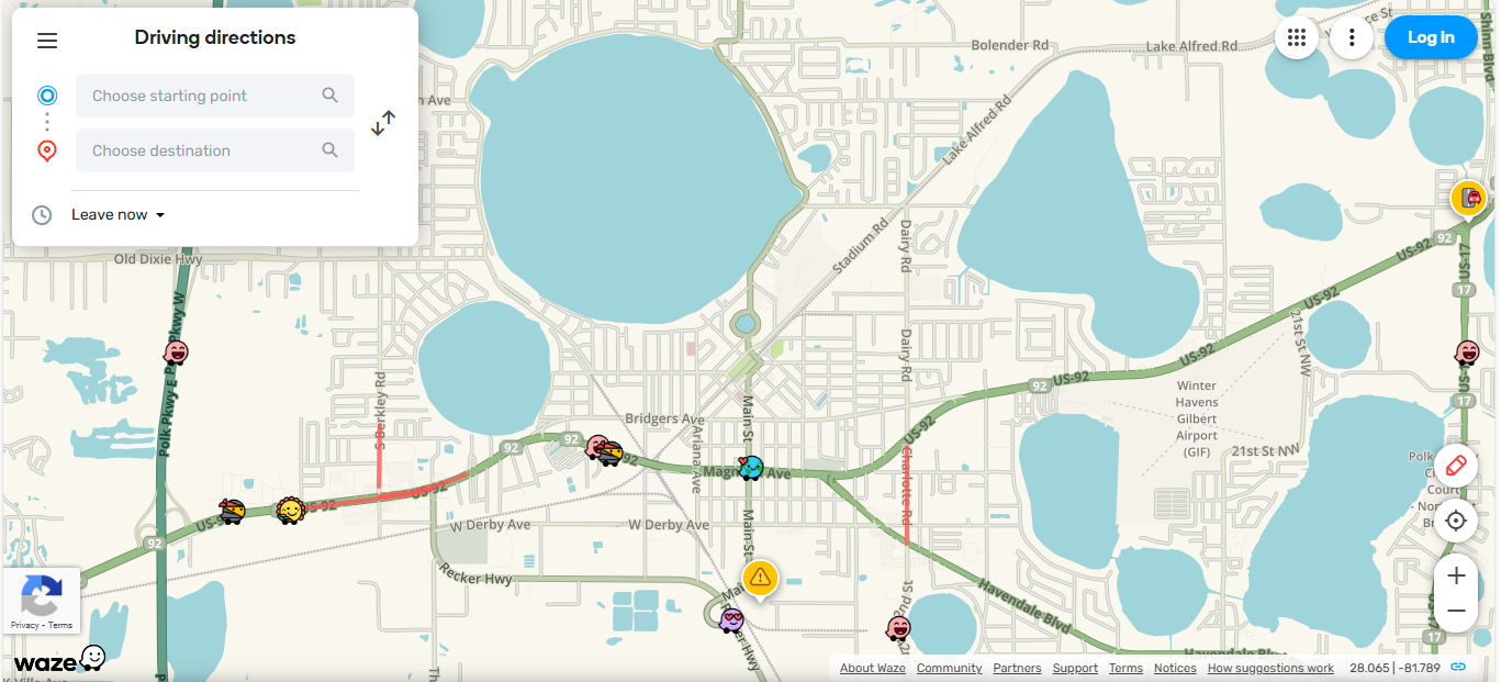
Driving and directions app Waze lets users hit the ground running with getting to where they want to go smoothly, safely, and with helpful features to alert them to real-time issues such as traffic conditions, hazards, and the like—in map form, matching their mental model.
© Waze, Fair use
How Cognitive Task Analysis Feeds Directly into Key UX Artifacts
You can find the benefits of CTA in the following places:
User flows and wireframes: Intel on decisions helps designers shape flows and grouping of content.
UX copy and labels: When designers know more about decision cues, they can craft wording that supports recognition rather than recall—if users have to pause to think or remember something, it breaks the “spell” of a seamless experience.
Onboarding guides: Designers can highlight expert shortcuts in tutorial design.
Error messaging and help: Designers can stay two steps ahead of users, and so anticipate confusion triggers and build context-sensitive support that works well.
Information architecture: Designers can align structure with user mental models for findability and create websites and apps that are easier to navigate and use.
User personas: CTA adds depth by clarifying user expertise and cognitive needs, so designers can “embody” these insights in the form of fictitious representations of real users and build their solutions on stronger foundations.
Discover how personas serve as vital ingredients in any design project, in this video with William Hudson: User Experience Strategist and Founder of Syntagm Ltd.
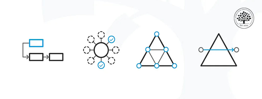
Core Cognitive Task Analysis Methods for UX Professionals
Cognitive task analysis offers researchers and designers a flexible toolkit, with each method tailored to extract the often-invisible thinking that drives user behavior and so provide crucial insights to improve designs. UX professionals can select techniques based on the task’s complexity, user expertise, and time available—with the most commonly used CTA methods listed below, including tips on when and how to apply each.
(Note that how designers and researchers choose the right method will depend on goals, complexity, expertise, and time.)
1. Critical Decision Method (CDM)
CDM is best for high-stakes decisions, expert performance, and emergency or real-time contexts. It’s a structured interview process that walks an expert through a specific incident they handled—such as a customer service representative for a medical insurance provider handling a complicated patient case. The interviewer probes decision points, judgments, cues noticed, and the reasoning behind actions which users take—and typically takes this approach:
Ask the user to recall a non-routine or challenging task.
Break the task into time segments and decision points. Use laddering questions such as “What made that part difficult?”, “What cues did you notice that other people might miss?” or “What might a novice have done differently?”.
Repeat back responses to the user so they can clarify any grey areas and refine the insights.
For example, a lead accountant might explain how they go about spotting tax reporting anomalies in enterprise software, and so they can reveal subtle UI signals and pattern recognition that can help designers come up with improved alerts or visualizations.
2. Applied Cognitive Task Analysis (ACTA)
Best for team-based systems, onboarding design, and capturing domain knowledge, ACTA combines short interviews with task decomposition and cognitive demand mapping. You can involve such approaches as breaking tasks down to help you uncover common pitfalls and expert reasoning strategies.
Steps include:
Task diagramming, where you outline high-level steps in the task.
Knowledge auditing, where you interview participants about cognitive demands, such as where they found themselves facing tough decisions, error likelihood.
Simulation interviews, where you present scenarios or cases and ask what the user would do and why.
ACTA balances depth with practicality—it works well whenever you need insights from multiple roles or are redesigning around shared workflows. For example, if designers are redesigning a project management tool, ACTA can show them that team leads struggle with project scoping because unclear milestones are clouding their view. So, designers can take this insight and gear it around prioritizing goal-setting tools.
3. Think-Aloud Protocols
Think-aloud approaches are best for direct observation of decision-making during usability testing. User researchers or designers ask participants to narrate their thoughts as they perform tasks—a remarkably effective way to reveal spontaneous reasoning, expectations, and confusion in real time. Some tips on how to do it well include to prompt gently (“Please say what you’re thinking as you go.”); not interrupt unless the user goes silent; and record both video and audio (with permission from participants), and then transcribe thought sequences to identify pain points.
For example, a designer might ask a new user to try to book a multi-leg flight on a prototype for a travel app. As the user speaks, it soon becomes clear they misunderstand how the “Add Stopover” option works—and from that hesitation, frowning, and frustrated commenting, it gives the designer insight into how to fix the label and add help text.
Discover why prototyping is a vital part of design and how it can lead to better solutions with the guidance of usability tests, in this video with Alan Dix.
4. GOMS Models (Goals, Operators, Methods, Selection rules)
GOMS is detailed modeling of task efficiency and expert behavior prediction—it breaks tasks down into goal-oriented units. This approach lets designers predict the time it takes to complete tasks and compare design alternatives by modeling the steps users need to take. GOMS splits cleanly into:
Goals: what the user wants to accomplish.
Operators: actions (not indilviduals) they need to take (clicking, typing).
Methods: different strategies they use to achieve goals.
Selection rules: How users choose among methods.
For example, in an admin dashboard, GOMS can show that power users can complete a report in half the time if designers add a shortcut for common filters to it.
5. Decision Ladders and Cognitive Function Models
They’re best for diagnosing decision processes in complex or safety-critical systems. Decision ladders diagram the progression from data recognition to action, which includes alternatives considered and evaluations made. The models uncover where users face uncertainty or experience cognitive overloads, and they help prioritize redesign for clarity or support tools.
For example, in a medical diagnostic app, the model can show that doctors hesitate to take action when lab data appears in inconsistent formats—which prompts designers to consider a unified, visual summary component.
6. Concept Mapping and Knowledge Elicitation Tools
These tools are great for understanding mental models and domain expertise—as concept maps capture how users relate ideas, functions, or data. When designers use these with expert interviews, it helps them grasp complex domains and restructure interfaces so they can match real-world thinking. Some tips include to ask participants to group and label core terms or tasks; connect them with labeled arrows, such as “requires” or “leads to”; and iterate and validate maps with multiple users.
For example, for designers working on educational software, concept maps can reveal how biology students think about DNA processes, and so allow designers to align UI flows with these mental groupings.
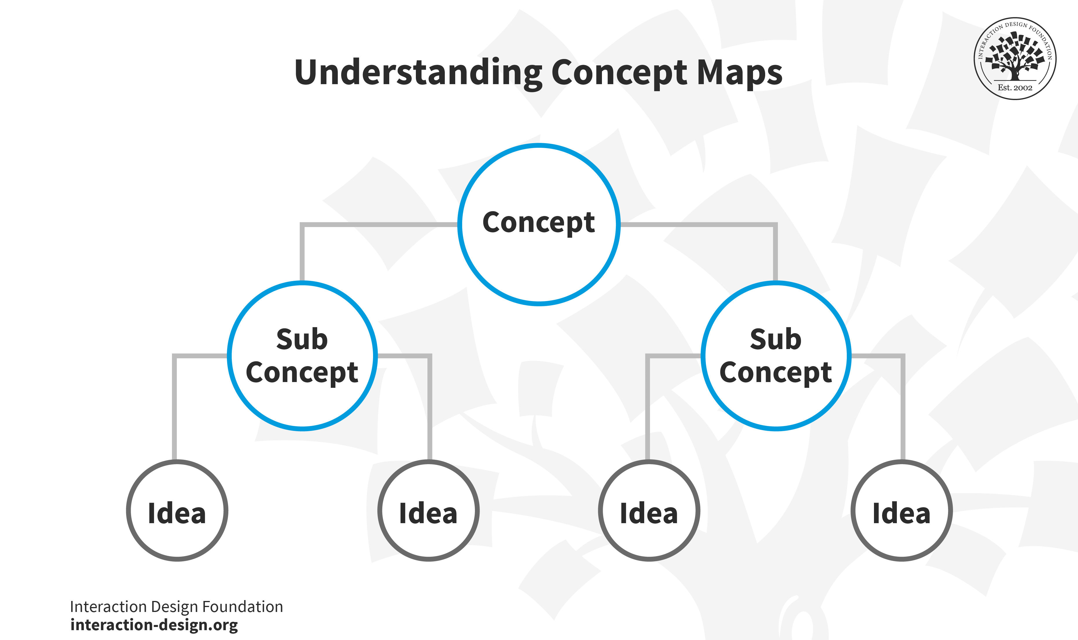
In concept maps, a concept “splinters” into sub concepts, which in turn splinter into ideas.
© Interaction Design Foundation, CC BY-SA 4.0
7. Contextual Inquiry
Contextual inquiries are an excellent way to observe real-world workflows and identify environmental cues—extremely popular in UX design and for good reason. They’re a semi-structured field method that combines observation and in-context interviewing, and so reveal how users adapt tools, rely on physical cues, or use workarounds. To conduct a contextual inquiry, observe the user in their natural setting, ask questions during breaks (not while they’re in flow), and take note of artifacts (notes, checklists) that support their cognition.
For example, in a warehouse app redesign, contextual inquiry can find that workers rely on sticky notes to track inventory exceptions. From this insight, designers can then redesign the app to support note-taking and flagging directly in the system.
Explore the pros and cons of user interviews in this video with Ann Blandford: Professor of Human-Computer Interaction at University College London.
When to Use Cognitive Task Analysis in the UX Design Process
Cognitive task analyses are at their most effective when researchers or designers use them at specific phases of UX design—namely:
1. During early research and when defining the problem because CTA can surface mental models, misconceptions, and decision points that shape personas, user flows, and content or information architecture.
2. During prototyping and the iterative stages because conducting a CTA during prototype testing can uncover hidden cognitive friction and show exactly where users struggle with understanding labels, flows, or structure.
3. In training, onboarding, and expert systems since UX systems aimed at expert users benefit from CTA insights to support decision-making, troubleshooting, and complex workflows—insights that might be hard to surface otherwise.
4. For error-prone or high-risk flows as for systems that demand critical decisions—such as in finance, healthcare, or other industries with systems with steep learning curves—CTA helps expose cognitive bottlenecks and error conditions.
Investigate how good information architecture (IA) helps designs become more successful as users can use and enjoy them more efficiently, in our video.
How To Conduct Cognitive Task Analysis, Step by Step
Please refer to Core Methods for UX Professionals (above) for guidance on which approach might work best in your situation. In any case, CTA follows a structured sequence that anyone on a UX team can benefit from:
Step 1: Set Clear Goals and Define Tasks
Choose a cognitively demanding task for the proposed digital solution—it could be booking travel, configuring options, troubleshooting, or the like—and define goals, scope, and users (novices vs experts).
Step 2: Recruit the Right Participants
Pick representative users: experts expose mental shortcuts, while novices highlight confusion points—you want a good mix. Note that even a small expert group can give you rich and deep insights.
Step 3: Elicit Task Performances
Use CDM, ACTA workshops, think-aloud sessions, or observations—whichever you decide most suitable for the context. Capture both spoken thoughts and nonverbal behavior—unsaid actions can provide insights which words often can’t (or which words might cover up or distort). For example, if you’re taking a CDM approach, you might ask: “What did you notice in that moment?” or “What options did you consider before choosing?”
Step 4: Analyze and Model the Cognitive Workflow
Begin by reviewing and transcribing your notes, recordings, or observations from earlier research sessions (such as interviews or contextual inquiries). Look for patterns in how users make decisions, solve problems, or retrieve and apply knowledge during key tasks.
Then, cluster your findings around meaningful cognitive elements—like decision points, mental shortcuts (heuristics), strategies, or knowledge triggers (things that prompt a user to recall or act on important information). Ask questions such as:
Where do users hesitate or get stuck?
What information do they rely on at each step?
Are there common breakdowns in understanding or workflow?
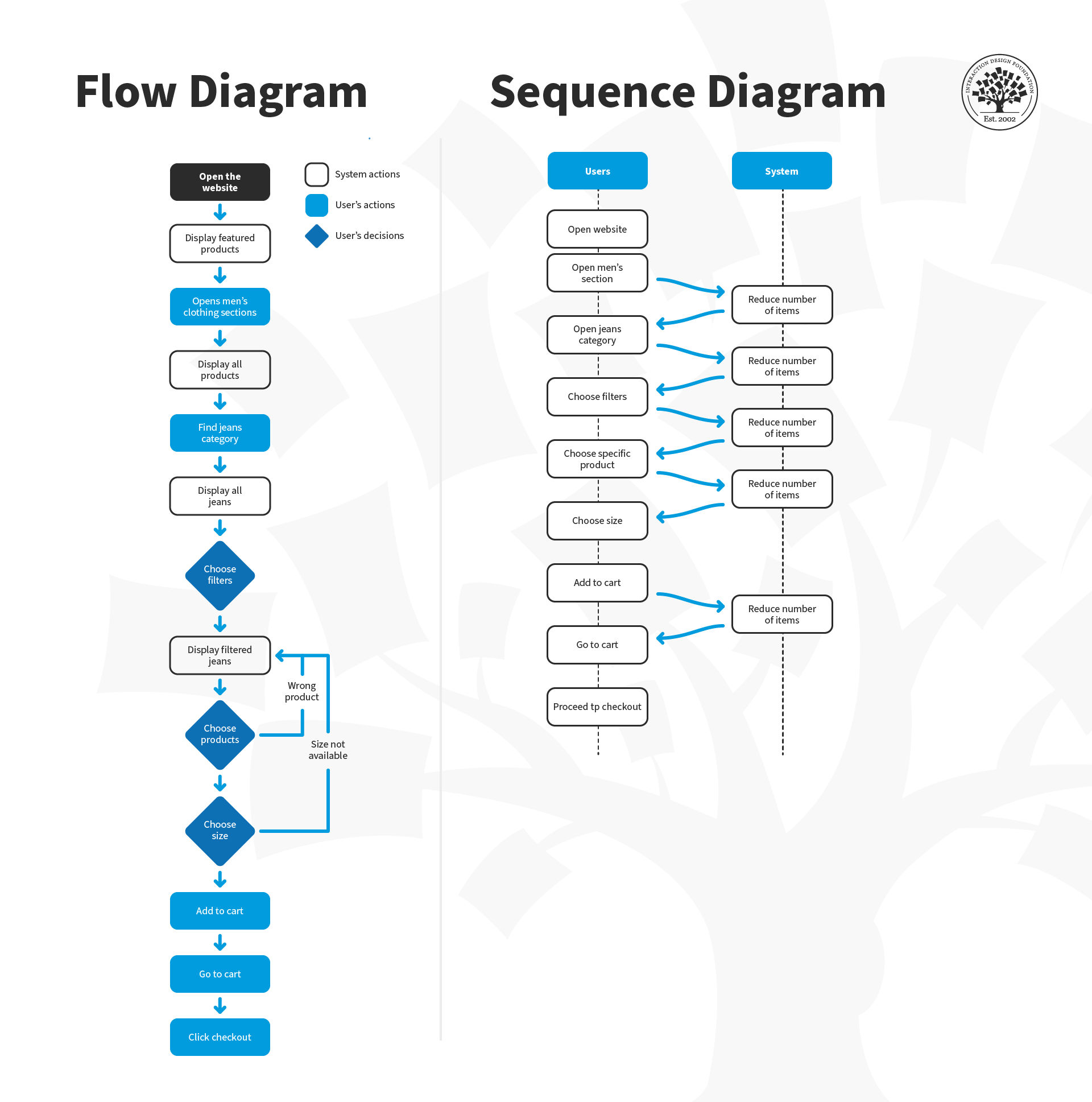
Once you’ve identified these elements, it’s time to create visual cognitive models so you can map the mental processes behind users’ actions. These models can include:
Decision trees—to show how users navigate choices.
Laddering models—to reveal how surface-level actions connect to deeper goals or motivations.
Cognitive function diagrams—to illustrate the mental steps users take (such as, perception → memory recall → decision → action).
These models help you externalize and communicate how users actually think and behave when they’re interacting with a system. They form the foundation for more intuitive design, too, because they allow you to spot gaps, friction points, and opportunities for improvement in the user experience.
Step 5: Validate Through Iteration
Share your conceptual models—such as user journey maps, mental models, task flows, storyboards, or even early prototypes—with other users or subject matter experts. These models represent how you think users understand and interact with a system, process, or experience.
The goal here is to refine your understanding: Do your models accurately reflect users’ real thought processes, needs, and behaviors? Or are you making assumptions that don’t hold up in practice?
Use feedback and iterative testing to adjust your models so they more closely mirror actual user mental models. This helps you ensure that you’re designing based on reality, not on flawed interpretations of user insights. Repeatedly validating and refining your models helps keep you and your team safe from costly design missteps later.
Step 6: Translate Insights into Design
Turn cognitive models into concrete design actions. You can clarify labels, add contextual help, reduce steps, surface decision support, or realign the navigation structure. Use whatever means it takes to tweak and fine-tune the problem areas so they don’t trip users up on the next iteration.
Step 7: Test and Measure Impact
After making the changes for your redesign, test again to capture (hopefully) better results in the form of reduced confusion, quicker decision making, fewer errors, and improved satisfaction. Use both CTA and usability measures to confirm how the improvements have made the design more effective.
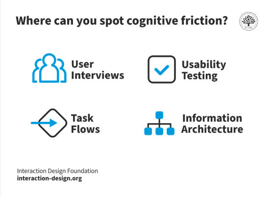
Uncover cognitive friction—one of the arch-enemies of good user experiences—through effective usability testing.
© Interaction Design Foundation, CC BY-SA 4.0
Special Considerations for Cognitive Task Analysis
The following are problem areas to watch out for:
Skipping depth: Designers who rely on simple observations without probing mental logic can end up with superficial results—problems which robust methods like CDM and think-aloud can help solve.
Neglecting novices or experts: Only interviewing one group will skew the insights you get, so compare both newcomers and experienced users to uncover learning or help needs.
Overwhelming visualizations: Present simplified maps or decision ladders that stakeholders can grasp and team members can get behind.
Delaying CTA: CTA is resource-intensive and essential to include from early on in the design process—plan early so insights inform design direction, not catch-ups that might miss the mark.
Overall, cognitive task analysis offers designers a powerful means of access to understand how users think—not just what they do—and gear appropriate solutions around their expectations in the moment and more. CTA helps uncover mental models, decision strategies, and cognitive demands that underpin user behaviors—a vital tool for designers to be able to wrench insights that can make a design usable, desirable, and more.
Brands that let their teams probe deeper into the psychological processes and realities of their users can empower designers to create more intuitive, effective interfaces. Even though CTA demands more effort than basic task analysis, it’s well worth it. It can make for better user experiences with solutions that truly align with how people think—and how human beings from a “target audience” experience being in the sequences of moments as they perform tasks. If the solutions they have at hand feel natural, efficient, and satisfying—and keep them from running into trouble either from confusion or mistakes—the designers responsible can afford to mark their products as successful in at least that sense.