The Law of Closure

Your constantly-updated definition of the Law of Closure and collection of videos and articles
77 shares

What is the Law of Closure?

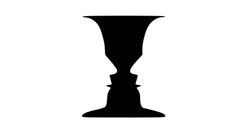
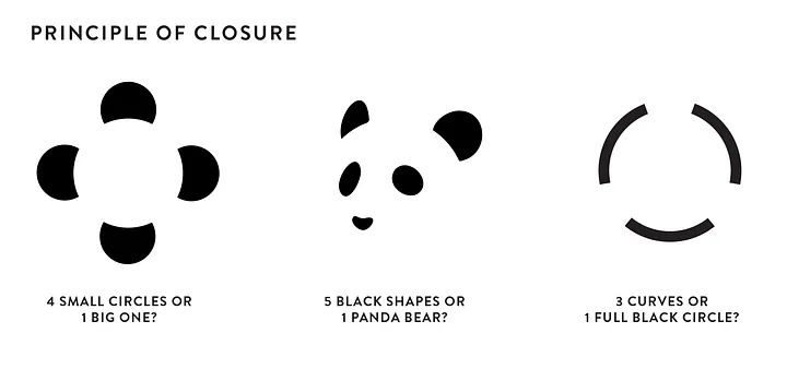
The law of closure is a visual perception law or Gestalt principle. It describes how humans have a natural inclination to perceive incomplete or fragmented visual elements as a complete object. The brain typically fills in the gaps in an image where there are missing parts to perceive a unified and coherent form.

Show Hide video transcript
  1. Transcript loading…

The Law of Closure — The Mind Fills in the Blanks

The Gestalt law or principle of closure, also called reification, is a recognized fundamental concept in the fields of design and visual perception. It comes from the 1920s’ German Gestalt school of psychology. The Gestalt psychologists explored how humans perceive and interpret visual stimuli and simplify complex images in certain ways. Gestalt is a German word that means “shape.” More precisely, in this context, it refers to an organized whole that is more than the sum of its parts.

The principle of closure is a grouping law of visual perception. According to the Gestalt psychologists, humans tend to perceive patterns using five main categories. These are the principle of proximity, the principle of similarity, the principle of continuity, the principle of closure and the principle of connectedness (or uniform connectedness).

Image of a dark triangle over light circles.

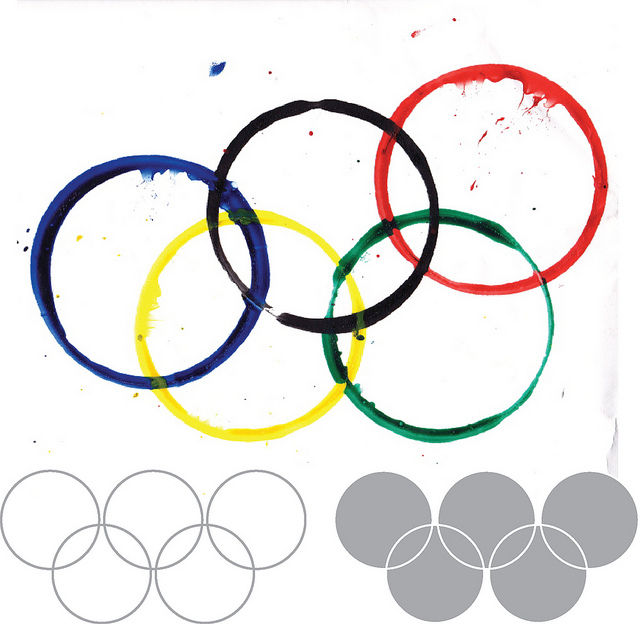
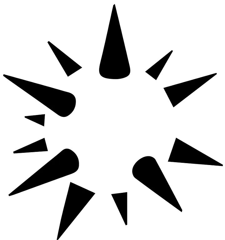
The principle of closure at work—a dark triangle, even if we see three “Pac Man”-like heads “talking” to one another.

© Craig Barber, Fair Use

How Does The Law of Closure Work in Design?

Closure holds significant importance in various design disciplines. These include graphic design, user experience (UX) design and user interface (UI) design. When designers understand and apply this principle, they can create visual designs that are more engaging, memorable and effective in communicating information.

One of the key reasons why the principle of closure is important in design is the mind’s ability to simplify complex visuals fast and make a meaningful whole from individual elements. As with other principles like the law of continuity, this is a handy technique from the days of survival in the wild. Early humans had little time to perceive objects that were potentially hazardous, namely moving ones. 

The principle of closure is evident in various aspects of modern daily human life. These range from recognizing shapes and objects to interpreting symbols and logos. When designers use incomplete or fragmented elements, they can guide the viewer's eye and encourage them to mentally complete the missing parts. This technique helps reduce visual clutter and allows for a more streamlined and cohesive design.

Moreover, a good application of the principle of closure enhances the user's ability to recognize and interpret visual information quickly. The process is automatic as the mind strives to recognize the intended form or object. This cognitive process enables users to comprehend and navigate through visuals more efficiently, leading to a better user experience.

The law of closure not only improves visual communication and user experience. It also adds depth and interest to designs. When they leverage the viewer's active participation in completing the missing parts well, designers can create visuals that are visually intriguing and evoke curiosity. This engagement can help capture the viewer's attention and leave a lasting impression with a brand.

Three example images showing the law of closure.

Closure “permits” viewers to question things as well as see them.

© Eva Shicker, Fair Use

Getting Closure on Closure – The Evidence for It

The principle of closure has been the subject of extensive study through empirical research and observations. Numerous studies have shown that users and viewers do indeed respond to closure in visual stimuli. The German psychologists Max Wertheimer, Wolfgang Köhler and Kurt Koffka provided early evidence of how humans perceive and respond to closure through experiments involving such stimuli. 

In more recent studies, neuroscientists have used brain imaging techniques, such as functional magnetic resonance imaging (fMRI). They have done so to examine the neural processes associated with closure perception. These studies have shown that when individuals encounter incomplete or fragmented visual stimuli, specific areas of the brain responsible for pattern recognition and completion become active. This neural activity indicates that the brain automatically fills in the missing parts to complete the incomplete form or object.

Also, user testing and user feedback in design projects have consistently shown that closure plays a significant role in how users perceive and understand visuals. Designs that effectively utilize closure principles tend to elicit positive responses from users. These responses include increased engagement, improved comprehension and enhanced memorability.

Image of two different broken-line-edged circles.

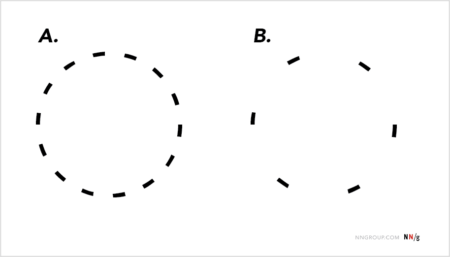
Although the viewer can still tell B is a circle, A is more obviously one with closure.

© Alita Joyce, Fair Use

Benefits of Using the Law of Closure in UX Design

When designers apply closure well, they can make effective use of users’ tendency to fill in the blanks in images. Closure helps to:

1. Simplify Complex Information

Closure enhances the user's ability to understand and navigate through the interface. This phenomenon leads to a more intuitive and efficient user experience.

2. Enhance Visual Engagement

Closure adds depth and interest to designs, making them visually engaging. By leveraging the viewer's active participation in completing missing parts, closure can capture attention and create a memorable impression.

3. Facilitate Pattern Recognition

Closure aids in pattern recognition, letting users quickly identify and understand visual elements. By mentally completing missing parts, users can recognize familiar forms or objects. This fact enables efficient information processing and decision-making.

Image showing the PBS logo.

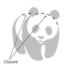
The viewer can fill in the missing information at a glance, such as the two other heads.

© PBS, Fair Use

How and When to Apply the Law of Closure

UI and UX designers can apply the law or principle of closure when they use the key technique of utilizing incomplete or fragmented visual elements. They intentionally incorporate these in their design work to encourage the viewer's participation in completing the missing parts. Principal uses of closure include:

Logo Design

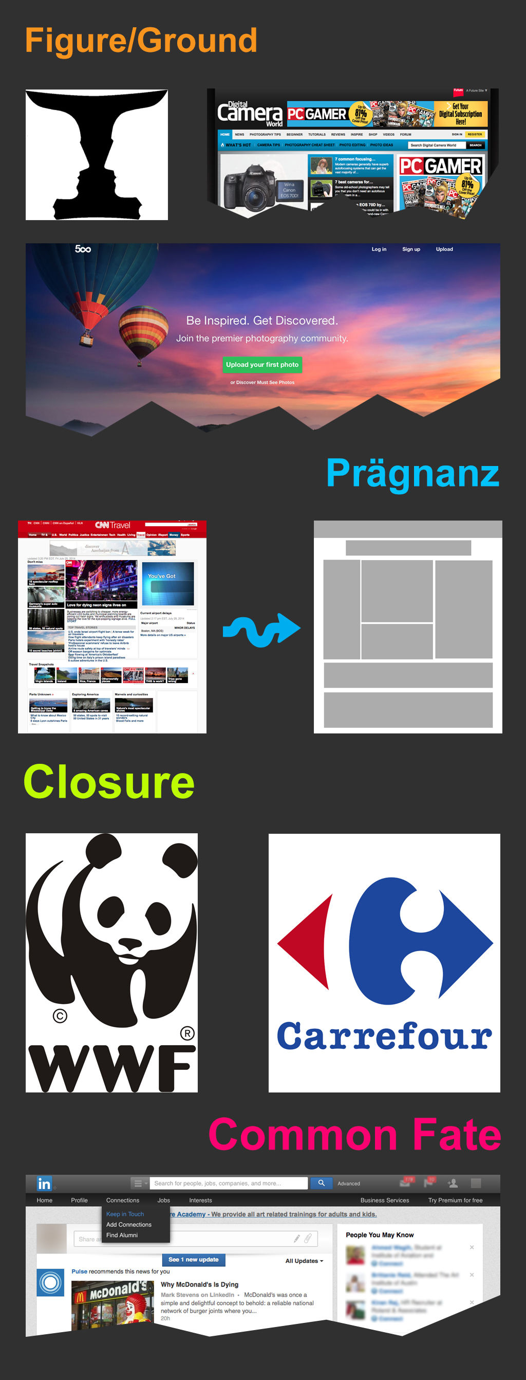
Designers frequently use the law of closure in logo design. With this principle, they can create logos that are simple yet intriguing, with simple or abstract shapes that come into view easily for the user. For example, they make logos that use negative space to suggest a shape or object that isn't explicitly drawn. This not only makes the design more engaging but also aids in brand recall. For example, the World Wildlife Fund’s panda logo embodies the law of closure in its iconic form.

Image showing a panda logo with law of closure.

The World Wildlife Fund’s iconic panda logo is an example of closure in the wild, as outlined here.

© Tangient LL. Fair Use

Interface Icons

Icons are an integral part of any interface. They serve as visual cues for various actions or functions. When they use the law of closure, designers can create minimalist yet effective icons that users can easily recognize and understand.

Image of icons in a Google Slides piece.

On this Google Slides’ piece, the shape icon of a circle appears over what the human eye sees as a square.

© Alita Joyce, Fair Use

Signaling Additional Content

Designers also leverage the law of closure to indicate the presence of additional content and encourage interaction. For example, showing only parts of an item in a carousel tells users that more items lie past the visible area. Even if users can't guess the exact details of the partly displayed item, the fact that it’s incomplete suggests they can find more. Intrigued, they will feel prompted to interact with the digital product.

Image showing screen carousels in use.

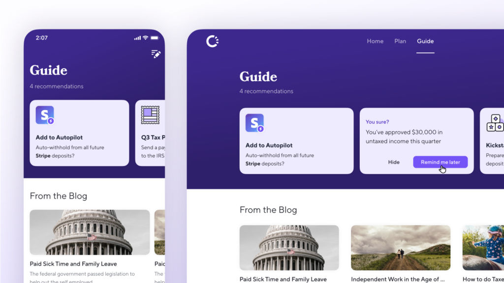
Carousels utilize the principle of closure here.

© Craig Barber, Fair Use

Best Practices to Apply the Law of Closure

It takes thoughtful consideration to apply closure to user interfaces. Design elements and their arrangement need to become meaningful instantaneously. Some best practices and tips on how to effectively apply the principle of closure to UI design include:

1. Simplify Visual Elements

Designers do this to reduce unnecessary complexity. Avoid cluttering the interface with excessive details, as this can hinder closure perception. Focus on using clean lines, minimalistic shapes and easily recognizable forms.

2. Use Negative Space Strategically

Negative space (also called white space) plays a crucial role in closure perception. Utilize negative space strategically to create implied shapes or forms. Carefully arrange and balance the empty areas around visual elements to help users mentally complete the missing parts and perceive a coherent whole.

Illustration of black spikes on a white ball effect.

Closure and space – important parts in a design strategy to help users find their way, right away.

© Travis Jones, Fair Use

3. Maintain Consistency in Design

Consistency in design is vital for closure perception. Establish consistent visual patterns, such as using similar shapes, colors, or styles for related elements. Consistency helps viewers mentally group these elements and perceive them as a unified entity.

4. Leverage Other Gestalt Principles

In addition to the principle of closure, other Gestalt principles, such as proximity, similarity and common fate, can enhance closure perception. Utilize these principles to organize visual elements in a way that encourages viewers to mentally group them and perceive them as a cohesive whole.

5. Consider Context and User Expectations

Consider the users’ context. What are they typically doing? Where are they? How many steps must they take to complete a goal? Designers need to know the user journey regarding how users encounter the design. An understanding of the user scenario is vital to grasp and work with the expectations of the target users. Design elements should align with the users' mental models and expectations, making it easier for them to complete the missing parts. A design that is too abstract or diverges significantly from user expectations may hinder their ability to perceive closure.

6. Design Minimalist Icons

Do this to give users an easy advantage and help them on their way. The less “busy” an icon looks, the better, and closure is a smart and economical tool to hint at function.

7. Use Closure to Indicate The Presence of Additional Content

Do this to encourage interaction, for example, in a carousel or below the fold in the screen. It’s especially vital to signal to users this way if important options aren’t readily visible on the screen that loads for them.

8. Test and Iterate

Conduct user testing and gather feedback to evaluate the effectiveness of closure perception in a UI design. Iterate and refine the design based on user insights to ensure a seamless and intuitive user experience. User feedback will provide valuable insights into how users perceive and interact with the design, and visual closure—like other Gestalt principles—is a fundamental area to trial.

Illustration of a zebra embodying the closure law.

Users will be the ones to determine how successful a design is in the wild.

© Eduard Volianskyi, Fair Use

What Else do Designers Need to Know about The Law of Closure?

Several factors are important to bear in mind when designing with the principle of closure, such as:

1. Cognitive Load

Consider the cognitive load that closure perception may impose on users. Closure can simplify visuals. However, it may also require mental effort from users to complete the missing parts. Designers should strike a balance between closure and cognitive load. This is crucial to help ensure a seamless user experience.

2. Ambiguity and Misinterpretation

Consider the contextual relevance of closure in a UX design. Closure may not be applicable or effective in all design contexts. Assess whether closure aligns with the goals, content and target users of a UX design project. It should enhance the user experience and not create confusion or ambiguity. Inconsistent or incorrect interpretations will work against the design message. Ensure that users mentally complete missing parts in the same way, to make the same meaning.

3. Accessibility

Ensure that closure does not hinder accessibility for users with visual impairments or cognitive challenges. As with color, shape and other factors, design elements should be perceivable and understandable without relying heavily on closure perception. Provide alternative means of understanding and interacting with the interface for a more inclusive experience.

4. Balance

If designers add too many details in an image intended to trigger the closure response, it will defeat the purpose. An image needs to cue users to do the “automatic” work of completing the picture mentally, not feed them the whole story directly. Meanwhile, providing too little information will make it difficult for users to fill in the gaps. That sort of hesitation can lead to confusion and frustration. Therefore, when segmenting content or page elements, consider how much of that element will be on screen. Also consider whether it's enough to communicate value and function.

5. Below-the-Fold and Mobile UI Concerns

Also be careful with the fold, especially on smaller screens. A tangent issue of closure is that users might assume a screen is complete because their minds have filled in the blanks prematurely. Ensure they feel prompted to move or scroll down for more essential information or calls-to-action.

Image of a screen with elements featuring closure.

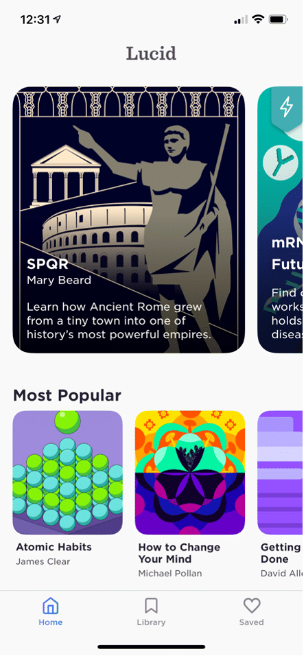
The segmented objects of Lucid appeared beyond the screen to tell users they could swipe horizontally to discover more content.

© Alita Joyce, Fair Use

6. Test and Test Again

Testing is the only way to ensure users can get the full picture. For example, can they understand what an icon represents right away? Designers may need to simplify the visual complexity of icons. User testing will show if users can decipher elements quickly, as well as how their perceptions may diverge if any elements need tweaking.

Overall, the law or principle of closure is a common and handy resource in a designer’s toolbox and a tried-and-tested design decision to include. However, it can be difficult to apply effectively at first. While designers shouldn’t underestimate its potential, neither should they underestimate the thought and strategy required to leverage it best. 

As with visual hierarchy and color theory, principles like the Gestalt law of closure are essential to master in user interface design. Designers who understand the power of such tools can use them to create visually compelling and cohesive designs that resonate with their target audience, optimize user experience and drive engagement further with their design work.

Logo of Carrefour.

Good use of closure can help brands signal an iconic look simply and effectively as household names.

© Carrefour, Fair Use

Learn More about the Gestalt Law of Closure

Take our Gestalt Psychology and Web design: The Ultimate Guide course.

Read our insightful piece The Laws of Figure/Ground, Prägnanz, Closure, and Common Fate – Gestalt Principles (Part 3) with examples of the law of closure and other Gestalt laws.

Consult our piece in Gestalt principles of form perception in the Glossary of Human-Computer Interaction.

Find further fascinating insights in Principle of Closure in Visual Design | by Alita Joyce.

Read more in-depth information in Gestalt Theory: How Our Minds React to What We See | by Cidinha Moss.

Questions related to Law of Closure

How does cultural background influence the perception of designs based on the Gestalt law of closure?

Cultural background significantly influences how users perceive designs. For instance, in some cultures, symbolism and abstraction are prominent in art and design. Therefore, viewers might be more used to recognizing and appreciating works that leverage the law of closure. Conversely, some cultures emphasize clarity and explicitness, and viewers there might find designs based on this law less intuitive or appealing.

The interpretation of shapes and patterns, the symbolism attached to certain visual elements and the context in which viewers encounter a design can all vary with cultural background. So, designers must understand these nuances to ensure their work communicates effectively across different cultures. It’s important to appreciate cultural diversity and how cultures around the world may differ in perceiving what they see from users in the United States, for example. 

Take our course The Ultimate Guide to Visual Perception and Design for more in-depth insights.

How does the Gestalt law of closure impact the accessibility of a design for users with different abilities?

The Gestalt law of closure can be a significant part of enhancing the accessibility of a design for users with varying abilities. Designers can use it to help create interfaces that are more inclusive. They can also make ones that are easier to navigate, especially for users with visual or cognitive impairments.

Visual Accessibility: For low-vision users, designs that feature the law of closure can be easier to interpret. As they suggest shapes and forms without explicitly defining every detail, these designs reduce visual clutter. This makes it easier for those users who may struggle with complex visuals to understand and interact with the content.

Cognitive Accessibility: The law of closure also aids in cognitive accessibility. People with cognitive disabilities may find it easier to comprehend and remember information presented in a simplified, cohesive form.

Universal Design: Incorporating the law of closure well can help ensure that products are usable and accessible to people with a wide range of abilities. This not only benefits users with disabilities. It also provides a better user experience for all users by making information more digestible and interfaces more intuitive.

Designers should, however, be mindful of over-reliance on this principle. Excessive use of closure can lead to ambiguity. This fact makes it crucial to strike a balance between simplicity and clarity. Designers should test designs with a diverse user group and consider the range of abilities and assistive technology involved.

Take our Accessibility: How to Design For All course for more in-depth insights into accessibility and design.

What challenges can designers face when they apply the Gestalt law of closure in complex or data-heavy interfaces?

When they apply the Gestalt law of closure in complex or data-heavy interfaces, designers may face several challenges:

●  Balancing Simplicity and Clarity: Designers must ensure that while elements are simplified, the essential details remain clear and understandable.

●  Cognitive Overload: In data-heavy interfaces, there's a risk of cognitive overload from overusing the law of closure. Designers must ensure that users can easily perceive and understand the intended patterns or shapes comfortably.

●  Diverse User Interpretations: Different users may perceive incomplete elements differently. This can be due to their cultural background, experiences, and cognitive abilities. So, create designs that communicate effectively across a diverse user base, whatever the target audience or abilities involved.

●  Testing and Validation: It takes rigorous user testing to ensure that the law of closure contributes positively to the user experience. Designers need to validate their designs with real users.

●  Maintaining Consistency: This is vital to apply the law of closure across various elements of the interface. If designers use closure inconsistently, confusion and a disjointed user experience can result.

Take our Conducting Usability Testing course to help make more user-friendly visual designs and play an important role in helping users interact with high-quality product designs.

In what ways can the Gestalt law of closure enhance navigation and information architecture in UX design?

The law of closure can do this by promoting a more intuitive and user-friendly interface. Here are some ways:

●  Simplify Complex Information: When they use the law of closure well, designers can present complex information in a more simplified way. Users naturally fill in the missing parts. So, designers can avoid over-cluttering the interface with excessive details. This simplification makes it easier for users to navigate through the information and understand the underlying structure in user interface design.

●  Create Intuitive Navigation Elements: Designers can use the closure principle to create navigation elements that are more intuitive. For example, icons or buttons may not need to be fully detailed if users can easily perceive their function and form through closure. This can lead to a cleaner design and a more intuitive user experience on a digital product.

●  Streamline User Flows: The closure law can help in streamlining user flows by reducing visual noise and focusing users' attention on the completion of tasks. Well-designed paths using this principle can lead users naturally from one step to the next, enhancing the overall usability of the system.

Take our Gestalt Psychology and Web Design: The Ultimate Guide course for more in-depth insights.

Can the Gestalt law of closure influence the choice of colors and contrasts in UI design?

Yes, the law of closure can significantly influence how designers choose colors and contrasts in UI design. This principle interacts with color and contrast to affect how users perceive and interpret visual elements. It does so in these ways:

Enhancing Element Visibility: By using contrasting colors, designers can emphasize the parts of an element that are crucial for the law of closure to take effect.

Creating Depth and Focus: Designers can use color gradients and contrasting colors to create a sense of depth.

Improving Comprehension: Proper use of colors and contrasts can improve the user's ability to comprehend incomplete shapes or patterns.

Affecting Emotional Response: For example, if designers use warm, contrasting colors for incomplete shapes, it can make the interface feel more inviting and engaging.

Guiding User Interaction: The strategic use of colors and contrasts can guide user interaction with elements that utilize the closure principle. A well-designed, color-contrasted incomplete element can attract the user's attention and indicate where to take action.

For more on understanding how aspects of color work in UI and other elements related to visual design skills, watch this video from CEO of Hype4, Michal Malewicz.

Show Hide video transcript
  1. Transcript loading…

How is the Gestalt law of closure useful in emerging UX/UI trends such as voice UI or augmented reality?

Designers can use the law of closure in innovative applications in emerging UX/UI trends like Voice User Interfaces (VUIs) and Augmented Reality (AR). They can enhance the user experience by leveraging users' perceptual tendencies. Here are important application areas:

●  Voice User Interfaces (VUIs):

Contextual Completion: In VUIs, the law of closure helps to create a more natural interaction. Users often provide incomplete commands or information, and designers engineer systems to fill in the gaps contextually, anticipating user needs or next steps. This is much like how the human brain uses closure to complete patterns.

Feedback Loops: Visual indicators or sounds in VUIs often hint at the system's status or next steps. These cues, although not complete representations, allow users to perceive the system's state or the completion of a task. Doing so, they apply the principle of closure to user-system interaction.

 ●  Augmented Reality (AR):

Visual Layering: AR interfaces use the law of closure by overlaying digital information on the real world. Users naturally fill in the gaps between digital and physical elements. This creates a cohesive experience where incomplete digital elements seem part of the physical space.

Interactive Storytelling: AR leverages closure in storytelling, where users' actions or movements complete the narrative. The story unfolds based on user interaction. Also, the brain's tendency to fill in gaps ensures a seamless and immersive experience.

Moreover, designers can harness artificial intelligence (AI) as well as a range of tools and skills related to visual elements and design principles in UI design for AR and voice commands for VUIs to optimize experiences for a wide range of users. Meanwhile, they should consider important issues such as accessibility to help make their designs even more user friendly as well as innovative.

Watch as CEO of Experience Dynamics, Frank Spillers explains what AR is and involves:

Show Hide video transcript
  1. Transcript loading…

What are some highly cited scientific pieces of research about the Gestalt law of closure?

1. Chang, D., Dooley, L., & Tuovinen, J. E. (2002). Gestalt Theory in Visual Screen Design — A New Look at an old subject. In Selected Papers from the 7th World Conference on Computers in Education (WCCE’01), Copenhagen, Computers in Education 2001: Australian Topics, Volume 8 (pp. 5–12). Melbourne: Australian Computer Society. https://oro.open.ac.uk/11356/

This publication revisits the application of Gestalt theory in educational visual screen design. It critically examines the common yet narrow application of Gestalt laws in design literature and identifies eleven relevant laws for enhancing visual screen design in educational contexts. The study applies these principles to redesign an instructional multimedia application, 'WoundCare', and presents an evaluation of the new designs based on user feedback, highlighting the positive impact of these principles on learning and design aesthetics.

2. Li, Y., & Fu, K. (2022). Research on Minimalism in Interface Design Based on Gestalt Psychology. In Proceedings of the 2022 International Conference on Science Education and Art Appreciation (SEAA 2022). Atlantis Press. https://www.atlantis-press.com/proceedings/seaa-22/125976903

This publication explores the application of Gestalt psychology in minimalist interface design, particularly analyzing interfaces from Apple and Huawei. It discusses how Gestalt principles aid in structuring information in a user-friendly manner and enhance user experience by simplifying visual elements and aligning them with human visual perception principles. The study underscores the synergy between Gestalt principles and minimalist design, proposing advantages for user comprehension and interface aesthetics.

What are some highly regarded books about the Gestalt law of closure?

Malone, E. (2023). A Guide to Gestalt Principles for UX Designers: A mini visual design guide to help user experience designers leverage gestalt principles for better designs. 8 paw press.


This book offers a concise exploration of Gestalt principles in UX design. Erin Malone provides a practical guide, applying these principles to digital interfaces with a focus on mobile and web examples. The book delves into visual hierarchy, animation, and microinteractions, aiming to help readers improve design skills. It also includes downloadable templates for design documentation, making it a hands-on resource for UX designers.

Where can I learn more about the Gestalt law of closure?

Literature on the Law of Closure

Here’s the entire UX literature on the Law of Closure by the Interaction Design Foundation, collated in one place:

Learn more about the Law of Closure

Take a deep dive into Law of Closure with our course Gestalt Psychology and Web Design: The Ultimate Guide .

One of the key ingredients to a successful product is the creation of effective, efficient and visually pleasing displays. In order to produce such high-quality displays, whether they are graphical (e.g., websites) or tangible (e.g., remote controls), an understanding of human vision is required, along with the knowledge of visual perception. By observing, researching, and identifying examples of our perceptual abilities, we can design products according to these unifying qualities. In order to spread such skills within the world of interaction design, we have developed “Gestalt Psychology and Web Design: The Ultimate Guide.”

Gestalt psychology is a theory of mind which has been applied to a number of different aspects of human thought, action, and perception. In particular, Gestalt theorists and researchers attempt to understand visual perception in terms of the way in which underlying processes are organized and how they help us make sense of the world. The organization of these cognitive processes is important to our understanding of how we interpret the constant stream of visual information entering our eyes and how it becomes a cohesive, meaningful and usable representation of the world. Over the last twenty years, the work of Gestalt psychologists has been adopted by interaction designers and other professionals involved in the development of products for human users.

Within this course, we have compiled and consolidated some of the best resources currently available on the subject of Gestalt psychology and visual perception. To help you appreciate how you can apply Gestalt psychology to web design, we have provided many different examples from existing designs. These draw attention to the exact qualities, quirks, and features of visual perception. Moreover, they discuss how these have been accommodated and, on a number of occasions, exploited so as to support either the user's intentions or those of the designer or client.

The application of Gestalt thinking to design provides us with insights and new ways of approaching problems and challenges. By cementing in our own minds the many ways we organize visual information, we can improve our designs for all users.

All open-source articles on the Law of Closure

Please check the value and try again.

Open Access—Link to us!

We believe in Open Access and the democratization of knowledge. Unfortunately, world-class educational materials such as this page are normally hidden behind paywalls or in expensive textbooks.

If you want this to change, , link to us, or join us to help us democratize design knowledge!